
Conversion from wview to weewx weather station software - Part 1, data cleanup
Personal weather station conversion
I have been running wview since June 23, 2012. It has been a reliable workhorse, but it doesn’t appear to be maintained any longer, and it does have a couple of issues. The new, improved open-source product seems to be weewx, so I’m migrating to that one.
This is the story of that conversion.
Preliminaries
I know that my old database has some bad data in it, so the first thing I want to do is figure out where that bad data is, and fix it before I migrate the database.
For example, there were a few days when moisture got to a plug and caused false bucket-tipping signals, resulting in a 50 inch rainfall.
Then my humidity sensor failed, causing negative dewpoints and ridiculously low humidities.
It would be cool to do this in a reproducible fashion with R, so let’s go that route.
library(DBI)
library(tidyverse)
## ── Attaching packages ─────────────────────────────────── tidyverse 1.2.1 ──## ✔ ggplot2 3.1.0 ✔ purrr 0.2.5
## ✔ tibble 2.0.1 ✔ dplyr 0.7.8
## ✔ tidyr 0.8.2 ✔ stringr 1.3.1
## ✔ readr 1.3.1 ✔ forcats 0.3.0## ── Conflicts ────────────────────────────────────── tidyverse_conflicts() ──
## ✖ dplyr::filter() masks stats::filter()
## ✖ dplyr::lag() masks stats::lag()library(dbplyr)##
## Attaching package: 'dbplyr'## The following objects are masked from 'package:dplyr':
##
## ident, sqllibrary(lubridate)##
## Attaching package: 'lubridate'## The following object is masked from 'package:base':
##
## datelibrary(tsibble)##
## Attaching package: 'tsibble'## The following objects are masked from 'package:lubridate':
##
## interval, new_interval## The following object is masked from 'package:dplyr':
##
## id## The following object is masked from 'package:stats':
##
## filterlibrary(DescTools)
# Let's create a general function for plotting where NA's live
PlotNA <- function(df, Variable){
# Pull out just NA's and then build select criteria around them
V <- enquo(Variable)
runs <-
df %>%
select(dateTime, !!V) %>%
filter(is.na(!!V)) %>%
mutate(diffs=(as.numeric(dateTime)-lag(as.numeric(dateTime)))/300) # run length
NAlocations <-
rle(runs$diffs) %>%
unclass() %>%
as.data.frame() %>%
mutate(end = cumsum(lengths),
start = c(1, lag(end)[-1] + 1)) %>%
select(c(1,2,4,3)) %>% # To re-order start before end for display
filter(lengths>1)
# create a tibble of start stop times - widen interval by 1 hour
Startstop <-
tibble(Start=runs[NAlocations$start,]$dateTime-300*12,
Stop =runs[NAlocations$end , ]$dateTime+300*12)
# build a plot for each interval
for (i in 1:nrow(Startstop)) {
temp <-
df %>%
filter(between(dateTime,
Startstop$Start[i],
Startstop$Stop[i])) %>%
mutate(dateTime=as_datetime(dateTime)) %>%
select(dateTime, outTemp)
print(ggplot(data=temp,aes(x=dateTime,
y=!!V)) +
geom_point() +
scale_x_datetime(date_labels = "%Y-%m-%d")
)
}
}
database <- "/home/ajackson/Dropbox/Rprojects/AdelieTranquil/wview-archive.sdb"
# Set connection to database
db <- DBI::dbConnect(RSQLite::SQLite(), database)
# Take a peek
src_dbi(db)## src: sqlite 3.22.0 [/home/ajackson/~/projects/AdelieTranquil/wview-archive.sdb]
## tbls: archive# database contains only one table, "archive"
database <- tbl(db,"archive") %>% collect()
database## # A tibble: 683,760 x 52
## dateTime usUnits interval barometer pressure altimeter inTemp outTemp
## <int> <int> <int> <dbl> <dbl> <dbl> <dbl> <dbl>
## 1 1.34e9 1 5 29.9 29.8 29.8 79.9 86.5
## 2 1.34e9 1 5 29.9 29.8 29.9 79.9 86.8
## 3 1.34e9 1 5 29.9 29.9 29.9 80.5 87.6
## 4 1.34e9 1 5 29.9 29.8 29.9 80.6 88.1
## 5 1.34e9 1 5 29.9 29.8 29.9 80.8 88.6
## 6 1.34e9 1 5 29.9 29.8 29.9 80.8 89
## 7 1.34e9 1 5 29.9 29.8 29.9 81 89.4
## 8 1.34e9 1 5 29.9 29.8 29.9 81.2 89.8
## 9 1.34e9 1 5 29.9 29.8 29.8 81.2 90.3
## 10 1.34e9 1 5 29.9 29.8 29.9 81 90.7
## # … with 683,750 more rows, and 44 more variables: inHumidity <dbl>,
## # outHumidity <dbl>, windSpeed <dbl>, windDir <dbl>, windGust <dbl>,
## # windGustDir <dbl>, rainRate <dbl>, rain <dbl>, dewpoint <dbl>,
## # windchill <dbl>, heatindex <dbl>, ET <dbl>, radiation <dbl>, UV <dbl>,
## # extraTemp1 <dbl>, extraTemp2 <dbl>, extraTemp3 <dbl>, soilTemp1 <dbl>,
## # soilTemp2 <dbl>, soilTemp3 <dbl>, soilTemp4 <dbl>, leafTemp1 <dbl>,
## # leafTemp2 <dbl>, extraHumid1 <dbl>, extraHumid2 <dbl>,
## # soilMoist1 <dbl>, soilMoist2 <dbl>, soilMoist3 <dbl>,
## # soilMoist4 <dbl>, leafWet1 <dbl>, leafWet2 <dbl>,
## # rxCheckPercent <dbl>, txBatteryStatus <dbl>, consBatteryVoltage <dbl>,
## # hail <dbl>, hailRate <dbl>, heatingTemp <dbl>, heatingVoltage <dbl>,
## # supplyVoltage <dbl>, referenceVoltage <dbl>, windBatteryStatus <dbl>,
## # rainBatteryStatus <dbl>, outTempBatteryStatus <dbl>,
## # inTempBatteryStatus <dbl>Digging into the data
Let’s do some field summaries, looking at max, min values and nulls to start getting a feel for the issue, and then do some plots.
Originally I thought about doing all the plots at once, but really, better to work through each variable one at a time, since each one may have unique issues.
database %>%
  select(dateTime,barometer:dewpoint) %>%
  collect() %>%
  summarise_all(funs(min, max), na.rm = TRUE)
## # A tibble: 1 x 30
## dateTime_min barometer_min pressure_min altimeter_min inTemp_min
## <dbl> <dbl> <dbl> <dbl> <dbl>
## 1 1340464800 29.4 29.3 29.4 60.7
## # … with 25 more variables: outTemp_min <dbl>, inHumidity_min <dbl>,
## # outHumidity_min <dbl>, windSpeed_min <dbl>, windDir_min <dbl>,
## # windGust_min <dbl>, windGustDir_min <dbl>, rainRate_min <dbl>,
## # rain_min <dbl>, dewpoint_min <dbl>, dateTime_max <dbl>,
## # barometer_max <dbl>, pressure_max <dbl>, altimeter_max <dbl>,
## # inTemp_max <dbl>, outTemp_max <dbl>, inHumidity_max <dbl>,
## # outHumidity_max <dbl>, windSpeed_max <dbl>, windDir_max <dbl>,
## # windGust_max <dbl>, windGustDir_max <dbl>, rainRate_max <dbl>,
## # rain_max <dbl>, dewpoint_max <dbl># count the NA's in each column
map(database, ~sum(is.na(.)))## $dateTime
## [1] 0
##
## $usUnits
## [1] 0
##
## $interval
## [1] 0
##
## $barometer
## [1] 0
##
## $pressure
## [1] 0
##
## $altimeter
## [1] 0
##
## $inTemp
## [1] 0
##
## $outTemp
## [1] 1447
##
## $inHumidity
## [1] 0
##
## $outHumidity
## [1] 1448
##
## $windSpeed
## [1] 1452
##
## $windDir
## [1] 234173
##
## $windGust
## [1] 0
##
## $windGustDir
## [1] 234370
##
## $rainRate
## [1] 0
##
## $rain
## [1] 0
##
## $dewpoint
## [1] 1883
##
## $windchill
## [1] 1454
##
## $heatindex
## [1] 1448
##
## $ET
## [1] 0
##
## $radiation
## [1] 683760
##
## $UV
## [1] 683760
##
## $extraTemp1
## [1] 682315
##
## $extraTemp2
## [1] 683760
##
## $extraTemp3
## [1] 683760
##
## $soilTemp1
## [1] 683760
##
## $soilTemp2
## [1] 683760
##
## $soilTemp3
## [1] 683760
##
## $soilTemp4
## [1] 683760
##
## $leafTemp1
## [1] 683760
##
## $leafTemp2
## [1] 683760
##
## $extraHumid1
## [1] 683760
##
## $extraHumid2
## [1] 683760
##
## $soilMoist1
## [1] 683760
##
## $soilMoist2
## [1] 683760
##
## $soilMoist3
## [1] 683760
##
## $soilMoist4
## [1] 683760
##
## $leafWet1
## [1] 683760
##
## $leafWet2
## [1] 683760
##
## $rxCheckPercent
## [1] 0
##
## $txBatteryStatus
## [1] 0
##
## $consBatteryVoltage
## [1] 0
##
## $hail
## [1] 683760
##
## $hailRate
## [1] 683760
##
## $heatingTemp
## [1] 683760
##
## $heatingVoltage
## [1] 683760
##
## $supplyVoltage
## [1] 683760
##
## $referenceVoltage
## [1] 683760
##
## $windBatteryStatus
## [1] 683760
##
## $rainBatteryStatus
## [1] 683760
##
## $outTempBatteryStatus
## [1] 683760
##
## $inTempBatteryStatus
## [1] 683760Pressures are okay. But not much else. Temperature, Humidity, Windspeed and direction all have NA issues.
Look at dateTime
dateTime is in seconds since some epoch - probably Jan 1, 1970. The data is stored every 5 minutes (NWS standard). The histogram shows some gaps - times when the station was down for an extended period of time because I was out of town and unable to restart things.
It would be interesting to plot the gaps - I’ll have to think about how to do that.
database %>%
  mutate(dateTime=as_datetime(dateTime)) %>%
  ggplot(aes(x=dateTime)) +
  geom_histogram()
## `stat_bin()` using `bins = 30`. Pick better value with `binwidth`.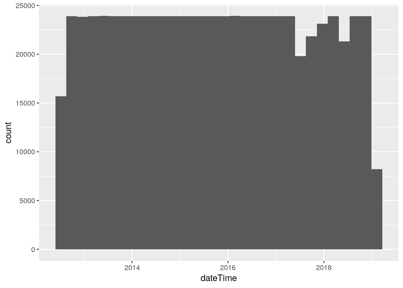
# Greatest common denominator. It should be 300, or 5 minutes
GCD(database$dateTime)
## [1] 60# But it is 60, one minute. How can that be?
# let's find anyone not divisible by 300
database %>%
mutate(a=dateTime/300) %>%
filter(as.integer(a)!=a) %>%
mutate(dateTime=as_datetime(dateTime)) ## # A tibble: 11 x 53
## dateTime usUnits interval barometer pressure altimeter inTemp
## <dttm> <int> <int> <dbl> <dbl> <dbl> <dbl>
## 1 2015-07-05 03:28:00 1 5 30.0 29.9 30.0 87.5
## 2 2015-12-12 21:26:00 1 5 29.8 29.7 29.8 78
## 3 2016-06-29 15:46:00 1 5 30.0 29.9 29.9 84.5
## 4 2016-08-31 19:21:00 1 5 29.9 29.8 29.8 89.8
## 5 2016-09-07 20:22:00 1 5 30.1 30.0 30.0 89.2
## 6 2017-01-06 14:41:00 1 5 30.1 30.0 30.1 74
## 7 2017-08-04 23:42:00 1 5 29.9 29.9 29.9 92.5
## 8 2017-09-02 23:06:00 1 5 30.0 29.9 30.0 81
## 9 2017-09-12 02:37:00 1 5 29.9 29.9 29.9 79.5
## 10 2017-12-29 17:01:00 1 5 30.4 30.4 30.4 71.4
## 11 2019-01-08 12:26:00 1 5 30.1 30.1 30.1 74.9
## # … with 46 more variables: outTemp <dbl>, inHumidity <dbl>,
## # outHumidity <dbl>, windSpeed <dbl>, windDir <dbl>, windGust <dbl>,
## # windGustDir <dbl>, rainRate <dbl>, rain <dbl>, dewpoint <dbl>,
## # windchill <dbl>, heatindex <dbl>, ET <dbl>, radiation <dbl>, UV <dbl>,
## # extraTemp1 <dbl>, extraTemp2 <dbl>, extraTemp3 <dbl>, soilTemp1 <dbl>,
## # soilTemp2 <dbl>, soilTemp3 <dbl>, soilTemp4 <dbl>, leafTemp1 <dbl>,
## # leafTemp2 <dbl>, extraHumid1 <dbl>, extraHumid2 <dbl>,
## # soilMoist1 <dbl>, soilMoist2 <dbl>, soilMoist3 <dbl>,
## # soilMoist4 <dbl>, leafWet1 <dbl>, leafWet2 <dbl>,
## # rxCheckPercent <dbl>, txBatteryStatus <dbl>, consBatteryVoltage <dbl>,
## # hail <dbl>, hailRate <dbl>, heatingTemp <dbl>, heatingVoltage <dbl>,
## # supplyVoltage <dbl>, referenceVoltage <dbl>, windBatteryStatus <dbl>,
## # rainBatteryStatus <dbl>, outTempBatteryStatus <dbl>,
## # inTempBatteryStatus <dbl>, a <dbl># Wow. So embedded in almost 700,000 observations are 11 wonky ones.
# What does it look like around these observations?
# Looks like they live in short gaps
# I think I will just delete them. They are likely to cause more
# trouble than they are worth.
database <-
database %>%
mutate(a=dateTime/300) %>%
filter(as.integer(a)==a)
# Let's check out tsibble and see if it makes life easier.
df <- database %>%
mutate(dateTime=as_datetime(dateTime)) %>%
as_tsibble(key=id(), index=dateTime)
has_gaps(df)## # A tibble: 1 x 1
## .gaps
## <lgl>
## 1 TRUEcount_gaps(df) ## # A tibble: 28 x 3
## .from .to .n
## <dttm> <dttm> <int>
## 1 2012-06-23 15:40:00 2012-06-23 15:40:00 1
## 2 2012-11-04 07:00:00 2012-11-04 07:55:00 12
## 3 2012-11-18 20:35:00 2012-11-19 02:50:00 76
## 4 2013-11-03 07:00:00 2013-11-03 07:55:00 12
## 5 2014-11-02 07:00:00 2014-11-02 07:55:00 12
## 6 2015-03-08 16:55:00 2015-03-08 17:50:00 12
## 7 2015-07-05 02:55:00 2015-07-05 03:25:00 7
## 8 2015-11-01 07:00:00 2015-11-01 07:55:00 12
## 9 2015-12-12 21:20:00 2015-12-12 21:25:00 2
## 10 2016-06-29 15:40:00 2016-06-29 15:45:00 2
## # … with 18 more rows# Let's be really tidy and fill the gaps.
df <- df %>%
fill_gaps(.full=TRUE)pressure
So there are three values here, barometer, pressure, and altimeter. Barometer is the raw value received from the station and represents what the National Weather Service calls mean sea level pressure, which uses the temperature of the air to move the measured pressure to sea level. Pressure is “Station Pressure”, or the actual raw pressure at the station - here actually back-calculated from the barometer value. Altimeter is the pressure moved to mean sea level using an average temperature gradient. This last is what is usually reported on TV.
So let’s plot up all three of these just for grins. They should more or less parallel each other.
df %>%
  select(barometer, pressure, altimeter) %>%
  gather(key="Measurement", value=Value, na.rm=TRUE) %>%
  ggplot(aes(x=Value)) +
  geom_histogram(binwidth=0.01) +
  facet_grid(Measurement ~ .)
## Selecting index: "dateTime"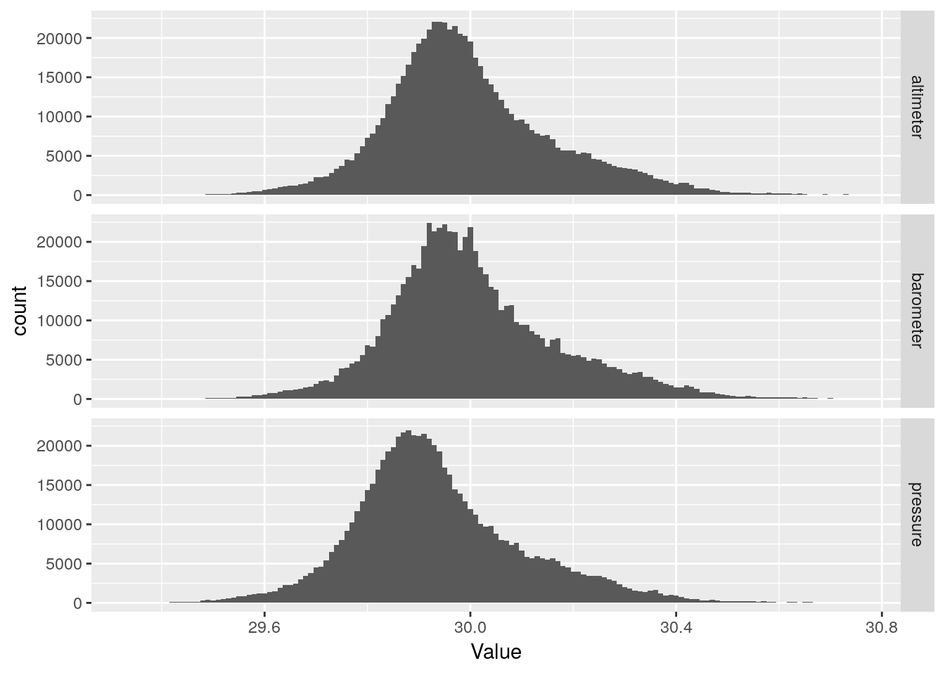
df %>%
  select(dateTime, barometer, pressure, altimeter) %>%
  gather(key="Measurement", value=Value, -dateTime, na.rm=TRUE) %>%
  ggplot(aes(x=dateTime, y=Value, color=Measurement)) +
geom_line() 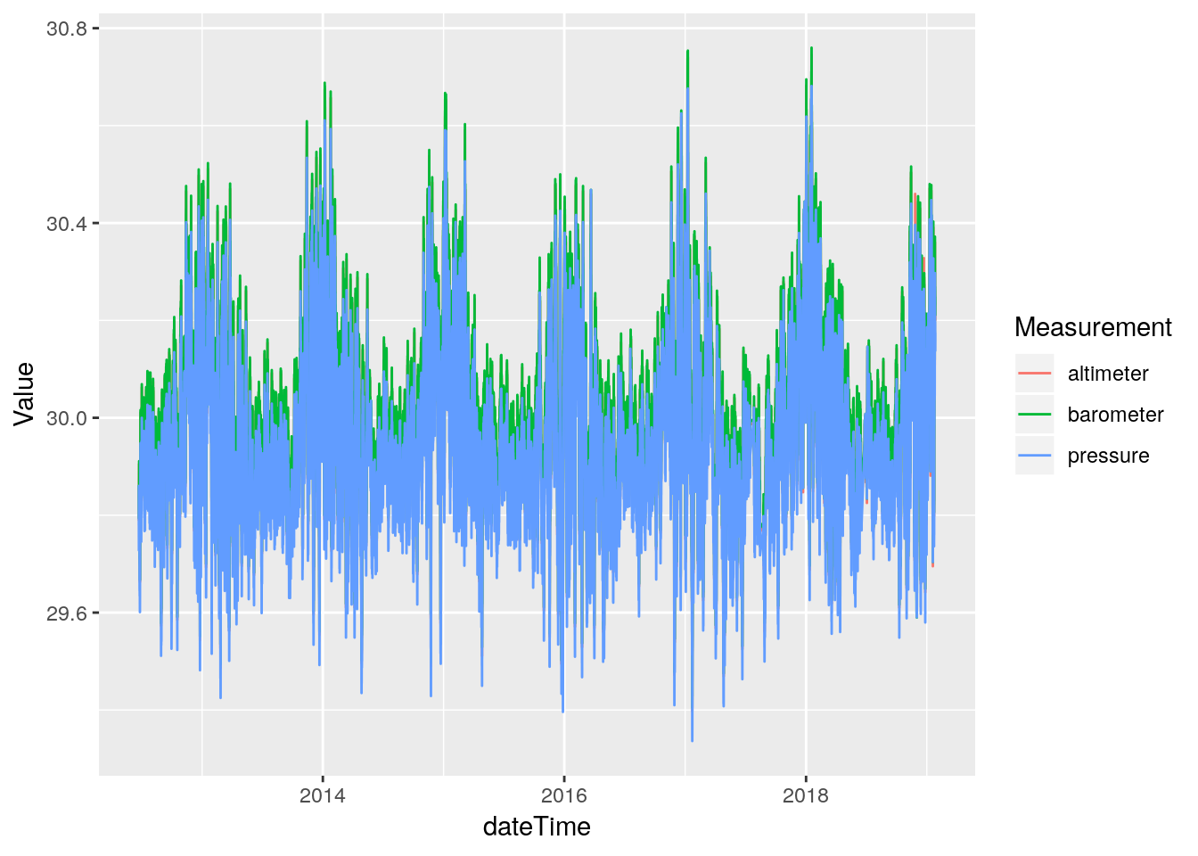
From the histograms there are no obvious data busts, so hopefully these fields, at least, will not need to be repaired.
Temperatures
inTemp is inside temperature, outTemp is outside temperature. Let’s look at plots similar to what we did for pressure.
I should note thet the station console sits above my desktop PC, and so always reads an inside temperature about 5 or so degrees warmer than the rest of the house.
df %>%
  select(inTemp, outTemp) %>%
  gather(key="Measurement", value=Value, na.rm=TRUE) %>%
  ggplot(aes(x=Value)) +
  geom_histogram(binwidth=1) +
  facet_grid(Measurement ~ .)
## Selecting index: "dateTime"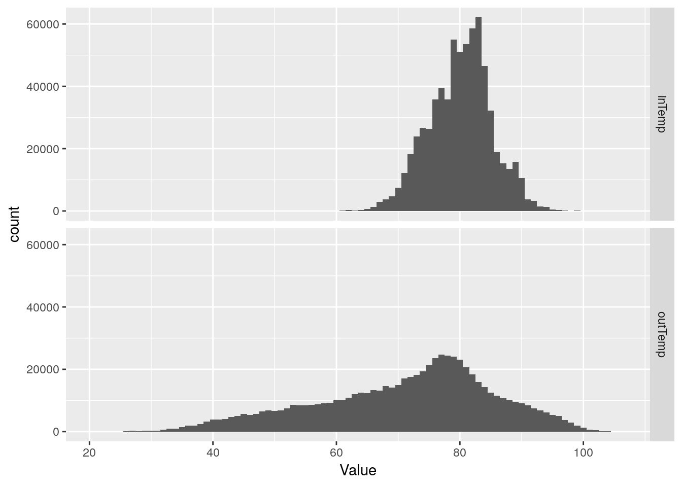
df %>%
  select(dateTime, inTemp, outTemp) %>%
  gather(key="Measurement", value=Value, -dateTime, na.rm=TRUE) %>%
  ggplot(aes(x=dateTime, y=Value)) +
  geom_line(na.rm = TRUE) +
  facet_grid(Measurement ~ .)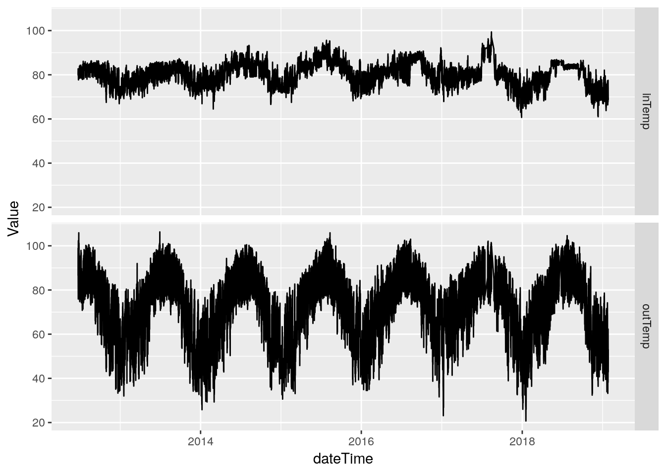
# Just for fun, let's plot where the NA's live.


PlotNA(df, outTemp)
## Warning: Removed 12 rows containing missing values (geom_point).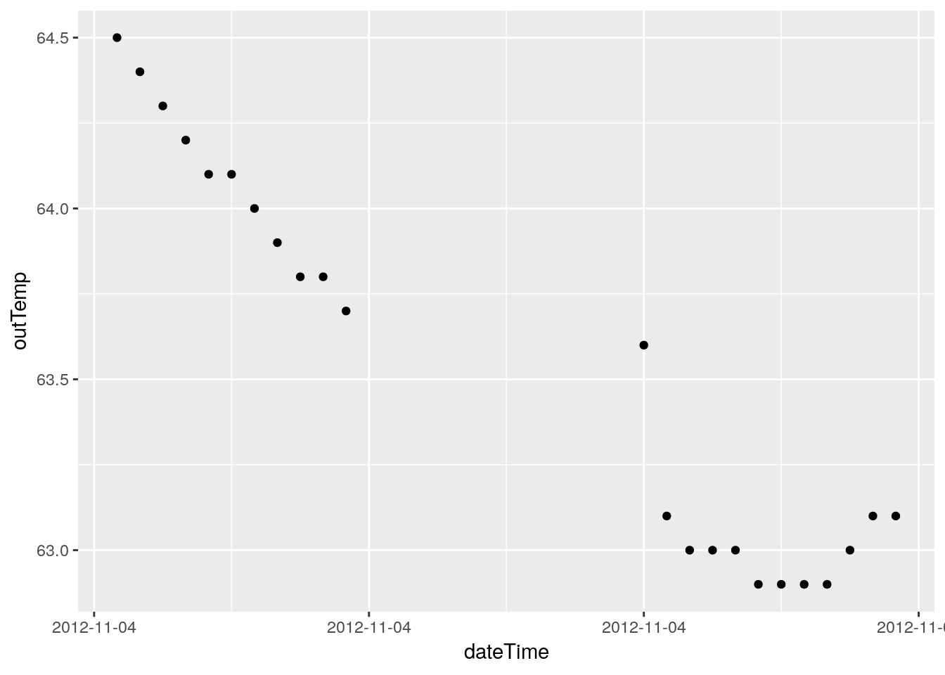
## Warning: Removed 76 rows containing missing values (geom_point).
## Warning: Removed 12 rows containing missing values (geom_point).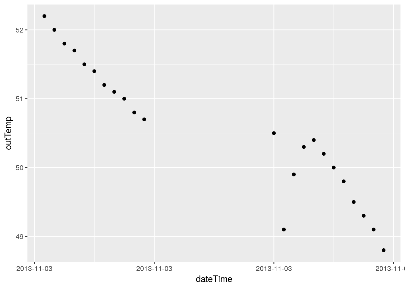
## Warning: Removed 12 rows containing missing values (geom_point).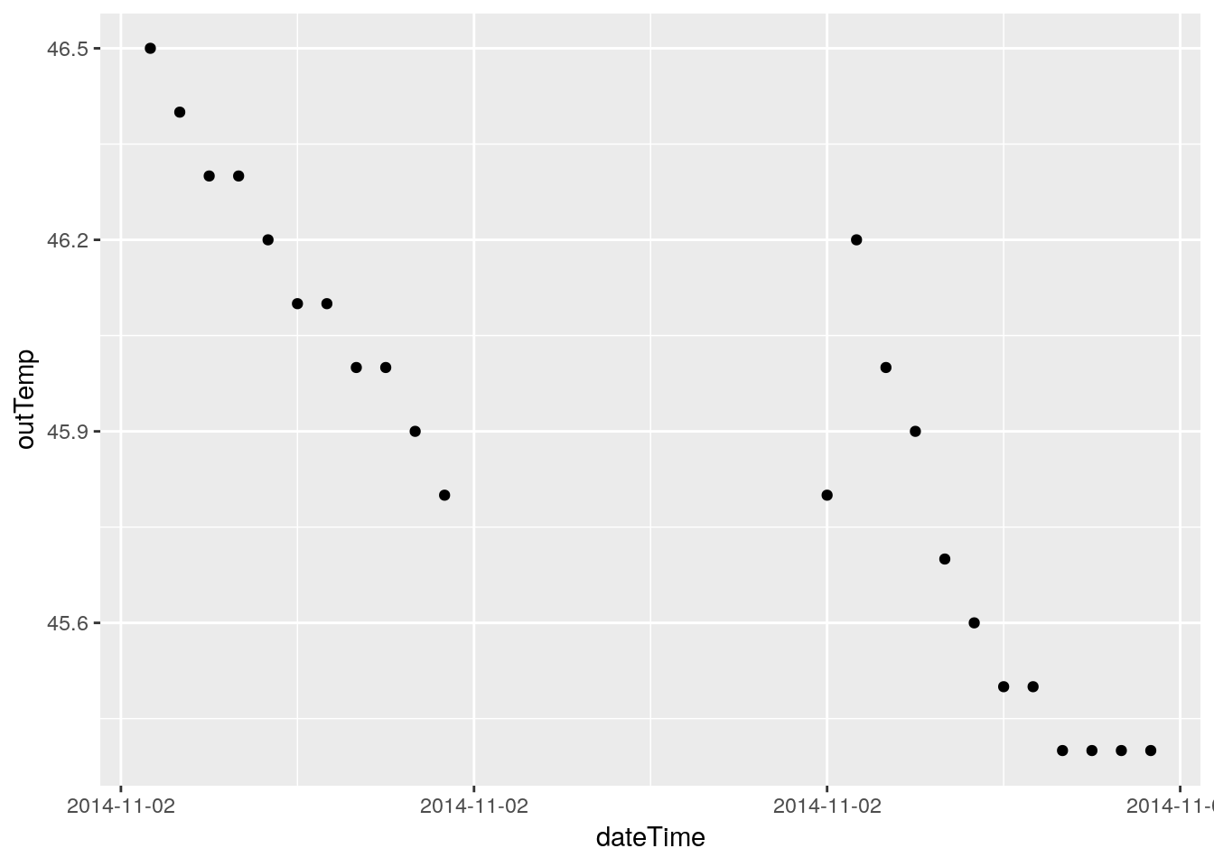
## Warning: Removed 12 rows containing missing values (geom_point).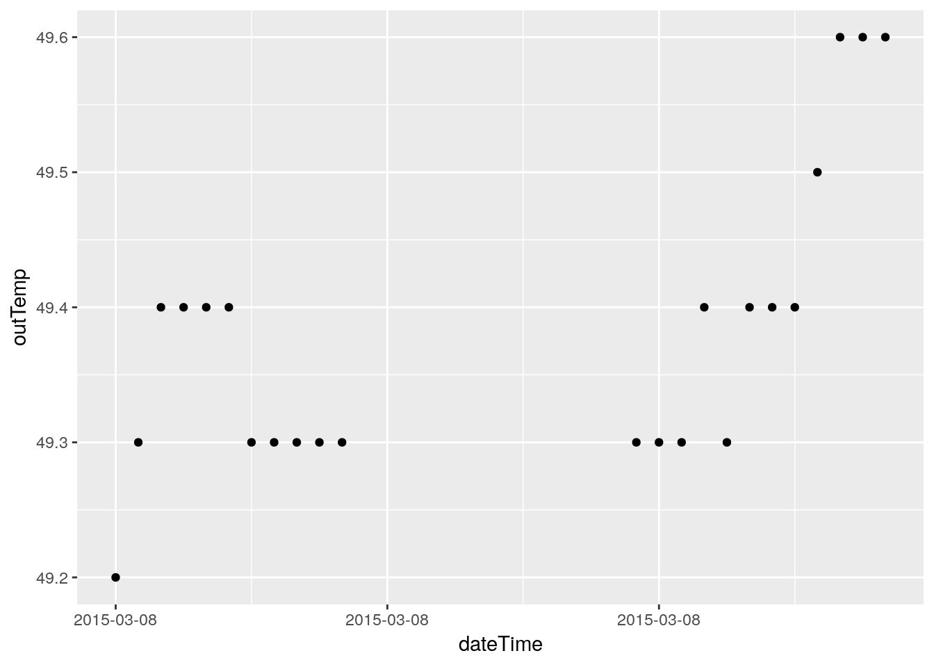
## Warning: Removed 7 rows containing missing values (geom_point).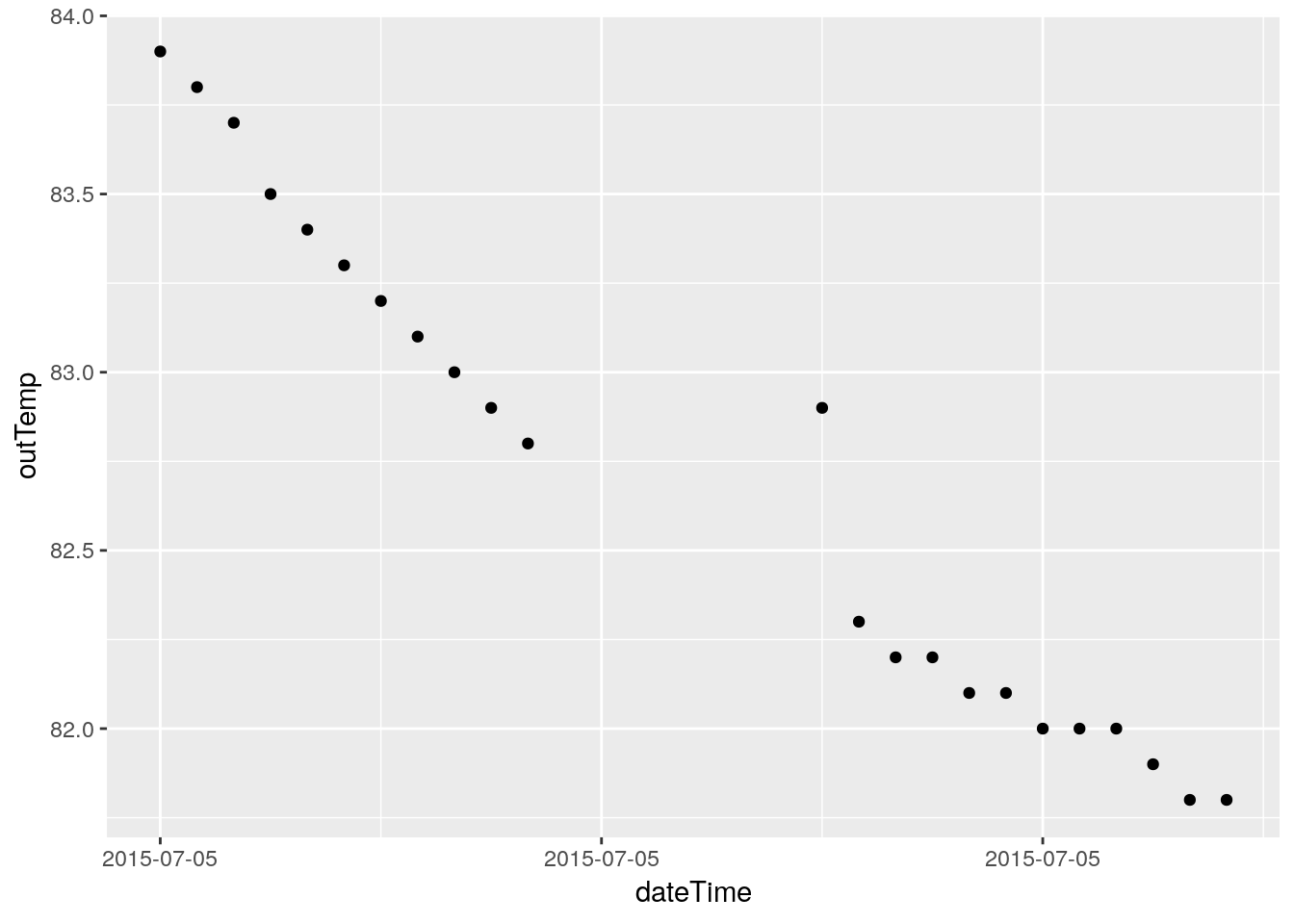
## Warning: Removed 12 rows containing missing values (geom_point).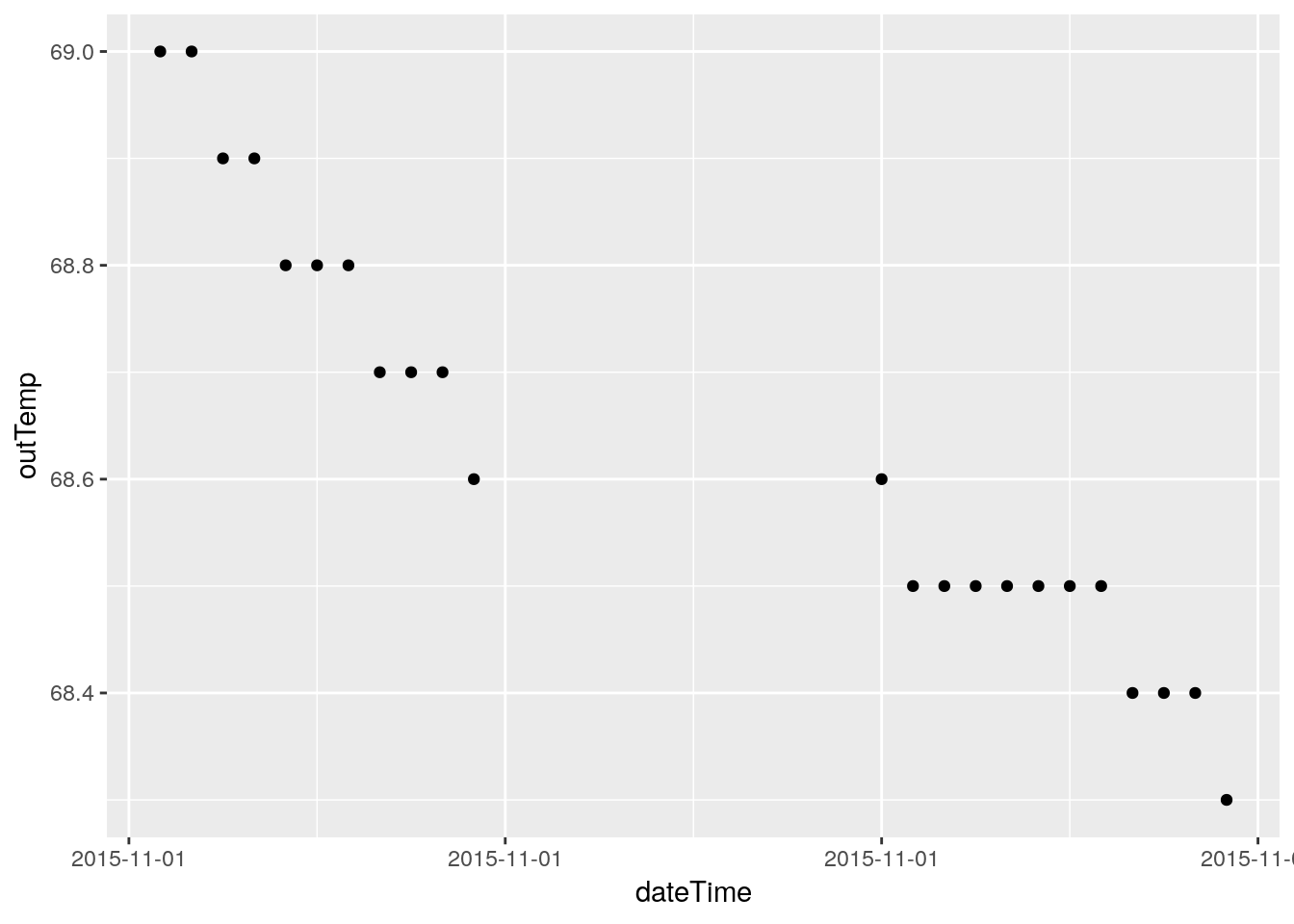
## Warning: Removed 12 rows containing missing values (geom_point).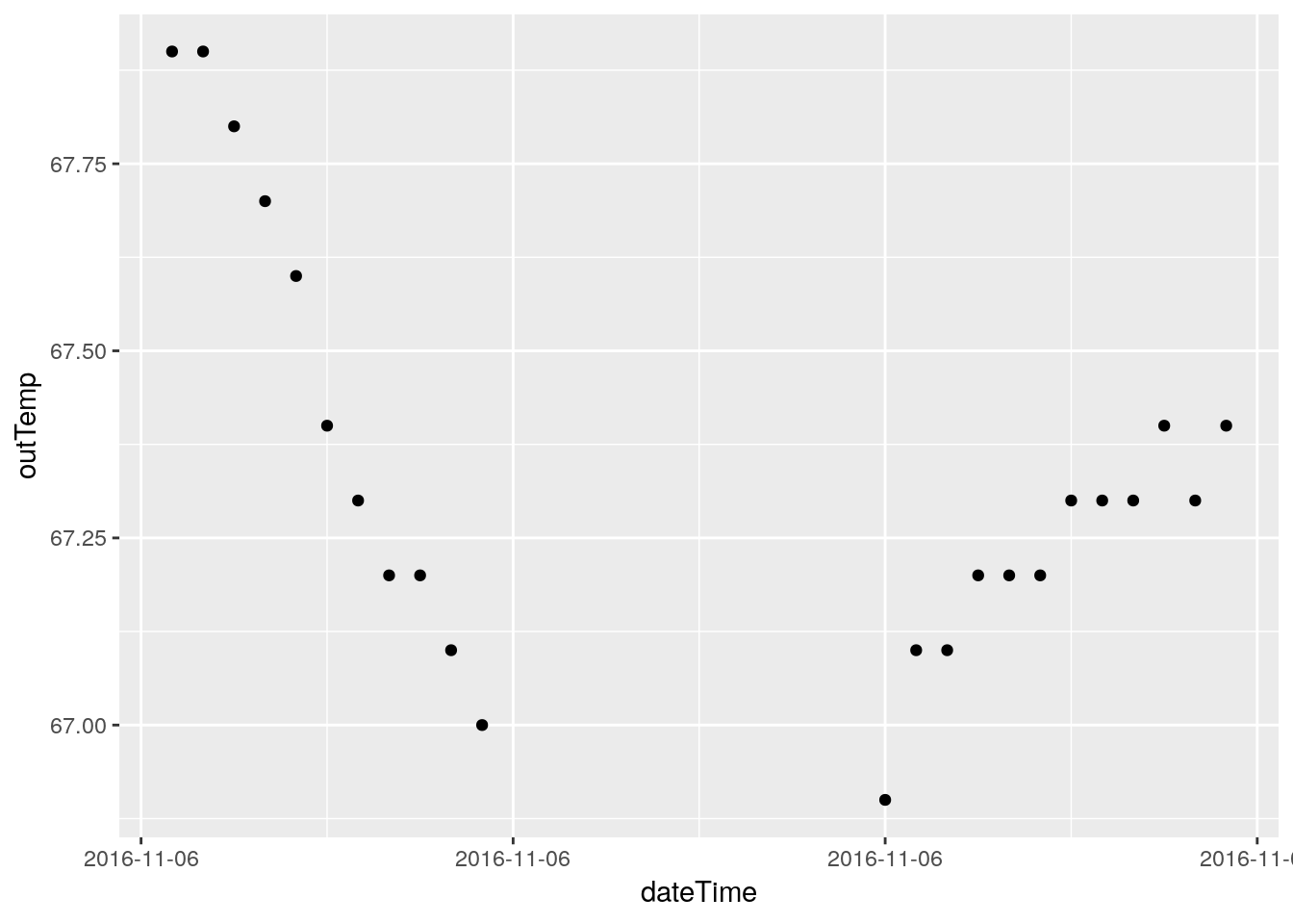
## Warning: Removed 3235 rows containing missing values (geom_point).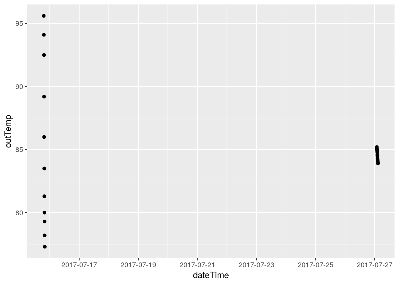
## Warning: Removed 6 rows containing missing values (geom_point).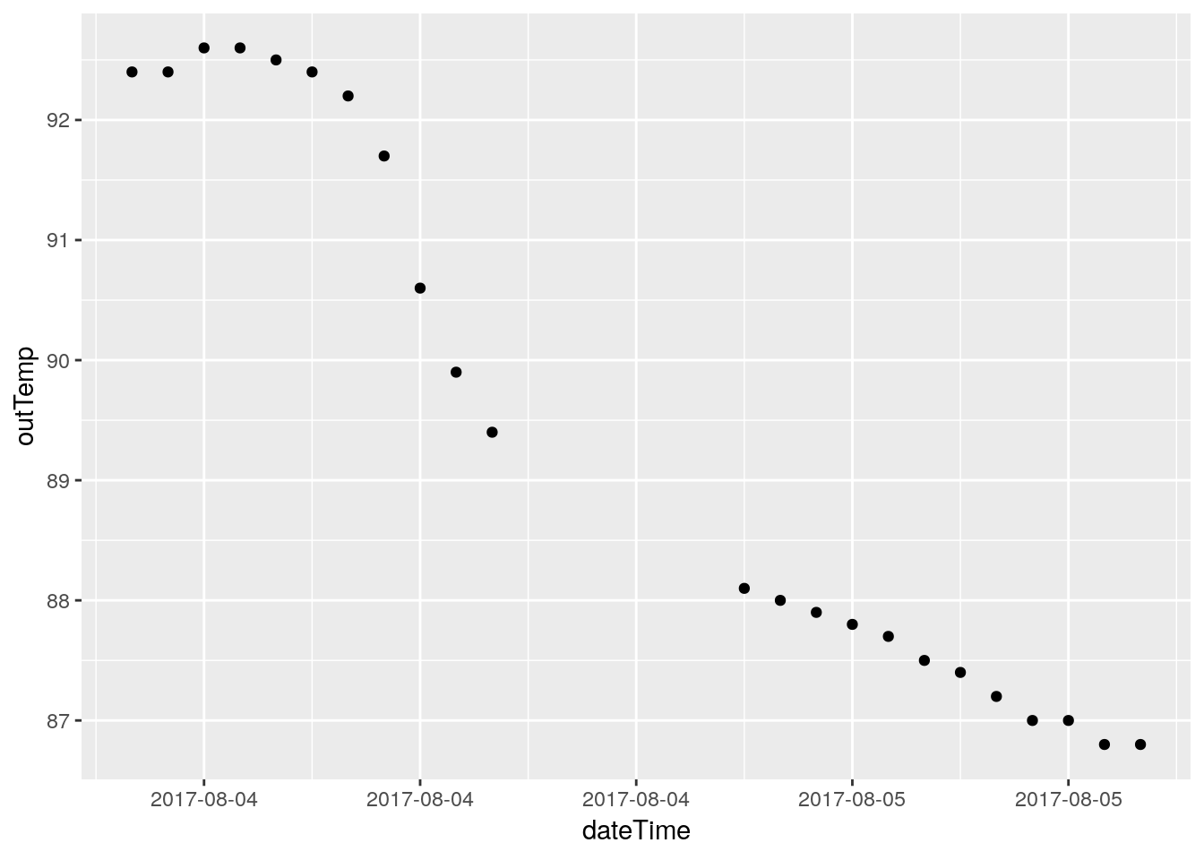
## Warning: Removed 2939 rows containing missing values (geom_point).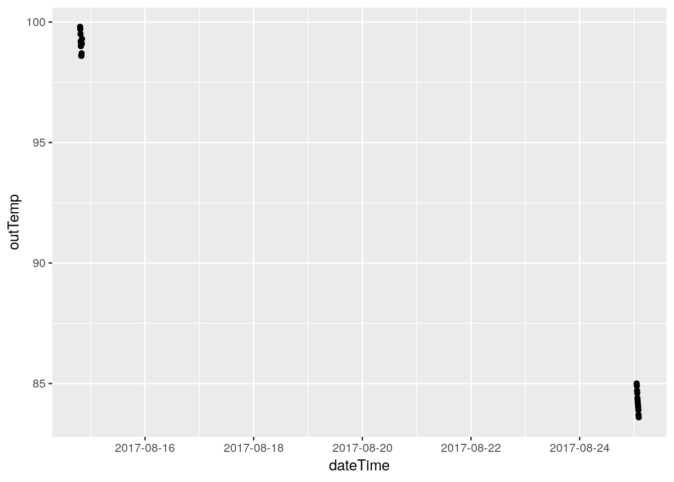
## Warning: Removed 6 rows containing missing values (geom_point).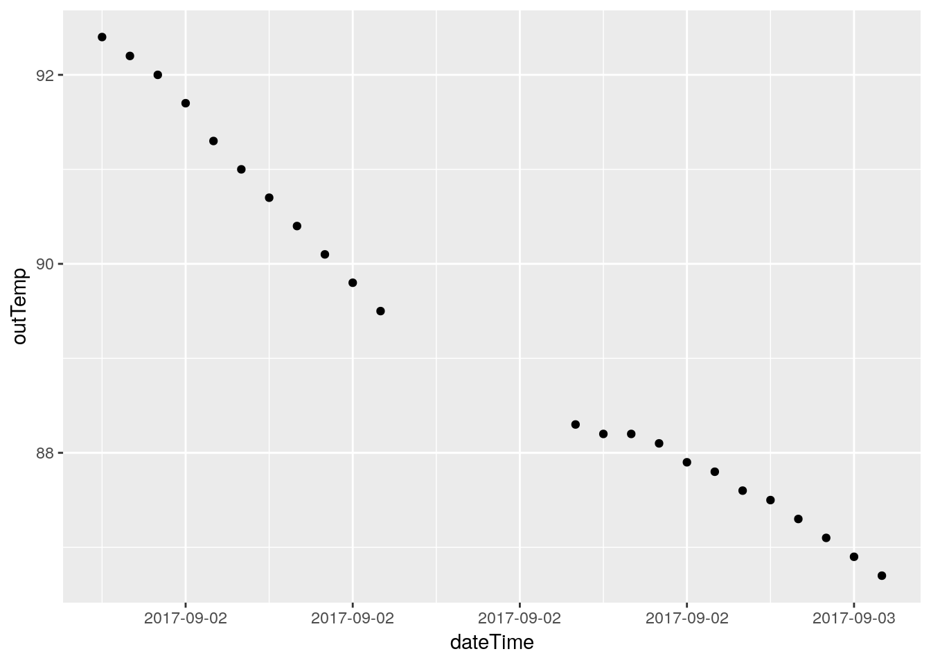
## Warning: Removed 12 rows containing missing values (geom_point).
## Warning: Removed 785 rows containing missing values (geom_point).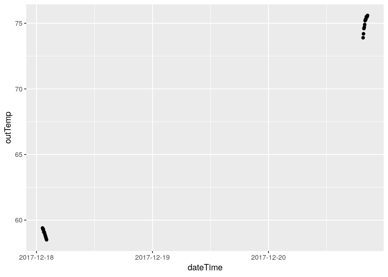
## Warning: Removed 3 rows containing missing values (geom_point).
## Warning: Removed 2593 rows containing missing values (geom_point).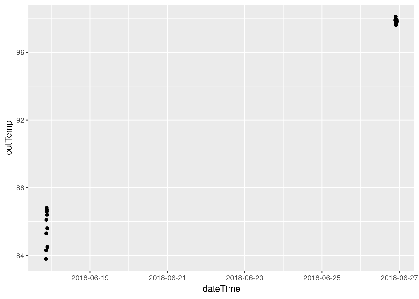
## Warning: Removed 6 rows containing missing values (geom_point).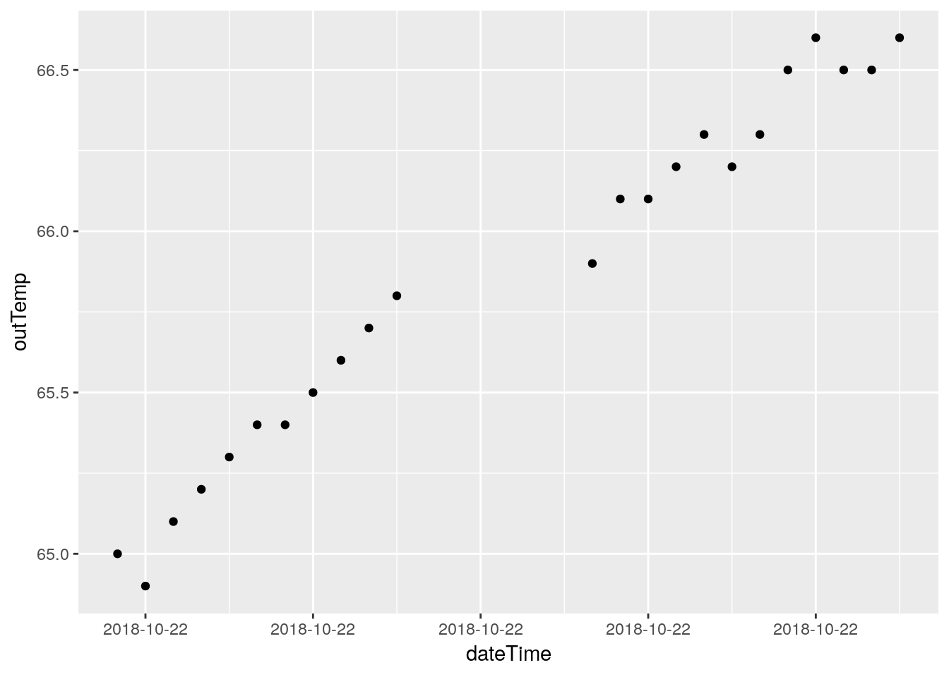
## Warning: Removed 12 rows containing missing values (geom_point).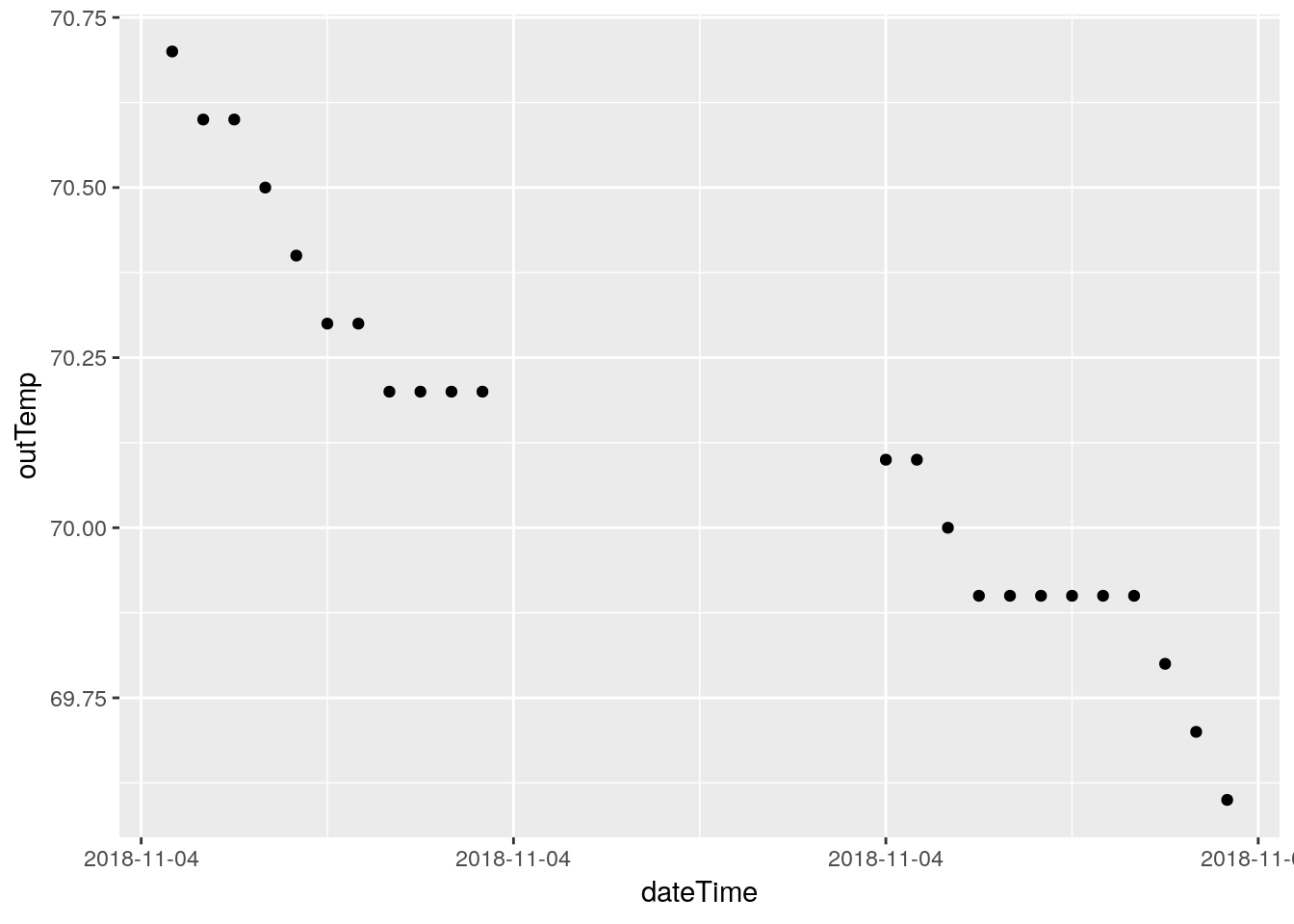
## Warning: Removed 1444 rows containing missing values (geom_point).
Humidity
My humidity sensor started failing sometime in late 2018, so I know there are bogus values in there. But where? I’d like to wipe them out, replace them with NA’s so that any statistics are minimally affected. Let’s see what we can do. I will include dewpoint, because that is calculated from the humidity (and temperature) and is actually where I first noticed bad humidity values.
# start with histograms

df %>%
  select(inHumidity, outHumidity, dewpoint) %>%
  gather(key="Measurement", value=Value, na.rm=TRUE) %>%
  ggplot(aes(x=Value)) +
  geom_histogram(binwidth=2) +
  facet_grid(Measurement ~ .)
## Selecting index: "dateTime"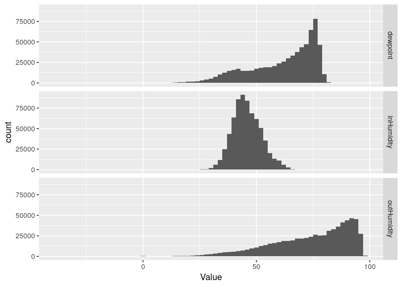
df %>%
  select(dateTime, inHumidity, outHumidity, dewpoint) %>%
  gather(key="Measurement", value=Value, -dateTime, na.rm=TRUE) %>%
  ggplot(aes(x=dateTime, y=Value, color=Measurement)) +
  geom_line(na.rm = TRUE) +
  facet_grid(Measurement ~ .)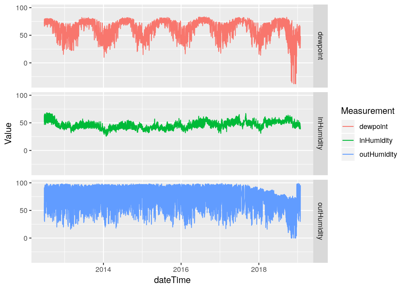
Hmmm… The line plot seems to show that the humidity data started going bad in late 2017. That is sad - that would be a lot of data to toss out. Let’s pull off the data from 2017-today and look more closely to better understand the issues. Certainly the low humidity values look okay until late 2018, only the high values look bad earlier.
df %>%
  select(dateTime, outHumidity, dewpoint) %>%
  filter(dateTime>ymd("2016-1-1")) %>%
  drop_na(outHumidity) %>%
  gather(key="Measurement", value=Value, -dateTime, na.rm=TRUE) %>%
  ggplot(aes(x=dateTime, y=Value, color=Measurement)) +
  geom_line(na.rm = TRUE) +
  facet_grid(Measurement ~ .)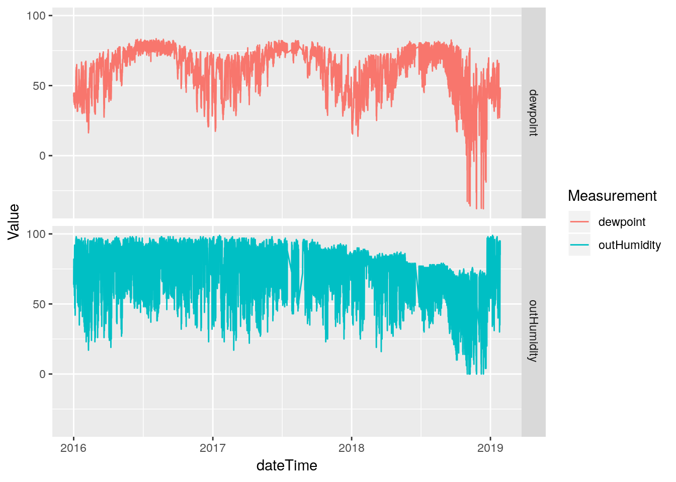
#   Let's just look at the maximum daily values

recent <-
  df %>%
  select(dateTime, outHumidity) %>%
  filter((dateTime>ymd("2017-1-1"))  )

# Find max and min in a week long tiled window (a week helps smooth)

  MaxHumidity <- tile_dbl(recent$outHumidity,
                               max,
                               na.rm = TRUE,
                               .size=288*7) %>%
                 na_if(.,Inf) %>%
                 na_if(.,-Inf)
## Warning in .Primitive("max")(..., na.rm = na.rm): no non-missing arguments
## to max; returning -Inf MinHumidity <- tile_dbl(recent$outHumidity,
min,
na.rm = TRUE,
.size=288*7) %>%
na_if(.,Inf) %>%
na_if(.,-Inf) ## Warning in .Primitive("min")(..., na.rm = na.rm): no non-missing arguments
## to min; returning Inf Days <- seq(min(recent$dateTime), max(recent$dateTime), by="weeks")
tibble(dateTime=Days,
maxHumidity=MaxHumidity,
minHumidity=MinHumidity) %>%
gather(key="Measurement", value=Value, -dateTime ) %>%
ggplot(aes(x=dateTime, y=Value, color=Measurement)) +
geom_line(na.rm=FALSE)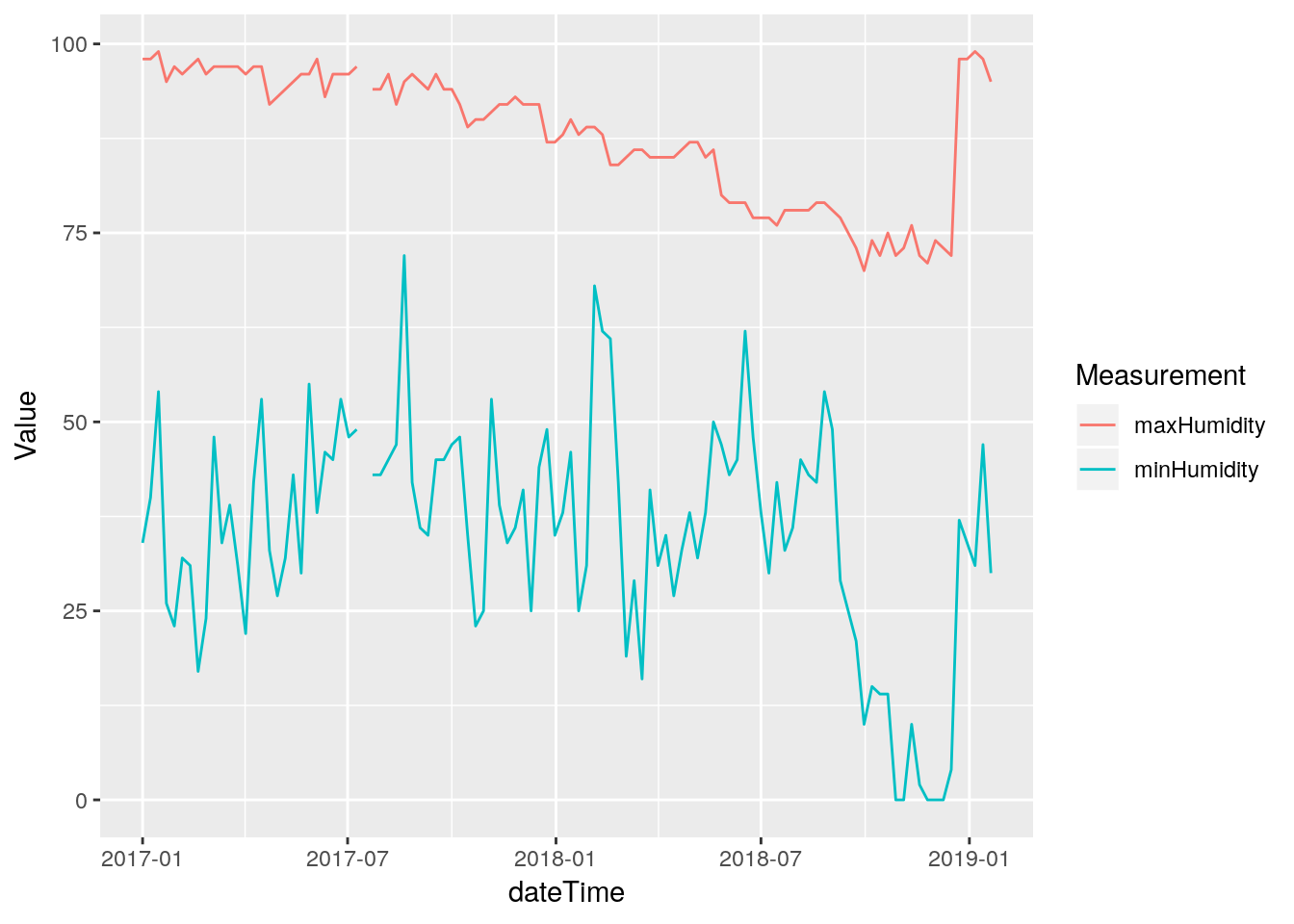
Wow, this is sad. The maximum humidity looks bad starting about July of 2017, while the minimum looks okay until about September of 2018. What to do? (Actually, starting at 2017-07-15 20:05:00). Good data returns on December 22 2018 at 1:00 PM when I replaced the temperature and humidity sensor. Clearly from August 2018 until sensor replacement, the data is irretrievably bad. Before then it is tempting to assume the minimum humidity is okay, and try to correct the maximum and stretch the ones in between. But that seems like a bad idea. Instead, I will save the bad data off to a file of its own, and replace it all with NA.
#   Pull out bad segment and save

Baddata <-
  df %>%
  select(dateTime, outHumidity, dewpoint) %>%
  filter(between(dateTime,ymd_hms("2017-07-15 20:05:00"),
                          ymd_hms("2018-12-22 13:00:00"))) %>%
  saveRDS("/home/ajackson/Dropbox/weather/BadHumidityData2017-2018.rds")

#   Now turn those values into NA's

database <-
  database %>%
  mutate(a=as_datetime(dateTime)) %>% # add a datetime
  mutate(outHumidity=ifelse(between(a,
                               ymd_hms("2017-07-15 20:05:00"),
                               ymd_hms("2018-12-22 13:00:00")),
                            NA,
                            outHumidity)) %>%
  mutate(dewpoint   =ifelse(between(a,
                               ymd_hms("2017-07-15 20:05:00"),
                               ymd_hms("2018-12-22 13:00:00")),
                            NA,
                            dewpoint)) %>%
  select(-a)  # remove the datetime

#   Check it

database %>%
  select(dateTime, outHumidity, dewpoint) %>%
  mutate(dateTime=as_datetime(dateTime)) %>% # add a datetime
  filter(dateTime>ymd("2016-1-1")) %>%
  gather(key="Measurement", value=Value, -dateTime, na.rm=FALSE) %>%
  ggplot(aes(x=dateTime, y=Value, color=Measurement)) +
  geom_line(na.rm = FALSE) +
  facet_grid(Measurement ~ .)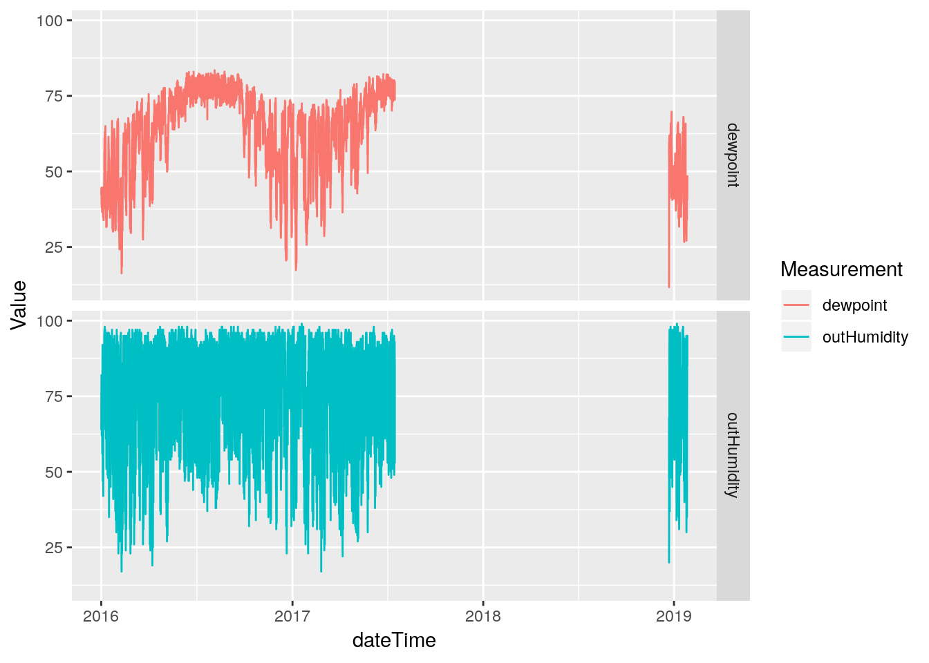
The Wind
Let’s look at the wind data. It frankly isn’t very good, because I would need a super tall pole to get the sensors up above the houses, but we can look for obvious busts and clean those up.
# First look at speed and gust

df %>%
  select(dateTime, windSpeed, windGust) %>%
  gather(key="Measurement", value=Value, -dateTime, na.rm=TRUE) %>%
  ggplot(aes(x=dateTime, y=Value, color=Measurement)) +
  geom_line(na.rm = TRUE) +
  facet_grid(Measurement ~ .)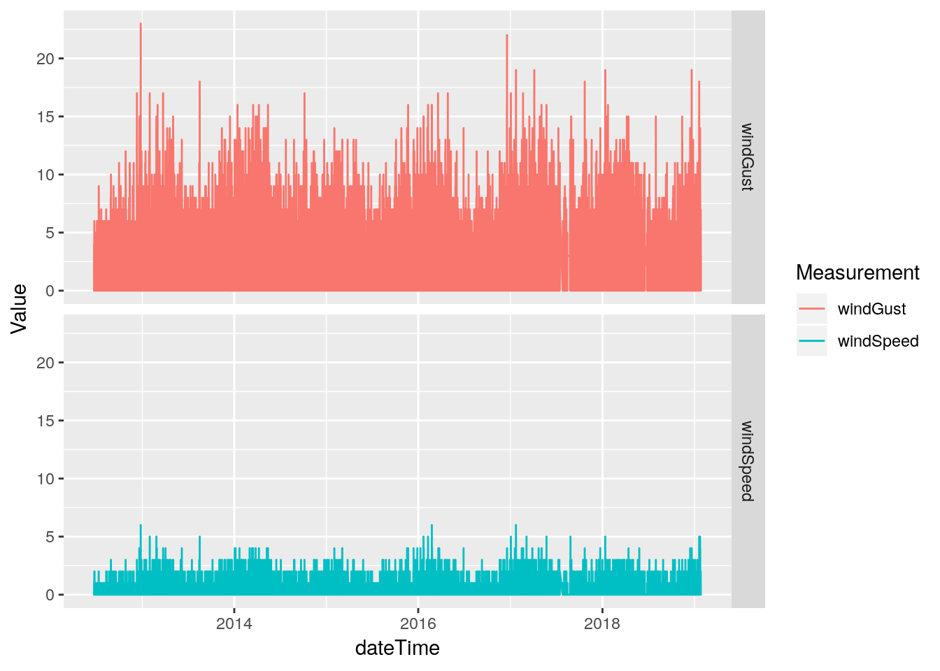
# Wind and Gust speeds look okay, let's look at direction

df %>%
  select(dateTime, windDir, windGustDir) %>%
  gather(key="Measurement", value=Value, -dateTime, na.rm=TRUE) %>%
  ggplot(aes(x=dateTime, y=Value, color=Measurement)) +
  geom_line(na.rm = TRUE) +
  facet_grid(Measurement ~ .)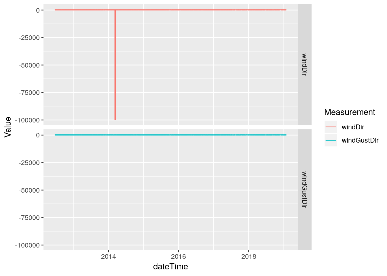
#     Oops. Looks like some bad direction data. Simple enough,
#     we'll just NA anything <0, since valid values are 0-359

df %>%
  select(dateTime, windDir, windGustDir) %>%
  mutate(windDir=ifelse(windDir<0, NA, windDir)) %>%
  gather(key="Measurement", value=Value, -dateTime, na.rm=TRUE) %>%
  ggplot(aes(x=dateTime, y=Value, color=Measurement)) +
  geom_point(na.rm = TRUE) +
  facet_grid(Measurement ~ .)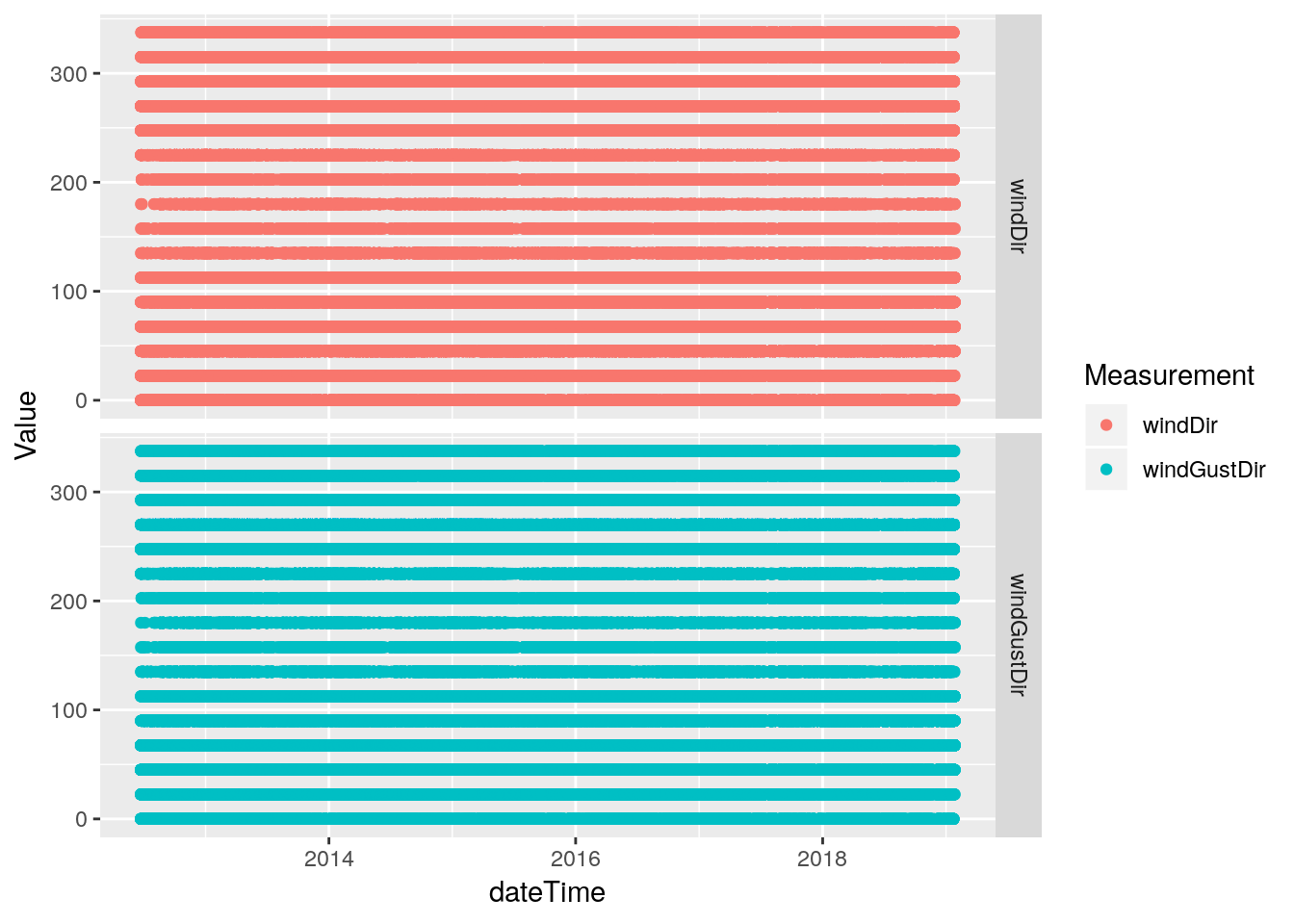
#   Okay, looks good. Let's repair the original

database <-
  database %>%
  mutate(windDir=ifelse(windDir<0, NA, windDir))
Rain
Almost done! We know there were some issues with rain to to moisture in a connection causing false bucket tips to be recorded, so we will need to find those false readings and eliminate them
#   The absurd values make it hard to look at the more normal
#   values, so let's just get rid of the offending days first

df %>%
  select(dateTime, rainRate) %>%
  filter(between(dateTime,
                 ymd_hms("2018-10-19 00:00:00"),
                 ymd_hms("2018-10-24 00:00:00"))) %>%
  mutate(newrate=ifelse(between(dateTime,
                                ymd_hms("2018-10-21 00:00:00"),
                                ymd_hms("2018-10-22 23:59:59")),
                        NA,
                        rainRate)) %>%
  gather(key="Measurement", value=Value, -dateTime, na.rm=TRUE) %>%
  ggplot(aes(x=dateTime, y=Value, color=Measurement)) +
  geom_line() +
  facet_grid(Measurement ~ .)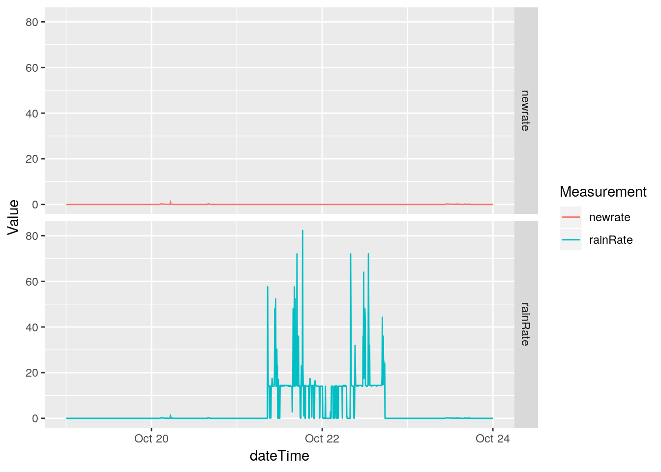
# Now we can do a histogram

df %>%
  select(rainRate) %>%
  mutate(newrate=ifelse(between(dateTime,
                                ymd_hms("2018-10-21 00:00:00"),
                                ymd_hms("2018-10-22 23:59:59")),
                        NA,
                        rainRate)) %>%
  ggplot(aes(x=log10(newrate))) +
  geom_histogram(binwidth=0.1)
## Selecting index: "dateTime"## Warning: Removed 678352 rows containing non-finite values (stat_bin).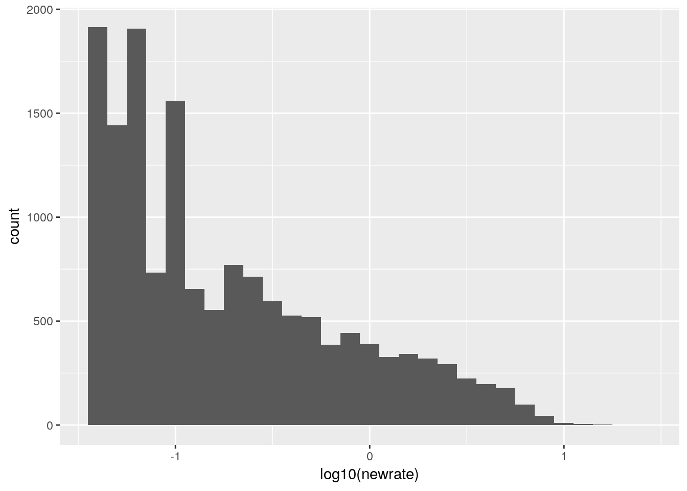
# Line plot

df %>%
  select(dateTime, rainRate) %>%
  mutate(newrate=ifelse(between(dateTime,
                                ymd_hms("2018-10-21 00:00:00"),
                                ymd_hms("2018-10-22 23:59:59")),
                        NA,
                        rainRate)) %>%
  ggplot(aes(x=dateTime, y=newrate )) +
geom_line(na.rm = TRUE) 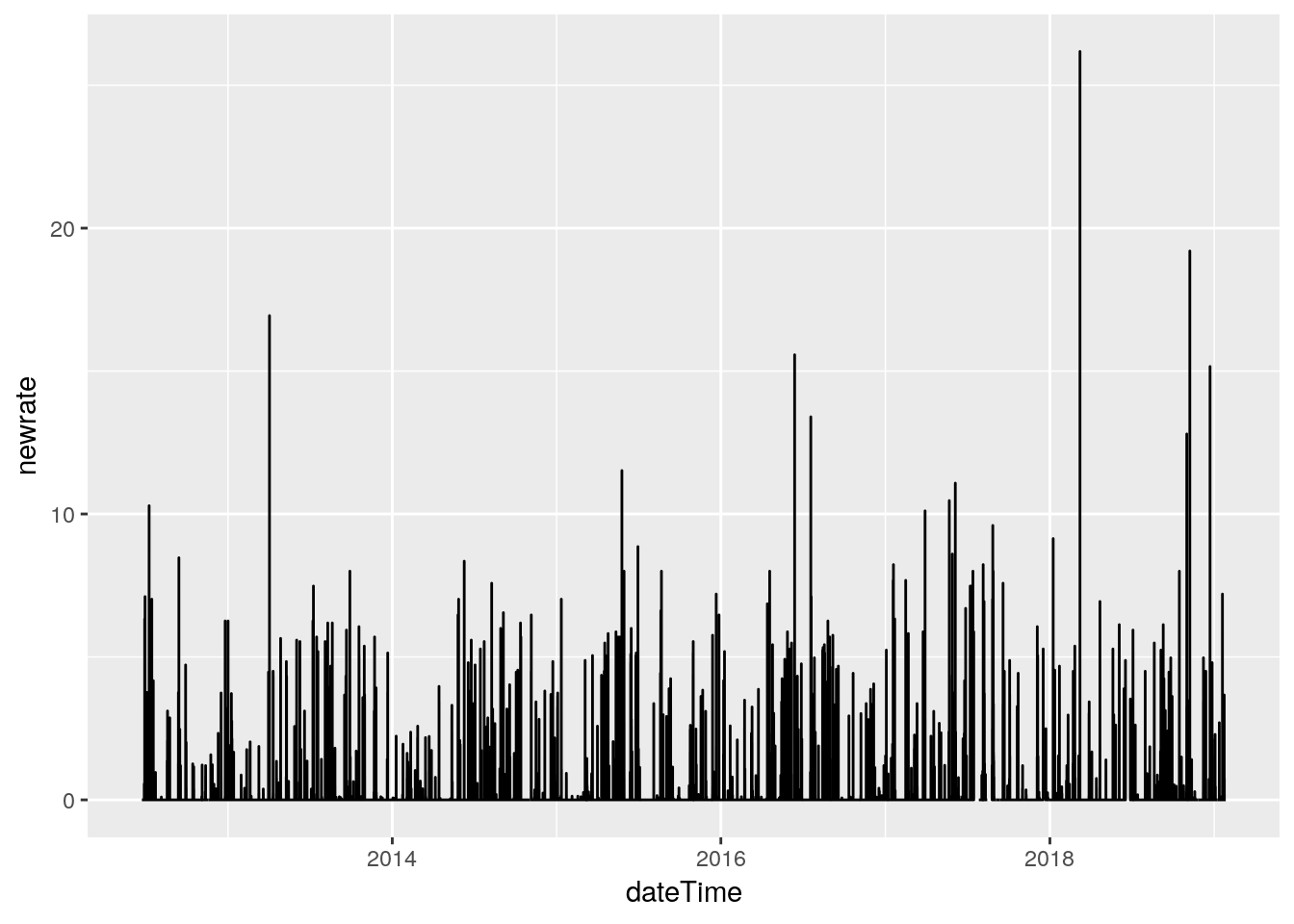
#   Some suspicious values. March 8, 2018 has an isolated
#   26.18 in/hr spike. I'm going to eliminate it. I need a way to
#   find spikes and plot nearby values. Let's look for anything above
#   12 in/hr, and pull out 1 hour on each side, and plot it.

highrates <-
  df %>%
  select(dateTime, rainRate) %>%
  filter(!between(dateTime,
                 ymd_hms("2018-10-21 00:00:00"),
                 ymd_hms("2018-10-23 00:00:00"))) %>%
  filter(rainRate>12)

Startstop <-
    tibble(Start=highrates$dateTime-minutes(60),
           Stop =highrates$dateTime+minutes(60))

for (i in 1:nrow(Startstop)) {
    temp <-
    df %>%
      filter(between(dateTime,
                        Startstop$Start[i],
                        Startstop$Stop[i])) %>%
      select(dateTime, rainRate)

      print(ggplot(data=temp,aes(x=dateTime, y=rainRate)) +
          geom_point() +
          geom_line() +
          scale_x_datetime(date_labels = "%Y-%m-%d %H:%M")+
          theme(axis.text.x = element_text(angle = 45, hjust = 1))
      )
} 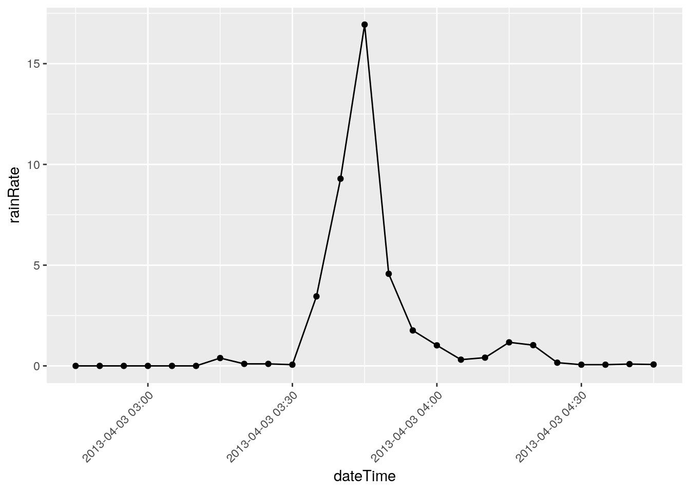
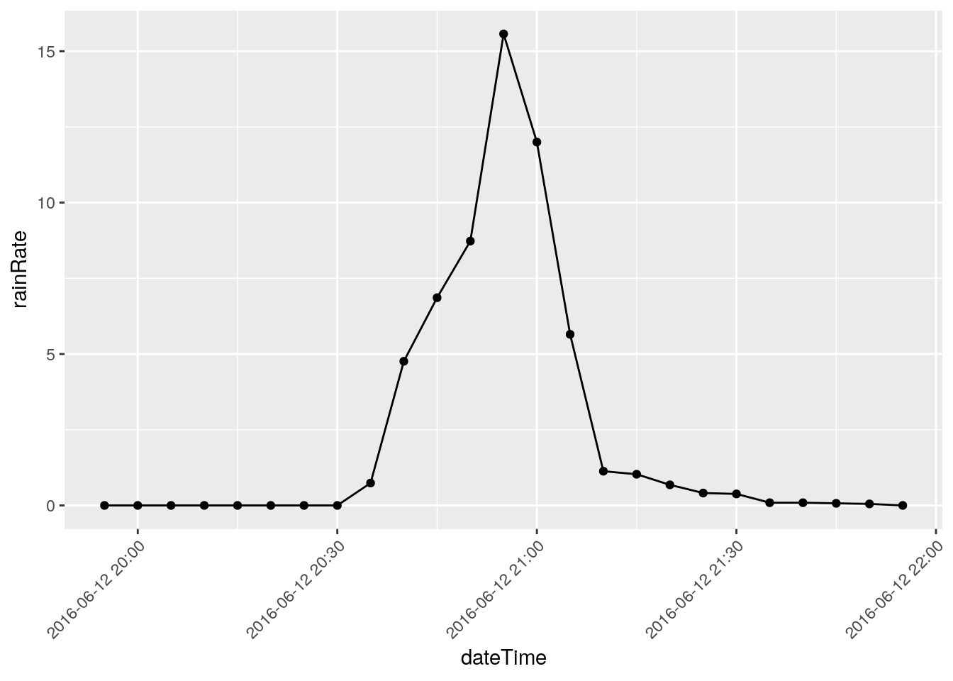
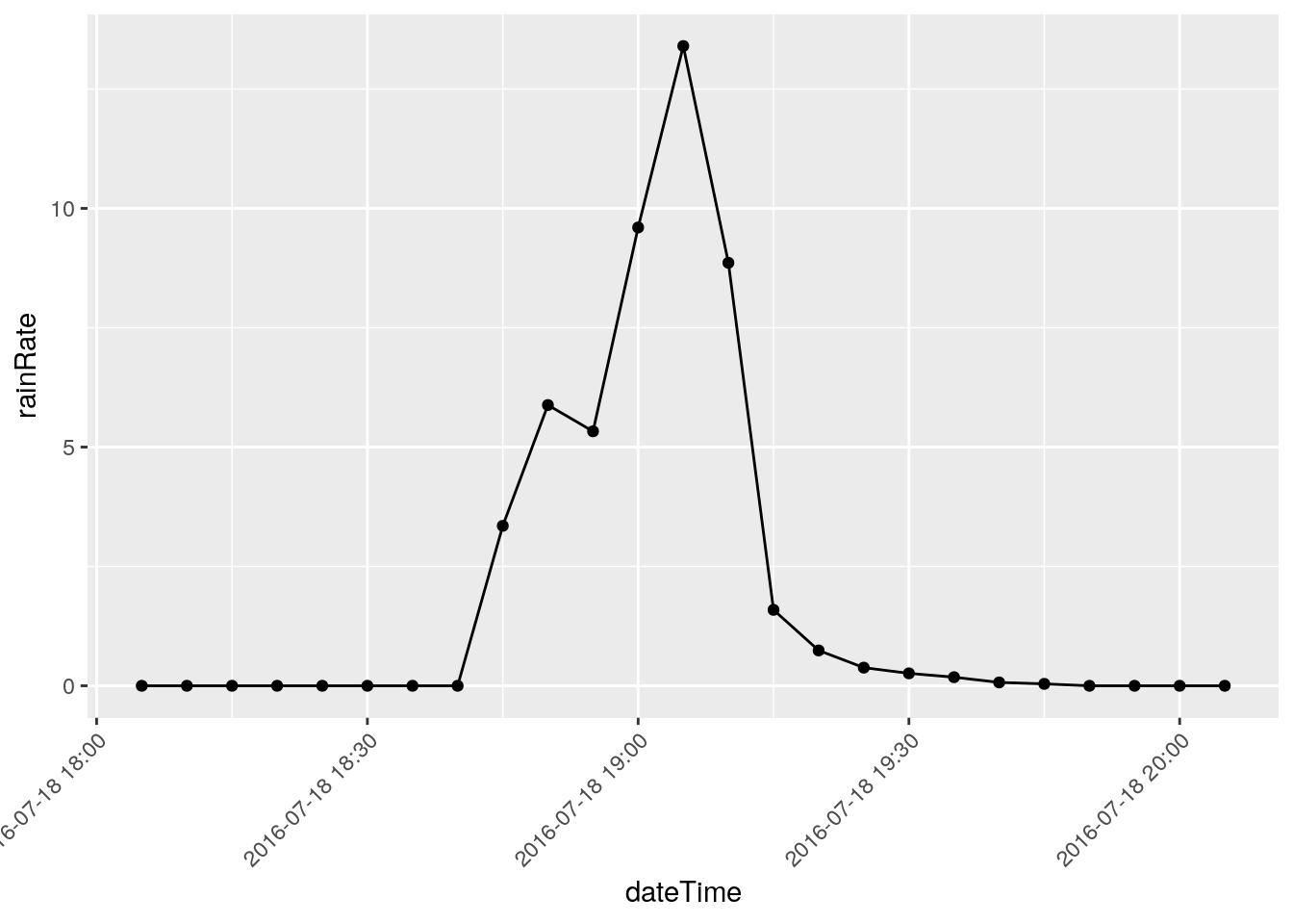
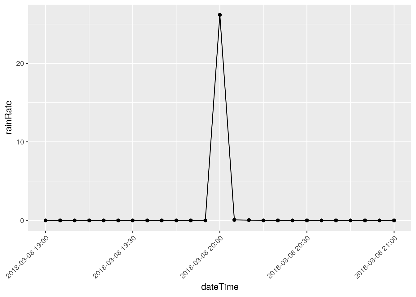
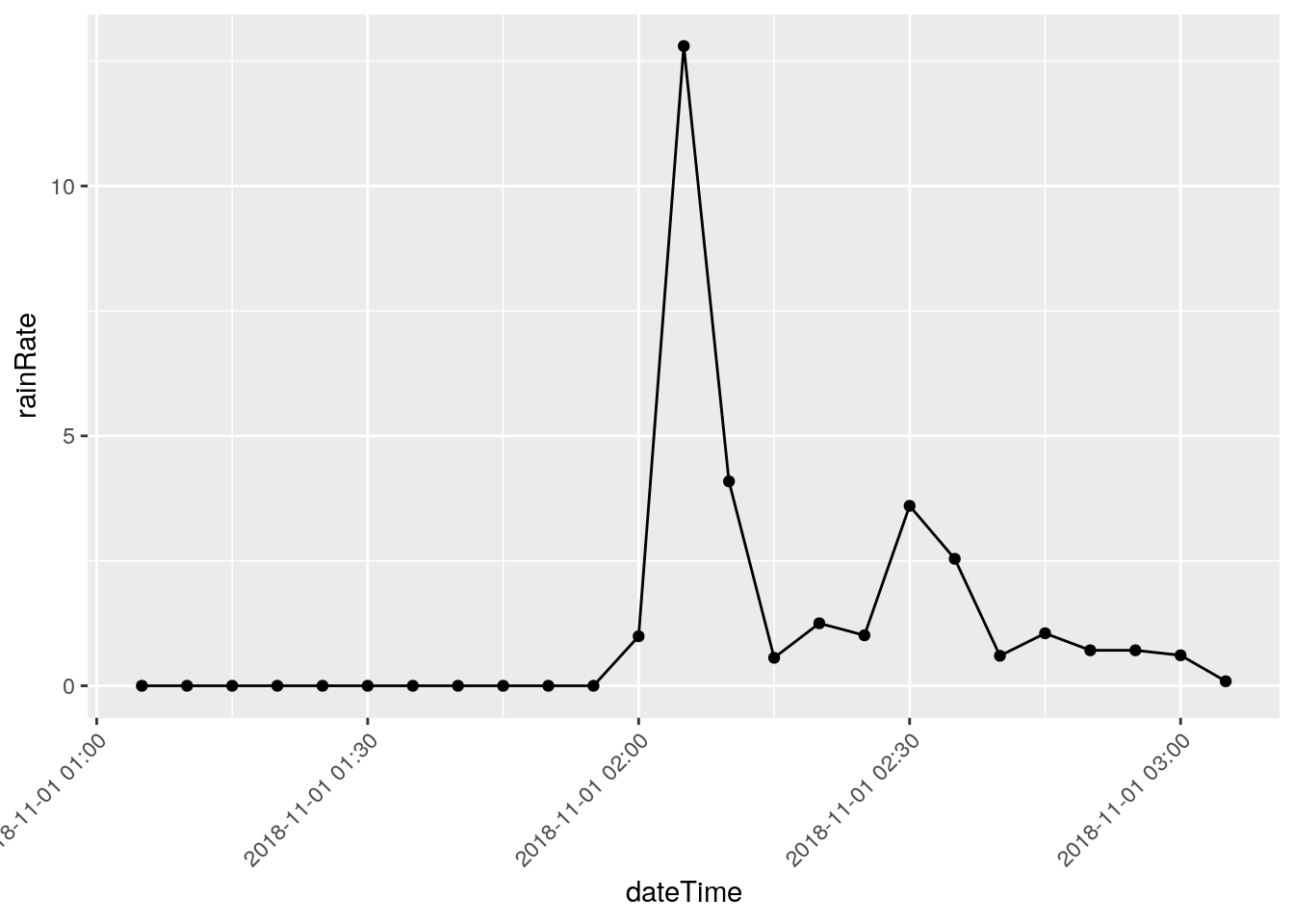
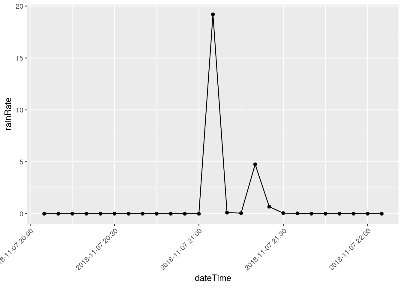
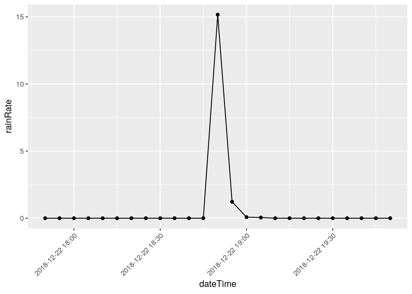
There are three events that I will eliminate, they represent times when I was working on the station and jostled the raingauge: 2018-12-22 18:50, 2018-03-08 20:00, and 2018-11-07 21:05
Note that I have looked at nearby stations and confirmed the massive rainfalls on the other dates, like June 12, 2016.
So now we will remove those records and the hcorresponding rain total, and then look at the total to see if there are any other issues.
baddates <- ymd_hms(c("2018-12-22 18:50:00", "2018-03-08 20:00:00", "2018-11-07 21:05:00"))

database <-
  database %>%
  mutate(a=as_datetime(dateTime)) %>% # add a datetime
  mutate(rainRate=ifelse(between(a,
                 ymd_hms("2018-10-21 00:00:00"),
                 ymd_hms("2018-10-23 00:00:00")),
                            NA,
                            rainRate)) %>%
  mutate(rain       =ifelse(between(a,
                 ymd_hms("2018-10-21 00:00:00"),
                 ymd_hms("2018-10-23 00:00:00")),
                            NA,
                            rain)) %>%
  mutate(rainRate=ifelse(a %in% baddates, NA, rainRate)) %>%
  mutate(rain    =ifelse(a %in% baddates, NA, rain    )) %>%
  select(-a)  # remove the datetime

df <- database %>%
  mutate(dateTime=as_datetime(dateTime)) %>%
  as_tsibble(key=id(), index=dateTime) %>%
  fill_gaps(.full=TRUE)

#   and now for the rain totals

df %>%
  select(dateTime, rain) %>%
  ggplot(aes(x=dateTime, y=rain)) +
geom_line() 
#   and just for fun, daily totals
 raintot <- tile_dbl(df$rain,
                     sum,
                     na.rm = TRUE,
                     .size=288)

 Days <-  seq(min(df$dateTime), max(df$dateTime), by="days")

 tibble(dateTime=Days, dailyrain=raintot) %>%
   ggplot(aes(x=dateTime, y=dailyrain)) +
geom_line(na.rm=FALSE) 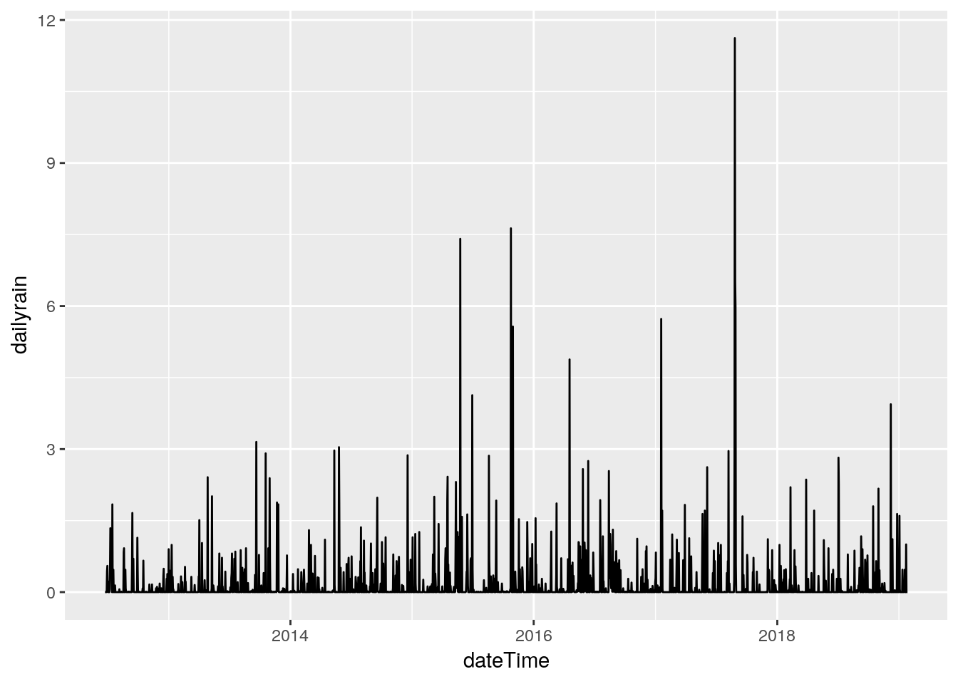
Put it all back
Final step in the data cleanup is to create a new database with the newly cleaned up data.
databasename <- "/home/ajackson/Dropbox/weather/weewx.sdb"

#   Set connection to database

dbnew <- DBI::dbConnect(RSQLite::SQLite(), databasename)

#   Create a table and write to it

dbWriteTable(dbnew, "archive", database)