
Solar Panels in Houston
Having bought solar panels myself a couple of years ago, and realizing that the city permit database could be used to find most installations, I decided that it would be interesting to look at the recent history and a few other facets of residential solar panel installations.
The first step is to download the structural permit data as a CSV file from the city open data website.
Grabbing the correct records
As far as I can tell, Solar Panels are designated as such in the Description field, and nothing else. So a simple filter on “Solar” should suffice to capture all the installation permits.
solar <- permits %>%
filter(grepl("SOLAR ", Description)) %>%
filter(Date>"2013-12-31") %>%
mutate(match = row_number())Converting to monthly records
For looking at the history of installations, we need to look at counts per time period, so let’s count up the number of installations per month, and then plot that to see the history.
solar %>%
mutate(ByMonth=floor_date(Date, "month")) %>%
group_by(ByMonth) %>%
summarise(MonthlyTotal=n()) %>%
ggplot(aes(x=ByMonth, y=MonthlyTotal))+
geom_point()+
geom_smooth(method="lm") +
labs(title="Residential Solar Panel Permits in Houston",
subtitle="Monthly totals",
x="Year",
y="Month Total")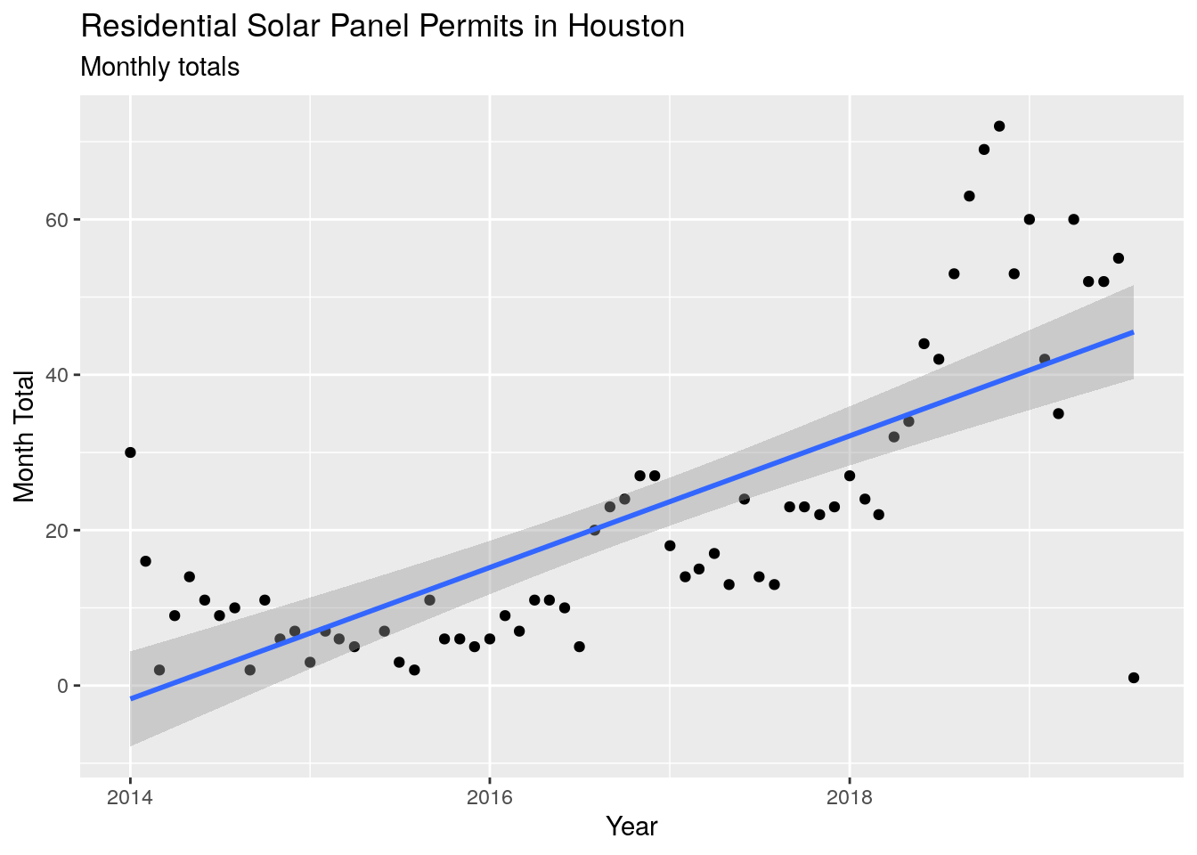
2018 and 2019
What happened in about July of 2018, when the number of permits soared? No obvious pattern surfaces from the raw data, and the federal tax credit does not start to decline until 2020, so it is a mystery.
Total panels added since 2014
The permit database only really goes back to 2014, so that will be the starting point for analysis. Since that time there have been 1479 installations done, and assuming about 6 kW capacity per installation, the city has added about 8874 kilowatts of solar electrical capacity.
Overall rate of installation
Just using the linear fit to the data (which does not capture the recent acceleration of permit numbers), we get a doubling time on the rate of about 2 1/2 years. That is about a 30% annual increase in the number of permits per month. At that rate, in ten years there should be around 300-500 installations per month, which means that in ten years around 5%-10% of homes would have solar panels.
Where have the panels been installed?
Let’s look at where panels have been installed. First we’ll look at Super Neighborhoods, since those are well-defined and cover almost all the city.
# mask out rows with bad coordinates
maskcoord <- !(is.na(solar$lat) | is.na(solar$lon))
# Create a temporary sf data frame for doing the intersects
# set longitudes as the first column and latitudes as the second
dat <- data.frame(Longitude=solar$lon[maskcoord], Latitude=solar$lat[maskcoord], match=solar$match[maskcoord], stringsAsFactors = FALSE)
dat <- st_as_sf(dat, coords=c("Longitude", "Latitude"), crs=googlecrs, agr = "identity")
temp <- readRDS("~/Dropbox/CrimeStats/SuperNeighborhoodPolys.rds") %>%
mutate(SNBNAME=str_to_title(SNBNAME))
# find points in polygons
# since superneighborhoods don't overlap, let's just grab the array index
# instead of creating a huge matrix
a <- st_intersects(dat, temp, sparse = TRUE)## although coordinates are longitude/latitude, st_intersects assumes that they are planar
## although coordinates are longitude/latitude, st_intersects assumes that they are planar# Replace empty values with 89
a <- unlist(replace(a, !sapply(a, length),89))
# Now add super neighborhood 89 as NA
temp[89,] <- temp[88,]
temp$SNBNAME[89] <- "None"
# Append the super neighborhood field to the data frame
solar$SuperNeighborhood[maskcoord] <- temp$SNBNAME[a]## Warning: Unknown or uninitialised column: 'SuperNeighborhood'.# Top ten neighborhoods
solar %>%
group_by(SuperNeighborhood) %>%
summarise(n = n()) %>%
dplyr::arrange(desc(n)) %>%
dplyr::slice(1:10) %>%
gt() %>%
tab_header(
title = "Solar Panel Installations by Super Neighborhood",
subtitle = "2014 - present"
) %>%
cols_label(
SuperNeighborhood = "Neighborhood",
n = "Number of Installations"
)| Solar Panel Installations by Super Neighborhood | |
|---|---|
| 2014 - present | |
| Neighborhood | Number of Installations |
| Alief | 103 |
| Greater Heights | 96 |
| Central Southwest | 95 |
| Minnetex | 60 |
| Brays Oaks | 53 |
| Clear Lake | 46 |
| South Belt / Ellington | 42 |
| Kingwood Area | 41 |
| Eldridge / West Oaks | 38 |
| Central Northwest | 35 |
Looks like Alief is the winner, followed closely by the Greater Heights. Central Southwest is interesting, as that neighborhood, statistically, is solidly middle-income, and almost entirely Hispanic and Black. So solar panels aren’t just for white people.
It is worth noting that the Minnetex neighborhood is dominated by a single set of 22 permits for an apartment home complex.
Zipcode
Let’s get a little more granular and look at the top 20 zipcodes for solar panel installations.
# All texas zips
temp <- readRDS(file = "~/Dropbox/Rprojects/CensusDataframe/ZCTA_polygons_2016.rds")
temp <- temp %>% rename(Zip=ZCTA5CE10)
# find points in polygons
# since zipcodes don't overlap, let's just grab the array index
# instead of creating a huge matrix
a <- st_intersects(dat, temp, sparse = TRUE)## although coordinates are longitude/latitude, st_intersects assumes that they are planar
## although coordinates are longitude/latitude, st_intersects assumes that they are planar# Append the zipcode field to the data frame
solar$Zipcode[maskcoord] <- temp$Zip[unlist(a)]## Warning: Unknown or uninitialised column: 'Zipcode'.# Top 20 zipcodes
solar %>%
group_by(Zipcode) %>%
summarise(n = n()) %>%
dplyr::arrange(desc(n)) %>%
dplyr::slice(1:20) %>%
gt() %>%
tab_header(
title = "Solar Panel Installations by Zip Code",
subtitle = "2014 - present"
) %>%
cols_label(
Zipcode = "Zip Code",
n = "Number of Installations"
)| Solar Panel Installations by Zip Code | |
|---|---|
| 2014 - present | |
| Zip Code | Number of Installations |
| 77008 | 63 |
| 77048 | 62 |
| 77009 | 53 |
| 77072 | 53 |
| 77035 | 42 |
| 77045 | 41 |
| 77099 | 41 |
| 77025 | 40 |
| 77096 | 40 |
| 77085 | 37 |
| 77007 | 36 |
| 77077 | 33 |
| 77021 | 31 |
| 77088 | 30 |
| 77018 | 28 |
| 77034 | 26 |
| 77071 | 26 |
| 77339 | 26 |
| 77004 | 25 |
| 77074 | 25 |
Zipcodes 77008 and 77009 cover most of The Heights plus some, so that makes sense. Alief is almost completely coincident with 77072 and 77099, so that checks out as well.
Analysis by census block group
If we carry our analysis down to the census block group level, we can calculate per capita numbers, look at the relationship to income, and other interesting things. For this work I will use the data from the census bureau for the year 2016.
Note that values have a Margin Of Error attached to them, which means that there is a 90 percent chance that the range of +/- MOE would contain the population value. For weighting regressions, we can use weights = (1.645/MOE)**2 or 1/variance.
censusdata <- "~/Dropbox/Rprojects/CensusDataframe/"
Census <- readRDS(paste0(censusdata, "CensusData/HarrisCounty_16.rds"))
# Create full block group codes state (48), county (201), tract (6 numbers), blockgroup (1 number)
# Transform to correct crs
Census <- st_transform(Census, googlecrs)
Census %>% mutate(BlockGrp=paste0("48", County, Tract, BlkGrp)) -> Census
# find points in polygons
# since block groups don't overlap, let's just grab the array index
# instead of creating a huge matrix
a <- st_intersects(dat, Census, sparse = TRUE)## although coordinates are longitude/latitude, st_intersects assumes that they are planar
## although coordinates are longitude/latitude, st_intersects assumes that they are planar# Append the census fields to the data frame
solar$BlockGrp[maskcoord] <- Census$BlockGrp[unlist(a)]## Warning: Unknown or uninitialised column: 'BlockGrp'.solarCensus <- solar %>%
filter(Address != "14155 FAYRIDGE DR, 77048") %>%
group_by(BlockGrp) %>%
summarise(n = n()) %>%
mutate(Label=paste(as.character(n) , "permits", BlockGrp)) %>%
#filter(n>5) %>%
dplyr::arrange(desc(n))
solarCensus <- right_join(Census, solarCensus, by="BlockGrp")
solarCensus$Num <- as_factor(solarCensus$n)
solarCensus <- solarCensus %>% mutate(percapita=ifelse(Pop<100, 0, n/Pop*1000))
solarCensus$area <- as.numeric(st_area(solarCensus))
solarCensus <- solarCensus %>% mutate(density=n/(area*3.86102e-7)) # square miles
# Number of permits
# Create a factored palette function
pal <- colorFactor(
#palette = c("#fecc5c", "#bd0026"),
palette = "Blues",
domain = solarCensus$Num)
leaflet::leaflet(solarCensus) %>%
setView(lng = -95.362306, lat = 29.756931, zoom = 12) %>%
addTiles() %>%
addPolygons(weight=1,
fillColor = ~pal((n)),
fillOpacity = 0.5,
label = ~Label) %>%
addLegend("bottomleft", pal = pal, values = ~n,
title = "Num Permits",
opacity = 1
)## Warning in RColorBrewer::brewer.pal(max(3, n), palette): n too large, allowed maximum for palette Blues is 9
## Returning the palette you asked for with that many colors## Warning in RColorBrewer::brewer.pal(max(3, n), palette): n too large, allowed maximum for palette Blues is 9
## Returning the palette you asked for with that many colors# Per Capita
# Create a continuous palette function
pal <- colorNumeric(
#palette = c("#fecc5c", "#bd0026"),
palette = blues9,
domain = log(solarCensus$percapita+1))
legpal <- colorNumeric(
#palette = c("#fecc5c", "#bd0026"),
palette = blues9,
domain = solarCensus$percapita)
solarCensus %>%
mutate(Label=paste(as.character(round(percapita,2)) , "per capita")) -> solarCensus
leaflet(solarCensus) %>%
setView(lng = -95.362306, lat = 29.756931, zoom = 12) %>%
addTiles() %>%
addPolygons(weight=1,
fillColor = ~pal((log(percapita+1))),
fillOpacity = 0.5,
label = ~Label) %>%
addLegend("bottomleft", pal = legpal, values = ~percapita,
title = "Per capita</br>x1000",
opacity = 1
)solarCensus %>%
filter(percapita<10) %>%
ggplot(aes(x=percapita)) +
geom_histogram(bins=50,
color="black",
fill="lightblue"
) +
xlab("Permits per capita x 1000") +
ylab("Count") +
labs(title = 'Permits per capita x 1000, 2014-2019',
subtitle = 'Only values less than 10')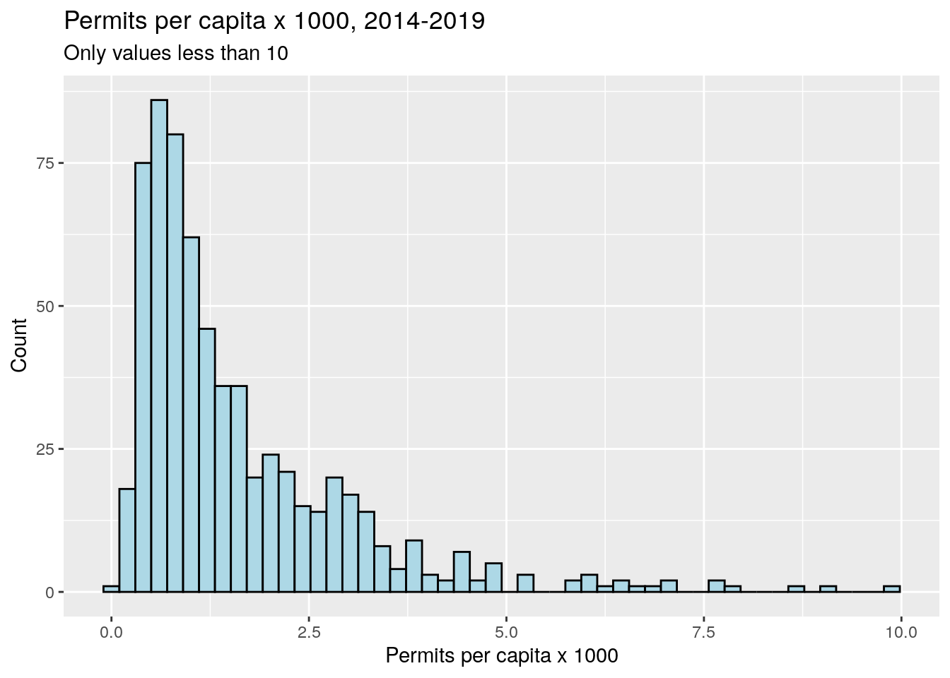
# Density
# Create a continuous palette function
legpal <- colorNumeric(
palette = c("#fecc5c", "#bd0026"),
domain = solarCensus$density)
pal <- colorNumeric(
palette = c("#fecc5c", "#bd0026"),
domain = log(solarCensus$density+1))
solarCensus %>%
mutate(Label=paste(as.character(round(density,2)) , "per sq mile")) -> solarCensus
leaflet(solarCensus) %>%
setView(lng = -95.362306, lat = 29.756931, zoom = 12) %>%
addTiles() %>%
addPolygons(weight=1,
fillColor = ~pal((log(density+1))),
fillOpacity = 0.5,
label = ~Label) %>%
addLegend("bottomleft", pal = legpal, values = ~density,
title = "Per sq-mi",
opacity = 1
)Let’s use the census data
Let’s look at plots of number of panel permits against income and age. Somewhat surprisingly, I don’t see a clear pattern -
solarCensus %>%
filter(n<15) %>%
filter(!is.na(MedIncome)) %>%
ggplot(aes(y=MedIncome, x=n)) +
geom_point() +
scale_y_continuous(labels = scales::dollar) +
xlab("Number of Permits") +
ylab("Median Income in Census Block") +
labs(title = 'Median Income vs. Number of Permits, 2014-2019')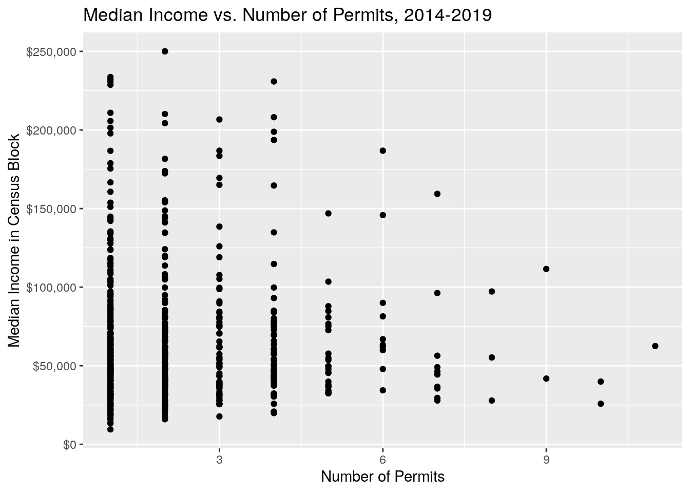
solarCensus %>%
filter(n<15) %>%
filter(!is.na(MedIncome)) %>%
ggplot(aes(x=MedIncome, y=Num, fill = ..x..)) +
scale_x_continuous(labels = scales::dollar) +
geom_density_ridges_gradient(scale = 3, rel_min_height = 0.01) +
scale_fill_viridis(name = "Median Income", option = "C", labels = scales::dollar) +
ylab("Number of Permits") +
xlab("Median Income in Census Block") +
labs(title = 'Median Income vs. Number of Permits, 2014-2019')## Picking joint bandwidth of 11700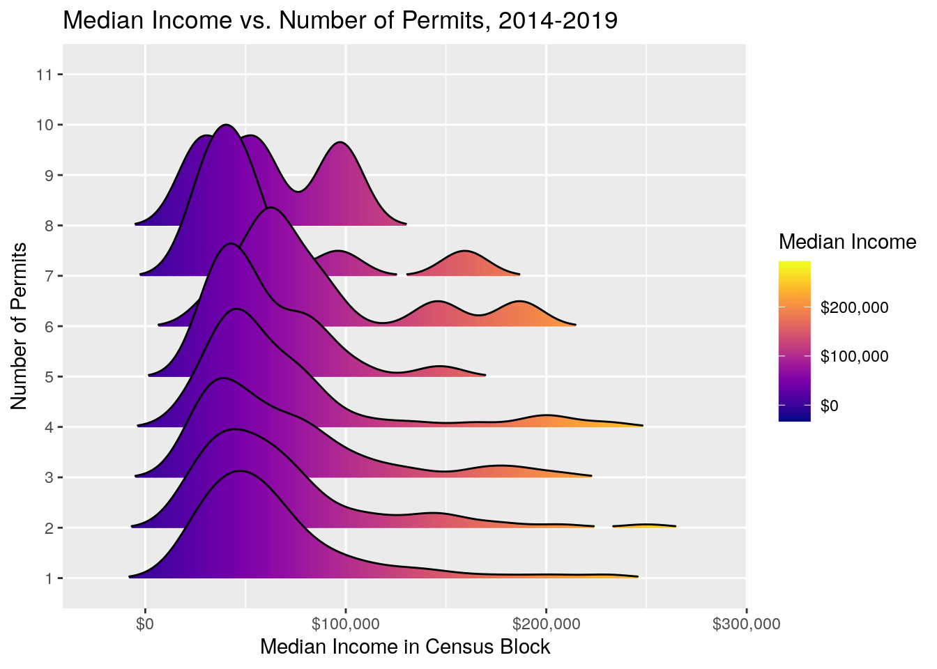
solarCensus %>%
filter(n<15) %>%
filter(!is.na(MedAge)) %>%
ggplot(aes(y=MedAge, x=n)) +
scale_y_continuous(labels = scales::comma) +
geom_point() +
xlab("Number of Permits") +
ylab("Median Age in Census Block") +
labs(title = 'Median Age vs. Number of Permits, 2014-2019')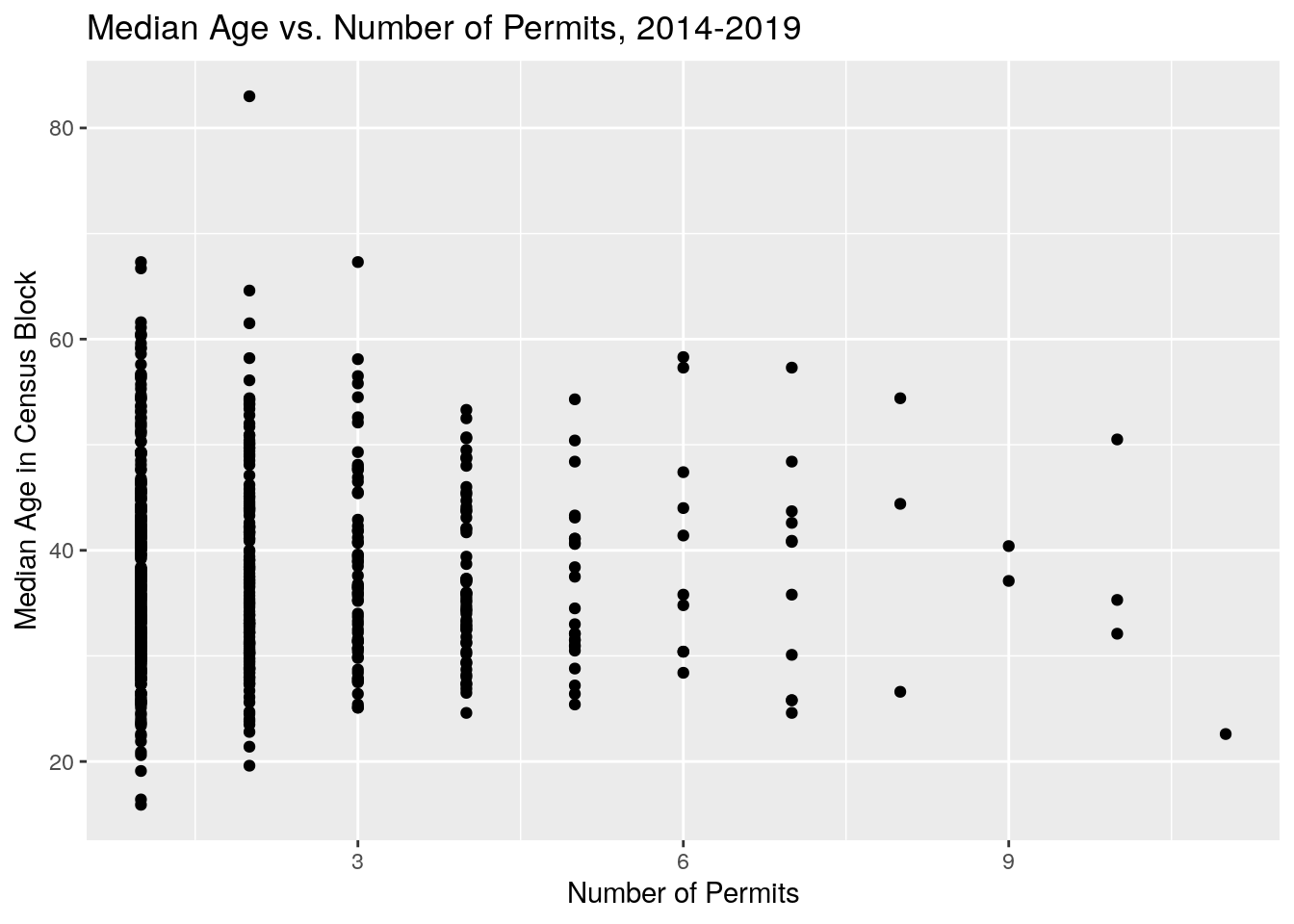
solarCensus %>%
filter(n<15) %>%
filter(!is.na(MedAge)) %>%
ggplot(aes(x=MedAge, y=Num, fill = ..x..)) +
scale_x_continuous(labels = scales::comma) +
geom_density_ridges_gradient(scale = 3, rel_min_height = 0.01) +
scale_fill_viridis(name = "Median Age", option = "C", labels = scales::comma) +
ylab("Number of Permits") +
xlab("Median Age in Census Block") +
labs(title = 'Median Age vs. Number of Permits, 2014-2019')## Picking joint bandwidth of 4.11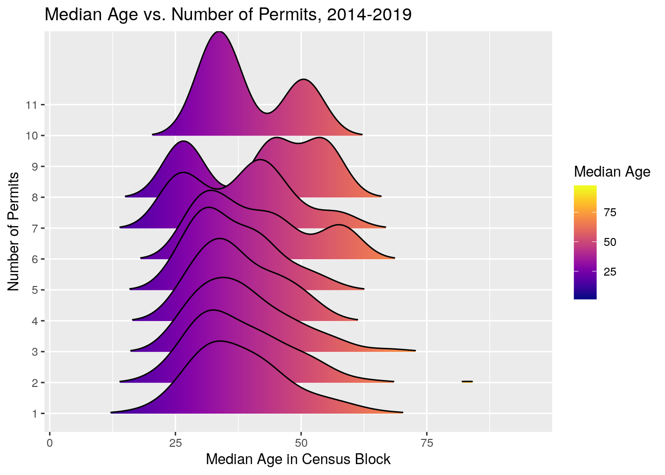
Contour maps
Let’s try contouring up the density. It appears from the density that the Heights and Westbury win out for most panel permits per square mile.
kde = bkde2D(cbind(solar$lon,solar$lat),bandwidth=c(0.03,0.03),
gridsize = c(1000, 1000))
contour(kde$x1,kde$x2,kde$fhat)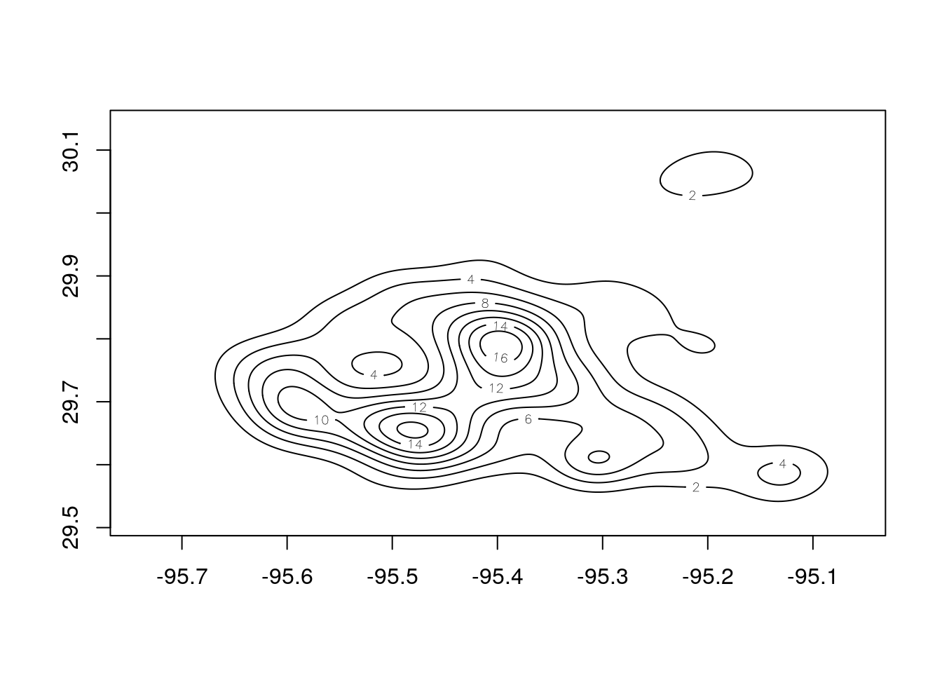
# Create Raster from Kernel Density output
KernelDensityRaster <- raster(list(x=kde$x1 ,y=kde$x2 ,z = kde$fhat))
#set low density cells as NA so we can make them transparent with the colorNumeric function
KernelDensityRaster@data@values[which(KernelDensityRaster@data@values < 1)] <- NA
palRaster <- colorBin("Spectral", bins = 7, domain = KernelDensityRaster@data@values, na.color = "transparent")
## Leaflet map with raster
leaflet() %>% addTiles() %>%
addRasterImage(KernelDensityRaster,
colors = palRaster,
opacity = .4) %>%
addLegend(pal = palRaster,
values = KernelDensityRaster@data@values,
title = "Solar Panel Density<br><font size='-2'>per square mile")So in terms of density, The Heights and Westbury win, and not surprisingly the east side has few panels. I would say that the density of panels tends to follow the population density, with an additional economic overlay (poor neighborhoods don’t buy solar panels).