
Covid in Harris County
Harris County COVID-19 data
I have a very nice (I hope) dataset consisting of number of positive COVID-19 cases per day in Harris county by zipcode. In this blog entry I would like to study this dataset and look at comparisons with various other data.
Initial look
First off, let’s explore the data for issues, and for ideas about what might be interesting.
# How is the data distributed? Let's look at the most recent day
Harris %>%
group_by(Zip) %>%
summarize(Cases_today=last(Cases)) %>%
ggplot(aes(x=Cases_today)) +
geom_histogram()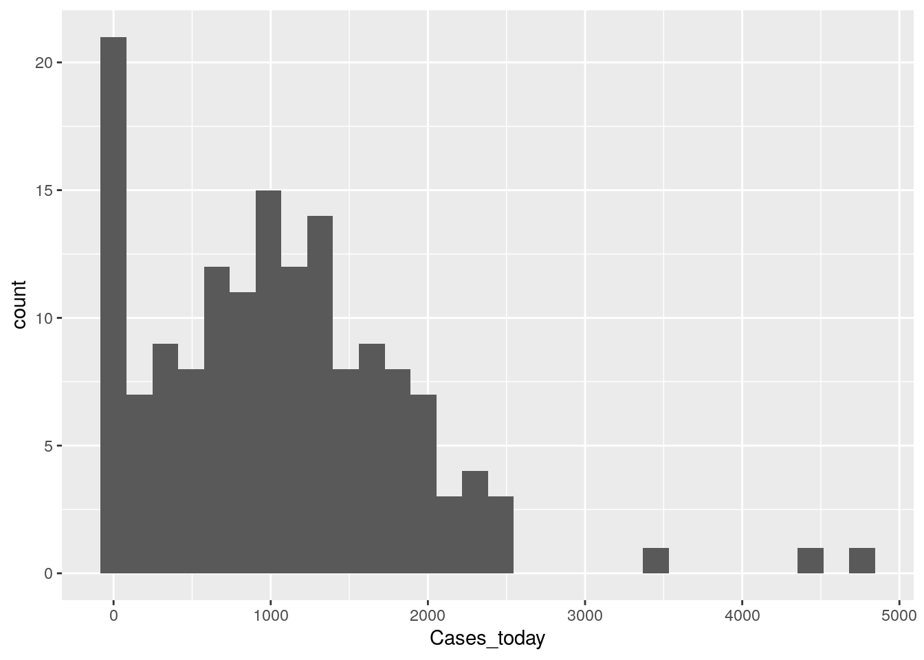
So over 20 zipcodes have no cases (but they may also have no people), and it looks like most zipcodes are in the 250-750 range. No obvious outliers or busts, so the data is looking pretty good so far.
Let’s look at the time behavior - this may get messy.
Harris %>%
mutate(Zip=as.factor(Zip)) %>%
ggplot(aes(x=Date, y=Cases, color=Zip)) +
geom_line() +
theme(legend.position = "none")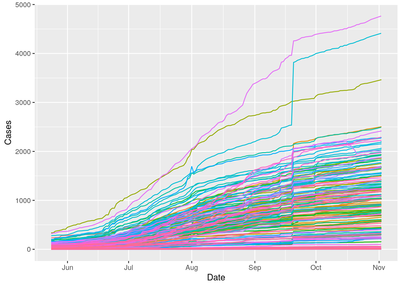
Obviously almost zipcodes are up, but some much more than others. But again, most importantly at this stage, no obvious data busts.
Let’s load up some more datasets. I need Population, area, median age, race, blueness, and median income.
path <- "/home/ajackson/Dropbox/Rprojects/Datasets/"
# SF file of zipcode outlines and areas
Zip_outlines <- readRDS(paste0(path, "ZipCodes_sf.rds"))
# Census data for 2016
Zip_census16 <- readRDS(paste0(path, "TexasZipcode_16.rds"))
Zip_census16 <- Zip_census16 %>%
mutate(ZCTA=as.character(ZCTA))
# Median family income and number of families
Income <- readRDS("/home/ajackson/Dropbox/Rprojects/Datasets/IncomeByZip.rds")
# Many vs 2 generational households
House <- readRDS("/home/ajackson/Dropbox/Rprojects/Datasets/HouseholdByZip.rds")
# Blueness
Blueness <- readRDS(paste0(path,"HarrisBlueness.rds")) Construct master dataframe
I want to build one data frame for all the ancilliary data by ZCTA, including the polygons, just to make things easier. Let’s make 2, one with geometries, and one without.
DF_values <- Zip_census16 %>%
select(-MalePop) %>%
mutate(MedianAge=as.numeric(MedianAge))
DF_values <- left_join(DF_values, Income, by="ZCTA")
DF_values <- left_join(DF_values, House, by="ZCTA")
# Drop NA will restrict to Harris county
DF_values <- left_join(DF_values, Blueness, by="ZCTA") %>%
drop_na()
left_join.sf =
function(x,y,by=NULL,copy=FALSE,suffix=c(".x",".y"),...){
ret = NextMethod("left_join")
sf::st_as_sf(ret)
}
Zip_outlines <- sf::st_as_sf(Zip_outlines)
DF_polys <- left_join(DF_values, Zip_outlines, by=c("ZCTA"="Zip_Code"))
DF_polys <- sf::st_as_sf(DF_polys)
# Check it out
pal <- leaflet::colorNumeric(palette = colorspace::diverge_hsv(8),
na.color = "transparent",
reverse=TRUE,
domain = DF_values$blueness)
leaflet::leaflet(DF_polys) %>%
leaflet::setView(lng = -95.3103, lat = 29.7752, zoom = 7 ) %>%
leaflet::addTiles() %>%
leaflet::addPolygons(data = DF_polys,
weight = 1,
smoothFactor = 0.2,
fillOpacity = 0.7,
fillColor = ~pal(DF_values$blueness)) Let’s now calculate some per capita numbers, since I’ll be wanting those later. Also pop density. Turn all relevant numbers into per capita or percents. Also calculate doubling time in a sliding window.
#DF_values$Population[DF_values$ZCTA=="77407"] <- 28585
#DF_values$Population[DF_values$ZCTA=="77046"] <- 1196
#DF_values$Population[DF_values$ZCTA=="77002"] <- 16793
DF_values <- DF_values %>%
mutate(WhitePct=White/Pop*100,
BlackPct=Black/Pop*100,
HispanicPct=Hispanic/Pop*100,
MultigenPct=Households_threegen/Total_Households*100)
DF_values <- DF_polys %>% as_tibble %>%
select(-Shape) %>%
select(ZCTA, Shape_Area) %>%
left_join(DF_values, by="ZCTA") %>%
mutate(Density=5280*5280*Pop/Shape_Area) # per sq mileNow let’s calculate a bunch of useful stuff from case numbers
######################################################################
# Calculate doubling times along whole vector
######################################################################
doubling <- function(cases, window=5, grouper) {
if (length(cases)<10){ # must have >= 10 points
return(rep(NA,length(cases)))
}
halfwidth <- as.integer(window/2)
rolling_lm <- tibbletime::rollify(.f = function(logcases, Days) {
lm(logcases ~ Days)
},
window = window,
unlist = FALSE)
foo <-
tibble(Days = 1:length(cases), logcases = log10(cases)) %>%
mutate(roll_lm = rolling_lm(logcases, Days)) %>%
filter(!is.na(roll_lm)) %>%
mutate(tidied = purrr::map(roll_lm, broom::tidy)) %>%
unnest(tidied) %>%
filter(term=="Days") %>%
mutate(m=estimate) %>%
# calculate doubling time
mutate(m=signif(log10(2)/m,3)) %>%
mutate(m=replace(m, m>200, NA)) %>%
mutate(m=replace(m, m<=0, NA)) %>%
select(m)
return(matlab::padarray(foo[[1]], c(0,halfwidth), "replicate"))
} ###################### end doubling
######################################################################
# trim outliers
######################################################################
isnt_out_z <- function(x, thres = 8, na.rm = TRUE) {
good <- abs(x - mean(x, na.rm = na.rm)) <= thres * sd(x, na.rm = na.rm)
x[!good] <- NA # set outliers to na
x[x<=0] <- NA # non-positive values set to NA
x
}
#--------------- Control matrix, available everywhere
calc_controls <- tribble(
~base, ~avg, ~percap, ~trim, ~positive,
"Cases", TRUE, TRUE, FALSE, TRUE,
"pct_chg", TRUE, FALSE, FALSE, TRUE,
"doubling", TRUE, FALSE, TRUE, TRUE,
"active_cases", TRUE, TRUE, FALSE, TRUE,
"new_cases", TRUE, TRUE, FALSE, TRUE
)
######################################################################
# Calculate everything by grouping variable (County, MSA)
######################################################################
prep_counties <- function(DF, Grouper) {
window <- 5
Grouper_str <- Grouper
Grouper <- rlang::sym(Grouper)
#--------------- Clean up and calc base quantities
foo <- DF %>%
group_by(!!Grouper) %>%
arrange(Date) %>%
mutate(day = row_number()) %>%
add_tally() %>%
ungroup() %>%
select(!!Grouper, Cases, Date, new_cases, Population, n) %>%
filter(!!Grouper!="Total") %>%
filter(!!Grouper!="Pending County Assignment") %>%
replace_na(list(Cases=0, new_cases=0)) %>%
group_by(!!Grouper) %>%
arrange(Date) %>%
mutate(pct_chg=100*new_cases/lag(Cases, default=Cases[1])) %>%
mutate(active_cases=Cases-lag(Cases, n=14, default=Cases[1])) %>%
mutate(doubling=doubling(Cases, window, !!Grouper)) %>%
ungroup()
#----------------- Trim outliers and force to be >=0
for (base in calc_controls$base[calc_controls$trim]){
for (grp in unique(foo[[Grouper_str]])) {
foo[foo[[Grouper_str]]==grp,][base] <- isnt_out_z((foo[foo[[Grouper_str]]==grp,][[base]]))
}
}
for (base in calc_controls$base[calc_controls$positive]){
foo[base] <- pmax(0, foo[[base]])
}
#----------------- Calc Rolling Average
inputs <- calc_controls$base[calc_controls$avg==TRUE]
foo <- foo %>%
group_by(!!Grouper) %>%
mutate_at(inputs, list(avg = ~ zoo::rollapply(., window,
FUN=function(x) mean(x, na.rm=TRUE),
fill=c(first(.), NA, last(.))))) %>%
rename_at(vars(ends_with("_avg")),
list(~ paste("avg", gsub("_avg", "", .), sep = "_"))) %>%
ungroup()
foo <- foo %>%
mutate(pct_chg=na_if(pct_chg, 0)) %>%
mutate(pct_chg=replace(pct_chg, pct_chg>30, NA)) %>%
mutate(pct_chg=replace(pct_chg, pct_chg<0.1, NA)) %>%
mutate(avg_pct_chg=na_if(avg_pct_chg, 0)) %>%
mutate(avg_pct_chg=replace(avg_pct_chg, avg_pct_chg>30, NA)) %>%
mutate(avg_pct_chg=replace(avg_pct_chg, avg_pct_chg<0.1, NA))
#----------------- Calc per capitas
inputs <- calc_controls$base[calc_controls$percap==TRUE]
inputs <- c(paste0("avg_", inputs), inputs)
foo <- foo %>%
mutate_at(inputs, list(percap = ~ . / Population * 1.e3))
return(foo)
} ############### end of prep_counties
# Add Population to Harris file
########################################### stopped here
Harris <- DF_values %>% select(ZCTA, Pop) %>%
rename(Zip=ZCTA) %>%
left_join(Harris, .) %>%
rename(Population=Pop)
Harris <- Harris %>%
group_by(Zip) %>%
arrange(Date) %>%
mutate(new_cases=(Cases-lag(Cases, default=first(Cases)))) %>%
mutate(new_cases=pmax(new_cases, 0)) %>% # truncate negative numbers
ungroup()
Harris <- Harris %>% drop_na()
Harris <- Harris %>% filter(Cases>0)
############ Create Counties file
Harris_calc <- prep_counties(Harris, "Zip")Now let’s look at overall measures by zipcode, before we start trying to correlate things.
Harris_calc %>%
select(-n, -Population) %>%
pivot_longer(c(-Date, -Zip), names_to="Measurements", values_to="Values") %>%
ggplot(aes(x=Date, y=Values, color=Zip)) +
geom_line() +
facet_wrap(~ Measurements, scales = "free_y") +
labs(title="Zipcode Daily Measurements",
y="Value") +
theme(legend.position = "none")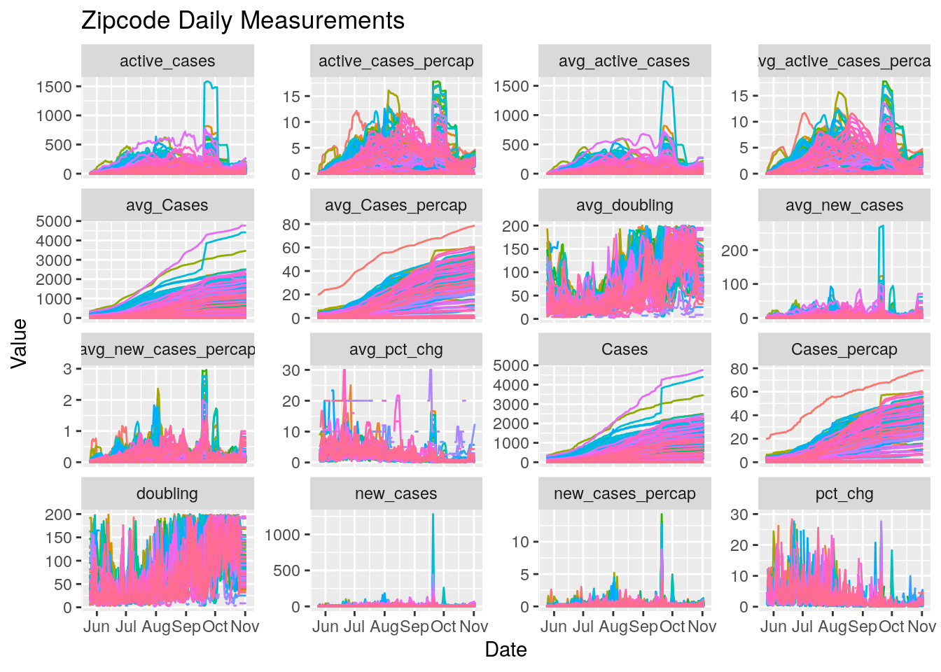
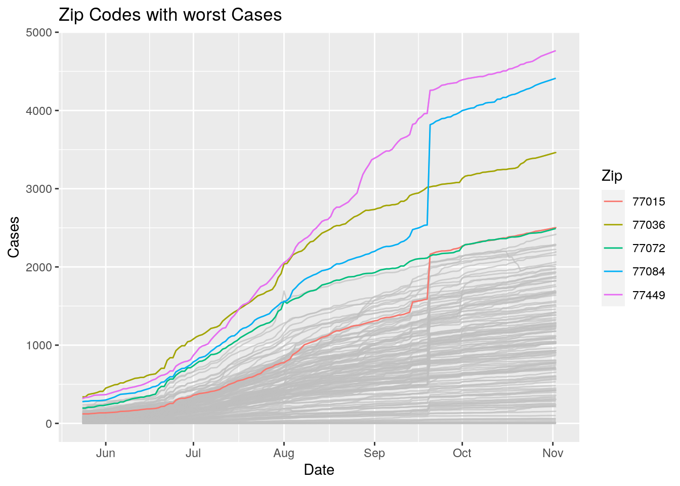
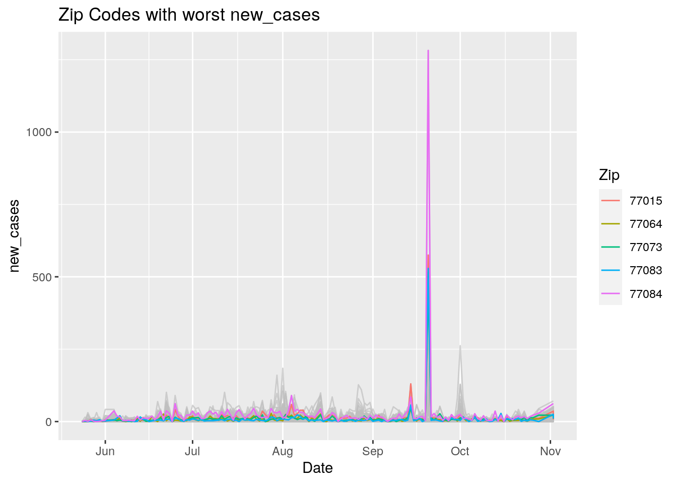
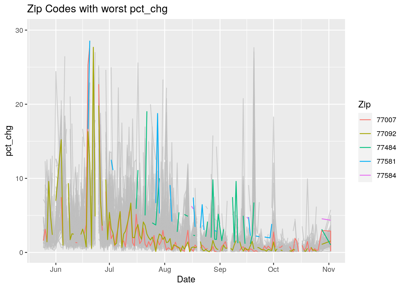
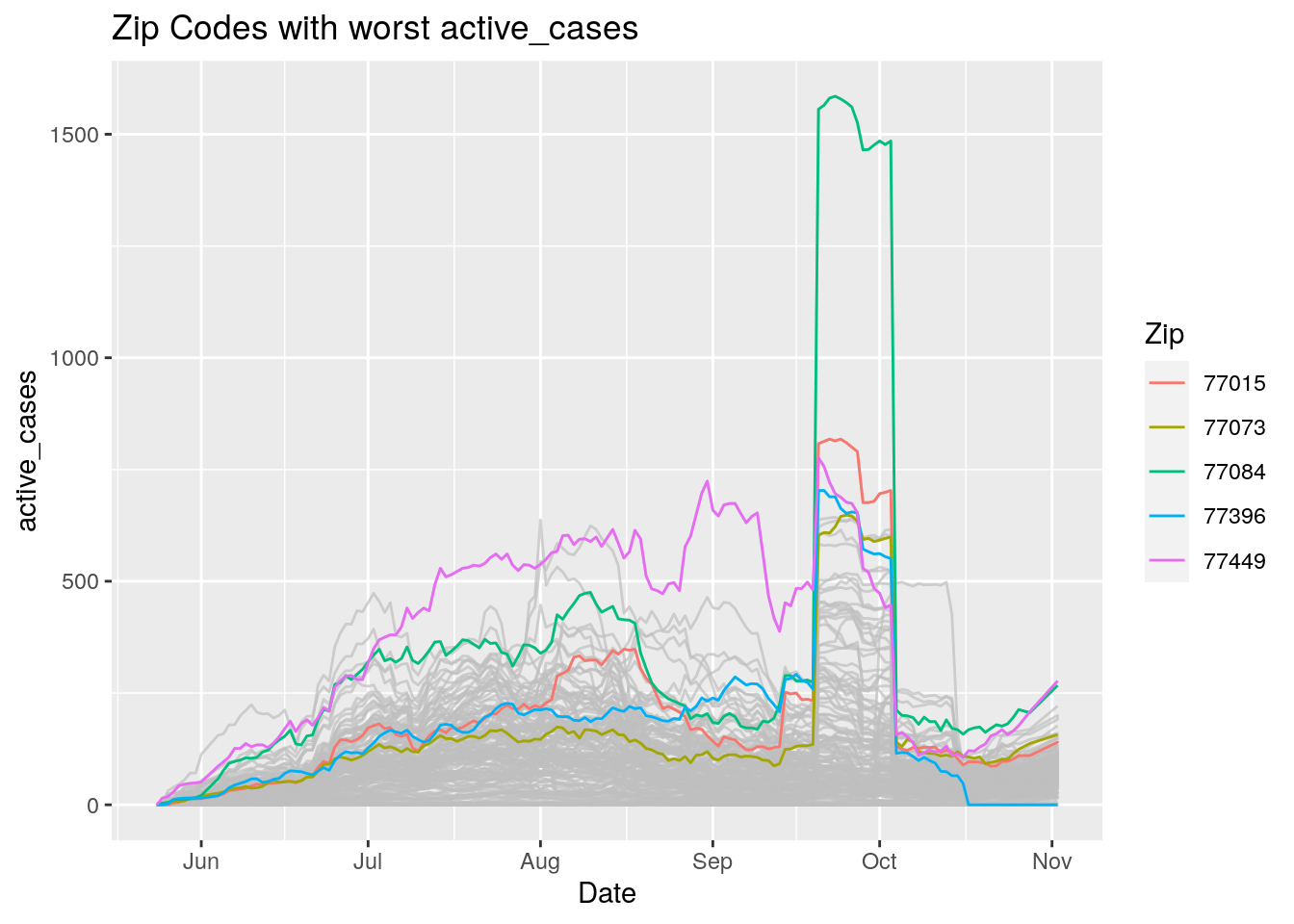
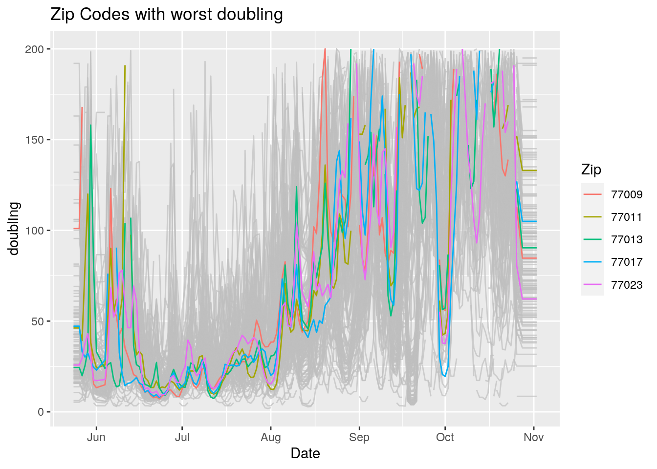
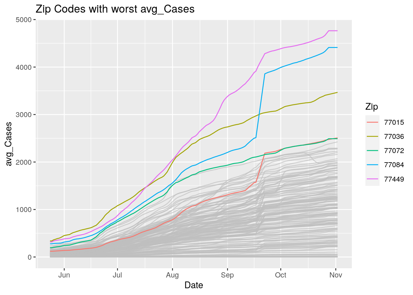
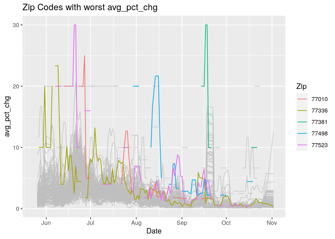
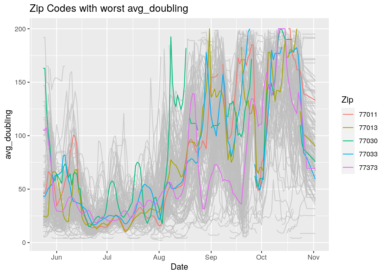
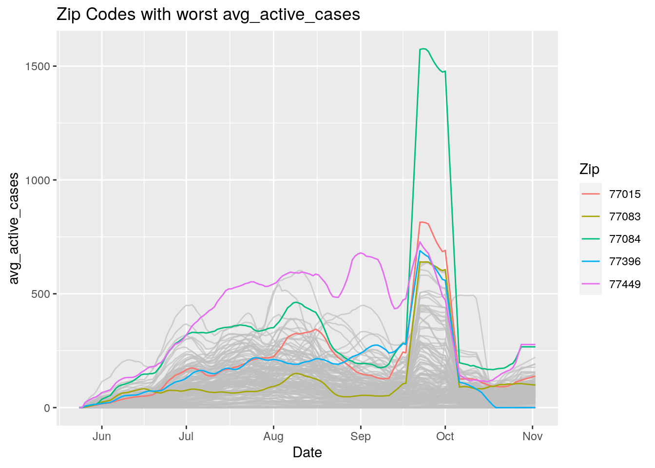
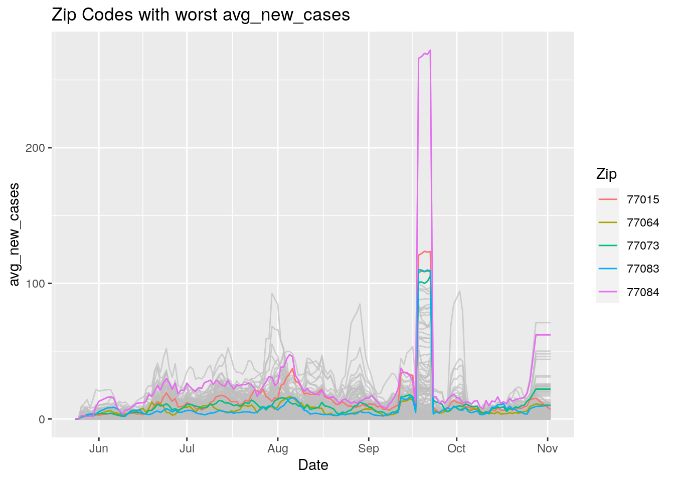
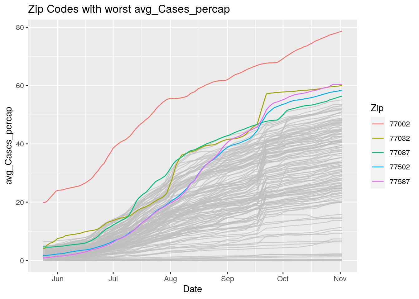
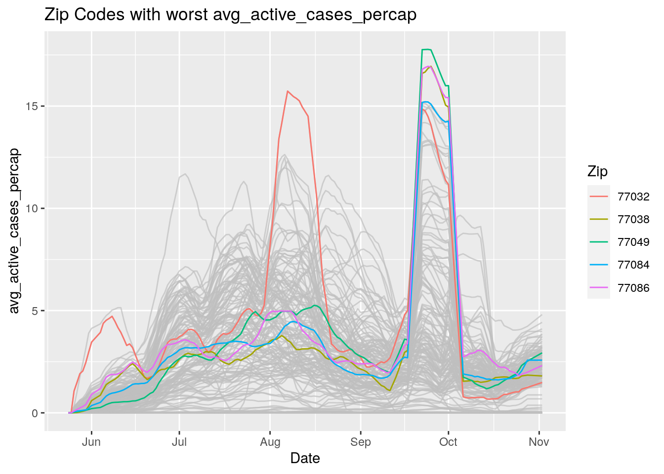
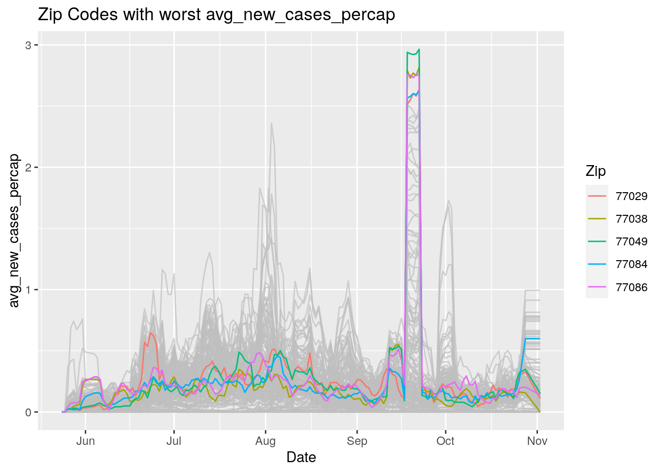
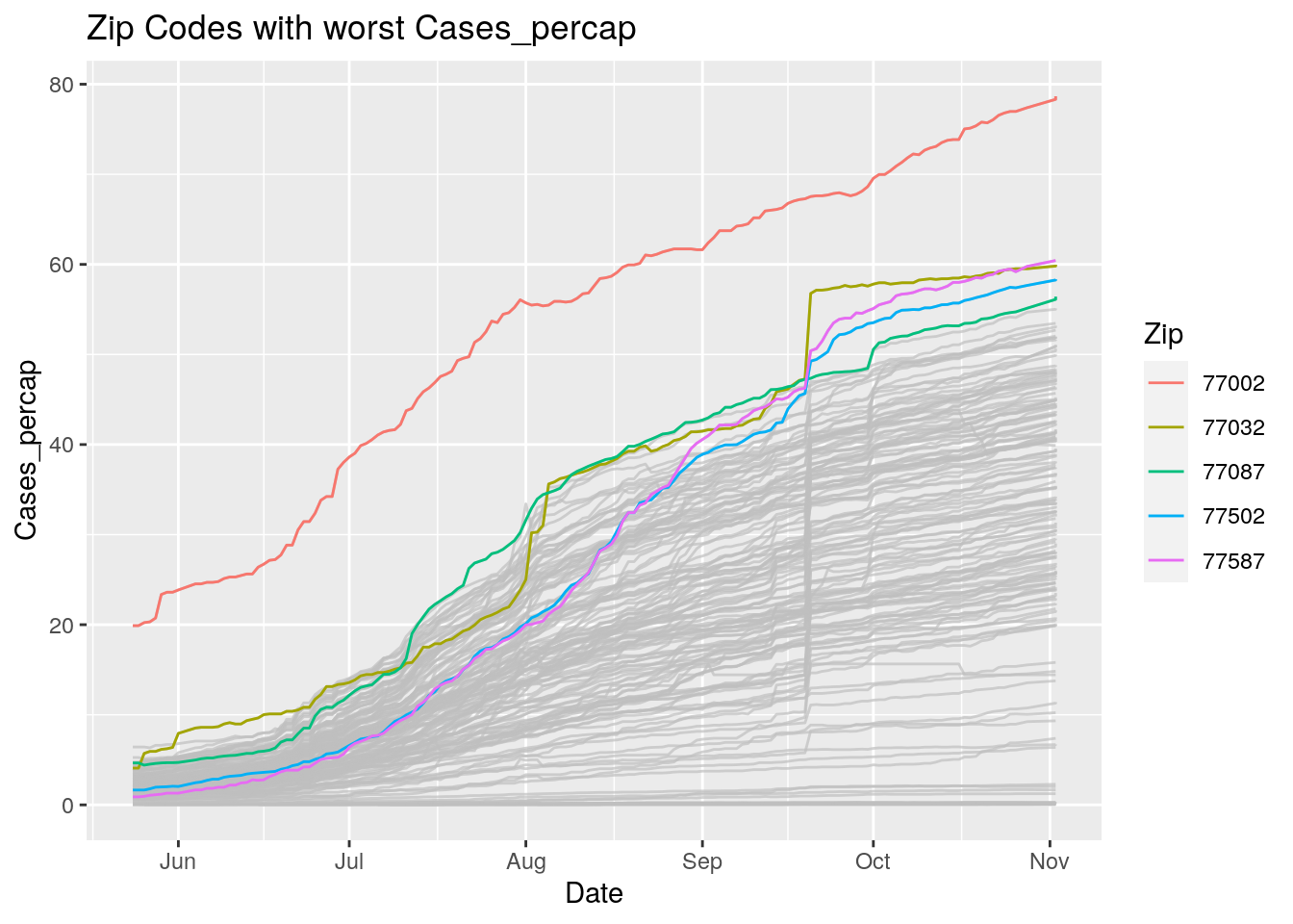
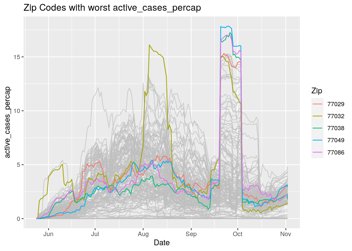
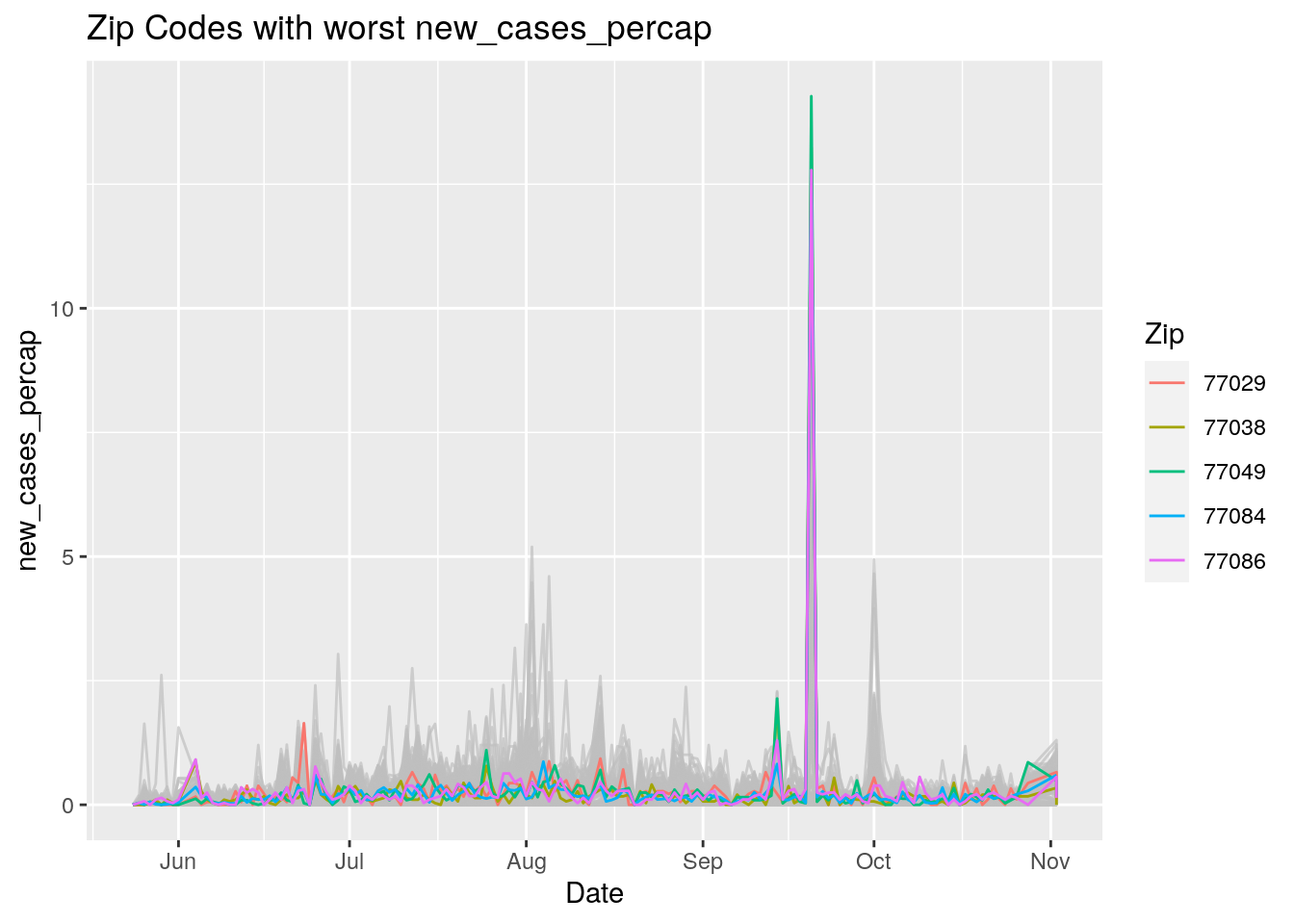
Let’s look at the top five zipcodes in each measurement
Measures <- names(Harris_calc %>% select(-Zip, -Date, -Population, -n))
for (variable in Measures) {
# get top 5
foo <- Harris_calc %>%
group_by(Zip) %>%
summarize(maxval=max(!!sym(variable), na.rm=TRUE),
minval=min(!!sym(variable), na.rm=TRUE))
if (str_detect(variable, "double")) {
top5 <- head(arrange(foo, maxval),5)
} else {
top5 <- head(arrange(foo, -maxval),5)
}
Select_Zips <- Harris_calc %>%
filter(Zip %in% top5$Zip)
# Plot all zips in gray, and then overplot the top 5 in color
# with labels
p <- Harris_calc %>%
ggplot(aes(x=Date, y=!!as.name(variable))) +
#theme(legend.position = "none", text = element_text(size=20)) +
geom_line(aes(group=Zip),colour = alpha("grey", 0.7), show.legend=FALSE) +
geom_line(data=Select_Zips,
aes(color=Zip)) +
labs(title=paste("Zip Codes with worst" ,variable),
x=paste0("Date"),
y=paste(variable))
print(p)
}
Let’s make a heat map
Harris_calc %>%
group_by(Zip) %>%
mutate(avg_doubling=pmin(avg_doubling, 25, na.rm=TRUE)) %>%
ungroup() %>%
ggplot(aes(x=Date, y=Zip, fill=avg_doubling)) +
geom_tile() +
scale_fill_gradient(high="blue", low="red")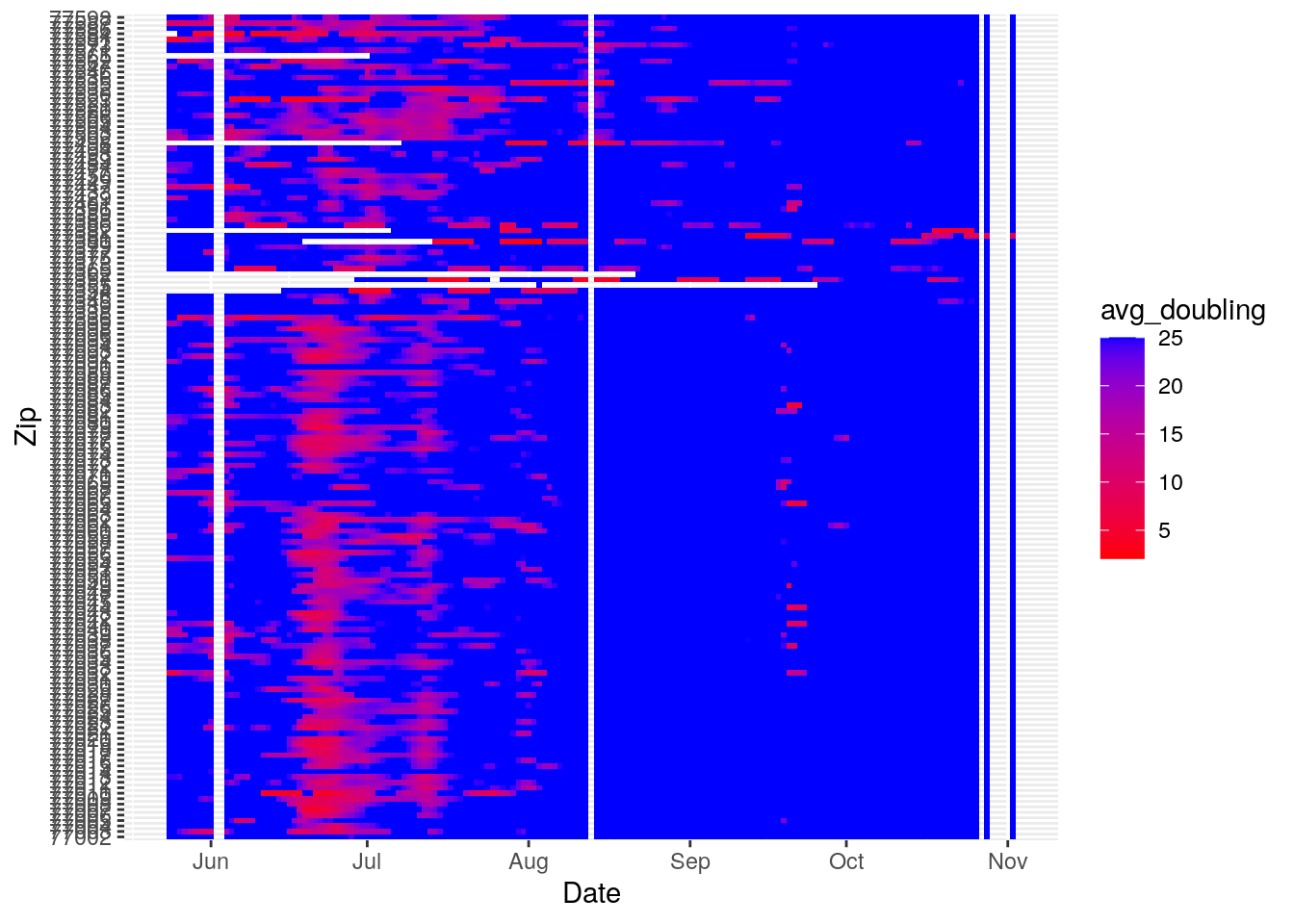
Harris_calc %>%
group_by(Zip) %>%
mutate(maxcases=max(Cases, na.rm=TRUE)) %>%
ungroup() %>%
filter(maxcases>500) %>%
ggplot(aes(x=Date, y=Zip, fill=avg_new_cases_percap)) +
geom_tile() +
labs(title="Restricted to Zip Codes with > 500 Cases") +
#scale_fill_viridis(discrete=FALSE, option="plasma")
scale_fill_gradient(low="blue", high="red")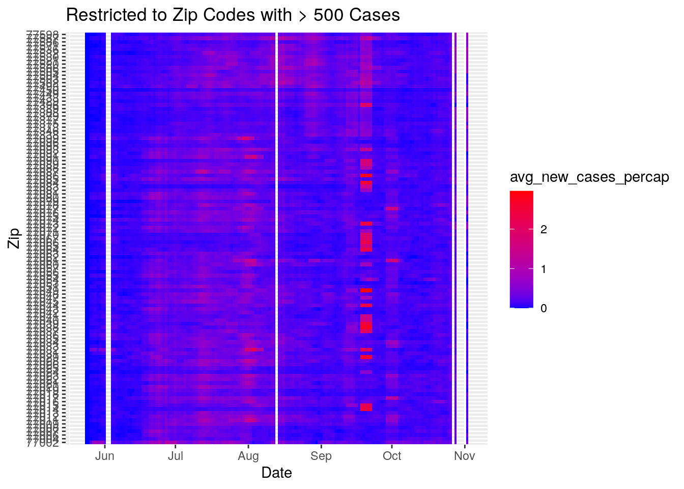
#scale_fill_distiller(type="seq", palette="YlOrRd", direction=+1)Okay, let’s make some maps
# Need dataframe of last values
Harris_last <- Harris_calc %>%
group_by(Zip) %>%
summarize(across(contains("avg"), last))
# Histograms to help pick color scales for maps
Harris_last %>%
pivot_longer(-Zip, names_to="Calculation", values_to="Value") %>%
ggplot(aes(x=Value)) +
facet_wrap(vars(Calculation), scales="free") +
geom_histogram()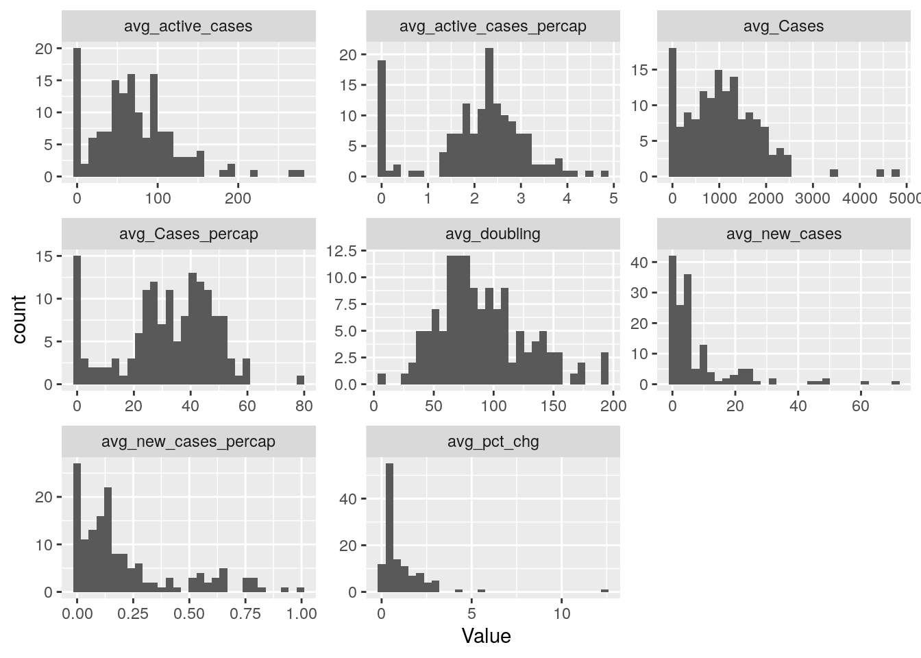
Harris_last <- left_join(Harris_last, Zip_outlines, by=c("Zip"="Zip_Code"))
Harris_last <- sf::st_as_sf(Harris_last)
# Check it out doubling time
pal <- leaflet::colorBin(palette = heat.colors(6),
bins = c(0,5,10,25,75, max(Harris_last$avg_doubling, na.rm = TRUE)),
na.color = "transparent",
reverse=FALSE,
# pretty = FALSE,
domain = Harris_last$avg_doubling)
leaflet::leaflet(Harris_last) %>%
leaflet::setView(lng = -95.3103, lat = 29.7752, zoom = 8 ) %>%
leaflet::addTiles() %>%
leaflet::addPolygons(data = DF_polys,
weight = 1,
stroke=TRUE,
smoothFactor = 0.2,
fillOpacity = 0.7,
fillColor = ~pal(Harris_last$avg_doubling)) %>%
leaflet::addLegend("bottomleft", pal = pal,
values = Harris_last$avg_doubling,
labels= as.character(seq(Range[1], Range[2], length.out = 5)),
labFormat = function(type, cuts, p) {
n = length(cuts)
paste0(signif(cuts[-n],2), " – ", signif(cuts[-1],2))
},
title = "Avg Doubling Time in Days",
opacity = 1
)# Now do new cases per cap, active cases per cap
# Avg new cases per cap
pal <- leaflet::colorBin(palette = heat.colors(5),
bins = c(0,0.5,1,2, max(Harris_last$avg_new_cases_percap, na.rm = TRUE)),
na.color = "transparent",
reverse=TRUE,
# pretty = FALSE,
domain = Harris_last$avg_new_cases_percap)
leaflet::leaflet(Harris_last) %>%
leaflet::setView(lng = -95.3103, lat = 29.7752, zoom = 8 ) %>%
leaflet::addTiles() %>%
leaflet::addPolygons(data = DF_polys,
weight = 1,
stroke=TRUE,
smoothFactor = 0.2,
fillOpacity = 0.7,
fillColor = ~pal(Harris_last$avg_new_cases_percap)) %>%
leaflet::addLegend("bottomleft", pal = pal,
values = Harris_last$avg_new_cases_percap,
labels= as.character(seq(Range[1], Range[2], length.out = 5)),
labFormat = function(type, cuts, p) {
n = length(cuts)
paste0(signif(cuts[-n],2), " – ", signif(cuts[-1],2))
},
title = "Avg New Cases per 1,000",
opacity = 1
)# Avg active cases per cap
pal <- leaflet::colorBin(palette = heat.colors(5),
bins = c(0,2.5,5,7.5, max(Harris_last$avg_active_cases_percap, na.rm = TRUE)),
na.color = "transparent",
reverse=TRUE,
# pretty = FALSE,
domain = Harris_last$avg_active_cases_percap)
leaflet::leaflet(Harris_last) %>%
leaflet::setView(lng = -95.3103, lat = 29.7752, zoom = 8 ) %>%
leaflet::addTiles() %>%
leaflet::addPolygons(data = DF_polys,
weight = 1,
stroke=TRUE,
smoothFactor = 0.2,
fillOpacity = 0.7,
fillColor = ~pal(Harris_last$avg_active_cases_percap)) %>%
leaflet::addLegend("bottomleft", pal = pal,
values = Harris_last$avg_active_cases_percap,
labels= as.character(seq(Range[1], Range[2], length.out = 5)),
labFormat = function(type, cuts, p) {
n = length(cuts)
paste0(signif(cuts[-n],2), " – ", signif(cuts[-1],2))
},
title = "Avg Active Cases per 1,000",
opacity = 1
)Now what? Can we make animated maps?
This doesn’t use leaflet, so will take a bit of work.
# stmp <- stamp("Jan 1, 1999")
# i <- 1
# for (ThisDay in sort(unique(Harris_calc$Date))){
#
# Daily <- Harris_calc %>%
# filter(Date == ThisDay)
# # Avg new cases per cap
# pal <- leaflet::colorBin(palette = heat.colors(6),
# bins = c(0,0.25,0.5,0.75,1.0, 1.5, 2),
# na.color = "transparent",
# reverse=TRUE,
# # pretty = FALSE,
# domain = Daily$avg_new_cases_percap)
#
# m <- leaflet::leaflet(Daily) %>%
# leaflet::setView(lng = -95.3103, lat = 29.7752, zoom = 10 ) %>%
# leaflet::addTiles() %>%
# leaflet::addPolygons(data = DF_polys,
# weight = 1,
# stroke=TRUE,
# smoothFactor = 0.2,
# fillOpacity = 0.7,
# fillColor = ~pal(Daily$avg_new_cases_percap)) %>%
# leaflet::addLegend("bottomleft", pal = pal,
# values = Daily$avg_new_cases_percap,
# labels= as.character(seq(Range[1], Range[2], length.out = 5)),
# labFormat = function(type, cuts, p) {
# n = length(cuts)
# paste0(signif(cuts[-n],2), " – ", signif(cuts[-1],2))
# },
# title = paste0("Avg New Cases per 1,000 : ", stmp(as_date(ThisDay))),
# opacity = 1
# )
#
# ## This is the png creation part
# htmlwidgets::saveWidget(m, 'temp.html', selfcontained = FALSE)
# webshot('temp.html', file=sprintf('Rplot%02d.png', i),
# cliprect = 'viewport')
#
# i <- i+ 1
# }
# convert -resize 50% -delay 100 Rplot* -loop 0 animation.gif
Animated Map
Time to correlate
Time to start correlating. First we will look at single factors. Later we will combine factors, maybe do an ANOVA.
lm_eqn <- function(df){
m <- lm(y ~ x, df);
eq <- substitute(italic(y) == a + b %.% italic(x)*","~~italic(r)^2~"="~r2,
list(a = format(unname(coef(m)[1]), digits = 2),
b = format(unname(coef(m)[2]), digits = 2),
r2 = format(summary(m)$r.squared, digits = 3)))
as.character(as.expression(eq));
}
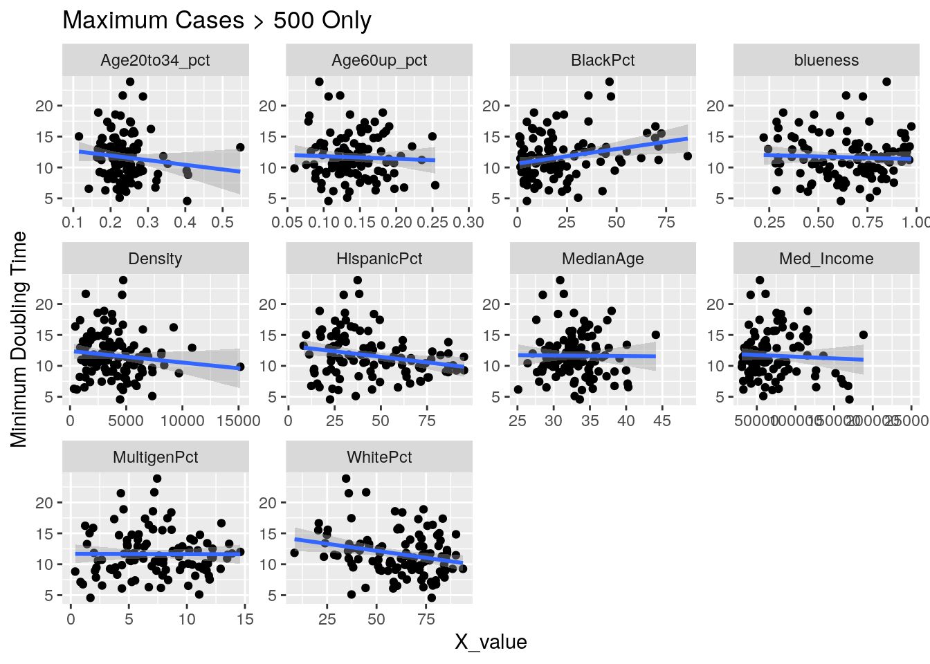
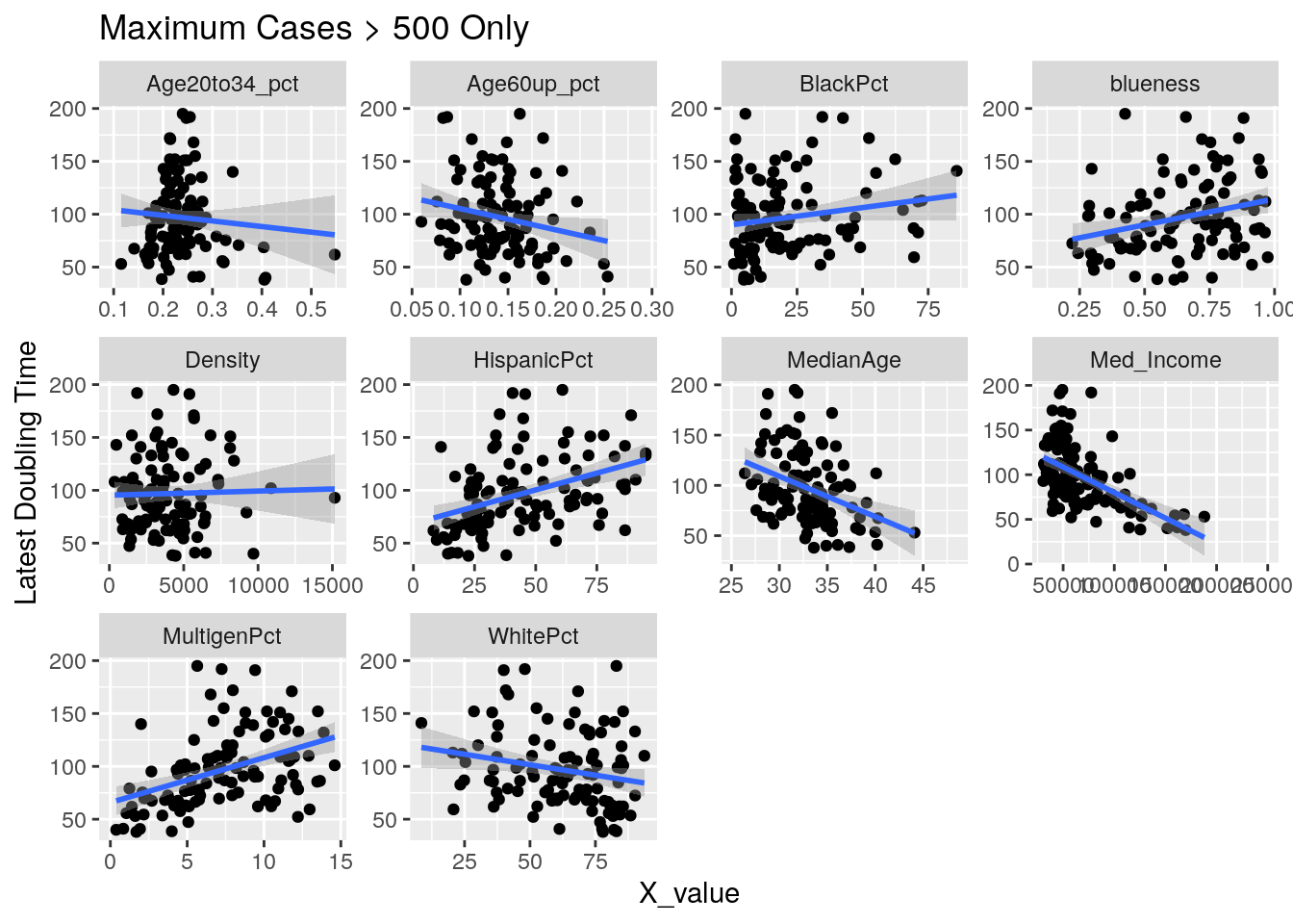
Correlates <- Harris_calc %>%
group_by(Zip) %>%
mutate(maxcases=max(Cases, na.rm=TRUE)) %>%
ungroup() %>%
filter(maxcases>500) %>% # only zips where max cases > 500
filter(Zip != "77002") %>% # drop downtown
group_by(Zip) %>%
summarize(min_doub = min(avg_doubling, na.rm=TRUE),
last_doub = last(avg_doubling),
last_new = last(avg_new_cases_percap),
max_new = max(new_cases_percap, na.rm=TRUE),
last_act = max(active_cases_percap, na.rm=TRUE),
last_cases = last(avg_Cases_percap))
DF_corrvals <- DF_values %>%
mutate(Age20to34_pct=(Age20to24+Age25to34)/Pop,
Age60up_pct=(Age60to64+Age65to74+Age75to84+Age85andup)/Pop,
) %>%
select(Zip=ZCTA, Pop, MedianAge, Med_Income, blueness, WhitePct,
BlackPct, HispanicPct, MultigenPct, Density,
Age20to34_pct, Age60up_pct)
foo <- left_join(DF_corrvals, Correlates, by="Zip")
x_axis <- c("MedianAge", "Med_Income" ,"blueness", "WhitePct",
"BlackPct", "HispanicPct", "MultigenPct", "Density",
"Age20to34_pct", "Age60up_pct")
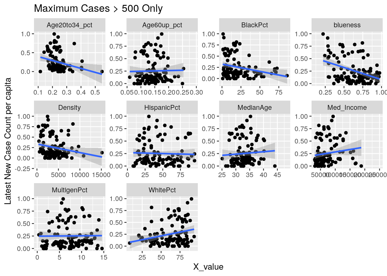
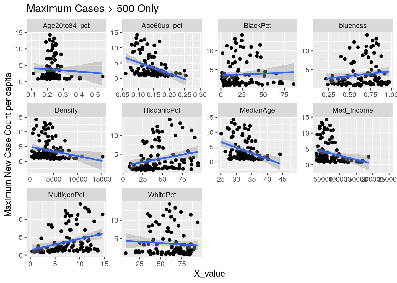
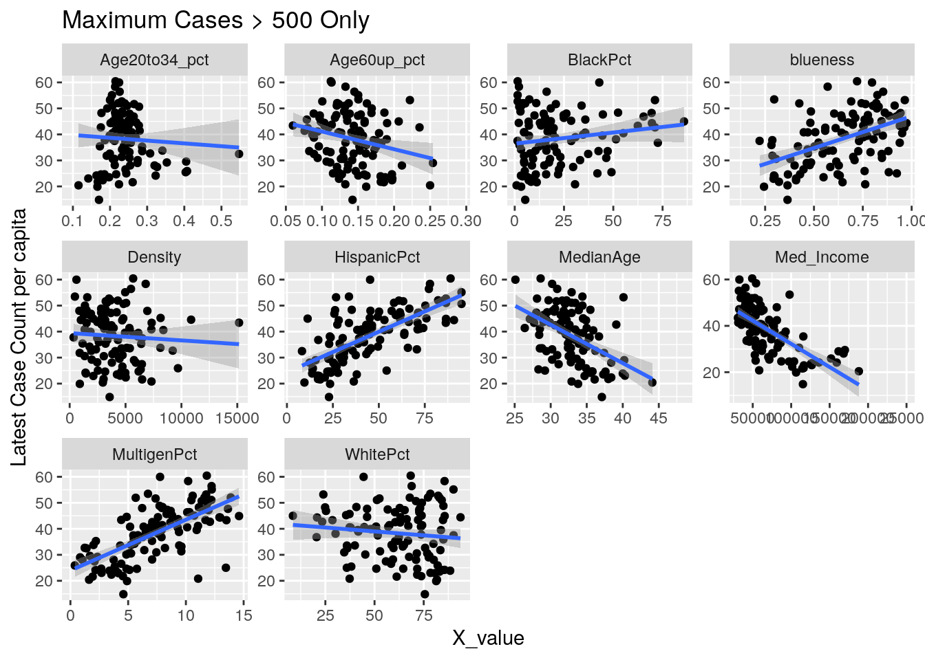
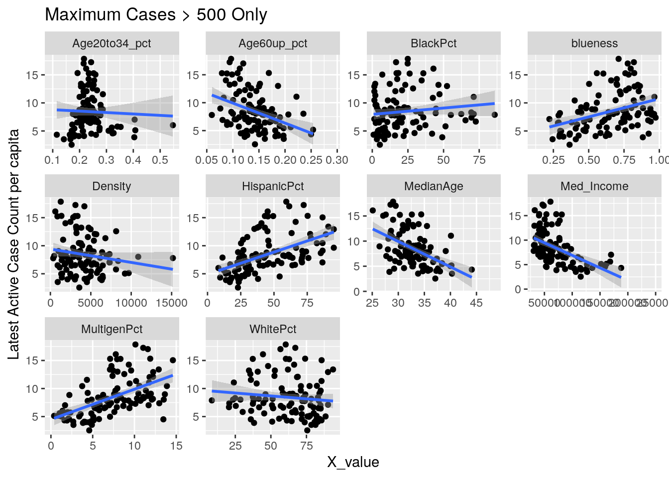
y_axis <- c("min_doub", "last_doub", "last_new", "max_new", "last_cases", "last_act")
y_names <- c("min_doub"="Minimum Doubling Time",
"last_doub"="Latest Doubling Time",
"last_new"="Latest New Case Count per capita",
"max_new"="Maximum New Case Count per capita",
"last_cases"="Latest Case Count per capita",
"last_act"="Latest Active Case Count per capita")
for (y_val in y_axis) {
p <-
foo %>% select(-Pop, -Zip) %>%
select(!! c(x_axis, y_val)) %>%
pivot_longer(-!!y_val, names_to="X_variable", values_to="X_value") %>%
ggplot(aes_string(x="X_value", y=y_val)) +
facet_wrap(vars(X_variable), scales="free") +
geom_point() +
geom_smooth(method="lm") +
labs(y=y_names[[y_val]], title="Maximum Cases > 500 Only")
print(p)
}
Let’s look at the outliers
Correlates %>% filter(last_act>10)## # A tibble: 29 x 7
## Zip min_doub last_doub last_new max_new last_act last_cases
## <chr> <dbl> <dbl> <dbl> <dbl> <dbl> <dbl>
## 1 77011 11.5 133 0.108 2.64 12.9 55.1
## 2 77014 23.9 86.7 0.147 11.6 13.2 30.9
## 3 77015 11.2 95.9 0.122 10.0 14.3 43.7
## 4 77028 13.4 112 0.138 1.73 11.1 53.2
## 5 77029 8.14 91.9 0.109 12.1 15.3 50.0
## 6 77032 6.17 NA 0.148 9.50 16.1 60.0
## 7 77037 9.26 110 0.201 9.42 13.4 44.4
## 8 77038 9.58 151 0 13.2 17.3 41.1
## 9 77039 12.0 101 0 11.4 15.0 44.9
## 10 77044 8.21 72.6 0.223 10.9 15.2 48.0
## # … with 19 more rows77011 : Second Ward 77028 : Houston Gardens 77030 : Med Center 77032 : IAH - ICE detention center 77061 : Glenbrook Valley / Hobby 77087 : Golfcrest / Park Place 77091 : Acres Homes 77099 : Alief
foo %>% #filter(Zip %in% c("77011", "77028", "77061", "77087",
# "77091", "77099")) %>%
select(-Pop, -Zip) %>%
filter(Med_Income<80000) %>%
select(!! c(x_axis, "last_act")) %>%
pivot_longer(-last_act, names_to="X_variable", values_to="X_value") %>%
ggplot(aes_string(x="X_value", y="last_act")) +
facet_wrap(vars(X_variable), scales="free") +
geom_point() +
geom_smooth(method="lm") +
labs(y=y_names[["last_act"]], title="Maximum Cases > 500 Only") 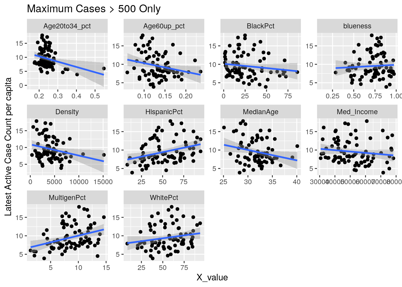
Let’s try a somewhat different tack. A simple model is that the virus diffuses evenly out through the population in a uniform way. Obviously not true, and most interesting are the deviations from that model. It may also be true that superspreader events are very important - so we could imagine a smoothly diffusing background infection rate with bubbles of superspreader events in it. So let’s look for the exceptions, and see if there are useful patterns there.
Let’s first drop all zip codes from the bottom 1/2 of case numbers, since having a small number of cases often leads to bad statistics. Then let’s look at the top 20 zip codes in terms of cases per capita.
# Make a list of the top 1/2 of zips by max cases
Top_half <- Harris_calc %>%
group_by(Zip) %>%
summarise(maxcase=max(Cases, na.rm=TRUE)) %>%
arrange(desc(maxcase)) %>%
head(nrow(.)/2) %>%
select(Zip) %>%
# remove downtown, med center, & IAH
filter(!(Zip %in% c("77002", "77030", "77032")))
# Now from that list, take the top 20 by max cases per capita
Top20 <- Harris_calc %>%
filter(Zip %in% Top_half$Zip) %>%
group_by(Zip) %>%
summarise(maxcase=max(Cases_percap, na.rm=TRUE)) %>%
arrange(desc(maxcase)) %>%
head(20) %>%
select(Zip)
Bot20 <- Harris_calc %>%
filter(Zip %in% Top_half$Zip) %>%
group_by(Zip) %>%
summarise(maxcase=max(Cases_percap, na.rm=TRUE)) %>%
arrange(maxcase) %>%
head(20) %>%
select(Zip)
# Now let's look at correlations
Correlates <- Harris_calc %>%
# filter(Zip %in% Top20$Zip) %>%
filter(Zip %in% Top_half$Zip) %>%
group_by(Zip) %>%
summarize(min_doub = min(avg_doubling, na.rm=TRUE),
last_doub = last(avg_doubling),
last_new = last(avg_new_cases_percap),
max_new = max(new_cases_percap, na.rm=TRUE),
last_act = max(active_cases_percap, na.rm=TRUE),
last_cases = last(avg_Cases_percap))
DF_corrvals <- DF_values %>%
mutate(Age20to34_pct=(Age20to24+Age25to34)/Pop,
Age60up_pct=(Age60to64+Age65to74+Age75to84+Age85andup)/Pop,
) %>%
select(Zip=ZCTA, Pop, MedianAge, Med_Income, blueness, WhitePct,
BlackPct, HispanicPct, MultigenPct, Density,
Age20to34_pct, Age60up_pct)
foo <- left_join(DF_corrvals, Correlates, by="Zip")
x_axis <- c("MedianAge", "Med_Income" ,"blueness", "WhitePct",
"BlackPct", "HispanicPct", "MultigenPct", "Density",
"Age20to34_pct", "Age60up_pct")
y_axis <- c("min_doub", "last_doub", "last_new", "max_new", "last_cases", "last_act")
y_names <- c("min_doub"="Minimum Doubling Time",
"last_doub"="Latest Doubling Time",
"last_new"="Latest New Case Count per capita",
"max_new"="Maximum New Case Count per capita",
"last_cases"="Latest Case Count per capita",
"last_act"="Latest Active Case Count per capita")
for (y_val in y_axis) {
red_data <- foo %>%
filter(Zip %in% Top20$Zip) %>%
select(-Pop, -Zip) %>%
select(!! c(x_axis, y_val)) %>%
pivot_longer(-!!y_val, names_to="X_variable", values_to="X_value") %>%
na.omit()
green_data <- foo %>%
filter(Zip %in% Bot20$Zip) %>%
select(-Pop, -Zip) %>%
select(!! c(x_axis, y_val)) %>%
pivot_longer(-!!y_val, names_to="X_variable", values_to="X_value") %>%
na.omit()
p <-
foo %>% select(-Pop, -Zip) %>%
filter(Med_Income < 150000) %>%
select(!! c(x_axis, y_val)) %>%
pivot_longer(-!!y_val, names_to="X_variable", values_to="X_value") %>%
na.omit() %>%
ggplot(aes_string(x="X_value", y=y_val)) +
facet_wrap(vars(X_variable), scales="free") +
geom_point() +
geom_point(data=red_data,
aes_string(x="X_value", y=y_val),
color="red")+
geom_point(data=green_data,
aes_string(x="X_value", y=y_val),
color="green")+
geom_smooth(method="lm") +
labs(y=y_names[[y_val]], title="Top and Bottom 20 Zip Codes for Total Case Count in red / green")
print(p)
}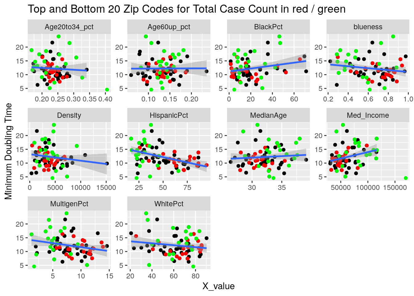
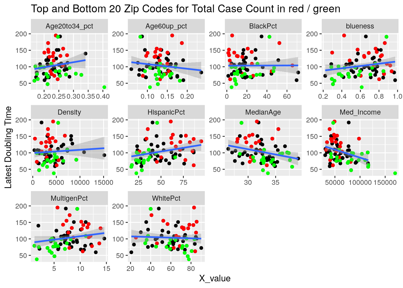
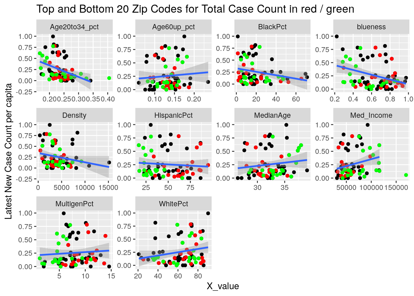
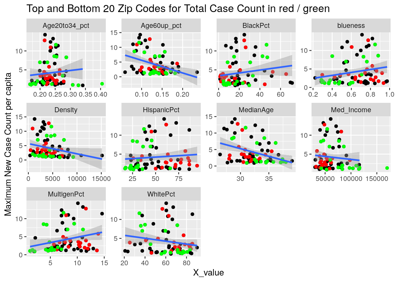
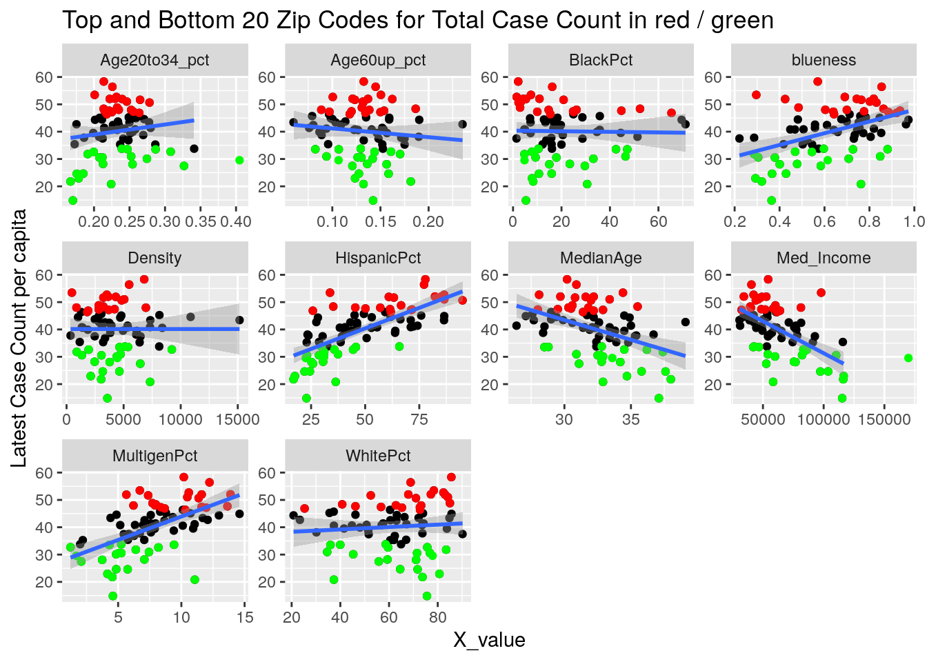
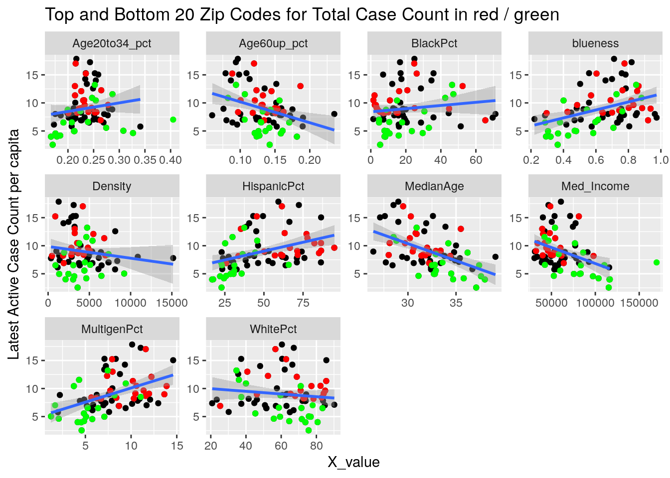
It looks to me like median income is the main driver correlated to covid cases. That and being a Democrat.