Vaccine Reluctance and politics
Vaccine Reluctance
Let’s look at Texas counties and test various factors for correlations to the vaccination rate.
We’ll primarily look at the rate of the first vaccination, since there are a variety of reasons why someone might not get the second dose.
Let’s start with the raw rates of vaccination by county.
Vaccine %>%
mutate(Pct_one_dose=People_one_dose/Pop_total) %>%
ggplot(aes(x=Date, y=Pct_one_dose, color=County)) +
geom_line(show.legend = FALSE) +
labs(x="Date", y="First Dose Percentage", title="Texas counties Vaccine Progress")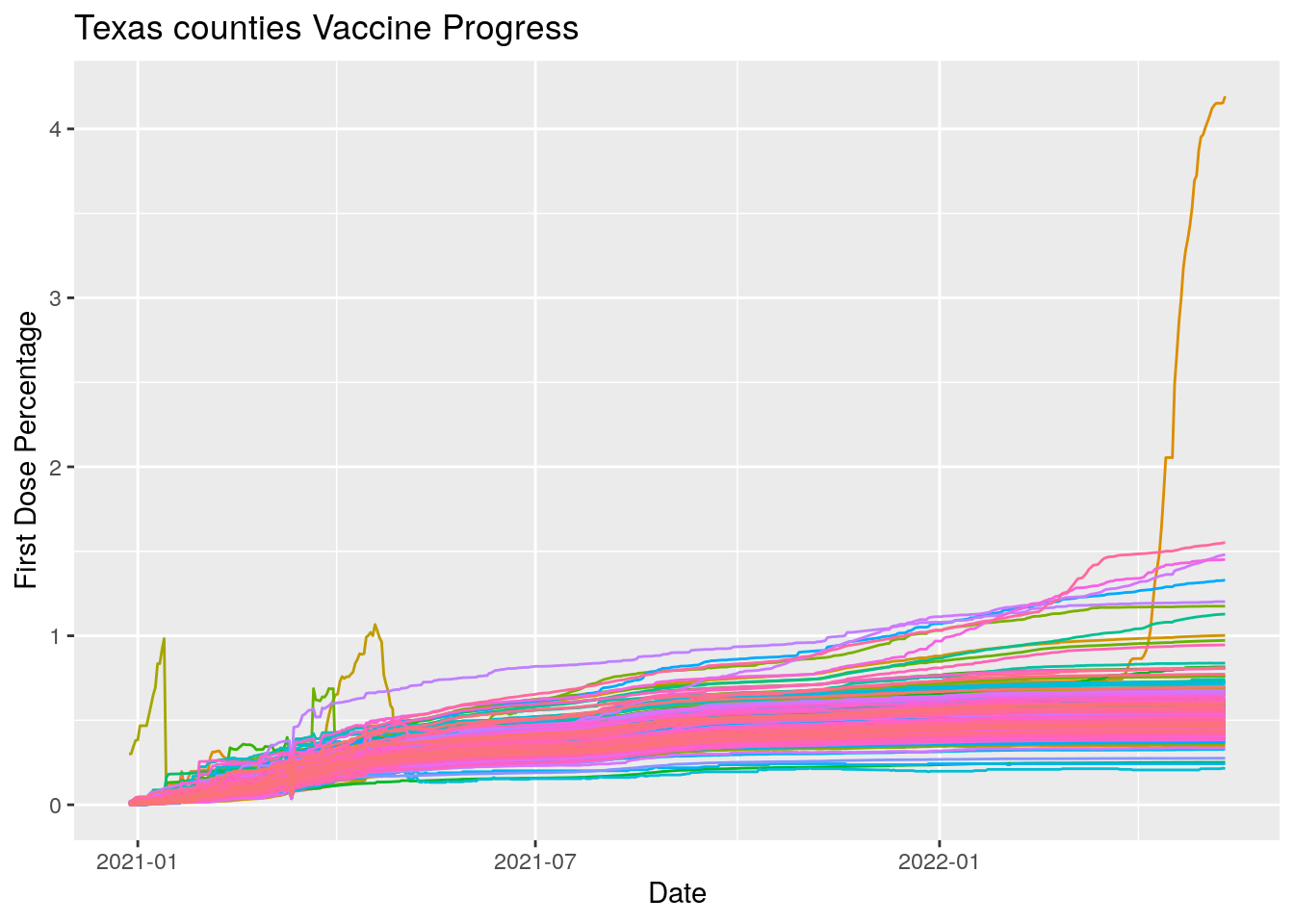 Hmmm… let’s do a little cleanup. We’ll pull out the offenders first and look
at them.
Hmmm… let’s do a little cleanup. We’ll pull out the offenders first and look
at them.
foo <-
Vaccine %>%
  mutate(Pct_one_dose=People_one_dose/Pop_total) %>%
  filter(!is.na(Pct_one_dose)) %>%
  group_by(County) %>%
    mutate(maxdose=max(Pct_one_dose)) %>%
  ungroup() %>%
  select(County, Date, People_one_dose, Pct_one_dose, maxdose) %>%
  filter(maxdose>0.7)

#   Cleanup

#   Set specific errors to na

Vaccine$People_one_dose[(Vaccine$County=="Cochran") &
                      (Vaccine$Date>"2021-02-05")] <- NA
Vaccine$People_one_dose[(Vaccine$County=="Cottle") &
                      (Vaccine$Date>"2020-12-27") &
                      Vaccine$Date<"2021-03-24"] <- NA
Vaccine$People_one_dose[(Vaccine$County=="Edwards") &
                      (Vaccine$Date>"2021-03-13") &
                      Vaccine$Date<"2021-04-01"] <- NA

#   Delete data showing decrease and interpolate to infill

Vaccine <-
  Vaccine %>%
  group_by(County) %>%
    mutate(Daily_dose=People_one_dose-lag(People_one_dose)) %>%
  ungroup()

Vaccine$Daily_dose <- replace_na(Vaccine$Daily_dose, 0)

Vaccine$People_one_dose[Vaccine$Daily_dose<0] <- NA

Vaccine <- Vaccine %>%
    #mutate(Daily_dose=zoo::na.approx(Daily_dose, na.rm=FALSE)) %>%
    #mutate(People_one_dose=zoo::na.approx(People_one_dose, na.rm=FALSE))
    mutate(Daily_dose=imputeTS::na_interpolation(Daily_dose, maxgap=5)) %>%
    mutate(People_one_dose=imputeTS::na_interpolation(People_one_dose, maxgap=5))

#   Replot

Vaccine %>%
  mutate(Pct_one_dose=100*People_one_dose/Pop_total) %>%
  ggplot(aes(x=Date, y=Pct_one_dose, color=County)) +
    geom_line(show.legend = FALSE) +
    labs(x="Date", y="First Dose Percentage", title="Texas counties Vaccine Progress")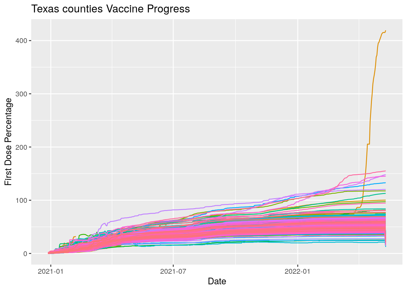
I think that looks better. At least the nonsensical data is gone.
Now let’s look at the distribution.
Vaccine %>%
  #filter(Date=="2021-05-01") %>%
  filter(Date==last(Date)) %>%
  mutate(Pct_one_dose=100*People_one_dose/Pop_total) %>%
  #arrange(Pct_one_dose)
  ggplot(aes(x=Pct_one_dose)) +
    geom_histogram() +
    labs(title="Percent Vaccinated With One Dose By Texas County",
         x="Percent Vaccinated",
         subtitle=paste("As of", today_date))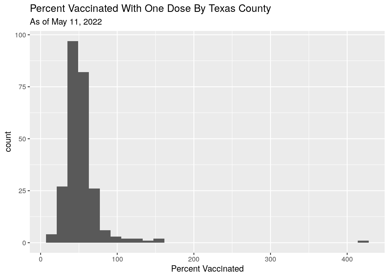
Let’s look at the progress to getting two doses. We’ll plot the number who are late getting a second dose by summing first doses up to 3 weeks ago, and subtracting that from the total fully vaxed.
Vaccine %>%
  mutate(One_dose=if_else((Date<=today()-28), People_one_dose, 0)) %>%
  group_by(County) %>%
    summarise(Full=sum(People_fully, na.rm = TRUE),
              One=sum(One_dose, na.rm = TRUE)) %>%
  ungroup() %>%
  mutate(Missed_pct=-100*(Full-One)/One) %>%
  filter(Missed_pct>0, Missed_pct<100) %>%
  ggplot(aes(x=Missed_pct)) +
  geom_histogram() +
  labs(x="Percent Missing Second Dose",
       y="Number of counties",
       title="Estimated Percent of First Dose Missing Second, by County")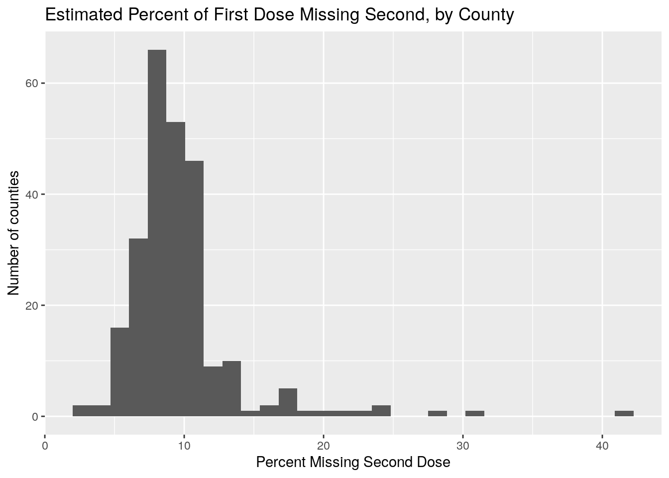
Vaccine %>%
  mutate(One_dose=if_else((Date<=today()-28), People_one_dose, 0)) %>%
  group_by(County) %>%
    summarise(Full=sum(People_fully, na.rm = TRUE),
              One=sum(One_dose, na.rm = TRUE)) %>%
  ungroup() %>%
  mutate(Missed_pct=-100*(Full-One)/One) %>%
  filter(Missed_pct>15, Missed_pct<100)
## # A tibble: 16 × 4
## County Full One Missed_pct
## <chr> <dbl> <dbl> <dbl>
## 1 Crane 542347 716324 24.3
## 2 Dallam 1027469 1307588 21.4
## 3 Dimmit 2283264 3181835 28.2
## 4 Foard 174962 209760. 16.6
## 5 Hartley 891479 1054773 15.5
## 6 Jim Hogg 1013028 1220949 17.0
## 7 King 16489 20710. 20.4
## 8 Loving 11597 15175 23.6
## 9 Martin 596776 717627 16.8
## 10 Maverick 14308841 18632908 23.2
## 11 Moore 3110283 3760094 17.3
## 12 Motley 113568 163073 30.4
## 13 Reeves 2755792 4694902. 41.3
## 14 Sherman 342103 419349 18.4
## 15 Val Verde 10030442 12245956 18.1
## 16 Webb 75659991 91180428. 17.0Let’s take a look at the data by regions
DataArchive <- "/home/ajackson/Dropbox/mirrors/ajackson/SharedData/"
MSA_raw <- readRDS(paste0(DataArchive, "Texas_MSA_Pop_Counties.rds"))

#  Add vaccine to MSA's

MSA <- MSA_raw %>%
  unnest(Counties) %>%
  rename(County=Counties) %>%
  left_join(Vaccine, ., by="County") %>%
  group_by(MSA, Date) %>%
    summarise(People_one_dose=sum(People_one_dose, na.rm = TRUE),
              People_fully=sum(People_fully, na.rm = TRUE),
              Pop_total=sum(Pop_total, na.rm = TRUE),
              Population=unique(Population)) %>%
    mutate(Daily_dose=People_fully-lag(People_fully)) %>%
  ungroup() %>%
  mutate(Pct_fully=100*People_fully/Pop_total)

MSA$med <- zoo::rollmedian(MSA$Pct_fully, 9,
                    fill=c(0, NA, last(MSA$Pct_fully)))

# Pull out top 5 and bottom 5

MSA_extremes <-
  MSA %>%
  group_by(MSA) %>%
    summarize(med=max(med), MSA=unique(MSA)) %>%
    arrange(-med) %>%
  ungroup()


MSA_top <- slice_head(MSA_extremes, n=4)
MSA_bot <- slice_tail(MSA_extremes, n=4)
MSA_topbot <- bind_rows(MSA_top, MSA_bot)

MSA_extremes <- inner_join(MSA, MSA_topbot, by="MSA") %>%
  rename(med=med.x, ordering=med.y) %>%
  arrange(-ordering)

#  MSA$Pct_one_dose[MSA$Daily_dose<0] <- NA
# Plot region progress

MSA %>%
  ggplot(aes(x=Date, y=med, color=MSA)) +
  geom_line(aes(group=MSA),colour = alpha("grey", 0.7),
            show.legend = FALSE) +
  geom_line(data=MSA_extremes,
            aes(color=fct_reorder(MSA, -ordering))) +
  labs(x="Date",
       y="Percent Fully Vaxed",
       title="MSA regions and Vaccination history",
       subtitle=paste("As of", today_date))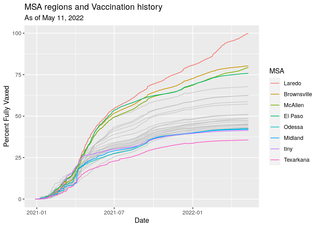
Let’s plot new cases vs. Vaccine status by County
Vaccine_last <- Vaccine %>%
  group_by(County) %>%
    summarise(Vax=last(100*People_fully/Pop_total),
              County=unique(County)) %>%
  ungroup()

Cases_last <- Covid %>%
  group_by(County) %>%
    summarise(New_cases=last(avg_active_cases_percap), County=unique(County)) %>%
  ungroup()

Vax_Cases <- left_join(Cases_last, Vaccine_last, by="County")

Vax_Cases %>%
  ggplot(aes(x=New_cases, y=Vax)) +
  geom_point() +
  geom_smooth(method="lm") +
  scale_x_continuous(trans='log10') +
  labs(x="Active Cases per 100,000",
       y="Percent Vaccinated",
       title="Active Cases vs. Percent Vaccinated by County in Texas",
       subtitle=paste("As of", today_date))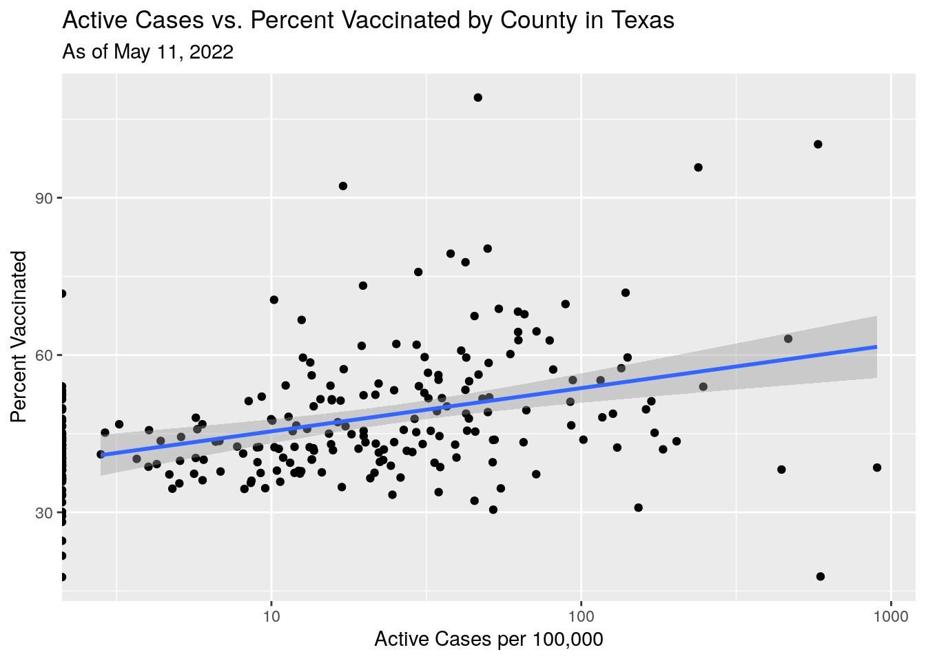
Hmmm…. that doesn’t make sense. Slightly more cases where there are more people vaccinated?
Let’s try something different. Let’s look at the positive case rate only in the unvaccinated cohort.
Vaccine_last <- Vaccine %>%
group_by(County) %>%
summarise(Vax=last(People_fully),
Pop=last(Pop_total),
County=unique(County)) %>%
ungroup()
Cases_last <- Covid %>%
group_by(County) %>%
arrange(Date) %>%
summarise(Active=last(active_cases),
County=unique(County)) %>%
ungroup()
Vax_Cases <- left_join(Cases_last, Vaccine_last, by="County") %>%
mutate(New_cases=Active*1.e5/(Pop-Vax), Vax_pct=100*Vax/Pop)
Vax_Cases %>%
ggplot(aes(y=New_cases, x=Vax_pct)) +
geom_point() +
geom_smooth(method="lm") +
scale_y_continuous(trans='log10') +
labs(y="Active Cases per 100,000 Un-Vaxxed",
x="Percent Vaccinated",
title="Active Cases vs. Percent Vaccinated by County in Texas",
subtitle=paste("As of", today_date))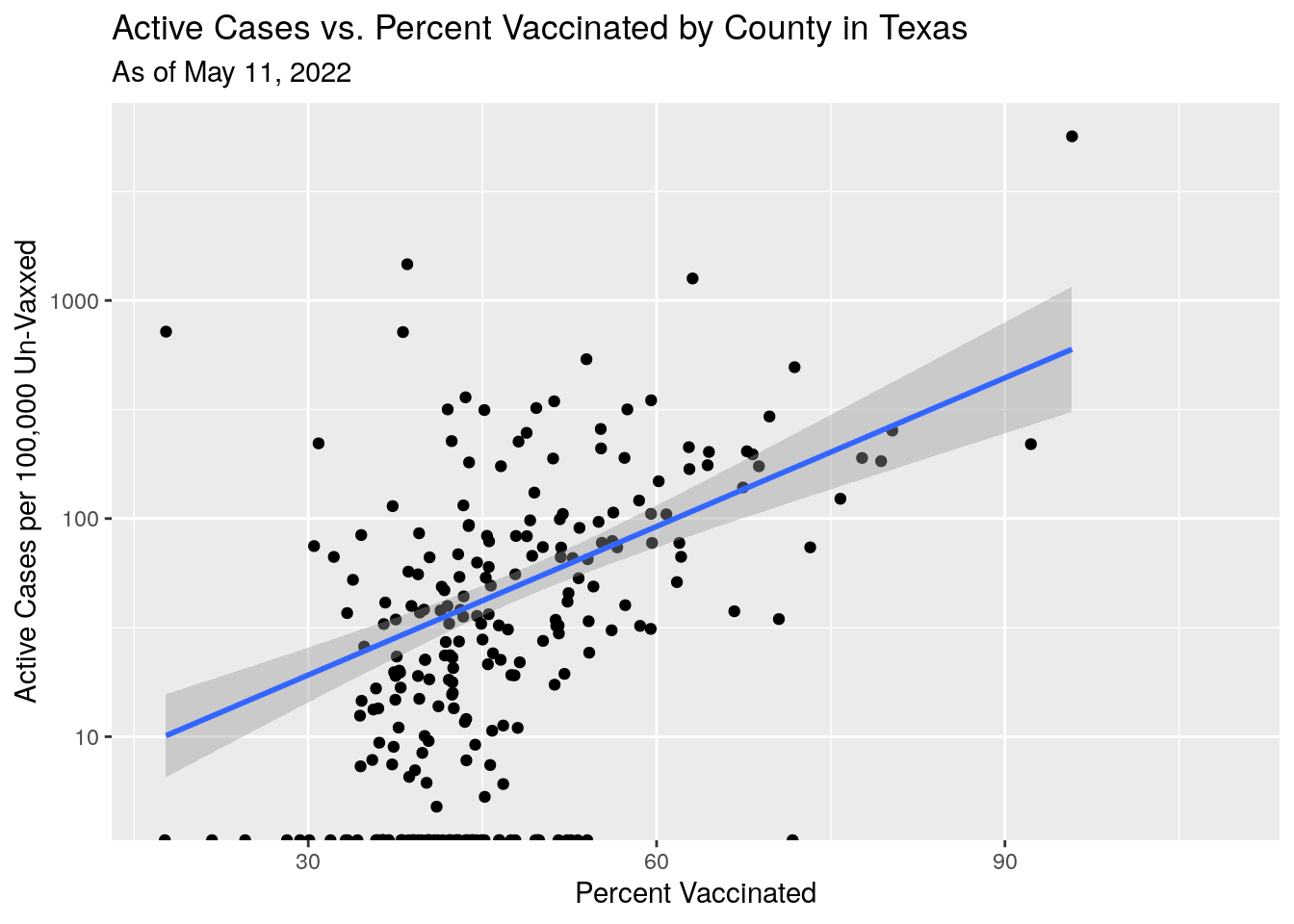 Still doesn’t make sense. Maybe the individual county stats are too noisy -
small rural counties imply small numbers imply noisy data.
Still doesn’t make sense. Maybe the individual county stats are too noisy -
small rural counties imply small numbers imply noisy data.
Let’s combine counties into MSA’s to get better behaved statistics.
MSA_case <- MSA_raw %>%
  unnest(Counties) %>%
  rename(County=Counties) %>%
  left_join(Covid, ., by="County") %>%
  group_by(MSA, Date) %>%
    summarise(Cases=sum(Cases, na.rm = TRUE),
              New_cases=sum(new_cases, na.rm = TRUE),
              Deaths=sum(Deaths, na.rm = TRUE),
              New_Deaths=sum(new_deaths, na.rm = TRUE),
              Active=sum(active_cases, na.rm = TRUE),
              new_tests=sum(new_tests, na.rm=TRUE)
              ) %>%
  ungroup()

MSA_final <-
MSA_case %>%
  group_by(MSA) %>%
    slice(tail(row_number(),21)) %>%
    summarize(avg=mean(New_cases, na.rm=TRUE),
              New_Deaths=mean(New_Deaths, na.rm=TRUE),
              new_tests=mean(new_tests, na.rm=TRUE)) %>%
  ungroup()

MSA_vax <-
  MSA %>%
  group_by(MSA) %>%
    slice(tail(row_number(),21)) %>%
    summarize(Fully=mean(People_fully, na.rm=TRUE),
              Pop=last(Pop_total),
              Tot_Pop=last(Population)) %>%
  ungroup()


MSA_all <- left_join(MSA_final, MSA_vax, by="MSA") %>%
  mutate(UnvaxCase=avg*1.e5/(Pop-Fully),
         Vax_pct=100*Fully/Pop,
         Cases_per_100k=1.0e5*avg/Tot_Pop,
         Cases_per_unvax=1.0e5*avg/(Tot_Pop-Fully),
         Percap_tests=new_tests*1.0e5/Tot_Pop,
         Percap_deaths_unvax=New_Deaths*1.0e5/(Tot_Pop-Fully)
         )

#           Tests vs vax
p1 <- MSA_all %>%
  #filter(Cases_per_100k<10) %>%
  ggplot(aes(y=Percap_tests, x=Vax_pct)) +
  geom_point() +
  geom_smooth(method="lm") +
  labs(y="Tests per 100,000",
       x="Percent Vaccinated",
       title="Avg Covid Tests vs. Percent Vaccinated by Metro Area in Texas",
       subtitle=paste("As of", today_date))

#         Cases vs Vaxed
p2 <- MSA_all %>%
  #filter(Cases_per_100k<10) %>%
  ggplot(aes(y=Cases_per_100k, x=Vax_pct)) +
  geom_point() +
  geom_smooth(method="lm") +
  labs(y="Avg Cases per 100,000",
       x="Percent Vaccinated",
       title="Avg Covid Cases vs. Percent Vaccinated by Metro Area in Texas",
       subtitle=paste("As of", today_date))

#         Deaths vs Vaxed
p3 <- MSA_all %>%
  #filter(Cases_per_100k<10) %>%
  ggplot(aes(y=Percap_deaths_unvax, x=Vax_pct)) +
  geom_point() +
  geom_smooth(method="lm") +
  labs(y="Deaths per 100,000 Unvaxed",
       x="Percent Vaccinated",
       title="Avg Covid Deaths vs. Percent Vaccinated by Metro Area in Texas",
       subtitle=paste("As of", today_date))

#         Deaths vs Tests
p4 <- MSA_all %>%
  #filter(Cases_per_100k<10) %>%
  ggplot(aes(y=Percap_deaths_unvax, x=Percap_tests)) +
  geom_point() +
  geom_smooth(method="lm") +
  labs(y="Deaths per 100,000 Unvaxed",
       x="Tests per 100,000",
       title="Avg Covid Deaths vs. Covid Tests by Metro Area in Texas",
       subtitle=paste("As of", today_date))

print(p1)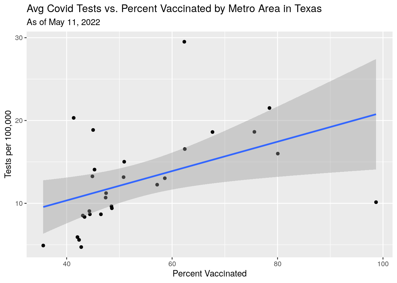
print(p2)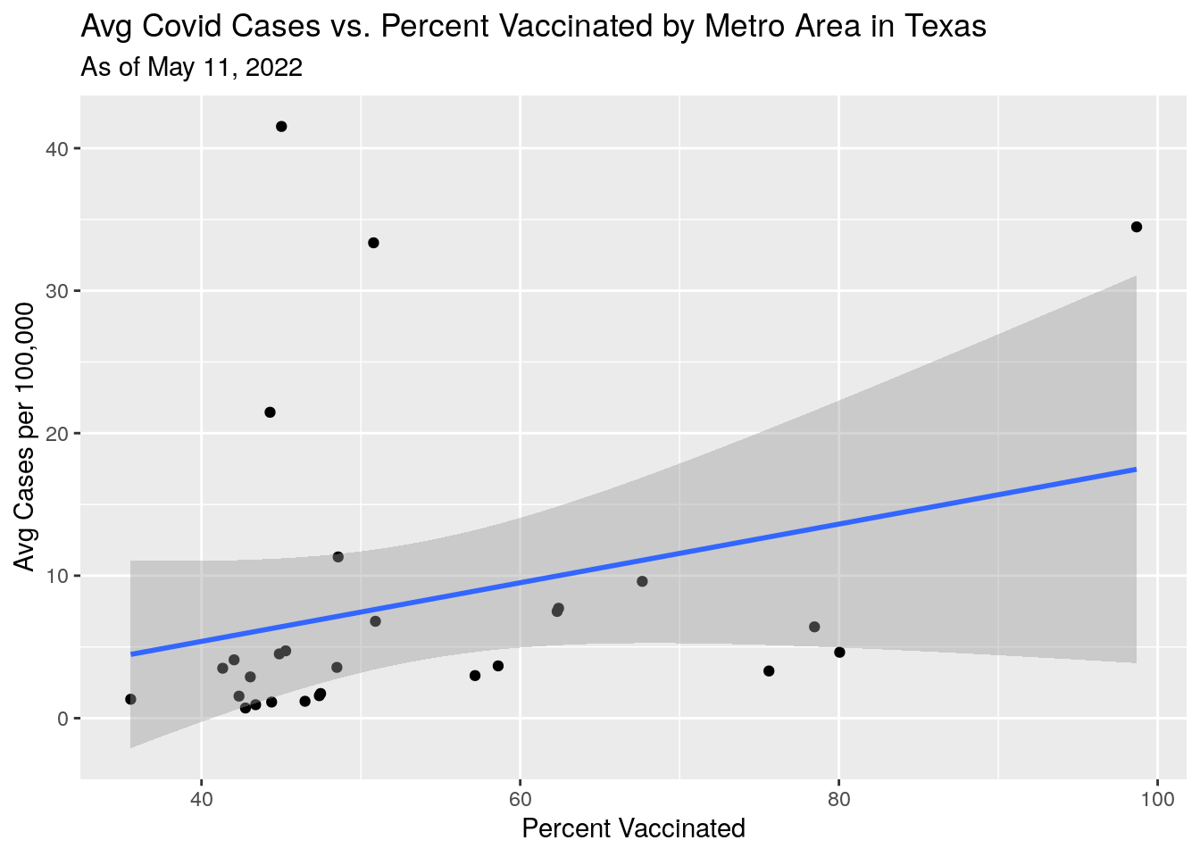
print(p3)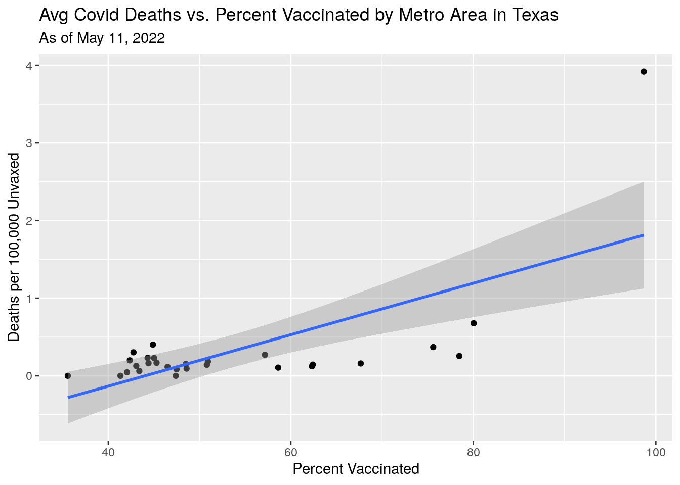
print(p4)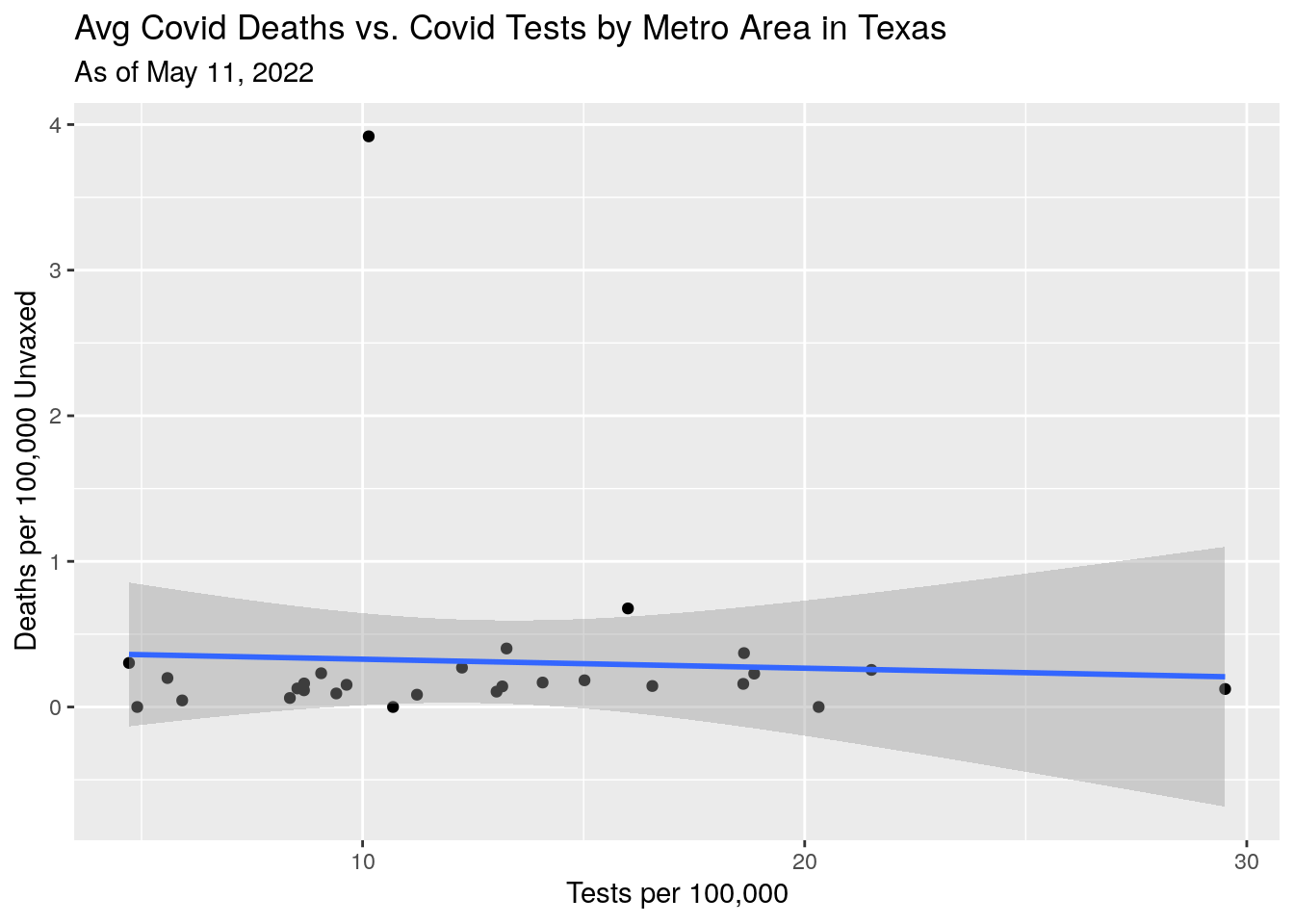
#grid.arrange(p1,p2,p3,p4)Well, still a bit mysterious. Fewer tests in lower vaxed counties - is that test reluctance or fewer people with symptoms?
Deaths also not making sense - though deaths are a lagging indicator, and I’m not sure how well they tag deaths back to the county of residence. Do the deaths counted in the county where they were hospitalized and died?
Now let’s try to predict the final vaccination rates based on fitting a logistic function to the percentages.
#---------------------------------------------------
#------------------- Fit Logistic function ---------
#---------------------------------------------------
fit_logistic <- function(indep="med", # independent variable
                         df=MSA,
                         MSA=MSA,
                         r=0.24,
                         output=c("fit", "asym"),
                         projection=10){

  #print(paste(":::::::  logistic", MSA))

  df$Days <- as.integer(df$Date - ymd("2020-12-28"))

  Asym <- max(df$med)*5
  xmid <- max(df$Days)*2
  scal <- 1/r
  my_formula <- as.formula(paste0(indep, " ~ SSlogis(Days, Asym, xmid, scal)"))

  #print("----1----")

  ## using a selfStart model

    logistic_model <- NULL
    try(logistic_model <- nls(my_formula,
                              data=df)); # does not stop in the case of error

    if(is.null(logistic_model)) {
       case_params <<- list(K=NA,
                            r=NA,
                            xmid=NA,
                            xmid_se=NA)
      return()
    }

  #print("----2----")
  #print(logistic_model)
  coeffs <- coef(logistic_model)
  xmid_sigma <- 2*summary(logistic_model)$parameters[2,2] # 2 sigma
  #print("----3----")
  #print(coeffs)
  #print(summary(logistic_model))

  Cases <- predict(logistic_model, data.frame(Days=df$Days))
  if (output=="fit"){ return(Cases) }
  else {return(coeffs)}
} ###############   end of fit_logistic

#   Let's try fitting a Logistic to each region as a way to really smooth
# the curves

eraseme <-
MSA %>%
  mutate(Days=as.integer(Date - ymd("2020-12-28"))) %>%
  select(MSA, Days, med, Date) %>%
  complete(nesting(MSA), Days=seq(min(Days), max(Days), 1L)) %>%
  nest(-MSA) %>%
    mutate(fit=map(data, ~ fit_logistic(df=., MSA=MSA, output="fit"))) %>%
  unnest(data,fit)

eraseme %>%
  ggplot(aes(x=Date, color=MSA)) +
  geom_line(aes(group=MSA, y=fit),colour = alpha("grey", 0.7),
            show.legend = FALSE) +
  geom_point(aes(y=med)) +
  labs(x="Date",
       y="Percent Vaxed",
       title="MSA regions and Vaccination history",
       subtitle=paste("As of", today_date))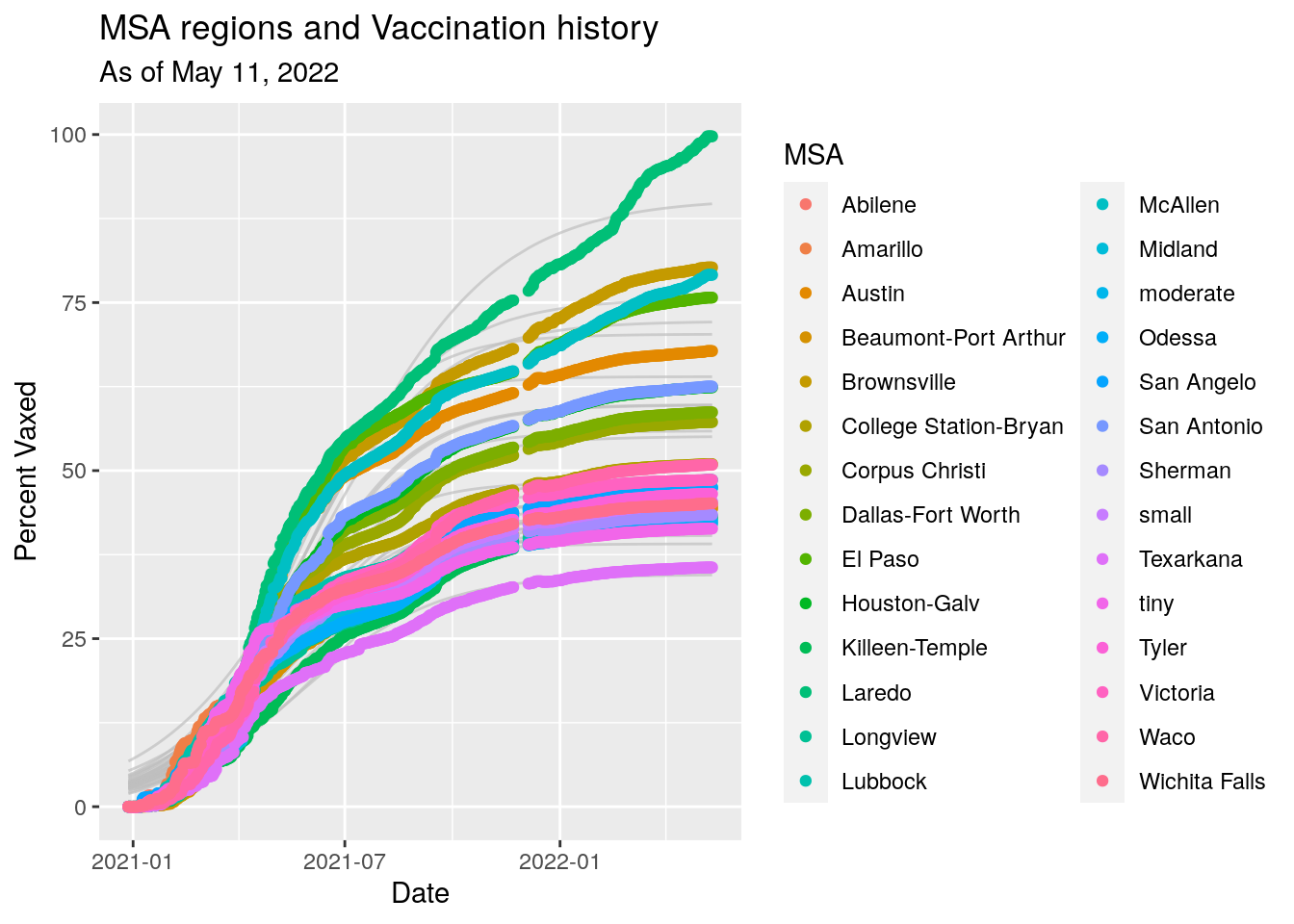
asymptotes <-
MSA %>%
  mutate(Days=as.integer(Date - ymd("2020-12-28"))) %>%
  select(MSA, Days, med, Date) %>%
  complete(nesting(MSA), Days=seq(min(Days), max(Days), 1L)) %>%
  nest(-MSA) %>%
    mutate(Coeffs = map(data, ~ fit_logistic(df=.,
                                                MSA=MSA,
                                                output="asym"))) %>%
  unnest_wider(Coeffs)

asymptotes <- asymptotes %>%
  select(MSA, Asym, xmid, scal) %>%
  left_join(., MSA, by="MSA") %>%
  select(MSA, Asym, xmid, scal, Population, Pop_total) %>%
  group_by(MSA) %>%
    filter(row_number()==n()) %>%
  ungroup() %>%
  mutate(midDate=xmid + ymd("2020-12-28"))

asymptotes %>%
  arrange(-Asym) %>%
  select(MSA, Asym, Pop_total) %>%
  mutate(Asym=Asym/100) %>%
  gt() %>%
  tab_header(title="Texas Regions: Logistic Fit Asymptotes",
             subtitle="Expected final percent vaccinated") %>%
  fmt_percent(columns=2, decimals=1) %>%
  fmt_number(columns=3, decimals=0) %>%
  cols_label(MSA= md("**Metro Stat Area**"),
             Asym= md("**Asymptote**"),
Pop_total= md("**Eligible (12+) Population**"))| Texas Regions: Logistic Fit Asymptotes | ||
|---|---|---|
| Expected final percent vaccinated | ||
| Metro Stat Area | Asymptote | Eligible (12+) Population |
| Laredo | 90.5% | 276,652 |
| Brownsville | 75.6% | 423,163 |
| McAllen | 72.2% | 868,707 |
| El Paso | 70.3% | 844,124 |
| Austin | 64.0% | 2,227,083 |
| San Antonio | 59.8% | 2,550,960 |
| Houston-Galv | 59.8% | 7,066,141 |
| Dallas-Fort Worth | 55.9% | 7,643,907 |
| Corpus Christi | 55.1% | 452,534 |
| Waco | 49.3% | 273,920 |
| College Station-Bryan | 48.3% | 264,728 |
| Victoria | 47.1% | 99,742 |
| moderate | 46.3% | 1,819,676 |
| San Angelo | 46.0% | 120,736 |
| Lubbock | 45.5% | 322,257 |
| Tyler | 44.8% | 232,751 |
| Abilene | 43.4% | 172,060 |
| small | 43.3% | 1,140,033 |
| Wichita Falls | 43.3% | 151,254 |
| Amarillo | 43.2% | 265,053 |
| Beaumont-Port Arthur | 43.1% | 406,158 |
| Killeen-Temple | 42.0% | 460,303 |
| Longview | 41.7% | 220,104 |
| Sherman | 41.5% | 136,212 |
| Odessa | 41.0% | 166,223 |
| Midland | 40.4% | 182,603 |
| tiny | 39.1% | 115,552 |
| Texarkana | 34.6% | 93,245 |
asymptotes %>%
  arrange(-Asym) %>%
  select(MSA, Asym, Pop_total) %>%
  mutate(Asym=Asym/100) %>%
  mutate(vaxed=Asym*Pop_total) %>%
  summarize(allvaxed=sum(vaxed), allpop=sum(Pop_total))
## # A tibble: 1 × 2
## allvaxed allpop
## <dbl> <dbl>
## 1 16429594. 28995881Rather depressing. Good looking fits, implying that unless something changes, many counties will get no where near herd immunity levels. It looks like a surge of Delta cases waiting to happen.
Let’s look at vaccine vs vote
Votes <- Votes %>%
  mutate(County=str_to_title(County))

Votes[Votes$County=='Mcculloch',]$County <- "McCulloch"
Votes[Votes$County=='Mclennan',]$County <- "McLennan"
Votes[Votes$County=='Mcmullen',]$County <- "McMullen"

Vax_vote <- left_join(Votes, Vaccine_last, by="County") %>%
  mutate(Vax_pct=Vax/Pop)

rects <- data.frame(ymin = -Inf,
                    ymax = Inf,
                    xmin = c(-Inf,0.45,0.55),
                    xmax = c(0.45,0.55,Inf),
                    fill = c("red", "magenta", "blue"))
Vax_vote %>%
  ggplot(aes(y=Vax_pct, x=Blueness)) +
  geom_rect(data = rects, aes(xmin = xmin,
                              xmax = xmax,
                              ymin = ymin,
                              ymax = ymax,
                              fill = fill),
            # Control the shading opacity here.
            inherit.aes = FALSE, alpha = 0.15) +
  scale_fill_identity() +
  scale_y_continuous(labels = scales::percent_format(accuracy = 1)) +
  geom_point() +
  geom_smooth(method="lm") +
  geom_text_repel(data=subset(Vax_vote, Vax_pct < 0.30 |
                          Vax_pct > 0.60 |
                          Blueness > 0.55),
            aes(Blueness,Vax_pct,label=County), hjust=0,
                nudge_x=.008) +
  labs(x="Fraction of Vote For Biden",
       y="Percent Vaccinated",
       title="Vaccination Rate per Texas County",
       subtitle=paste("As of", today_date),
       #subtitle=stamp("March 1, 1999")(today()-1),
       caption="Data from https://dshs.texas.gov/coronavirus/AdditionalData.aspx")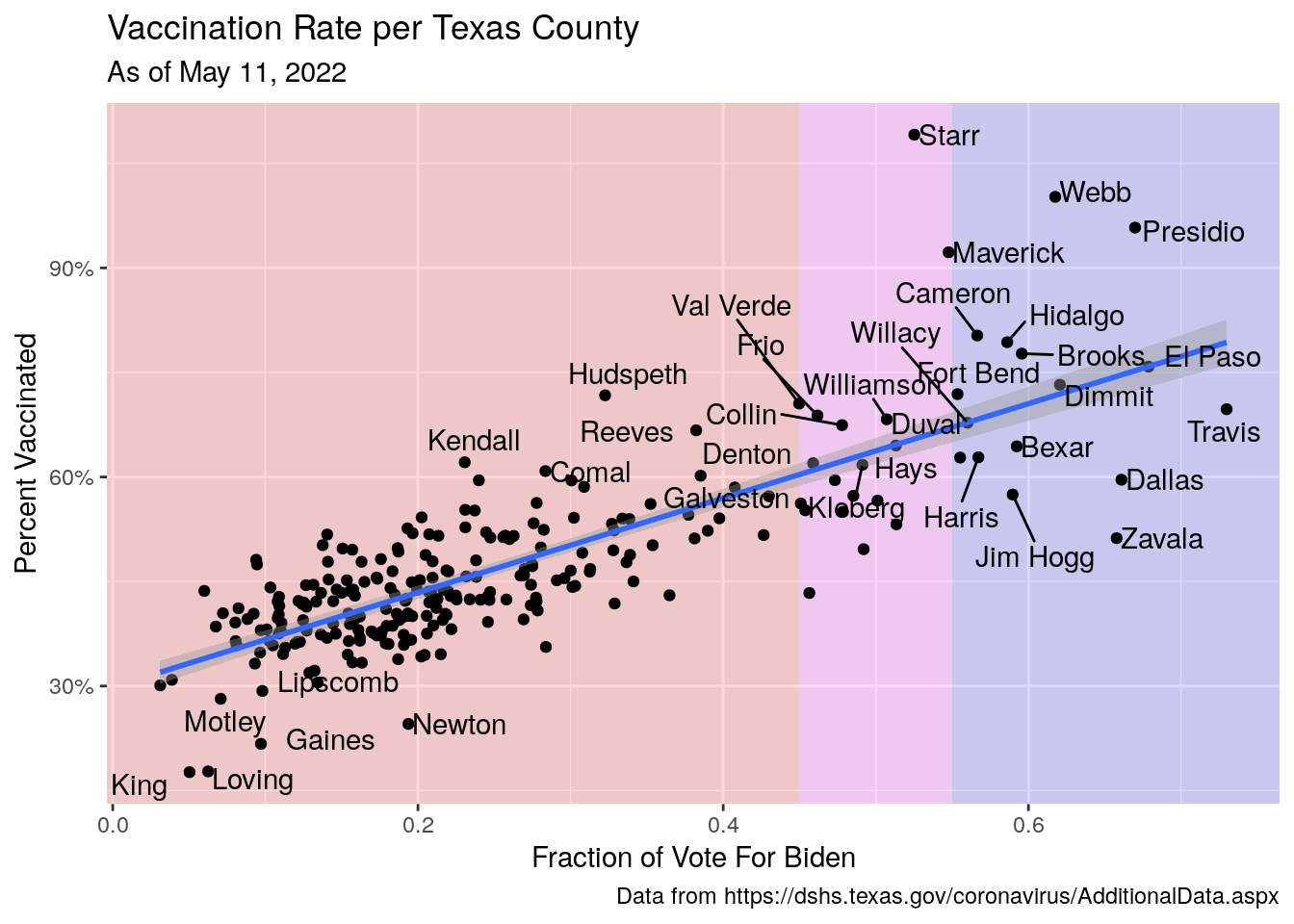
#  geom_text_repel(aes(label=County))

#   Vaccination rates vs demographics

Demographics <- readRDS(paste0(DataDemo, "County_Age_Sex.rds"))

Demo_data <- Demographics %>%
  mutate(Pct_over_65=0.01*(Total_pct_90plus +
                     Total_pct_85to89 +
                     Total_pct_80to84 +
                     Total_pct_75to79 +
                     Total_pct_70to74 +
                     Total_pct_65to69)) %>%
  select(CNTY_NM, FIPS, Pct_over_65)

Vax_vote <- Vax_vote %>%
  left_join(., Demo_data, by=c("County"="CNTY_NM"))

Vax_vote %>%
  ggplot(aes(y=Vax_pct, x=Pct_over_65)) +
  scale_y_continuous(labels = scales::percent_format(accuracy = 1)) +
  scale_x_continuous(labels = scales::percent_format(accuracy = 1)) +
  geom_point() +
  geom_smooth(method="lm") +
  geom_text_repel(data=subset(Vax_vote, Vax_pct < 0.30 |
                          Vax_pct > 0.60 |
                          Blueness > 0.55),
            aes(Pct_over_65,Vax_pct,label=County), hjust=0,
                nudge_x=.008) +
  labs(x="Percent of Population over 65",
       y="Percent Vaccinated",
       title="Vaccination Rate per Texas County",
       subtitle=paste("As of", today_date),
       #subtitle=stamp("March 1, 1999")(today()-1),
       caption="Data from https://dshs.texas.gov/coronavirus/AdditionalData.aspx")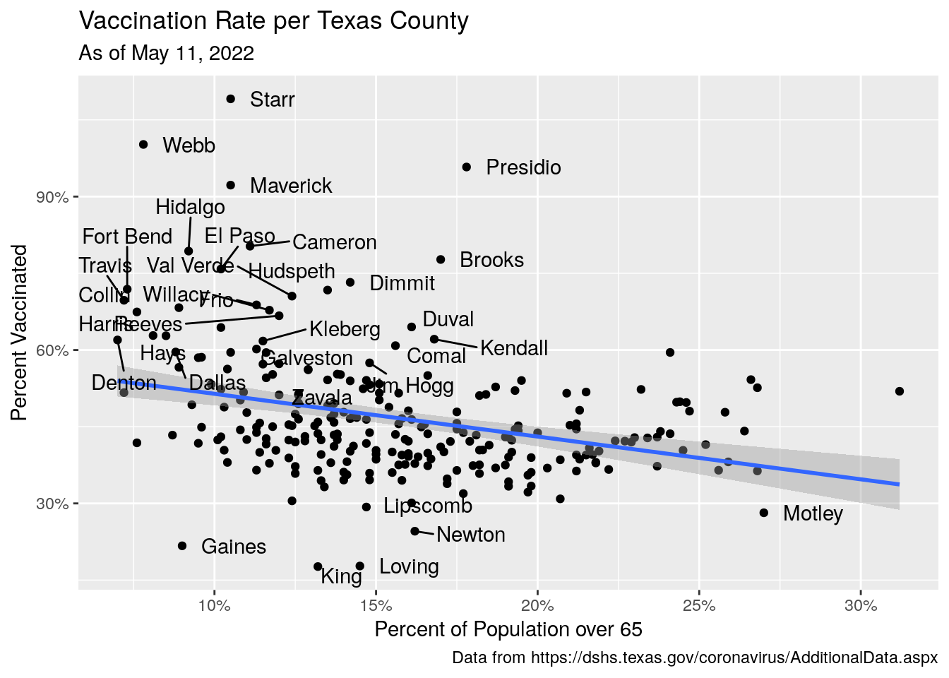
Best correlation I’ve gotten yet. And the saddest. Politicians encouraging people to make bad decisions and die for political gain.
Let’s look at the history of case counts vs. politics in 2-month windows.
#   Shrink data to what will be needed and sum in 2 month window

df <-
Covid %>%
  select(County, Cases, Deaths, Date, Population) %>%
  mutate(End_date=lubridate::ceiling_date(Date, unit="month")-1) %>%
  filter(Date==End_date) %>% # pull out last day of every month
  group_by(County) %>%
    mutate(Monthly_cases=pmax((Cases-lag(Cases, default=0)),0),
           Monthly_deaths=pmax((Deaths-lag(Deaths, default=0)),0)
           ) %>%
  ungroup() %>%
  mutate(bucket = case_when(
    month(Date) < 3  ~ "Jan-Feb",
    month(Date) < 5  ~ "Mar-Apr",
    month(Date) < 7  ~ "May-Jun",
    month(Date) < 9  ~ "Jul-Aug",
    month(Date) < 11 ~ "Sep-Oct",
    month(Date) < 13 ~ "Nov-Dec",
    TRUE             ~ "Unknown"
  )) %>%
  mutate(bucket=ifelse(year(Date)<2021,
                       paste(bucket, "2020"),
                       paste(bucket, "2021"))) %>%
  group_by(County,bucket) %>%
    summarize(Cases=sum(Monthly_cases),
              Deaths=sum(Monthly_deaths),
              Population=unique(Population)) %>%
  ungroup()
## `summarise()` has grouped output by 'County'. You can override using the
## `.groups` argument.df$bucket <- factor(df$bucket, levels=c("Jan-Feb 2020", "Mar-Apr 2020",
"May-Jun 2020", "Jul-Aug 2020",
"Sep-Oct 2020", "Nov-Dec 2020",
"Jan-Feb 2021", "Mar-Apr 2021",
"May-Jun 2021", "Jul-Aug 2021",
"Sep-Oct 2021", "Nov-Dec 2021",
"Unknown 2021"))
# Add in votes
df <- left_join(df, Votes, by="County")
# plots
df %>%
mutate(Cases_per_cap=1.e5*Cases/Population) %>%
ggplot(aes(x=Blueness, y=Cases_per_cap)) +
geom_point() +
geom_smooth(method="lm") +
scale_y_continuous(trans='log10') +
facet_wrap(vars(bucket), scales="free_y") +
labs(x="Fraction In County Voting for Biden",
y="Cases per 100,000",
title="Covid Cases by Texas County in Two Month Intervals",
subtitle=paste("As of", today_date))## Warning: Transformation introduced infinite values in continuous y-axis
## Transformation introduced infinite values in continuous y-axis## `geom_smooth()` using formula 'y ~ x'## Warning: Removed 46 rows containing non-finite values (stat_smooth).## Warning: Removed 22 rows containing missing values (geom_point).
df %>%
  mutate(Cases_per_cap=1.e5*Deaths/Population) %>%
  ggplot(aes(x=Blueness, y=Cases_per_cap)) +
  geom_point() +
  geom_smooth(method="lm") +
  scale_y_continuous(trans='log10') +
  facet_wrap(vars(bucket), scales="free_y") +
  labs(x="Fraction In County Voting for Biden",
       y="Deaths per 100,000",
       title="Covid Deaths by Texas County in Two Month Intervals",
       subtitle=paste("As of", today_date))
## Warning: Transformation introduced infinite values in continuous y-axis## Warning: Transformation introduced infinite values in continuous y-axis## `geom_smooth()` using formula 'y ~ x'## Warning: Removed 521 rows containing non-finite values (stat_smooth).## Warning: Removed 22 rows containing missing values (geom_point).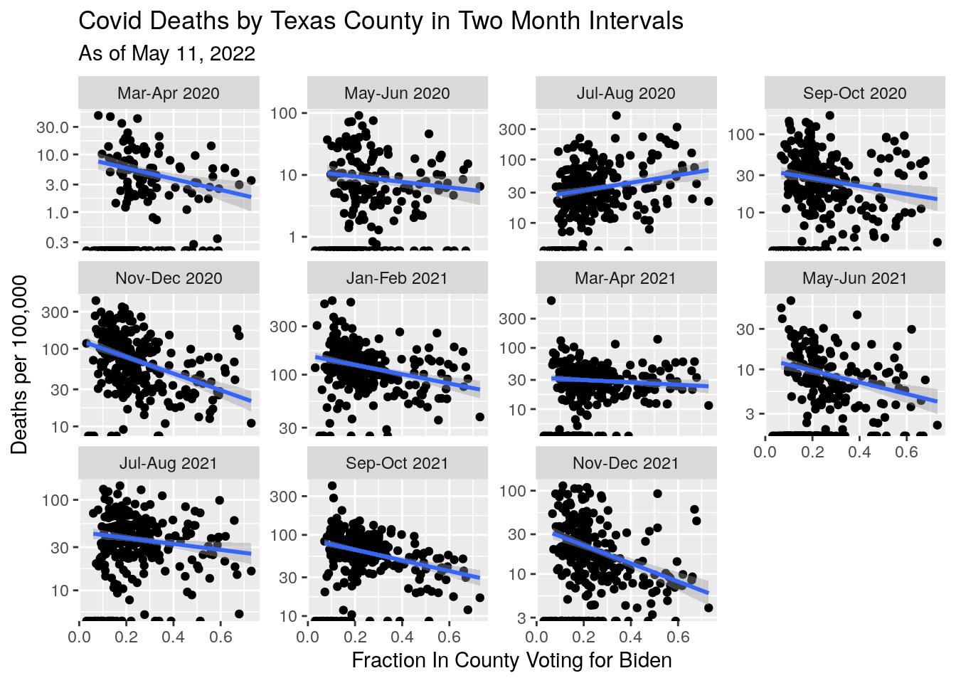
#    What is case vs death rates for various counties?

df %>%
  mutate(Cases_per_cap=Deaths/Cases) %>%
  ggplot(aes(x=Blueness, y=Cases_per_cap)) +
  geom_point() +
  geom_smooth(method="lm") +
  scale_y_continuous(trans='log10') +
  facet_wrap(vars(bucket), scales="free_y") +
  labs(x="Fraction In County Voting for Biden",
       y="Deaths per Case",
       title="Covid Deaths per Case by Texas County in Two Month Intervals",
       subtitle=paste("As of", today_date))
## Warning: Transformation introduced infinite values in continuous y-axis## Warning: Transformation introduced infinite values in continuous y-axis## `geom_smooth()` using formula 'y ~ x'## Warning: Removed 523 rows containing non-finite values (stat_smooth).## Warning: Removed 44 rows containing missing values (geom_point).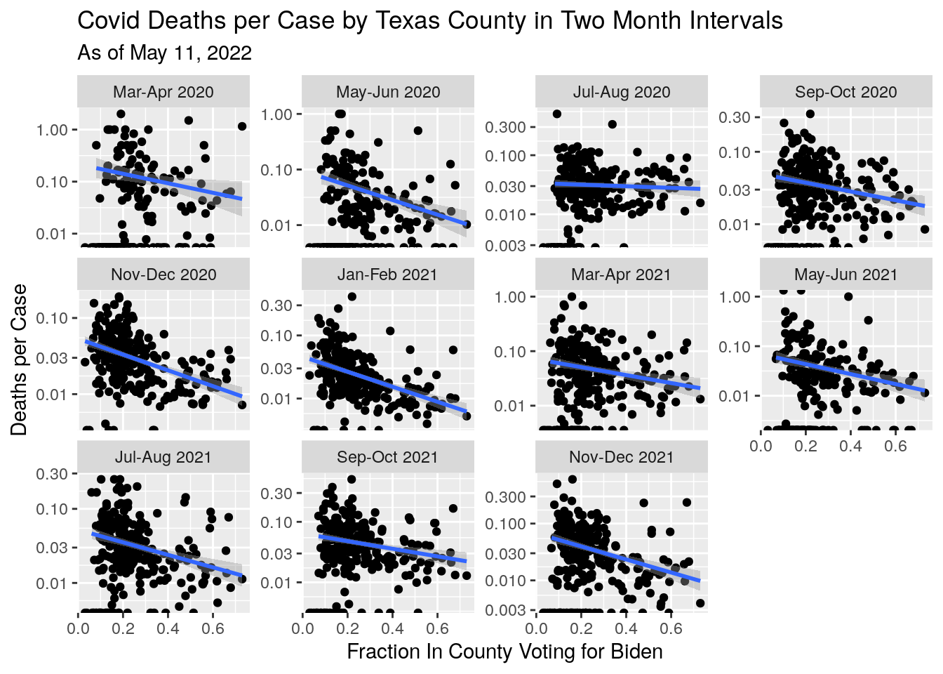 It does look like supporting Trump has amounted to a death sentence for many.
Let’s bring in the hospitalization data and add that into the mix
#   First Trauma Service Areas since that is how the hospital data is set

inpath <- "/home/ajackson/Dropbox/Rprojects/Curated_Data_Files/Texas_Trauma_Service_Areas/"

TSA <- readRDS(paste0(inpath, "Trauma_Service_Areas.rds"))

#   Read in hospitalization data

inpath <- "/home/ajackson/Dropbox/Rprojects/CovidTempData/DailyBackups/"

Hospital <- readRDS(paste0(inpath,"2022-03-21_Hospital.rds"))

Last_date <- last(Hospital$Date)

#   Attach TSA to Vaccine and Case files, then summarize by TSA

Vax_TSA <- Vaccine %>%
  select(County, Date, People_fully, Pop_teen, Pop_total) %>%
  left_join(., TSA, by="County") %>%
  rename(TSA_Area = Area_name) %>%
  group_by(TSA_Area, Date) %>%
    summarise(People_fully=sum(People_fully, na.rm=TRUE),
              Pop_teen=sum(Pop_teen, na.rm = TRUE),
              Pop_total=sum(Pop_total, na.rm=TRUE)) %>%
  left_join(., Hospital, by=c("TSA_Area", "Date")) %>%
  select(-TSA_ID) %>%
  filter(Date<=Last_date)
## `summarise()` has grouped output by 'TSA_Area'. You can override using the
## `.groups` argument.# Now add in votes
Votes[Votes$County=='Dewitt',]$County <- "DeWitt"
Votes_TSA <- Votes %>%
left_join(., TSA, by="County") %>%
rename(TSA_Area = Area_name) %>%
group_by(TSA_Area) %>%
summarize(Biden=sum(Biden, na.rm=TRUE),
Trump=sum(Trump, na.rm=TRUE)) %>%
mutate(Blueness=Biden/(Trump+Biden))
Vax_TSA <- Vax_TSA %>%
left_join(., Votes_TSA, by="TSA_Area")
# Most recent values
Vax_TSA_now <- Vax_TSA %>%
mutate(Hospitalized=as.numeric(Hospitalized)) %>%
filter(Date==Last_date) %>%
mutate(Vax_pct=People_fully/Pop_total) %>%
mutate(Hosp_percap=1.e5*Hospitalized/Pop_total)
# Now plot like crazy
# Vax rate vs. vote
Vax_TSA_now %>%
ggplot(aes(y=Vax_pct, x=Blueness)) +
geom_rect(data = rects, aes(xmin = xmin,
xmax = xmax,
ymin = ymin,
ymax = ymax,
fill = fill),
# Control the shading opacity here.
inherit.aes = FALSE, alpha = 0.15) +
scale_fill_identity() +
scale_y_continuous(labels = scales::percent_format(accuracy = 1)) +
geom_point() +
geom_smooth(method="lm") +
geom_text_repel(data=subset(Vax_TSA_now, Vax_pct < 0.38 |
Vax_pct > 0.65 |
Blueness > 0.55),
aes(Blueness,Vax_pct,label=TSA_Area), hjust=0,
nudge_x=.005) +
labs(x="Fraction of Vote For Biden",
y="Percent Vaccinated",
title="Vaccination Rate per Texas Trauma Service Area",
subtitle=paste("As of", today_date))## `geom_smooth()` using formula 'y ~ x'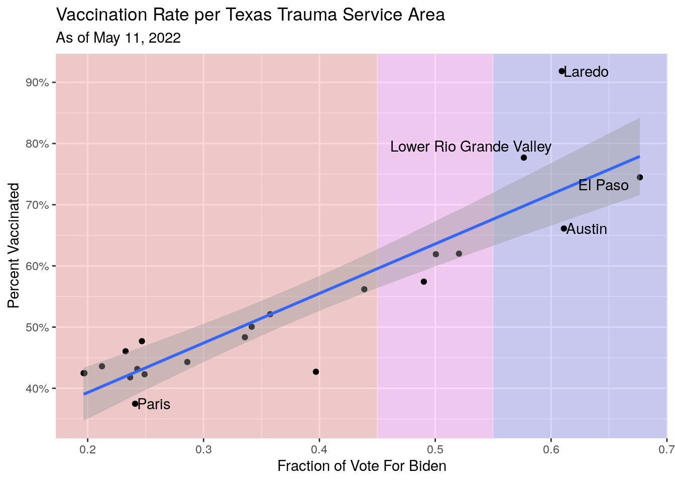
      # subtitle=stamp("March 1, 1999")(Last_date))

#         Hospitalization rate vs. vote

Vax_TSA_now %>%
  ggplot(aes(y=Hosp_percap, x=Blueness)) +
  geom_rect(data = rects, aes(xmin = xmin,
                              xmax = xmax,
                              ymin = ymin,
                              ymax = ymax,
                              fill = fill),
            # Control the shading opacity here.
            inherit.aes = FALSE, alpha = 0.15) +
  scale_fill_identity() +
  #scale_y_continuous(labels = scales::percent_format(accuracy = 1)) +
  geom_point() +
  geom_smooth(method="lm") +
  geom_text_repel(data=subset(Vax_TSA_now, Hosp_percap > 10),
            aes(Blueness,Hosp_percap,label=TSA_Area), hjust=0,
                nudge_x=.005) +
  labs(x="Fraction of Vote For Biden",
       y="Covid Hospitalizations per 100,000",
       title="Covid Hospitalization Rate per Texas Trauma Service Area",
       subtitle=paste("As of", today_date))
## `geom_smooth()` using formula 'y ~ x'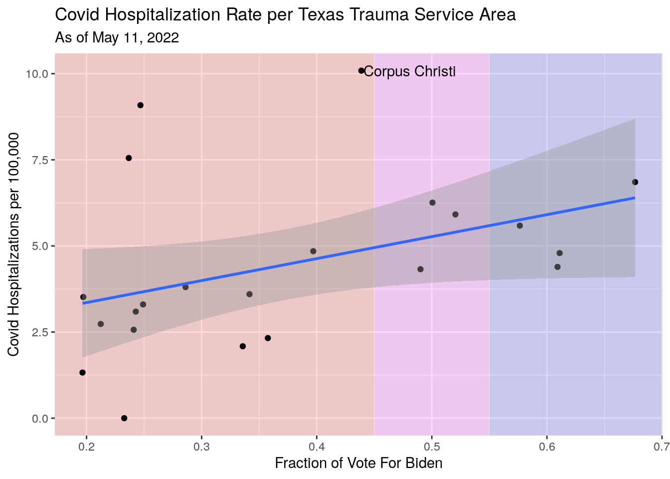
       #subtitle=stamp("March 1, 1999")(Last_date))

#         Hospitalization rate vs. Vaccination Rate

Vax_TSA_now %>%
  ggplot(aes(y=Hosp_percap, x=Vax_pct)) +
  scale_x_continuous(labels = scales::percent_format(accuracy = 1)) +
  geom_point() +
  geom_smooth(method="lm") +
  geom_text_repel(data=subset(Vax_TSA_now, Hosp_percap > 10),
            aes(Vax_pct,Hosp_percap,label=TSA_Area), hjust=0,
                nudge_x=.005) +
  labs(x="Percent Vaccinated",
       y="Covid Hospitalizations per 100,000",
       title="Covid Hospitalization Rate per Texas Trauma Service Area",
       subtitle=paste("As of", today_date))
## `geom_smooth()` using formula 'y ~ x'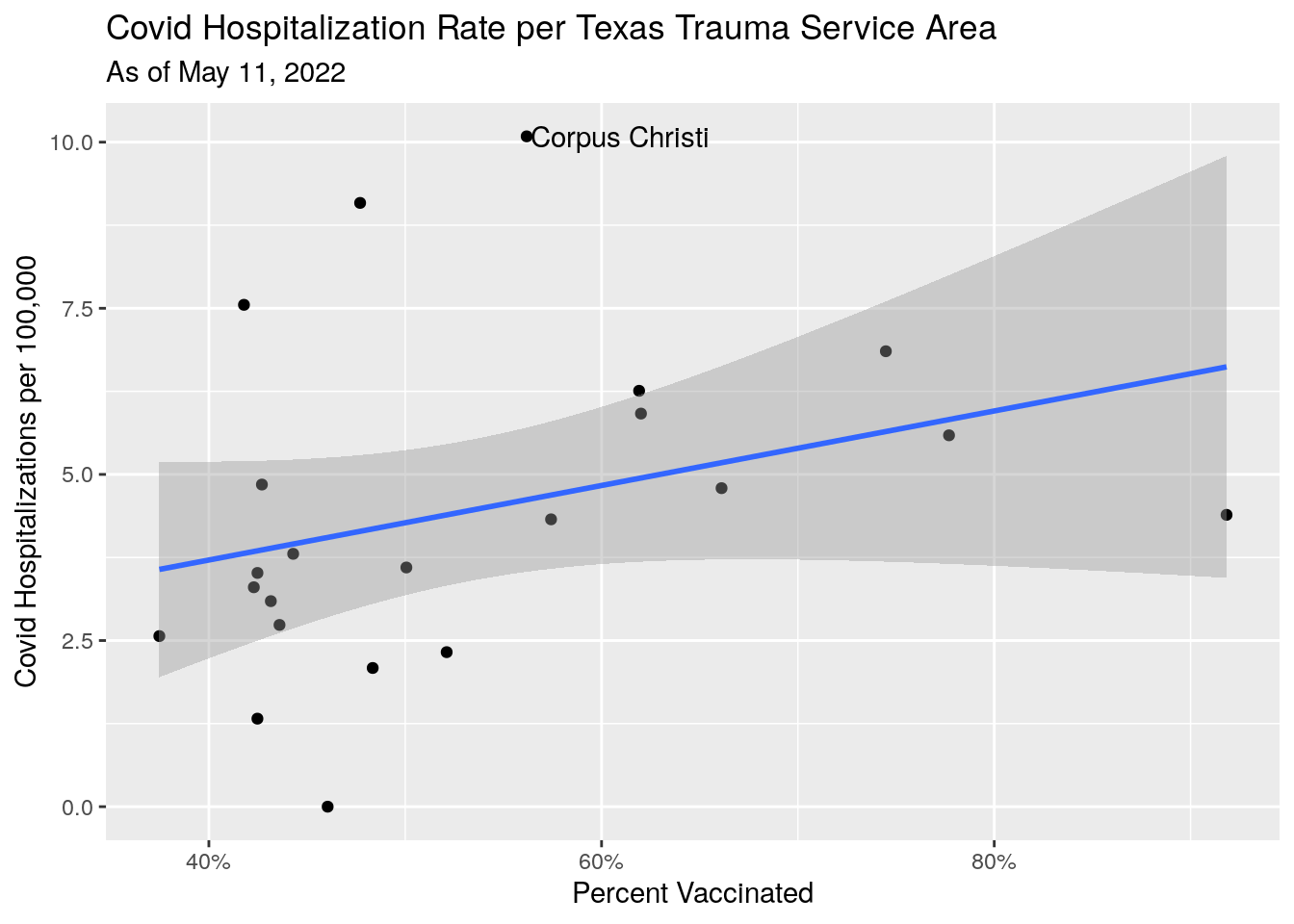
       #subtitle=stamp("March 1, 1999")(Last_date))

#   Plots vs time

Vax_TSA <- Vax_TSA %>%
  mutate(Hospitalized=as.numeric(Hospitalized)) %>%
  mutate(Vax_pct=People_fully/Pop_total) %>%
  mutate(Hosp_percap=1.e5*Hospitalized/Pop_total)

# Pull out top 5 and bottom 5

Vax_TSA_extremes <-
  Vax_TSA %>%
  group_by(TSA_Area) %>%
    summarize(Hosp_percap=last(Hosp_percap), TSA_Area=unique(TSA_Area)) %>%
    arrange(-Hosp_percap) %>%
  ungroup()


TSA_top <- slice_head(Vax_TSA_extremes, n=4)
TSA_bot <- slice_tail(Vax_TSA_extremes, n=4)
TSA_topbot <- bind_rows(TSA_top, TSA_bot)

TSA_extremes <- inner_join(Vax_TSA, TSA_topbot, by="TSA_Area") %>%
  rename(Hosp_percap=Hosp_percap.x, ordering=Hosp_percap.y) %>%
  arrange(-ordering)

# Plot region progress

Vax_TSA %>%
  ggplot(aes(x=Date, y=Hosp_percap, color=TSA_Area)) +
  geom_line(aes(group=TSA_Area),colour = alpha("grey", 0.7),
            show.legend = FALSE) +
  geom_line(data=TSA_extremes,
            aes(color=fct_reorder(TSA_Area, -ordering))) +
  labs(x="Date",
       y="Covid Hospitalizations per 100,000",
       title="Covid Hospitalization Rate per Texas Trauma Service Area",
       subtitle=paste("As of", today_date))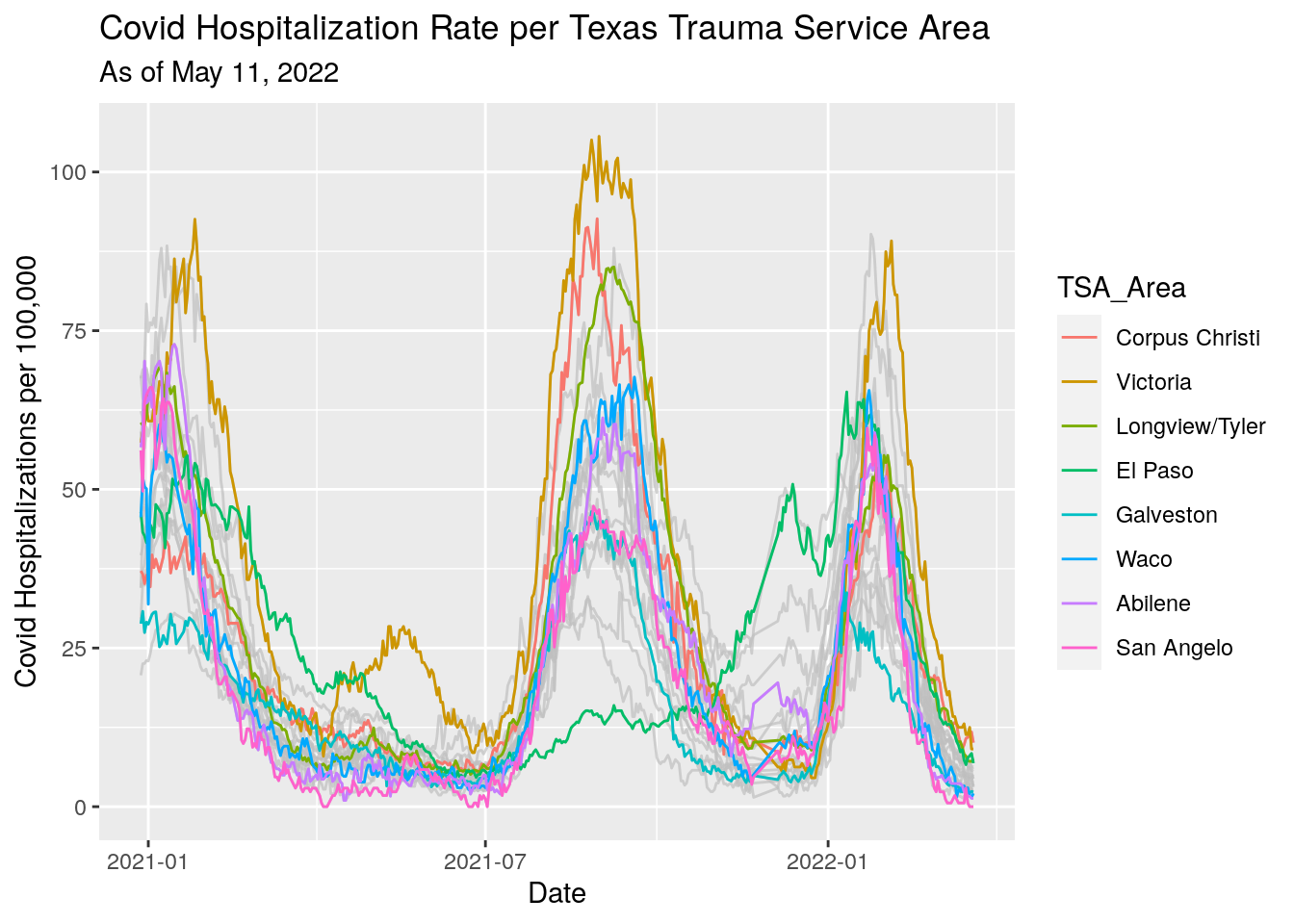
       #subtitle=stamp("March 1, 1999")(Last_date))

#   Vaccination pct vs time by TSA


# Pull out top 5 and bottom 5 by vax

Vax_TSA_extremes <-
  Vax_TSA %>%
  group_by(TSA_Area) %>%
    summarize(Vax_pct=last(Vax_pct), TSA_Area=unique(TSA_Area)) %>%
    arrange(-Vax_pct) %>%
  ungroup()


TSA_top <- slice_head(Vax_TSA_extremes, n=4)
TSA_bot <- slice_tail(Vax_TSA_extremes, n=4)
TSA_topbot <- bind_rows(TSA_top, TSA_bot)

TSA_extremes <- inner_join(Vax_TSA, TSA_topbot, by="TSA_Area") %>%
  rename(Vax_pct=Vax_pct.x, ordering=Vax_pct.y) %>%
  arrange(-ordering)

# Plot region progress

Vax_TSA %>%
  ggplot(aes(x=Date, y=Vax_pct, color=TSA_Area)) +
  geom_line(aes(group=TSA_Area),colour = alpha("grey", 0.7),
            show.legend = FALSE) +
  geom_line(data=TSA_extremes,
            aes(color=fct_reorder(TSA_Area, -ordering))) +
  geom_hline(yintercept=0.50, color="black", size=0.5,
             show.legend = FALSE) +
  labs(x="Date",
       y="Vaccination percentage",
       title="Vaccination Rate Rate per Texas Trauma Service Area",
       subtitle=paste("As of", today_date))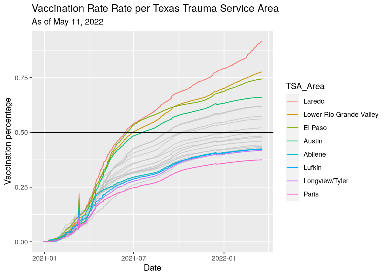
#subtitle=stamp("March 1, 1999")(Last_date)) Clearer picture in these areas. Fewer vaccinations imply more hospitalizations.
Votes for Trump imply more hospitalizations.
Next let’s try out some trajectory plots.
# Pull out top 5 and bottom 5 by hospitalization

Vax_TSA_extremes_hosp <-
  Vax_TSA %>%
  group_by(TSA_Area) %>%
    summarize(Hosp_percap=last(Hosp_percap), TSA_Area=unique(TSA_Area)) %>%
    arrange(-Hosp_percap) %>%
  ungroup()


TSA_top_hosp <- slice_head(Vax_TSA_extremes_hosp, n=4)
TSA_bot_hosp <- slice_tail(Vax_TSA_extremes_hosp, n=4)
TSA_topbot_hosp <- bind_rows(TSA_top_hosp, TSA_bot_hosp)

TSA_extremes_hosp <- inner_join(Vax_TSA, TSA_topbot_hosp, by="TSA_Area") %>%
  rename(Hosp_percap=Hosp_percap.x, ordering=Hosp_percap.y) %>%
  arrange(-ordering)

Vax_TSA %>%
  ggplot(aes(x=Vax_pct,
             y=Hosp_percap,
             color=TSA_Area)) +
  geom_line(aes(group=TSA_Area),colour = alpha("grey", 0.7),
            show.legend = FALSE) +
  geom_line(data=TSA_extremes_hosp,
            aes(color=fct_reorder(TSA_Area, -ordering))) +
  geom_vline(xintercept=0.50, color="black", size=0.5,
             show.legend = FALSE) +
  labs(x="Percent Vaccinated (12+ Population)",
       y="Covid Hospitalizations per 100,000",
       title="Hospitalization/Vaccination Trajectories per Texas Trauma Service Area",
       subtitle=paste("As of", today_date))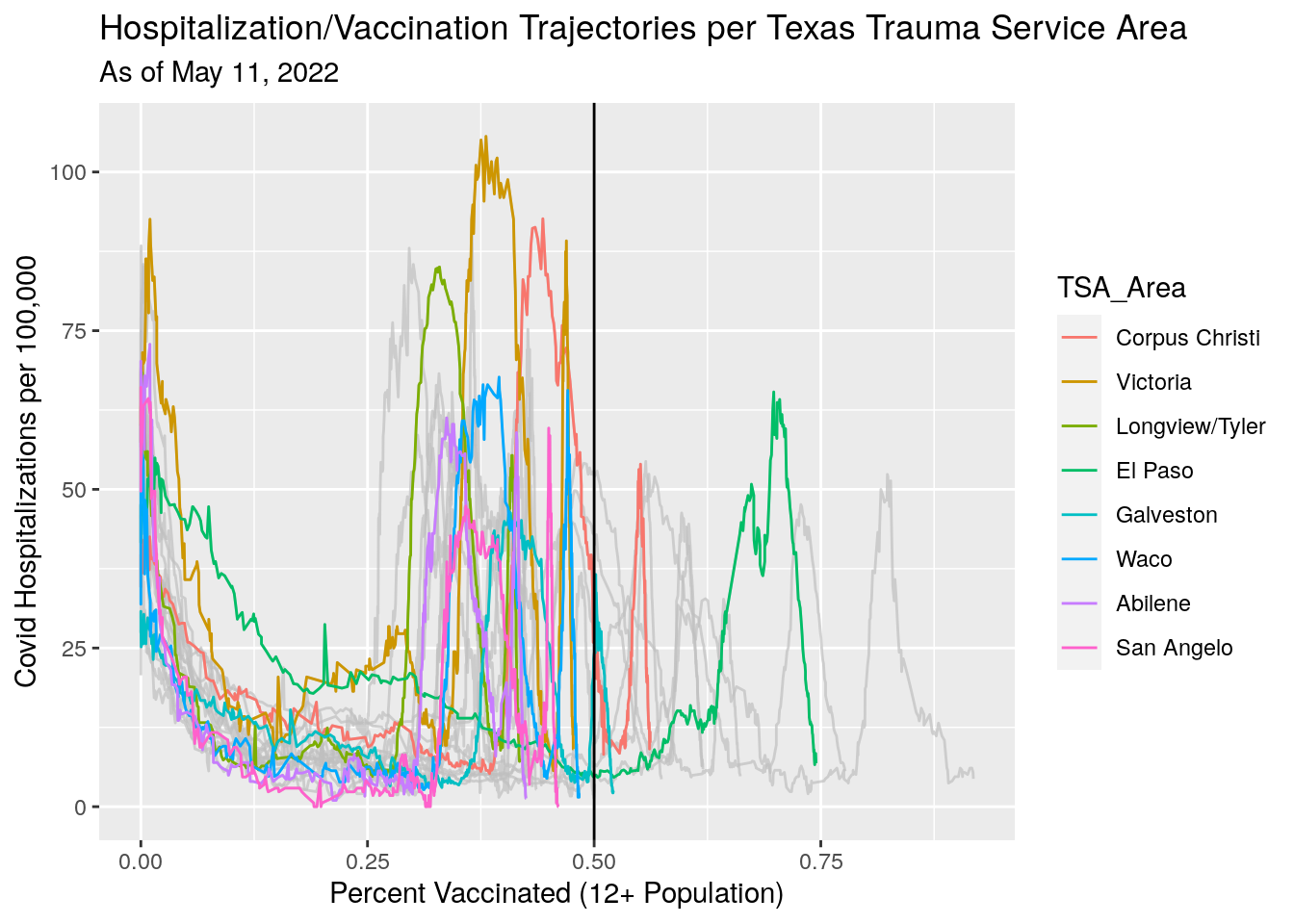
#   Attach TSA to Case file, then summarize by TSA

Case_TSA <- Covid %>%
  select(County, Date, Deaths, Cases, new_cases, new_deaths, Population) %>%
  left_join(., TSA, by="County") %>%
  rename(TSA_Area = Area_name) %>%
  filter(Date>lubridate::ymd("2021-01-01")) %>%
  group_by(TSA_Area, Date) %>%
    summarise(Deaths=sum(Deaths, na.rm=TRUE),
              Cases=sum(Cases, na.rm = TRUE),
              Pop=sum(Population, na.rm = TRUE),
              new_cases=sum(new_cases, na.rm = TRUE),
              new_deaths=sum(new_deaths, na.rm = TRUE)
              ) %>%
  mutate(cases_percap=Cases/Pop*100000) %>%
  mutate(deaths_percap=(Deaths-first(Deaths))/Pop*100000) %>%
  mutate(deaths_percase=Deaths/Cases) %>%
  left_join(., Vax_TSA, by=c("TSA_Area", "Date")) %>%
  filter(!is.na(Vax_pct)) %>%
  mutate(Vax_pct=Vax_pct*100) %>%
  group_by(TSA_Area) %>%
     mutate(Vax_pct=zoo::rollmedian(Vax_pct,
                                          5,
                                          fill=c(0, NA, last(Vax_pct)))) %>%
  ungroup() %>%
  filter(Date<=Last_date)
## `summarise()` has grouped output by 'TSA_Area'. You can override using the
## `.groups` argument.# Pull out top 5 and bottom 5 by hospitalization
Vax_TSA_extremes_case <-
Case_TSA %>%
group_by(TSA_Area) %>%
summarize(deaths_percap=last(deaths_percap), TSA_Area=unique(TSA_Area)) %>%
arrange(-deaths_percap) %>%
ungroup()
TSA_top_case <- slice_head(Vax_TSA_extremes_case, n=4)
TSA_bot_case <- slice_tail(Vax_TSA_extremes_case, n=4)
TSA_topbot_case <- bind_rows(TSA_top_case, TSA_bot_case)
TSA_extremes_case <- inner_join(Case_TSA, TSA_topbot_case, by="TSA_Area") %>%
rename(deaths_percap=deaths_percap.x, ordering=deaths_percap.y) %>%
arrange(-ordering)
Case_TSA %>%
filter(Date>lubridate::ymd("2021-01-01")) %>%
# group_by(TSA_Area) %>%
# mutate(deaths_percap=deaths_percap-first(deaths_percap)) %>%
# ungroup() %>%
ggplot(aes(x=Vax_pct,
y=deaths_percap,
color=TSA_Area)) +
geom_line(aes(group=TSA_Area),colour = alpha("grey", 0.7),
show.legend = FALSE) +
geom_line(data=TSA_extremes_case,
aes(color=fct_reorder(TSA_Area, -ordering))) +
# geom_vline(xintercept=0.50, color="black", size=0.5,
# show.legend = FALSE) +
labs(x="Vaccination Percent",
y="Covid Deaths per 100,000",
title="Vaccination/Death Trajectories per Texas Trauma Service Area Since January",
subtitle=paste("As of", today_date))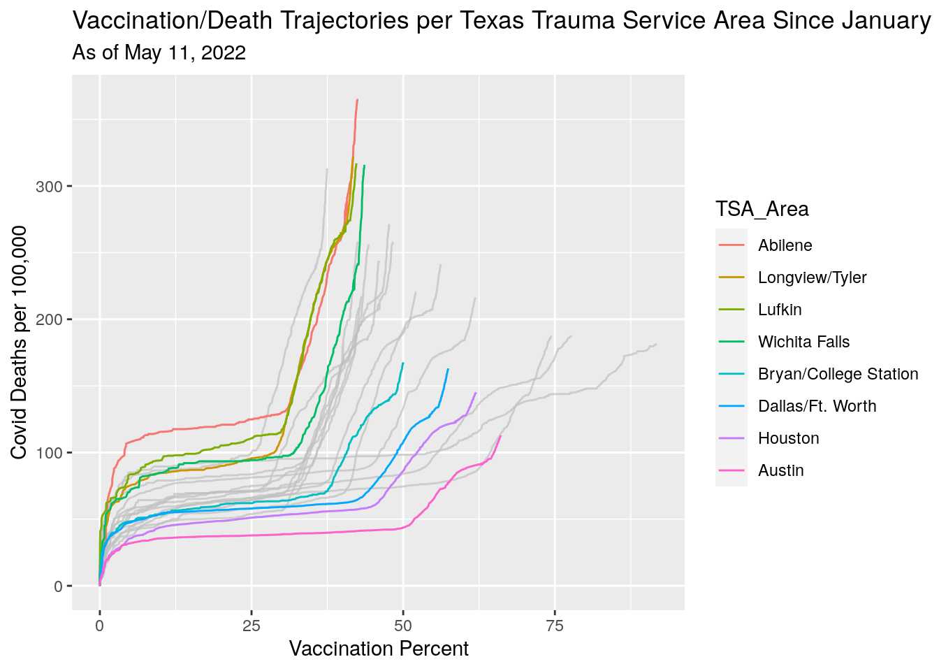 Vacination rates before and after full approval on August 23.
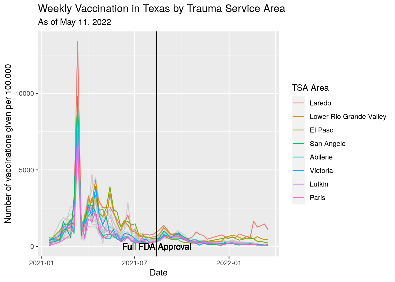
#  Let's look at 4 week tranches before and after approval

Approval = ymd("2021-08-13")

foo <-
Vax_TSA %>%
  mutate(Approval_week=(ceiling(as.numeric(Date-Approval)/7))) %>%
  group_by(TSA_Area, Approval_week) %>%
    summarize(All_dose=last(People_fully)-first(People_fully),
              Pop=first(Pop_total),
              n=n()) %>%
  filter(All_dose>0) %>%
  mutate(Week_date=Approval+Approval_week*n) %>%
  mutate(All_dose_percap=All_dose/(Pop/100000)) %>%
  filter(n==7)
## `summarise()` has grouped output by 'TSA_Area'. You can override using the
## `.groups` argument.# Pull out top 5 and bottom 5 by last Vax
Vax_TSA_extremes_case <-
foo %>%
group_by(TSA_Area) %>%
summarize(All_dose_percap=last(All_dose_percap),
TSA_Area=unique(TSA_Area)) %>%
arrange(-All_dose_percap)
TSA_top_case <- slice_head(Vax_TSA_extremes_case, n=4)
TSA_bot_case <- slice_tail(Vax_TSA_extremes_case, n=4)
TSA_topbot_case <- bind_rows(TSA_top_case, TSA_bot_case)
TSA_extremes_case <- inner_join(foo, TSA_topbot_case,
by="TSA_Area") %>%
rename(All_dose_percap=All_dose_percap.x,
ordering=All_dose_percap.y) %>%
arrange(-ordering)
foo %>%
ggplot(aes(y=All_dose_percap, x=Week_date)) +
#geom_line(aes(color=TSA_Area)) +
geom_line(aes(group=TSA_Area),colour = alpha("grey", 0.7),
show.legend = FALSE) +
geom_line(data=TSA_extremes_case,
aes(color=fct_reorder(TSA_Area, -ordering))) +
scale_colour_discrete(name="TSA Area") +
geom_vline(xintercept=Approval, color="black", size=0.5,
show.legend = FALSE) +
geom_text(x=Approval, y=0, label="Full FDA Approval") +
labs(x="Date",
y="Number of vaccinations given per 100,000",
title="Weekly Vaccination in Texas by Trauma Service Area",
subtitle=paste("As of", today_date))