
Texas Covid Deaths by County
Covid and Politics
Let’s take a look at Texas politics and Covid deaths. The CDC Wonder data has preliminary deaths and preliminary covid deaths, by county through April of 2022. We can combine this data with the votes from the presidential race and look for correlations.
But first, I will calculate the “excess” deaths using a bog simple approach, I will simply assume that for each county the deaths in years 2018 and 2019 represent a somewhat constant background, and any increase in the years 2020 and 2021 will be considered excess deaths likely due to Covid.
In the plots, I look at the nine counties with the largest per capita excess between 2018 and 2021. The data is pretty noisy, especially since these are small counties, so the statistics are not very robust.Even so, the picture that emerges is pretty consistent.
#   Look at year to year differences compared to 2018

df <- Deaths %>%
  add_count(County) %>%
  filter(n==51) %>%
  filter(Year<2022) %>%
  pivot_wider(c(County, Month), names_from=Year, values_from = Deaths) %>%
  rename(y2018=`2018`, y2019=`2019`, y2020=`2020`, y2021=`2021`) %>%
  mutate(y2018=replace_na(y2018, 0),
         y2019=replace_na(y2019, 0),
         y2020=replace_na(y2020, 0),
         y2021=replace_na(y2021, 0)) %>%
  mutate(Delta_1=y2019-y2018,
         Delta_2=y2020-y2018,
         Delta_3=y2021-y2018
         ) %>%
  group_by(County) %>%
    summarize(n = n(),
              D_1=mean(Delta_1, na.rm=TRUE)*12,
              D_2=mean(Delta_2, na.rm=TRUE)*12,
              D_3=mean(Delta_3, na.rm=TRUE)*12) %>%
  mutate(Total=D_2+D_3)

Pops <- Covid %>%
  select(County, Population) %>%
  unique() %>%
  mutate(County=stringr::str_to_upper(County))

df <- left_join(df, Pops, by="County")

df <- df %>%
  mutate(D_1=D_1/Population,
         D_2=D_2/Population,
         D_3=D_3/Population,
         Totalpercap=Total/Population)

Top_9 <- df %>%
  arrange(-Totalpercap) %>%
  head(9)

Deaths %>%
  filter(Year<2022) %>%
  filter(County %in% Top_9$County) %>%
  mutate(Year=factor(Year)) %>%
  ggplot(aes(x=Month, y=Deaths, group=Year, color=Year)) +
  geom_point() +
  geom_line(aes(x=Month)) +
  scale_x_discrete(breaks = c("Jan", "Apr", "Jul", "Oct"))+
  facet_wrap(vars(County), scales="free")+
  theme_classic()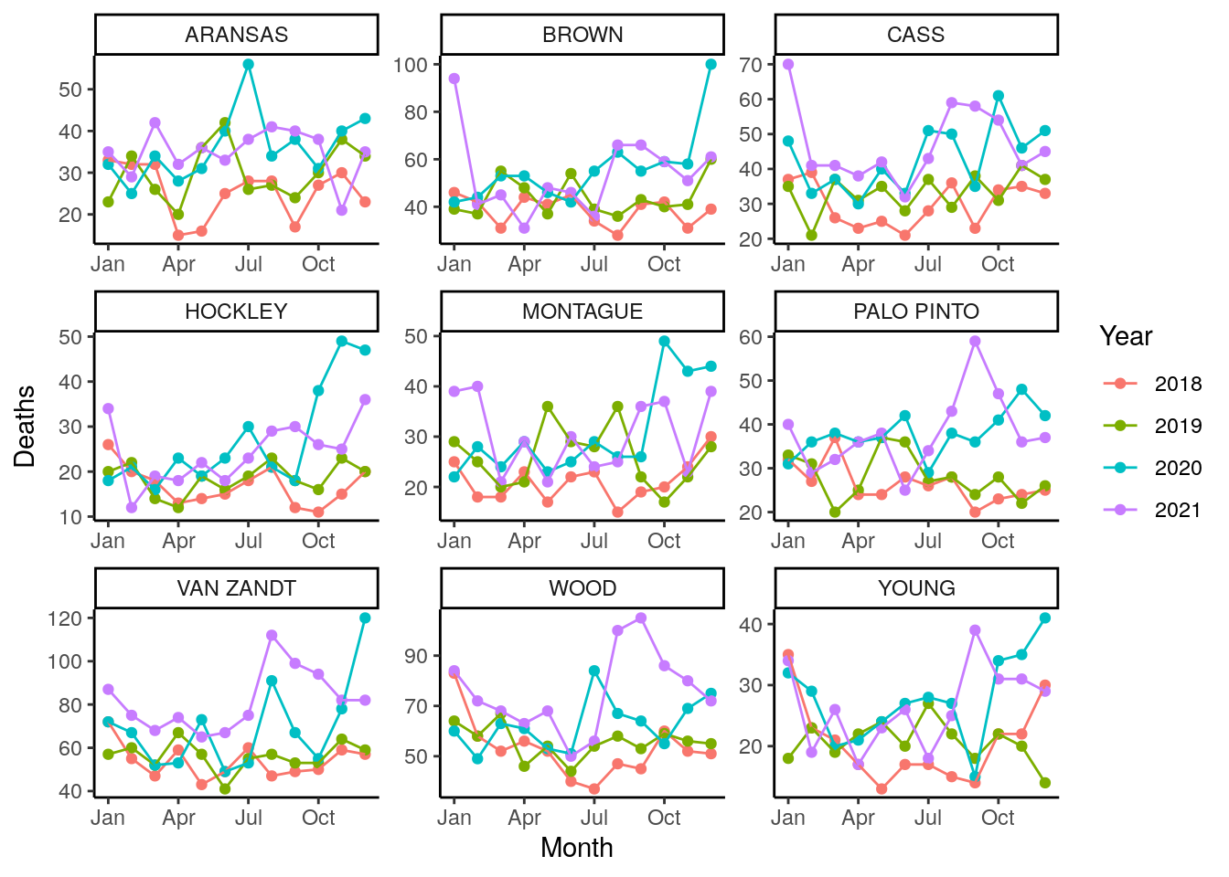
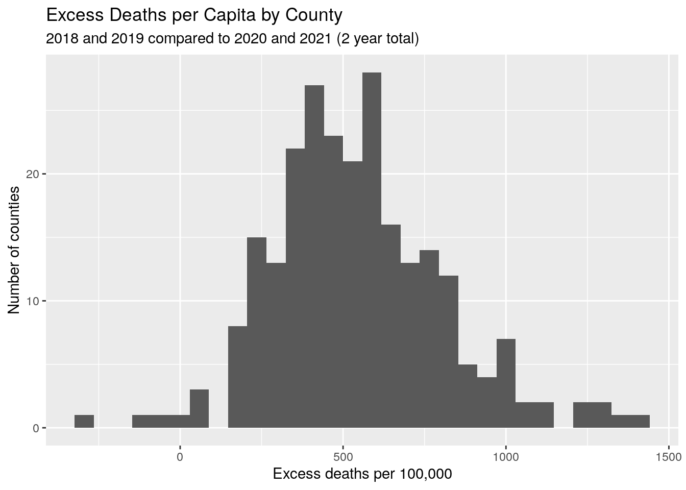
Excess deaths
Let’s do a very simple analysis. We will look at the number of deaths, per county, in 2018 and 2019, and compare that to 2020 and 2021. We will call that excess deaths.
The histograms clearly shows that almost every county experienced an excess of deaths, most on the order of 500 per 100,000 in those two years. Clearly there is a strong signal here.
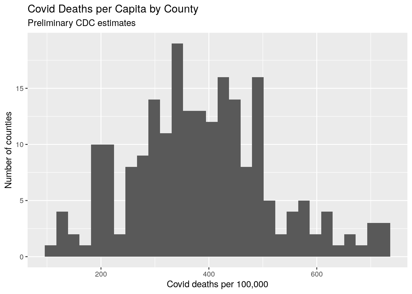
Add in CDC Covid estimates
So the CDC has preliminary numbers for Covid deaths based on death certificate data, although we know that in some counties (where the coroner is a JP) those numbers are low. One JP was quoted as saying “why would I waste a Covid test on a dead person?”.
None the less, their data shows a rate of close to 400 per 100,000, and less spread than the excess death estimate.
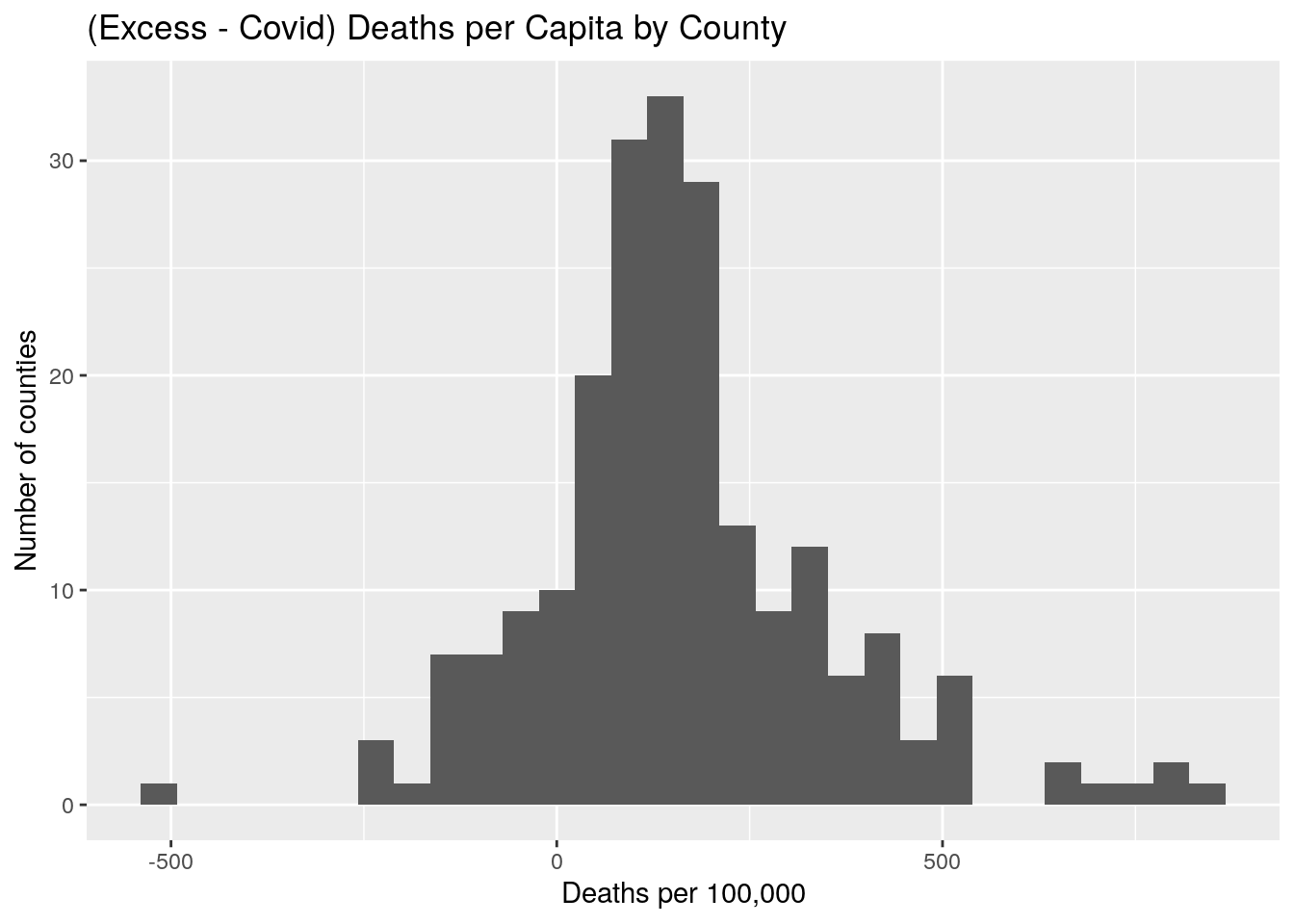
Compare CDC covid deaths and excess deaths
When we compare the two estimates, we find that there appears to be about a 150 deaths per 100,000 difference, with the excess deaths being fairly consistently larger than the proven Covid deaths. In light of what we know about the construction of death certificates, this is not surprising.
Analysis of Excess vs Covid deaths
Excess and Covid deaths are clearly correlated, but fairly noisy. But more importantly, the slope of the linear fit of that correlation is only 0.3, which implies that not only is there a constant shift from Covid deaths to Excess deaths, but that the shift itself has a bias - the counties with the largest excess deaths are possibly under-reporting their Covid deaths. Or counties with the lowest excess deaths are over-reporting Covid deaths, which seems unlikely. And this is not a small bias.
Places with the most deaths have the greatest under reporting of covid deaths.
Finally, counties with higher populations show fewer excess and fewer covid deaths, as well as a smaller disparity between the two.
#   Covid vs. Excess

foo %>%
  ggplot(aes(x=Excess_percap, y=Covid_percap)) +
  geom_point()+
  geom_smooth(method=lm)+
  annotate("text", x=250, y=700,
           label=(paste0("slope==",                      signif(coef(lm(foo$Covid_percap~foo$Excess_percap))[2],3))),
           parse=TRUE)+
  labs(title="Excess Deaths vs. Covid Deaths (per 100,000)",
       subtitle="By County",
       x="Excess Deaths per 100,000",
       y="Covid Deaths per 100,000")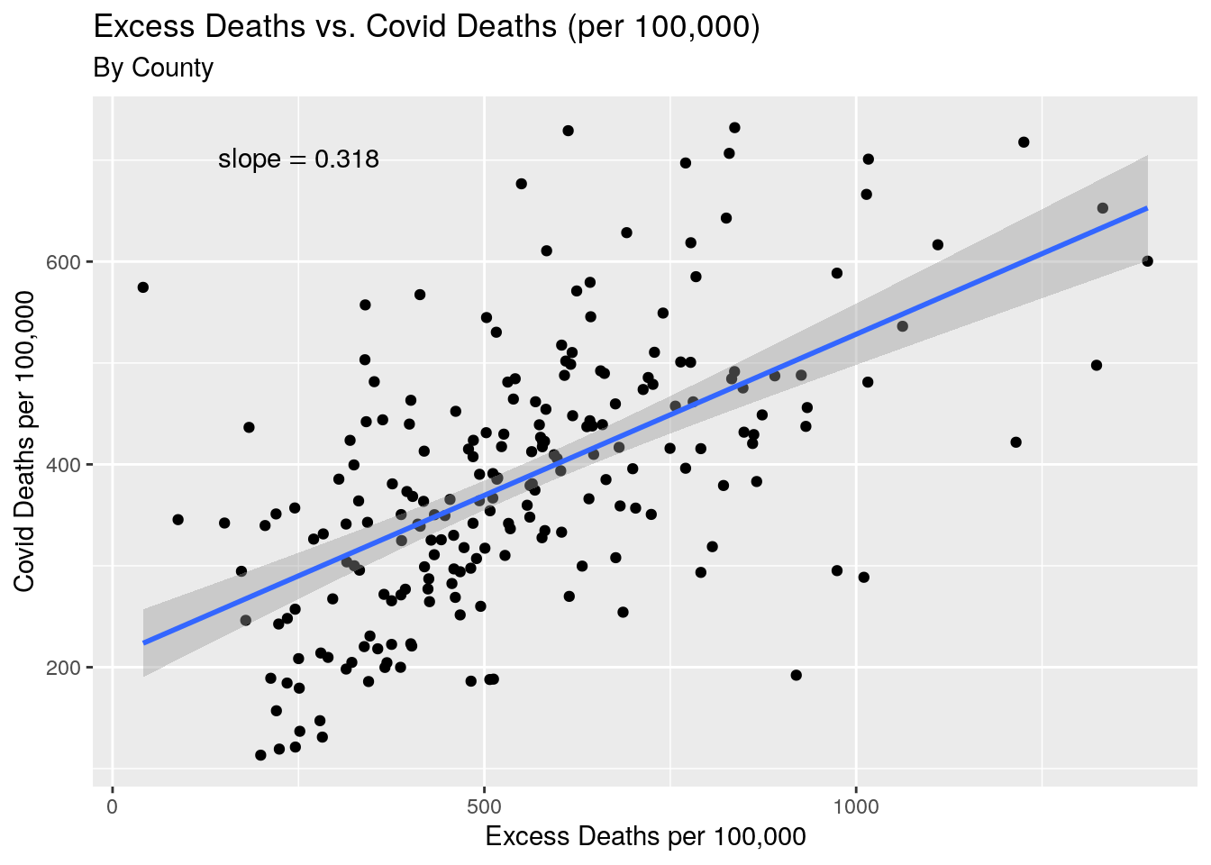
#   County pop vs. Covid, Excess, and difference

p1 <- foo %>%
  ggplot(aes(x=Population, y=Covid_percap))+
  geom_point()+
  scale_x_log10() +
  geom_smooth(method=lm)+
  labs(title="Covid Deaths (per 100,000) vs. Population",
       subtitle="By County",
       x="Population",
       y="Covid Deaths")


p2 <- foo %>%
  ggplot(aes(x=Population,y=Excess_percap ))+
  geom_point()+
  scale_x_log10()+
  geom_smooth(method=lm)+
  labs(title="Excess Deaths (per 100,000) vs. Population",
       subtitle="By County",
       x="Population",
       y="Excess Deaths")

p3 <- foo %>%
  ggplot(aes(x=Population, y=Excess_minus_Covid))+
  geom_point()+
  scale_x_log10()+
  geom_smooth(method=lm)+
  labs(title="Excess - Covid Deaths (per 100,000) vs. Population",
       subtitle="By County",
       x="Population",
       y="Death differences")

gridExtra::grid.arrange(p1, p2, p3, nrow=3)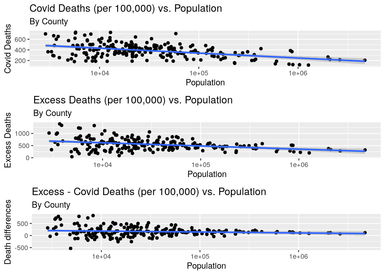
Data consolidation and politics
Since there is a huge disparity in county population, which causes a lot of noise in the data, we will consolidate into Trauma Service Areas (TSA’s). And we will add the votes for Trump and Biden as well.
By_county <- left_join(foo, Votes, by="County") %>%
  select(-Biden, -Trump)

#   First Trauma Service Areas

inpath <- "/home/ajackson/Dropbox/Rprojects/Curated_Data_Files/Texas_Trauma_Service_Areas/"

TSA <- readRDS(paste0(inpath, "Trauma_Service_Areas.rds"))

By_TSA <- TSA %>%
  mutate(County=stringr::str_to_upper(County)) %>%
           left_join(foo, ., by="County") %>%
           left_join(., Votes, by="County") %>%
  group_by(Area_name) %>%
    summarize(Population=sum(Population, na.rm = TRUE),
              Covid=sum(Covid, na.rm=TRUE),
              Excess=sum(Excess, na.rm=TRUE),
              Trump=sum(Trump, na.rm=TRUE),
              Biden=sum(Biden, na.rm=TRUE)
              ) %>%
  mutate(Blueness=Biden/(Trump+Biden)) %>%
  mutate(Excess_percap=Excess/Population*100000) %>%
  mutate(Covid_percap=Covid/Population*100000) %>%
  rename(TSA=Area_name)
Correlation with politics
By county, we see that the more Republican counties have more excess deaths per 100,000, and are also noisier - a consequence of them being much smaller than the bluer counties. To a large degree, population correlates with blueness.
If we consolidate into the Trauma Service Areas, the slope of the fit line is the same, and we can now more clearly see the different areas and the rather strong correlation. Some of the exceptions are the valley, where the death toll was terrible before vaccines became available.
If we look at the preliminary covid death numbers, the story stays the same, at least qualitatively. There are a few changes, but nothing radical. The main change is that the slope is lower - we are still seeing a bias in the difference between excess and covid deaths, this time correlated with how blue an area is.
Finally we can look at the differences between covid and excess deaths by TSA, and get a sense of how the red areas tend to have a greater difference between those two measures.
#  By County

By_county %>%
  ggplot(aes(x=Blueness,y=Excess_percap ))+
  geom_point()+
  geom_smooth(method=lm)+
  scale_x_continuous(labels = scales::percent_format(accuracy = 1)) +
  annotate("text", x=.5, y=1250,
           label=(paste0("slope==",                      signif(coef(lm(By_county$Excess_percap~By_county$Blueness))[2],3))),
           parse=TRUE)+
  labs(title="Excess Deaths (per 100,000) vs. Biden percent vote",
       subtitle="By County",
       x="Biden Percent Vote",
       y="Excess Deaths per 100,000")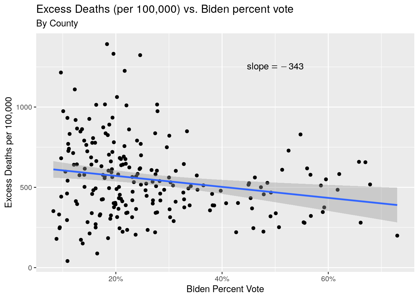
#  By TSA

By_TSA %>%
  ggplot(aes(x=Blueness,y=Excess_percap ))+
  geom_point()+
  geom_smooth(method=lm)+
  annotate("text", x=.5, y=650,
           label=(paste0("slope==",                      signif(coef(lm(By_TSA$Excess_percap~By_TSA$Blueness))[2],3))),
           parse=TRUE)+
  scale_x_continuous(labels = scales::percent_format(accuracy = 1)) +
  ggrepel::geom_text_repel(
            aes(Blueness,Excess_percap,label=TSA), hjust=0,
                nudge_x=.005) +
  labs(title="Excess Deaths (per 100,000) vs. Biden percent vote",
       subtitle="By Trauma Service Area",
       x="Biden Percent Vote",
       y="Excess Deaths per 100,000")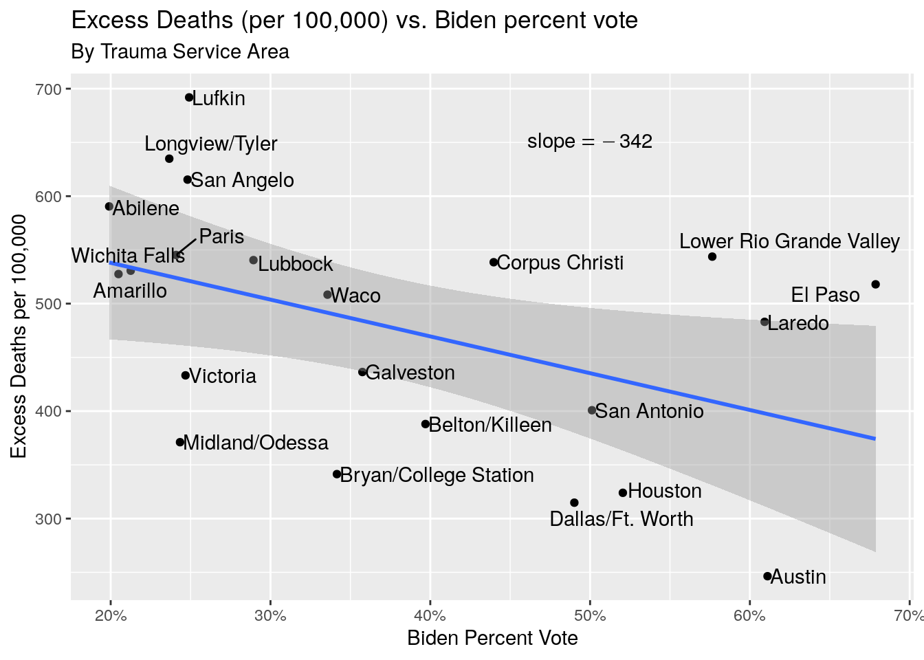
#  By TSA, COVID deaths

By_TSA %>%
  ggplot(aes(x=Blueness,y=Covid_percap ))+
  geom_point()+
  geom_smooth(method=lm)+
  annotate("text", x=.5, y=450,
           label=(paste0("slope==",                      signif(coef(lm(By_TSA$Covid_percap~By_TSA$Blueness))[2],3))),
           parse=TRUE)+
  scale_x_continuous(labels = scales::percent_format(accuracy = 1)) +
  ggrepel::geom_text_repel(
            aes(Blueness,Covid_percap,label=TSA), hjust=0,
                nudge_x=.005) +
  labs(title="Covid Deaths (per 100,000) vs. Biden percent vote",
       subtitle="By Trauma Service Area",
       x="Biden Percent Vote",
       y="Covid Deaths per 100,000")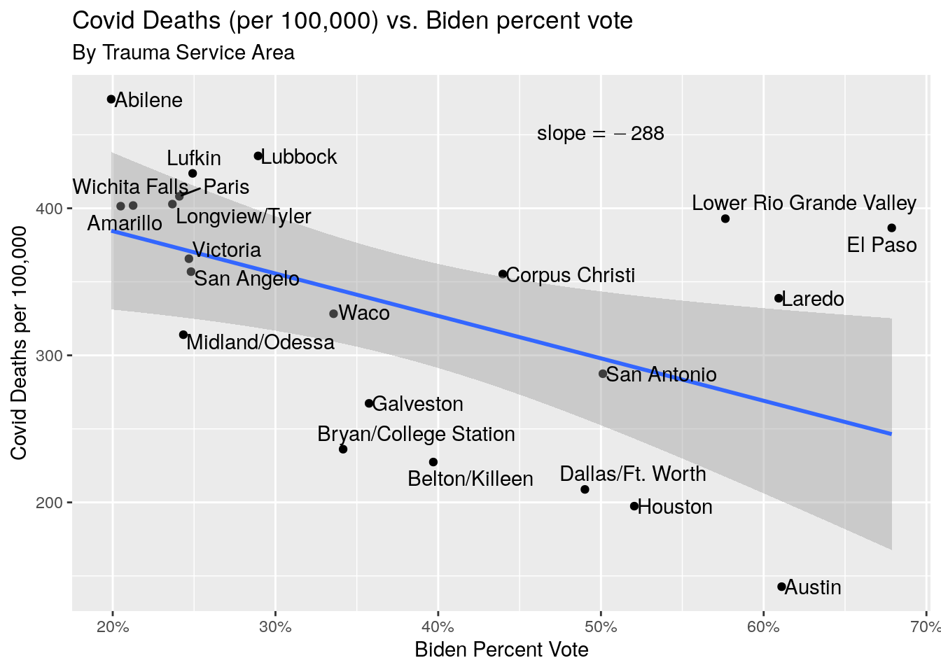
#  Trajectory from Excess to Covid

By_TSA <- By_TSA %>%
  mutate(Covid_percap=Covid/Population*100000) %>%
  mutate(Excess_percap=Excess/Population*100000)

Labels <- By_TSA %>%
  select(TSA, Blueness, Covid_percap)

TSA_longer <- By_TSA %>%
  select(TSA, Blueness, Covid_percap, Excess_percap) %>%
  pivot_longer(!c(TSA, Blueness), names_to="Names", values_to="Values")

ggplot(data=TSA_longer, aes(x=Blueness,y=Values, color=Names ))+
  geom_point()+
  scale_x_continuous(labels = scales::percent_format(accuracy = 1)) +
  geom_segment(data = By_TSA,
               aes(x = Blueness, xend = Blueness,
                   y = Covid_percap,  yend = Excess_percap,
                   group = TSA),
               colour = "black",
               arrow = arrow(length=unit(0.2, "cm"))) +
   ggrepel::geom_text_repel(data=subset(TSA_longer, Names=="Covid_percap"),
             mapping=aes(x=Blueness,y=Values,label=TSA), hjust=0,
                 nudge_x=.005) +
  labs(title="Covid and Excess Deaths (per 100,000) vs. Biden percent vote",
       subtitle="By Trauma Service Area",
       x="Biden Percent Vote",
       y="Covid or Excess Deaths per 100,000")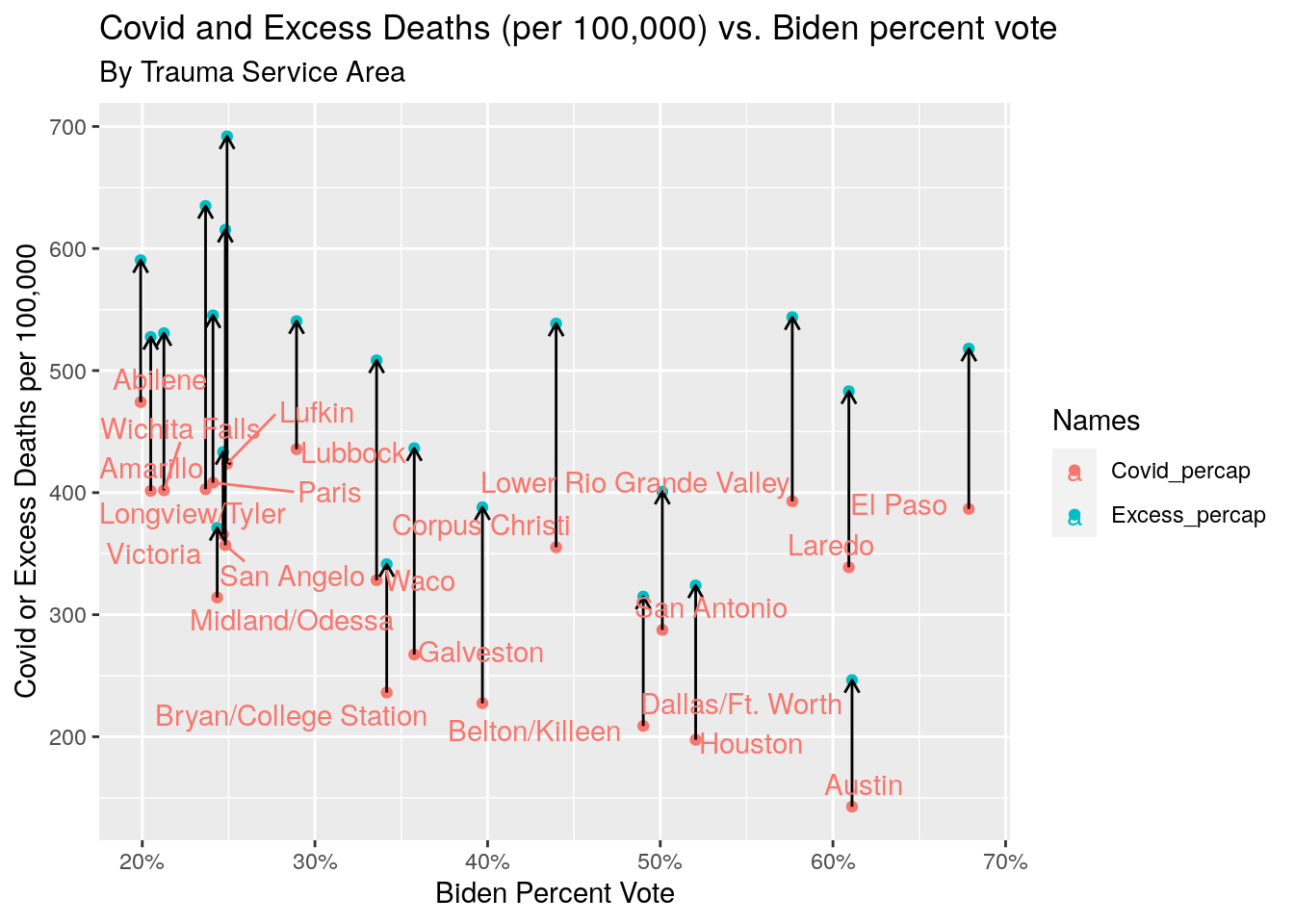
Post vaccine
Let’s take a quick look at just the year 2021, the post-vaccine year.
Covid deaths versus excess deaths is similar to before, but with a tighter distribution. Excess deaths versus “blueness” is also similar, with a clear trend for red counties to show a higher death rate. Not surprisingly, the number of vaccine doses per capita shows the same red/blue trend, though the data is pretty noisy. Not that apparently no one has very good information on how many people are vaxed with one, two, three, or four doses, or indeed are unvaxed. The number of doses given is pretty reliable, we just don’t know whose arm they went in. So I just show the total doses given per capita. If we were fully vaxed that number should be around 3, accounting for both second boosters and the unvaccinated status of under 5 year-olds.
Consolidating the data into the Trauma Service Areas, we see first of all that the discrepancy between Covid deaths and excess deaths is reduced, but still present. If they matched, the slope of the fit line would be one.
We still have a strong political bias in the excess death rate, as well as in the vaccination rate. Note that some of the vaccine doses used at the border may have been people coming from Mexico, although given the early horrors with Covid along the border, they might also just be a local response to that tragedy.
Covid_deaths <- read_tsv(paste0(DataDeaths,
                "Provisional Mortality Statistics, 2018-2021 covid.txt"),
                col_types="-cccci") %>%
  mutate(Year=factor(`Year Code`)
         ) %>%
  rename(County= `Residence County`) %>%
  mutate(County=stringr::str_remove(County, " County, TX"),
         County=stringr::str_to_upper(County))

Covid_deaths <-
Covid_deaths %>%
  drop_na() %>%
  select(County, Year, Deaths) %>%
  filter(Year=="2021") %>%
  group_by(County) %>%
    summarize(Covid=sum(Deaths, na.rm=TRUE)) %>%
  left_join(Pops, by="County") %>%
  mutate(Covid_percap=Covid/Population*100000)

Excess_deaths <- Excess_deaths %>%
  mutate(Excess_2021=`2021`-Pre_covid/2,
         Excess_2021_percap=Excess_2021/Population*100000)

foo <- left_join(Covid_deaths, Excess_deaths, by="County") %>%
  select(County, Covid, Covid_percap,
         Excess_2021, Excess_2021_percap, Population=Population.y) %>%
  mutate(Excess_minus_Covid=(Excess_2021-Covid)/Population*100000)

#   Covid vs. Excess

foo %>%
  ggplot(aes(x=Excess_2021_percap, y=Covid_percap)) +
  geom_point()+
  geom_smooth(method=lm)+
  annotate("text", x=250, y=400,
           label=(paste0("slope==",                      signif(coef(lm(foo$Covid_percap~foo$Excess_2021_percap))[2],3))),
           parse=TRUE)+
  labs(title="Excess Deaths vs. Covid Deaths Post-Vax (per 100,000)",
       subtitle="By County for 2021 only",
       x="Excess Deaths per 100,000",
       y="Covid Deaths per 100,000")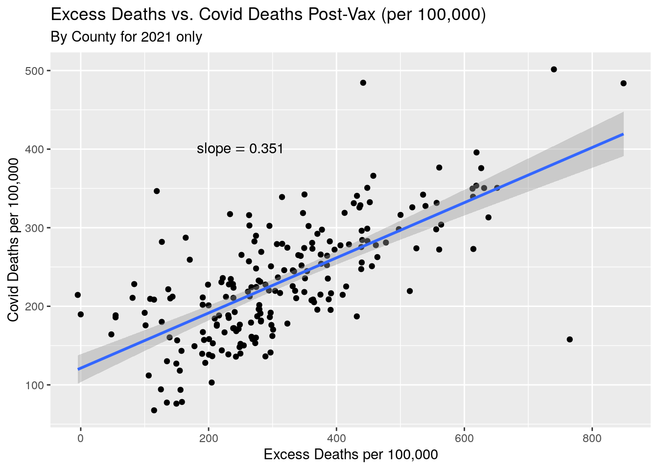
#   Add in votes and vaccinations rates

Vax <- Vaccine %>%
  mutate(County=stringr::str_to_upper(County)) %>%
  mutate(Doses_percap=Doses_admin/Pop_total) %>%
  select(County, Doses_percap, Doses_admin) %>%
  group_by(County) %>%
    summarise(Doses_percap=last(Doses_percap),
              Doses_admin=last(Doses_admin))

foo <- foo %>%
  left_join(., Votes, by="County") %>%
  left_join(., Vax, by="County")

#   By county Deaths vs. Blueness

foo %>%
  ggplot(aes(x=Blueness,y=Excess_2021_percap ))+
  geom_point()+
  geom_smooth(method=lm)+
  scale_x_continuous(labels = scales::percent_format(accuracy = 1)) +
  annotate("text", x=.4, y=600,
           label=(paste0("slope==",                      signif(coef(lm(foo$Excess_2021_percap~foo$Blueness))[2],3))),
           parse=TRUE)+
  labs(title="Excess Deaths in 2021 (per 100,000) vs. Biden percent vote",
       subtitle="By County",
       x="Biden Percent Vote",
       y="Excess Deaths per 100,000")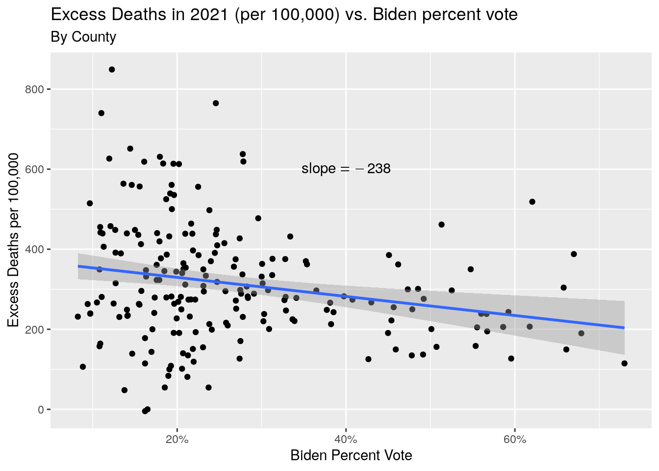
#   By county Deaths vs. Vaccine

foo %>%
  filter(!stringr::str_detect(County, "BROOKS")) %>%
  ggplot(aes(x=Doses_percap,y=Excess_2021_percap ))+
  geom_point()+
  geom_smooth(method=lm)+
  #scale_x_continuous(labels = scales::percent_format(accuracy = 1)) +
  annotate("text", x=2, y=600,
           label=(paste0("slope==",                      signif(coef(lm(foo$Excess_2021_percap~foo$Doses_percap))[2],3))),
           parse=TRUE)+
  labs(title="Excess Deaths in 2021 (per 100,000) vs. Vaccine Doses per capita",
       subtitle="By County (Brooks county dropped with 5x coverage)",
       x="Vaccine Doses per capita",
       y="Excess Deaths per 100,000")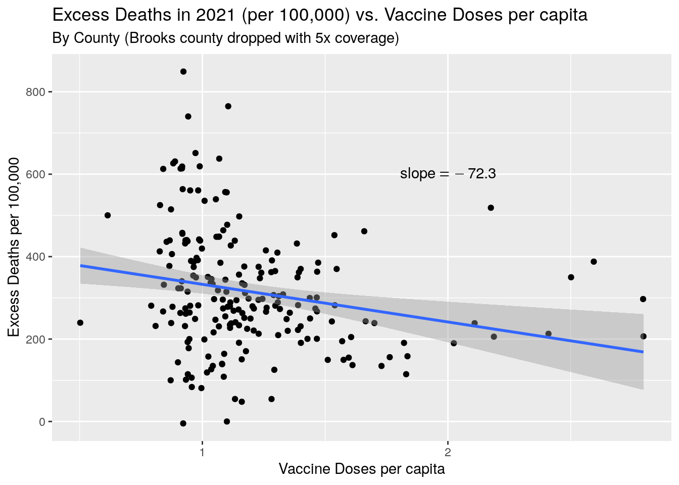
#  By TSA

By_TSA <- TSA %>%
  mutate(County=stringr::str_to_upper(County)) %>%
  left_join(foo, ., by="County") %>%
  group_by(Area_name) %>%
    summarize(Population=sum(Population, na.rm = TRUE),
              Covid=sum(Covid, na.rm=TRUE),
              Excess=sum(Excess_2021, na.rm=TRUE),
              Trump=sum(Trump, na.rm=TRUE),
              Biden=sum(Biden, na.rm=TRUE),
              Doses_admin=sum(Doses_admin, na.rm=TRUE)
              ) %>%
  mutate(Blueness=Biden/(Trump+Biden)) %>%
  mutate(Excess_percap=Excess/Population*100000) %>%
  mutate(Covid_percap=Covid/Population*100000) %>%
  mutate(Doses_percap=Doses_admin/Population) %>%
  rename(TSA=Area_name)

#   Covid vs. Excess

By_TSA %>%
  ggplot(aes(x=Excess_percap, y=Covid_percap)) +
  geom_point()+
  geom_smooth(method=lm)+
  annotate("text", x=200, y=275,
           label=(paste0("slope==",                      signif(coef(lm(By_TSA$Covid_percap~By_TSA$Excess_percap))[2],3))),
           parse=TRUE)+
  ggrepel::geom_text_repel(
            aes(Excess_percap,Covid_percap,label=TSA), hjust=0,
                nudge_x=.005) +
  labs(title="Excess Deaths vs. Covid Deaths Post-Vax (per 100,000)",
       subtitle="By TSA for 2021 only",
       x="Excess Deaths per 100,000",
       y="Covid Deaths per 100,000")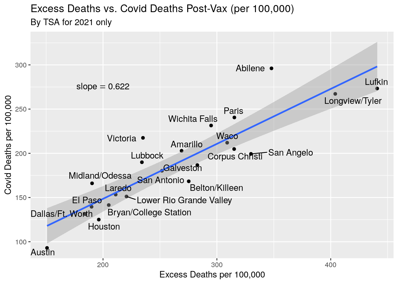
By_TSA %>%
  ggplot(aes(x=Blueness,y=Excess_percap ))+
  geom_point()+
  geom_smooth(method=lm)+
  annotate("text", x=.5, y=400,
           label=(paste0("slope==",                      signif(coef(lm(By_TSA$Excess_percap~By_TSA$Blueness))[2],3))),
           parse=TRUE)+
  scale_x_continuous(labels = scales::percent_format(accuracy = 1)) +
  ggrepel::geom_text_repel(
            aes(Blueness,Excess_percap,label=TSA), hjust=0,
                nudge_x=.005) +
  labs(title="Excess Deaths for 2021 (per 100,000) vs. Biden percent vote",
       subtitle="By Trauma Service Area",
       x="Biden Percent Vote",
       y="Excess Deaths per 100,000 in 2021")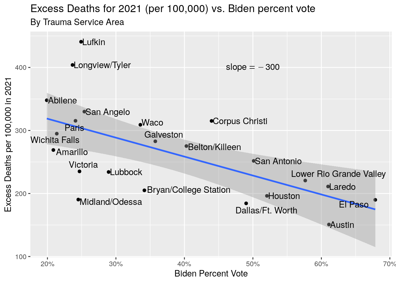
#  By TSA, Vax rates and deaths

By_TSA %>%
  ggplot(aes(x=Doses_percap,y=Excess_percap ))+
  geom_point()+
  geom_smooth(method=lm)+
  annotate("text", x=2, y=400,
           label=(paste0("slope==",                      signif(coef(lm(By_TSA$Excess_percap~By_TSA$Doses_percap))[2],3))),
           parse=TRUE)+
  #scale_x_continuous(labels = scales::percent_format(accuracy = 1)) +
  ggrepel::geom_text_repel(
            aes(Doses_percap,Excess_percap,label=TSA), hjust=0,
                nudge_x=.005) +
  labs(title="Excess Deaths in 2021 (per 100,000) vs. Vaccine Doses per capita",
       subtitle="By Trauma Service Area",
       x="Vaccine Doses per capita",
       y="Excess Deaths in 2021 per 100,000")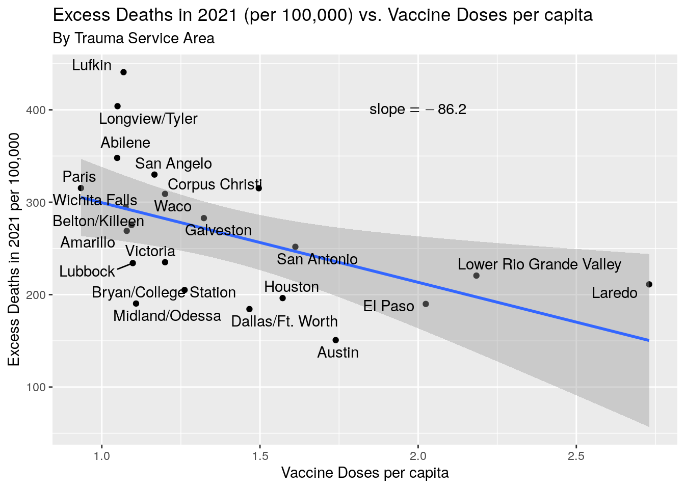
Conclusions
A simple-minded model for determining the number of excess deaths during the time of Covid seems to show that the number of those deaths is quite a bit higher than the preliminary estimates of Covid deaths that the CDC has derived from looking at Death Certificates. This is not surprising since most county coroners are essentially untrained JP’s.
More disturbing are the clear correlations between political party, vaccination rates, and excess deaths. This points to a basic social and political issue that has caused the needless loss of many lives, and will likely haunt us for many years to come.