
Making Contour Maps in R
Notes on how to make contour maps in R
As a retired Geophysicist, I spent a career making contour maps. I have found it to be challenging to make good contour maps in R, and so as part of my own learning process, I have documented the necessary steps in hopes that this may help others involved in the same struggles.
Ultimately I want to create filled contours that represent a surface, based on some random collection of input points, and display those contours on top of a detailed basemap, such as OpenStreetMap.
I will try to use what I believe are the most recent and most likely to survive packages wherever possible. Both static and interactive maps will be generated. I will also be explicit in which packages I am using. I found it rather frustrating to be looking at examples people had on the web, and then wondering which package supplied which function. A rule I read many years ago was “explicit is better than implicit”, and I will try to follow that dictum.
Note that there are several challenges that make this a somewhat difficult exercise.
First of all, this area of R has undergone and continues to see a fair bit of churn. There are a number of packages that address parts of this problem, and they tend to overlap with each other. Googling for help can easily lead to using a superseded package, since there have been so many recent developments. By the same token, the newer packages have not, in all cases, covered the functionality of the older packages, so some use of the older packages may still be necessary.
Secondly, there is a basic issue of coordinate systems. I will display maps in both geographic (that is, Lat-Long) coordinates and in projected (X-Y) coordinates.
Third, interpolating points to a grid is partly art and partly science, so I will give a bit of guidance there.
Fourth, interpolating to a grid in order to then generate contours should be done in a projected X-Y coordinate system, so keeping track of what data is in which system, and projecting back and forth are key.
My test data (seen below) consists of rainfall points in the Houston area from a selection of personal weather stations on August 19, 2022. I will create a simple tibble, and then attach proper geodetic information while converting it to an sf file. I will also transform the sf file to an appropriate projected UTM coordinate system.
Summary of process
- Create geodetically proper data in geographic and/or projected coordinates
- Preliminary work : basemap, Area of Interest
- Plot contours of measurement point density
- Create a grid to define interpolation locations
- Build an interpolator using:
- Inverse weighted nearest neighbor
- Kriging
- Spline fitting
- Thin-plate model
- Interpolate/Predict points onto the grid
- Calculate errors and plot
- Generate contours
- Plot contours over a basemap
References
There are a number of references that have been especially helpful.
I found Lovelace (2022) to be a great overall reference for making maps in R, even though he did not address my particular issue. Other generally useful references that I found were Pebesma and Bivand (2022), Moraga (2019), and Engel (2019).
df <- tibble::tribble(
  ~Rain, ~Lat, ~Lon,
   1.06, 29.8,  -95.4 ,
   0.27, 29.74, -95.39,
   0.15, 29.72, -95.43,
   0.32, 29.73, -95.32,
   0.75, 29.75, -95.47,
   0.56, 29.79, -95.36,
   1.72, 29.80, -95.42,
   0.49, 29.70, -95.51,
   1.3 , 29.76, -95.52,
   0.74, 29.65, -95.49,
   0.14, 29.82, -95.47,
   1.09, 29.84, -95.41,
   1.27, 29.84, -95.35,
   0.09, 29.59, -95.37,
   0   , 29.63, -95.54,
   0.66, 29.81, -95.55,
   1.1 , 29.74, -95.60,
   2.75, 29.55, -95.42,
   1.69, 29.56, -95.31,
   0.16, 29.54, -95.36,
   1.42, 29.91, -95.46,
   0.26, 29.57, -95.53,
   0.79, 29.88, -95.26,
   0.28, 29.82, -95.20,
   0.26, 29.64, -95.18,
   1.06, 29.68, -95.63,
   0.51, 29.93, -95.37,
   0.03, 29.69, -95.16,
   1.27, 29.75, -95.64,
   1.08, 29.59, -95.58,
   0.73, 29.58, -95.22,
   1.96, 29.86, -95.60,
   0.88, 29.90, -95.56,
   1.4 , 29.93, -95.28,
   0.9 , 29.53, -95.25,
   2.24, 29.95, -95.45,
   1.25, 29.82, -95.14,
   0.27, 29.54, -95.57,
   0.16, 29.64, -95.14,
   0   , 29.96, -95.50,
   0.22, 29.54, -95.21,
   1.37, 29.84, -95.67,
   0.23, 29.48, -95.31,
   1.36, 29.54, -95.61,
   0.15, 29.46, -95.37,
   1.07, 29.58, -95.66,
   1.91, 29.92, -95.16,
   1.71, 29.95, -95.20,
   1.97, 29.89, -95.66,
   0.14, 29.56, -95.13,
   0.48, 29.48, -95.22,
   1.57, 29.94, -95.63,
   2.58, 29.98, -95.60,
   0.46, 29.52, -95.67,
   1.6 , 29.48, -95.15,
   1.77, 29.99, -95.67
)

#  A few handy crs codes

googlecrs <- "EPSG:4326"
webcrs <- "EPSG:3857"
localcrs <- "EPSG:26915" # UTM 15N NAD83
localUTM <- "EPSG:32615" # a WGS84 similar to EPSG:26915 - same UTM zone

#     Locations and rainfall by lat long
df_sf <- sf::st_as_sf(df, coords=c("Lon", "Lat"), crs=googlecrs, agr = "identity")
#     Locations and rainfall by X, Y in webcrs
df_web <- sf::st_transform(df_sf, crs=webcrs)
#     Locations and rainfall by X, Y
df_xy <- sf::st_transform(df_sf, crs=localcrs)
#     Locations and rainfall by X, Y
df_xy_2 <- sf::st_transform(df_sf, crs=localUTM)

#   Let's define a bounding box (an AOI) based on the data (in Lat-Long)

bbox <- sf::st_bbox(df_sf)

#   Expand box by 20% to give a little extra room
Dx <- (bbox[["xmax"]]-bbox[["xmin"]])*0.1
Dy <- (bbox[["ymax"]]-bbox[["ymin"]])*0.1
bbox["xmin"] <- bbox["xmin"] - Dx
bbox["xmax"] <- bbox["xmax"] + Dx
bbox["ymin"] <- bbox["ymin"] - Dy
bbox["ymax"] <- bbox["ymax"] + Dy

bb <- c(bbox["xmin"], bbox["ymin"], bbox["xmax"], bbox["ymax"])
Basemaps
My goal is to use the OpenStreetMap as a basemap. There are other maps available (like Google), but OpenStreetMap is my own preferred. Retrieving those tiles will result in an image file in the so-called web crs, EPSG:3857, the Spherical Pseudo-Mercator projection. Being pixels, including the text, the image itself cannot be easily reprojected, so to use that image we will have to make sure everything is in EPSG:3857.
There are several packages that will download OSM tiles.
- OpenStreetMap: Last update a few years ago
- basemaps: appears to be an active project
- osmdata: Pulls vector data - different beast, we’ll cover it later
- basemapR: active project, not on CRAN
- ggspatial: active project, on CRAN
Interestingly, OpenStreetMap, basemaps, and ggspatial make crappy looking maps, fuzzy and not pleasing - cluttered with odd stuff. The basemapR map is much more aesthetically pleasing.
Note that when talking to OSM, things like the bounding box should be in lat-long coordinates, EPSG:4326 my googlecrs. Tiles are returned in X-Y coordinates in the webcrs, EPSG:3857.
I don’t understand what OpenStreetMap is actually doing when it “reprojects” the basemap.
Using osmdata is a lot more work, and the map is much plainer (unless you expend significant effort adding and controlling features), but it does make a pretty good looking map.
As far as I can tell, the only package that will allow for a projected basemap (that is X-Y coordinates) is OpenStreetMap. Which is sad.
There is also quite a bit of disparity in the size of the map objects.
| Sizes in KB for different map objects | |
| Package | Size_KB |
|---|---|
| OpenStreetMap | 7800.0 |
| basemaps | 4.7 |
| basemapR | 4.4 |
| ggspatial | 34.0 |
Let’s start downloading basemaps. They are relatively large and we want to be kind to the servers, so we will cache them so we don’t need to download more than once.
First we use OpenStreetMap::openmap
# Produces an OpenStreetMap object (and caches it)
Base_osm <- OpenStreetMap::openmap(c(bbox[["ymin"]],
                                      bbox[["xmin"]]),
                                    c(bbox[["ymax"]],
                                      bbox[["xmax"]]),
                                    type="osm")

#   Plot in projected coordinates, but be careful!
OpenStreetMap::autoplot.OpenStreetMap(OpenStreetMap::openproj(Base_osm,
                                      projection=localcrs)) +
  # Note that I am using projected point locations
  geom_point(data=as_tibble(sf::st_coordinates(df_xy)), aes(x=X, y=Y))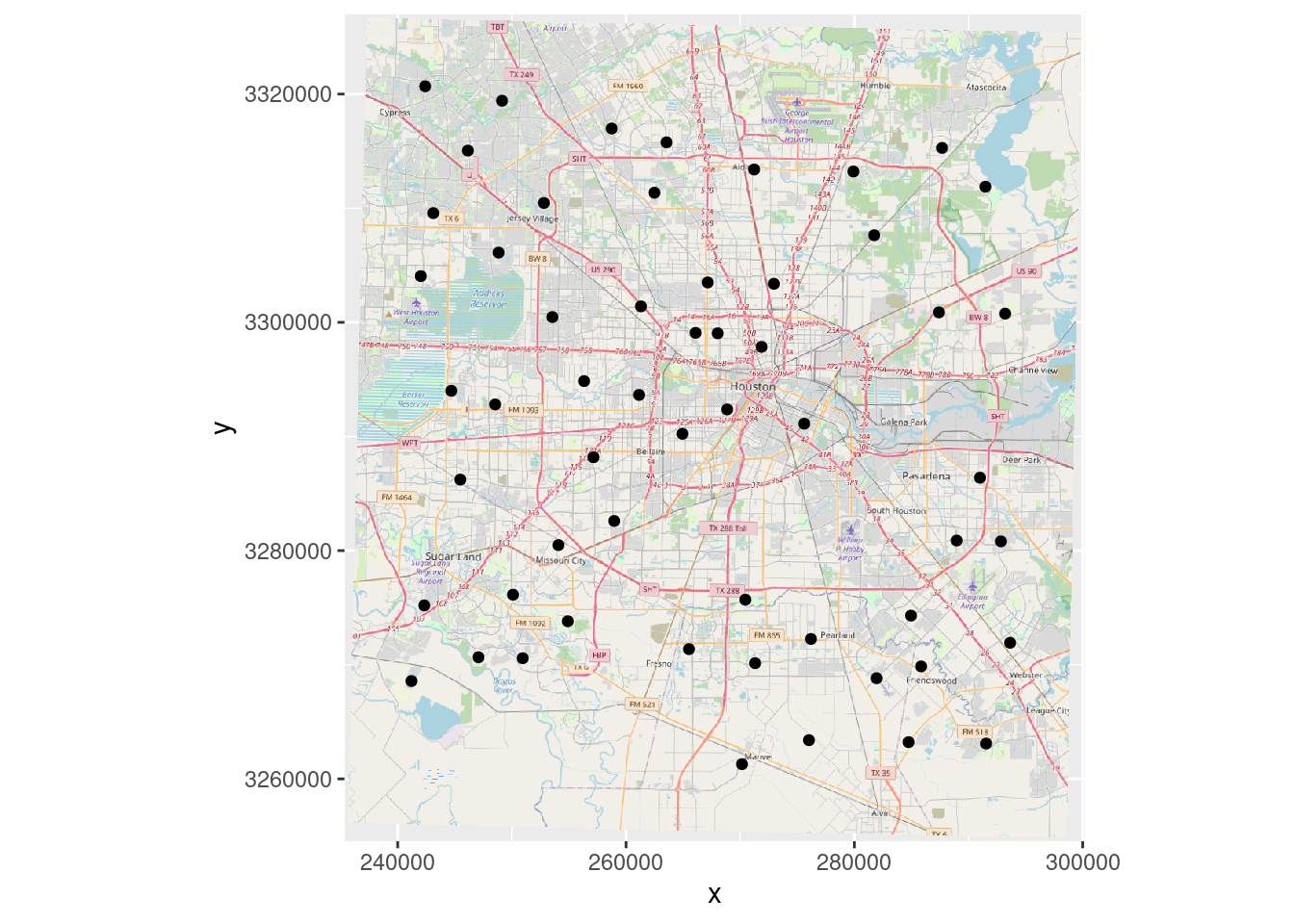
#   Plot in Lat Long (Scale coordinates to act like lat-long)
OpenStreetMap::autoplot.OpenStreetMap(OpenStreetMap::openproj(Base_osm),
                                       projection=webcrs) +
   geom_point(data=df, aes(y=Lat, x=Lon))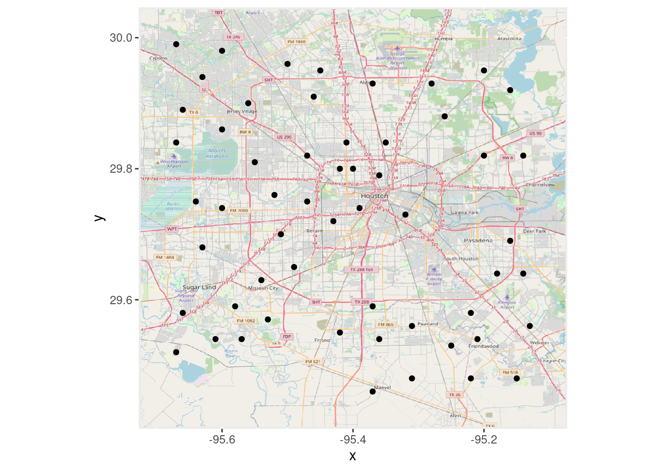
Now let’s use basemaps::basemap_ggplot
# Produces a ggplot object (and caches it)
basemaps::set_defaults(map_service = "osm", map_type = "streets")
Base_basemaps <-  basemaps::basemap_ggplot(ext=bbox, verbose=FALSE)

Base_basemaps +
geom_sf(data=df_web) 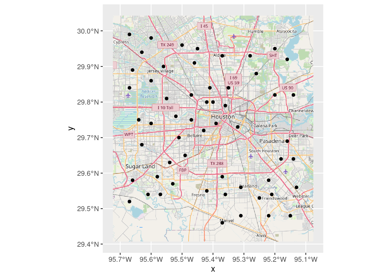
Now we download using basemapR::base_map
BasemapR may be found at ChrisJB (2020).
# Produces a ggplot object
Base_basemapR <- basemapR::base_map(bbox, basemap="mapnik", increase_zoom=2)

#   This is the best looking one.
df_sf %>%
  ggplot() +
  Base_basemapR +
  geom_sf()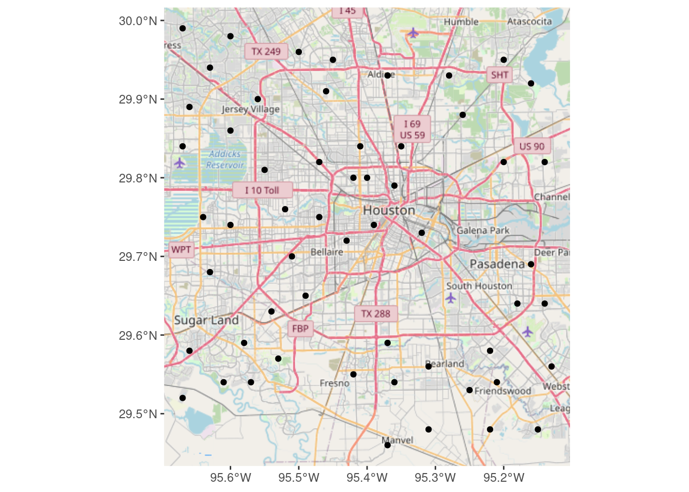
And last but not least, download using ggspatial::annotation_map_tile
# Produces a ggplot object
Base_ggspatial <- ggplot(df_sf) +
  ggspatial::annotation_map_tile(zoomin=-1,
                                 progress="none")

Base_ggspatial +
    geom_sf(inherit.aes = FALSE) +
    theme_minimal()
One more basemap, but this one built with vectors, not rasters
The data from the Open Street Maps can be downloaded as points, vectors, and polygons. This allows a scale-free map of much higher resolution, but is not quite as nice, unless a lot of effort is expended on the aesthetics, and is also quite large. Actually the various vector layers can be quite large, but the final map is quite small, as can be seen in the table below.
For plotting the map in projected coordinates, we have to project the AOI as well. But we can plot the map in projected coordinates which most of the raster-based basemaps do not allow. So there are some clear advantages to using a vector map. Probably not what you want for a quick and dirty, but if you plan to be working in the same area for some time, it is probably worth spending the effort to tweak up a pretty vector-based map.
There were many references I found that helped work out how to best deal with OSM data. My primary references were McCrain (2020) and Burkhart (2019), followed by Padgham (2021). Other useful references were Club (2020), Guillou (2021), and Bailey (2022).
| Sizes in KB for different map objects | |
| Package | Size_KB |
|---|---|
| Big Streets | 47.4 |
| Medium Streets | 99.0 |
| Rivers | 35.4 |
| Lakes | 45.9 |
| ggplot object | 5.7 |
First let’s download the desired data
#   What features are available?
osmdata::available_features() %>% head()
## [1] "abandoned" "abutters"
## [3] "access" "addr"
## [5] "addr:city" "addr:conscriptionnumber"# What tags are available?
osmdata::available_tags("highway") %>% head()## [1] "bridleway" "bus_guideway" "bus_stop" "busway" "construction"
## [6] "corridor"# pull out the "big streets"
big_streets <-
tmaptools::bb(bbox, output="matrix") %>% # turn bounding box into matrix
osmdata::opq()%>% # Build query
osmdata::add_osm_feature(key = "highway",
value = c("motorway",
"motorway_link"
)) %>% # select the big roads
osmdata::osmdata_sf() # turn into an sf file
# pull out the "medium streets"
med_streets <-
tmaptools::bb(bbox, output="matrix") %>% # turn bounding box into matrix
osmdata::opq()%>% # Build query
osmdata::add_osm_feature(key = "highway",
value = c( "secondary_link",
"secondary")) %>% # Grab smaller roads
osmdata::osmdata_sf() # Make sf
# Now get rivers
osmdata::available_tags("waterway") %>% head()## [1] "boatyard" "canal" "dam" "ditch" "dock" "drain"osmdata::available_tags("water") %>% head()## [1] "basin" "canal" "ditch" "fish_pass" "lagoon" "lake"river <- tmaptools::bb(bbox, output="matrix") %>%
osmdata::opq()%>%
osmdata::add_osm_feature(key = "waterway", value = "river") %>%
osmdata::osmdata_sf()
lakes <- tmaptools::bb(bbox, output="matrix") %>%
osmdata::opq()%>%
osmdata::add_osm_feature(key = "water", value = c("reservoir",
"lake",
"basin",
"pond")) %>%
osmdata::osmdata_sf() Now we put it together into a pair of maps. Note that this projected map is really and truly projected, since the vectors themselves were reprojected. If I had put labels on the maps, those too would have been projected.
Making a pretty map this way probably requires a full blog just in itself.
#   Now put it all together and make a plot
ggplot() +
  geom_sf(data = med_streets$osm_lines,
          inherit.aes = FALSE,
          size = 0.4,
          color = "grey25") +
  geom_sf(data = big_streets$osm_lines,
          inherit.aes = FALSE,
          size = 0.4,
          color = "red") +
  geom_sf(data = river$osm_lines,
          inherit.aes = FALSE,
          size = 0.4,
          color = "blue") +
  geom_sf(data = lakes$osm_polygons,
          inherit.aes = FALSE,
          fill="steelblue",
          color = "steelblue") +
  geom_sf(data=df_sf) +
  #   coord_sf needs to follow all the geom_sf statements
  coord_sf(xlim = c(bbox[["xmin"]], bbox[["xmax"]]),
           ylim = c(bbox[["ymin"]], bbox[["ymax"]]),
           expand = FALSE,
default_crs=googlecrs) 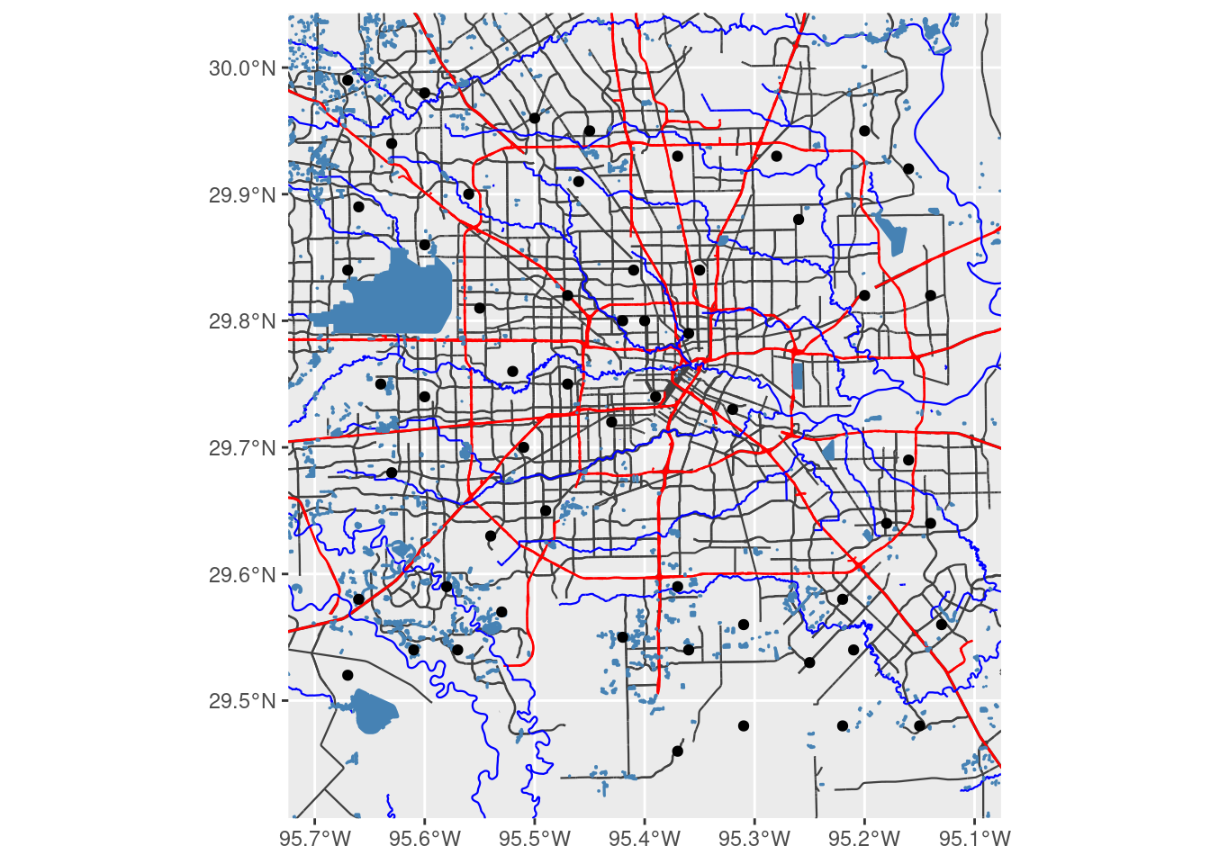
#####   Convert to X-Y for a projected map

#  First convert bounding box (I need to make this cleaner, but this will do for now)

XYmin <- sf::st_transform(sf::st_sfc(sf::st_point(x=c(bbox[["xmin"]], bbox[["ymin"]])),
                                     crs=googlecrs), crs=localcrs)
XYmax <- sf::st_transform(sf::st_sfc(sf::st_point(x=c(bbox[["xmax"]], bbox[["ymax"]])),
                                     crs=googlecrs), crs=localcrs)

ggplot(df_xy) +
  geom_sf(data = sf::st_transform(med_streets$osm_lines, crs=localcrs),
          inherit.aes = FALSE,
          size = 0.4,
          color = "grey25") +
  geom_sf(data = sf::st_transform(big_streets$osm_lines, crs=localcrs),
          inherit.aes = FALSE,
          size = 0.4,
          color = "red") +
  geom_sf(data = sf::st_transform(river$osm_lines, crs=localcrs),
          inherit.aes = FALSE,
          size = 0.4,
          color = "blue") +
  geom_sf(data = sf::st_transform(lakes$osm_polygons, crs=localcrs),
          inherit.aes = FALSE,
          fill="steelblue",
          color = "steelblue") +
  geom_sf(data=df_xy) + # This will post graticules in X-Y rather than Lat-Long
  # coord_sf must follow the geom_sf statements for the bounding box to be applied properly
  coord_sf(xlim = c(XYmin[[1]][1], XYmax[[1]][1]),
           ylim = c(XYmin[[1]][2], XYmax[[1]][2]),
           expand = FALSE,
           datum=localcrs,
           default_crs=localcrs)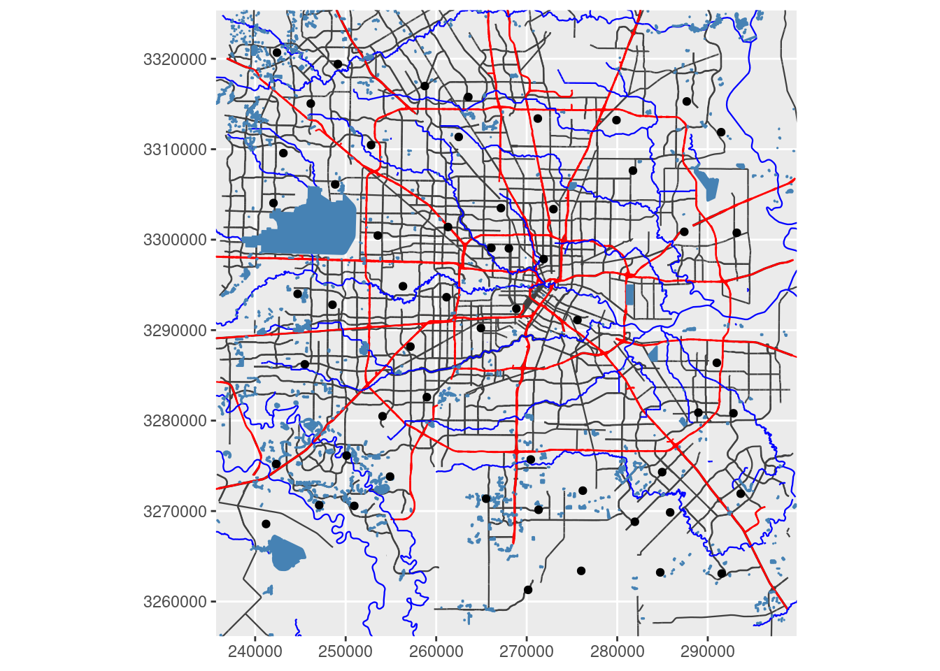
Interactive maps
Now we will create basemaps with input points as interactive maps using both Leaflet and tmap.
I like Leaflet, but it does seem to me to be a bit limited. What it does, it does well and simply. I have foregone the default markers because I don’t really like them, and so that this map is more comparable to the other maps.
Note that the basemap quality is quite high - the features and lettering are crisp and distinct - something that the static basemaps seem to struggle with. There is a plugin for Leaflet that allows the use of projected data - but only if the server uses that same projection. So, for the general case of projecting to a local system, it is pretty useless unless you actually set up your own server for your area of interest.
leaflet::leaflet() %>%
  leaflet::addTiles() %>% # OpenStreetMap by default
  leaflet::addCircleMarkers(data=df_sf,
                   radius=2,
                   color="black",
                   opacity=1,
                   fillOpacity = 1)
Finally let’s take a look at tmap - which can do both static and interactive maps.
We can also transform the basemap to a local X-Y coordinate system, but the results are not especially pleasing since the text labels get distorted by the transform.
Not sure why the data-points increase in size when zooming in, that is rather irritating.
Outside of Lovelace (2022), the other especially helpful tmap reference was Tennekes and Nowosad (2021).
#   Set default basemap
tmap::tmap_options(basemaps="OpenStreetMap")

tmap::tmap_mode("view") # set mode to interactive plots

tmap::tm_shape(df_sf) +
  tmap::tm_sf(col="black", size=0.5)
# Now make a static map
tmap::tmap_mode("plot") # set mode to static plots
Base_tmap_osm <- tmaptools::read_osm(bbox, type="osm")
tmap::tm_shape(Base_tmap_osm) +
tmap::tm_rgb() +
tmap::tm_graticules()+
tmap::tm_shape(df_sf) +
tmap::tm_sf(col="black", size=0.3)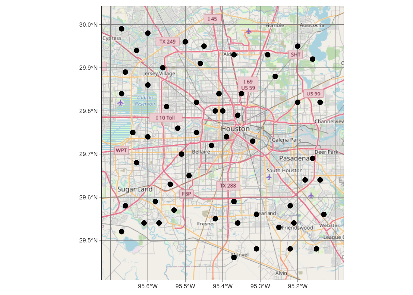
#     And now for projected coordinates

Base_tmap_osm_xy <- stars::st_transform_proj(Base_tmap_osm, crs=localcrs)

tmap::tm_shape(Base_tmap_osm_xy) +
    tmap::tm_rgb() +
    tmap::tm_grid()+
tmap::tm_shape(df_xy) +
  tmap::tm_sf(col="black", size=0.3)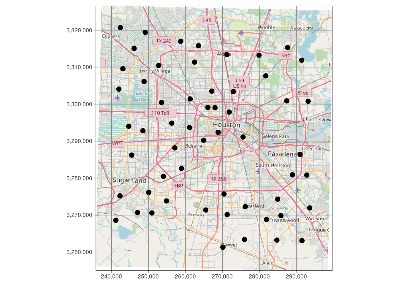
Density contours
We will ignore the actual point values and just look at the point density. This is generally a good idea, just to get a feel for where the data is thin and where the ending results are likely to be more reliable. And this will be a good way to work through the mechanics of posting filled contours onto a basemap.
Let’s plot three ways, an interactive plot with Leaflet, and a static plot with ggplot, and also use tmap.
For the static maps, I will use the basemaps generated above that looked the best.
To add a scalebar, there are two options: ggspatial or ggsn (Baquero (2019)).
References that were especially helpful were Wilke (2020) and Duong (2022).
My biggest issue with the density plot is that I don’t know what the numbers mean. A density of 5 is 5 stations per what? Not at all clear. Of course, it is fairly bogus anyway since I have done everything in Lat-Long, and not in X-Y.
One advantage of using the eks density estimate, is that it is clearer what the output means. The 20% contour means “20% of the measurements lie inside this contour”. The documentation for eks takes issue with how stat_density_2d does its calculation, I don’t know who is right, but for this dataset they are quite similar results.
I have also added a scalebar to the maps, which is a good idea. I like the scalebar from ggspatial the best, but the scalebar made with ggsn is generally easier to get to work and less fussy.
Note that I am mixing and matching things from ggspatial with other things, to get what I like the best. This can cause issues, but a little patience can get it all to work. It is and example of how some more consolidation and standards in this realm would be really helpful.
##########################################################
#   Density maps
##########################################################

#   Lay down basemap
ggplot(df_sf) +
  #   this is the best looking basemap
  Base_basemapR +
  #   Add points
  geom_sf(inherit.aes = FALSE) +
  #   Create filled density "contours" - the as.numeric converts from factor
  #   for the scale_fill_gradient command.
  stat_density_2d_filled(data=df,
                         alpha = 0.4,
                         n=50,
                         contour_var="density",
                         aes(x=Lon, y=Lat,
                             fill=as.numeric(..level..))) +
  #   Add actual contour lines
  stat_density_2d(data=df,
                  alpha = 0.8,
                  n=50,
                  contour=TRUE,
                  contour_var="density",
                  aes(x=Lon, y=Lat )) +
  #   Twiddle the color scale
  scale_fill_gradient2("Rainfall Station\ndensity",
                       low = "white",
                       mid = "yellow",
                       high = "red",
                       limits=c(0,8),
                       midpoint = 4) +
  #   Add a scale bar
 ggspatial::annotation_scale(data=df_sf, aes(unit_category="imperial",
                                             style="ticks"),
    location="br", width_hint=0.2, bar_cols=1) +
  #   Add title
  ggtitle("Density of Rainfall Measurements") +
  labs(subtitle="Density using stat_density_2d") +
coord_sf(crs=googlecrs) # required 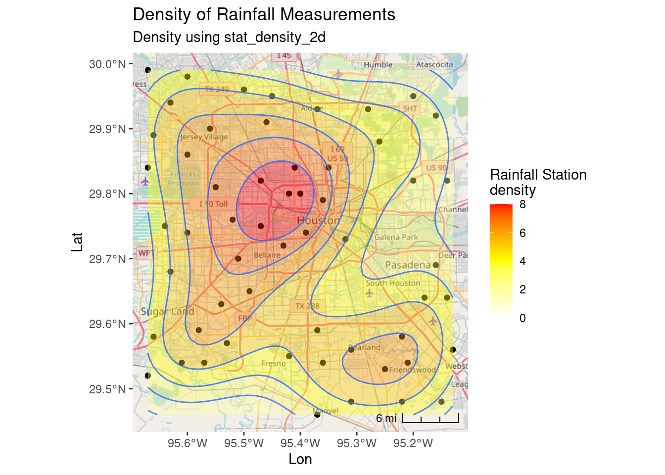
##  Now use the eks package for density estimates

Sta_den <- eks::st_kde(df_sf) # calculate density

#   Lay down basemap
ggplot() +
  #   this is the best looking basemap
  Base_basemapR +
  #   Add points
  geom_sf(data=df_sf) +
  #   Create filled density "contours"
  geom_sf(data=eks::st_get_contour(Sta_den,
                                   cont=c(20,40,60,80)),
          aes(fill=eks::label_percent(contlabel)), alpha=0.4) +
  #   Legend
  colorspace::scale_fill_discrete_sequential(name = "Density Percentile") +
  #   Add a scale bar
  ggspatial::annotation_scale(data=df_sf, aes(unit_category="imperial", style="ticks"),
    location="br", width_hint=0.2, bar_cols=1) +
 #   This is an alternative way to add a scale
 # ggsn::scalebar(df_sf, dist = 2, dist_unit = "mi", location="bottomleft",
  #           transform = TRUE, model = "WGS84") +
  #   Add title
  ggtitle("Density of Rainfall Measurements") +
  labs(subtitle="Density using EKS") +
coord_sf(crs=googlecrs) # required 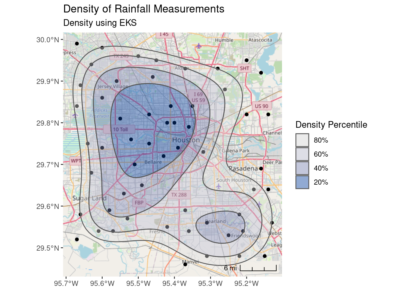
Now for Leaflet maps which I do not recommend. The heatmap is weirdly dependent on the map scale. Much better in my opinion to calculate the contours in eks and overlay them.
# Let's do it in Leaflet with heatmap

leaflet::leaflet() %>%
  leaflet::addTiles() %>% # OpenStreetMap by default
  leaflet::addCircleMarkers(data=df_sf,
                            radius=2,
                            color="black",
                            opacity=1,
                            fillOpacity = 1) %>%
  #   This is *not* the same as stat_density, and is scale dependent,
  #   which sucks.
  leaflet.extras::addHeatmap(data=df, group="heat", max=.6, blur = 60,
                             radius=30)
# VERY conveniently, eks can generate an sf file of contour lines
contours <- eks::st_get_contour(Sta_den, cont=c(20,40,60,80)) %>%
mutate(value=as.numeric(levels(contlabel)))
pal_fun <- leaflet::colorQuantile("YlOrRd", NULL, n = 5)
p_popup <- paste("Density", as.numeric(levels(contours$contlabel)), "%")
leaflet::leaflet(contours) %>%
leaflet::addTiles() %>% # OpenStreetMap by default
leaflet::addCircleMarkers(data=df_sf,
radius=2,
color="black",
opacity=1,
fillOpacity = 1) %>%
leaflet::addPolygons(fillColor = ~pal_fun(as.numeric(contlabel)),
popup = p_popup, weight=2)Okay, now let’s see what it takes to make a similar map in tmap.
I should note that one issue I have with tmap is that it will silently ignore errors far too often. I misspelled options, color palettes, and other items and the items were silently ignored, which was incredibly frustrating. That makes it much harder to use than it should be.
That said the basemaps are okay, though when transformed the labels get corrupted. My greatest issue is that I already understand ggplot, and don’t want to learn yet another package like it. Though I guess one could argue that it could replace leaflet, so that might be an argument in its favor. In any event, I present it here, but I’m not energetic enough to dual plot everything in ggplot and tmap.
tmap::tmap_mode("view") # set mode to interactive plots

tmap::tm_shape(df_sf) +
    tmap::tm_sf(col="black", size=0.5) +
  #   contours from eks
  tmap::tm_shape(contours) +
    tmap::tm_polygons(col="value",
                      palette="Blues",
                      alpha=0.5 )
# Now make a static map
tmap::tmap_mode("plot") # set mode to static plots
Base_tmap_osm <- tmaptools::read_osm(bbox, type="osm")
tmap::tm_shape(Base_tmap_osm) +
tmap::tm_rgb() +
tmap::tm_graticules()+
tmap::tm_shape(df_sf) +
tmap::tm_sf(col="black", size=0.3) +
tmap::tm_shape(contours) +
tmap::tm_polygons(col="contlabel",
title="Density %",
labels=c("80%", "60%", "40%", "20%"),
palette="Blues",
alpha=0.5 ) +
tmap::tm_layout(legend.position = c("right", "top"),
legend.frame=TRUE)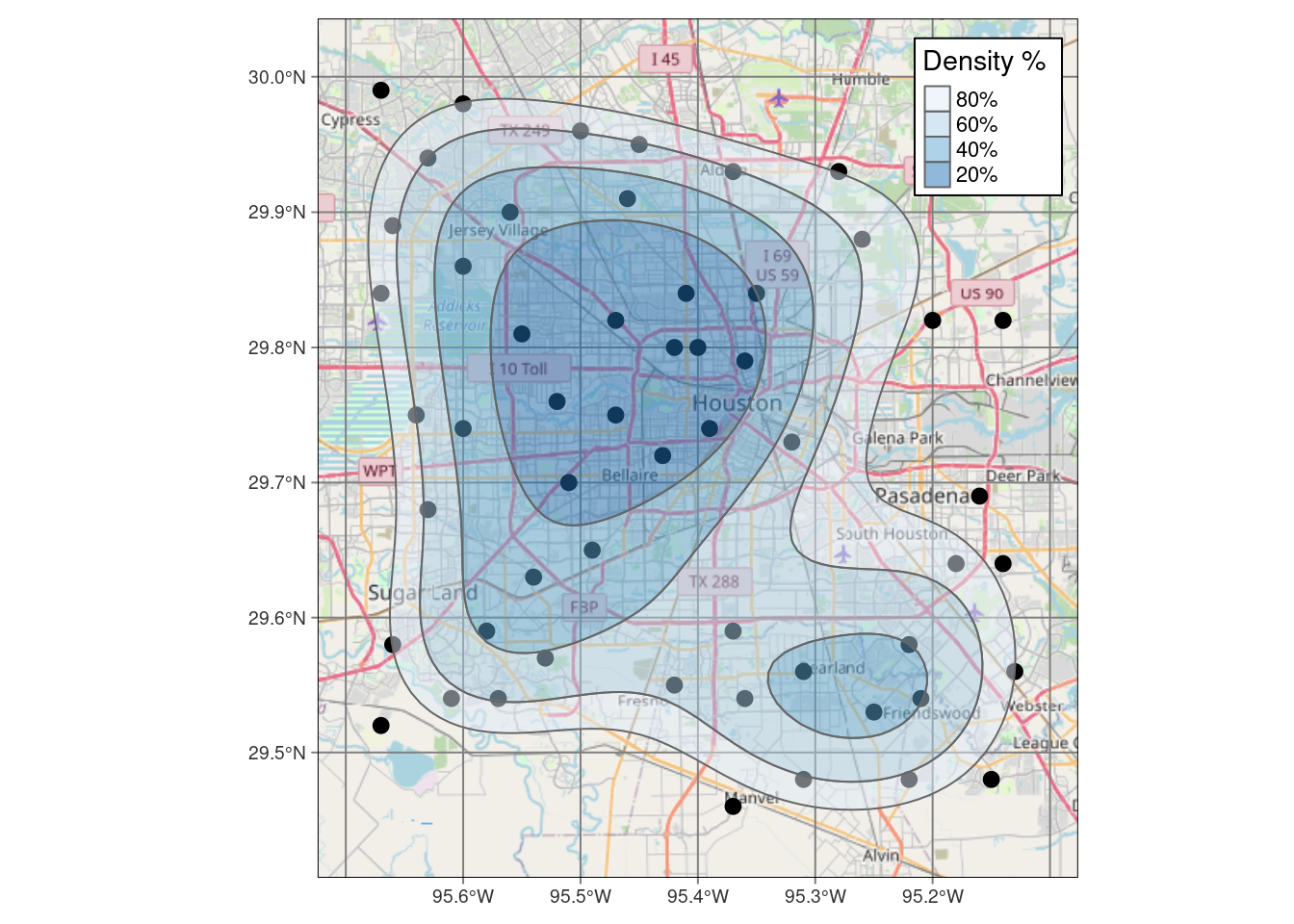
#     And now for projected coordinates

Base_tmap_osm_xy <- stars::st_transform_proj(Base_tmap_osm, crs=localcrs)

tmap::tm_shape(Base_tmap_osm_xy) +
    tmap::tm_rgb() +
    tmap::tm_graticules()+
tmap::tm_shape(df_xy) +
  tmap::tm_sf(col="black", size=0.3)+
tmap::tm_shape(sf::st_transform(contours, crs=localcrs)) +
  tmap::tm_polygons(col="contlabel",
                    title="Density %",
                    labels=c("80%", "60%", "40%", "20%"),
                    palette="Blues",
                    alpha=0.5 ) +
  tmap::tm_layout(legend.position = c("right", "top"),
                  legend.frame=TRUE)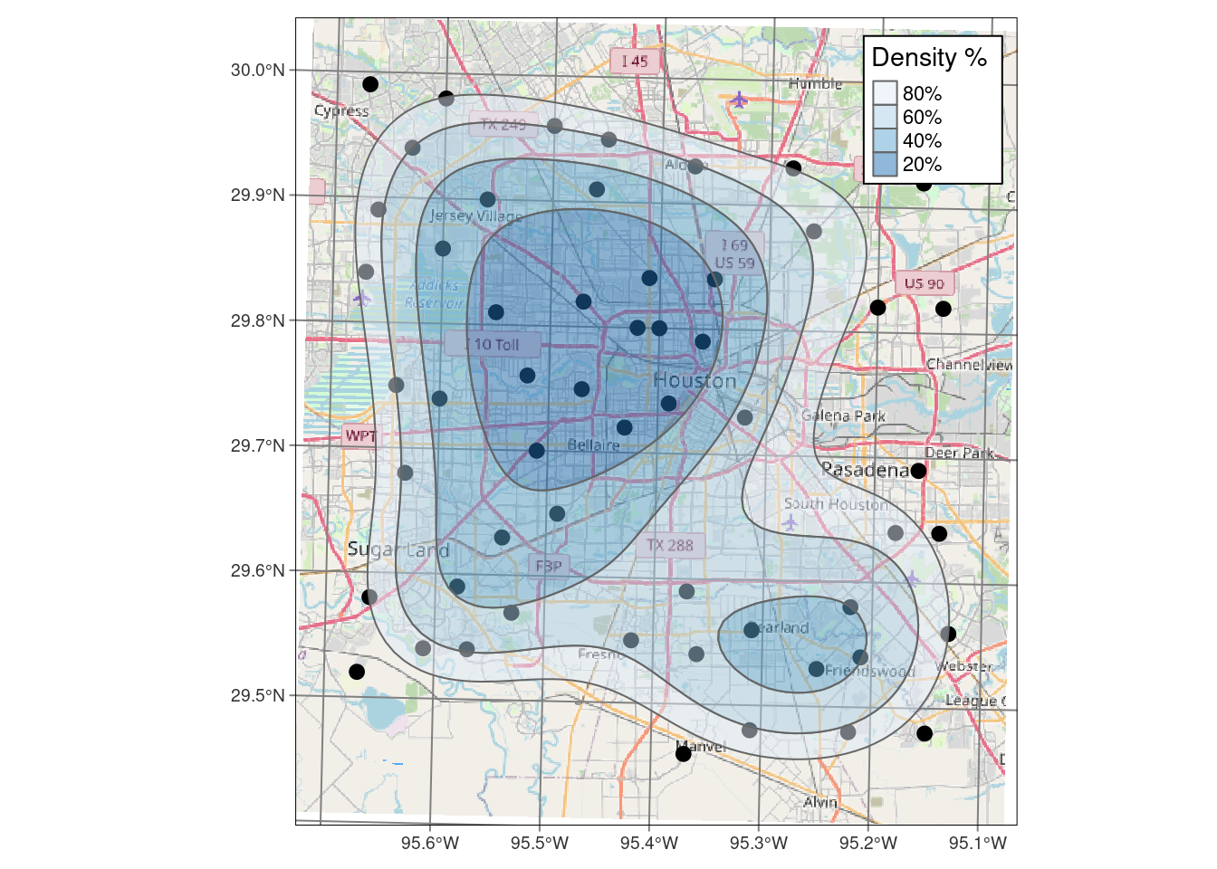
Contours by value
This is the meat of this blog. This is what I really want to do - everything else was just preliminary to getting to this point.
This is complicated. Because we want a basemap underneath, the basemap is in EPSG:3857, the Spherical Pseudo-Mercator projection, and is basically just an image. In order to plot points and contours on the basemap, those need to be in lat-long to be compatible with my preferred basemap.
But gridding schemes want to be in X-Y.
So the process is as follows:
- set up an X-Y grid
- convert input data to X-Y
- interpolate input data to the X-Y grid locations
- contour
- transform those contours back into lat-long
One source of frustration here is that I would prefer to stick with just one “raster” package, but I don’t see an easy way to not pop back and forth between terra and stars. Stars is much better integrated with sf, making those transitions smooth and painless, but terra has better smoothing options. Additionally, I had to go back and use raster to access some functionality.
Notes on making a grid. I have had many long, and sometimes heated discussions with colleagues on what a grid spacing should be. There is no right answer. The spacing should be of the same order of magnitude as the average spacing between your data points, but if that spacing is quite irregular with clusters and sparse areas, that becomes problematic. If you choose a spacing that honors the clustered data, then you may suffer from artifacts in the sparse data areas. If you honor the sparse spacing, then you will lose resolution in the densely populated areas. Ultimately it is a balancing act and needs to be looked at in light of the objectives of the map. Forcing sparse areas to not contour is one solution, or adding pseudo-data to the sparse areas to control the interpolation is another. It was simpler when I made my contour maps by hand on a drafting table, but a lot slower.
To pick this spacing I started with a guess, and then played with the grid spacing and looking at what the contours looked like to decide what the “best” value was.
References for interpolation that I used were Gimond (2022) (Appendix J), Wilke (2020), and chapter 4 of rspatial.org (2021). For Kriging in particular, I found Dorman (2022) very helpful.
#   First we create a box to build the grid inside of - in XY coordinates, not
#   lat long.

bbox_xy = bbox %>%
  sf::st_as_sfc() %>%
  sf::st_transform(crs = localcrs) %>%
  sf::st_bbox()

#    Four ways to create a grid definition - note that the first gives corner
#    coordinates. We will need each of these at some point.

#     Data frame
grd_df <- expand.grid(
  X = seq(from = bbox_xy["xmin"], to = bbox_xy["xmax"]+1000, by = 1000),
  Y = seq(from = bbox_xy["ymin"], to = bbox_xy["ymax"]+1000, by = 1000) # 1000 m resolution
)

#     sfc POINT file
grd_sf <- sf::st_make_grid(x=bbox_xy,
                                  what="corners",
                                  cellsize=1000,
                                  crs=localcrs
                                  )

#     SpatRaster file
grd_terra <- terra::rast(xmin=bbox_xy["xmin"]-500, xmax=bbox_xy["xmax"]+1000,
                             ymin=bbox_xy["ymin"]-500, ymax=bbox_xy["ymax"]+1000,
                             resolution=1000,
                             crs=localcrs,
                             vals=1,
                             names="Foo")

#     RasterLayer file
grd_raster <- raster::raster(xmn=bbox_xy["xmin"]-500, xmx=bbox_xy["xmax"]+1000,
                                ymn=bbox_xy["ymin"]-500, ymx=bbox_xy["ymax"]+1000,
                                resolution=1000,
                                crs=localcrs,
                                vals=1)


#     Let's see what they look like, and make sure they represent the same points
ggplot() +
  geom_point(data=grd_df, aes(x=X, y=Y)) +
  geom_sf(data=grd_sf, shape="+", color="red", size=4) +
  geom_sf(data=sf::st_as_sf(terra::as.points(grd_terra)),
          shape="o", size=5, color="green") +
  #     "zoom in" on a corner to see better
  coord_sf(xlim = c(XYmin[[1]][1], XYmin[[1]][1]+10000),
           ylim = c(XYmin[[1]][2], XYmin[[1]][2]+10000),
           expand = FALSE)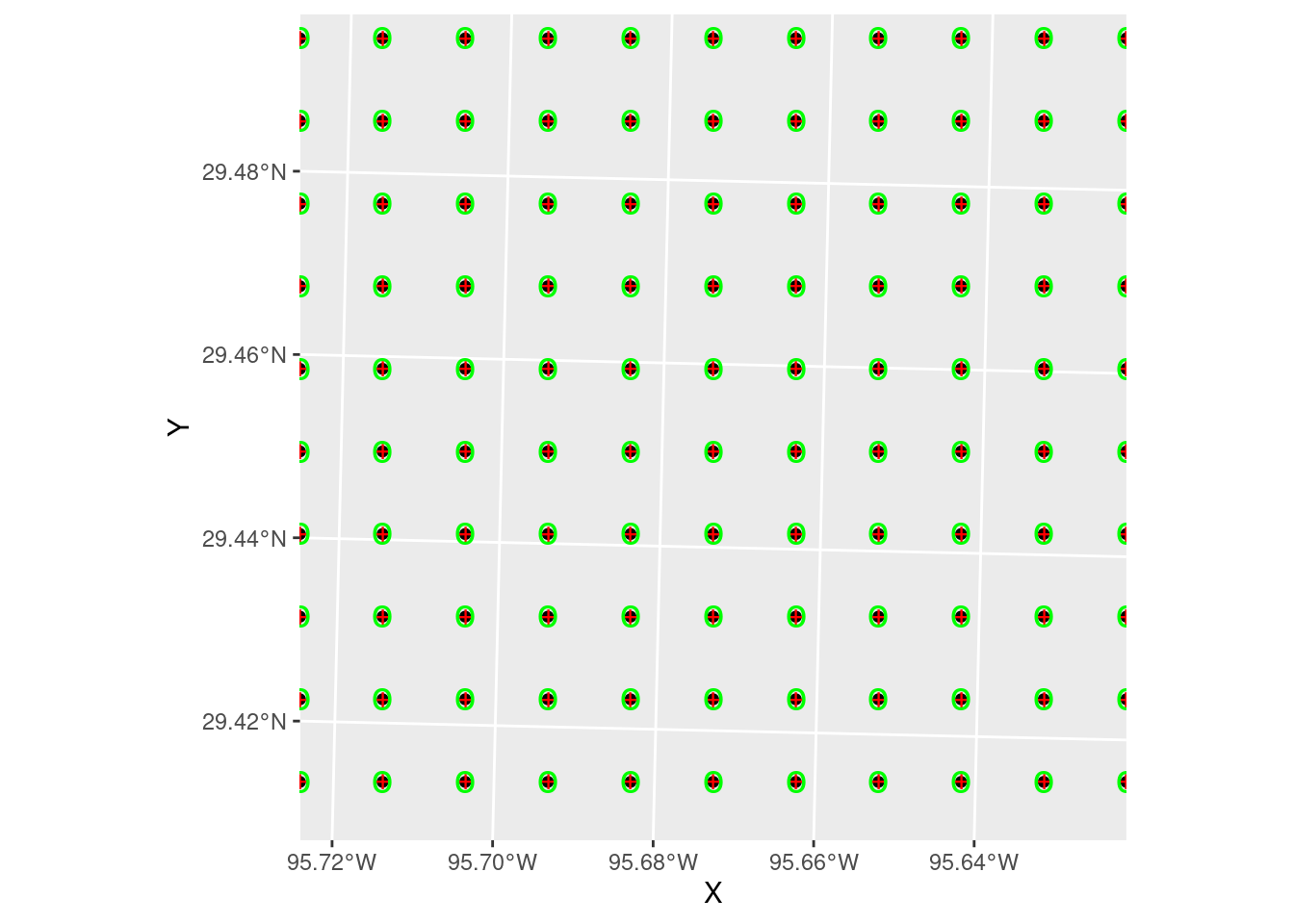
Inverse Distance Weighting
A note on the displays. A useful trick I learned from a software vendor (Jason Geophysics) was to place the original data on top of the colored grid fill, and give both the same colormap and matching scale. In this way, the original data point will seem to disappear if its value is close to the interpolated values around it. If the error is large, however, then the point will stand out. It is a nice qualitative measure of the robustness of the interpolation, and can also provide insights into where things might be going wrong.
Let’s start with Inverse Distance Weighting, which is a pretty dumb algorithm, but for well-populated and fairly smooth input data can yield nice results. It is also fast and reasonably intuitive.
In this case it does a pretty crappy job, but this is a challenging dataset. In practice you might start by trying IDW, but after seeing the results give it up and move on to a more sophisticated algorithm. Later we will look at some ways to pick parameters for the algorithm.
#     Create interpolator and interpolate to grid

fit_IDW <- gstat::gstat(
  formula = Rain ~ 1,
  data = df_xy,
  #nmax = 10, nmin = 3, # can also limit the reach with these numbers
  set = list(idp = 2) # inverse distance power
)

#   Use predict to apply the model fit to the grid (using the data frame grid
#   version)

#           We set debug.level to turn off annoying output
interp_IDW <- predict(fit_IDW, grd_sf, debug.level=0)

#   Convert to a stars object so we can use the contouring in stars
interp_IDW_stars <- stars::st_rasterize(interp_IDW %>% dplyr::select(Rain=var1.pred, geometry))

#   Quick sanity check, and can use to adjust the distance power Looks pretty
#   good - most input points look close to the output grid points, with some
#   notable exceptions. The red point to the north is possibly bad data. Easier
#   to judge from areal displays.
ggplot() +
  #   geom_stars is a good way to display a grid
  stars::geom_stars(data=interp_IDW_stars) +
  geom_sf(data=df_xy, aes(color=Rain), size=5) +
  geom_sf(data=df_xy, color="Black", size=1) +
  #     This is for the raster color fill
  scale_fill_gradientn(colors=rainbow(5), limits=c(0,3)) +
  #     This is for the original data points
  scale_color_gradientn(colors=rainbow(5), limits=c(0,3)) +
  labs(title="Inverse Distance Weighting, Power = 2")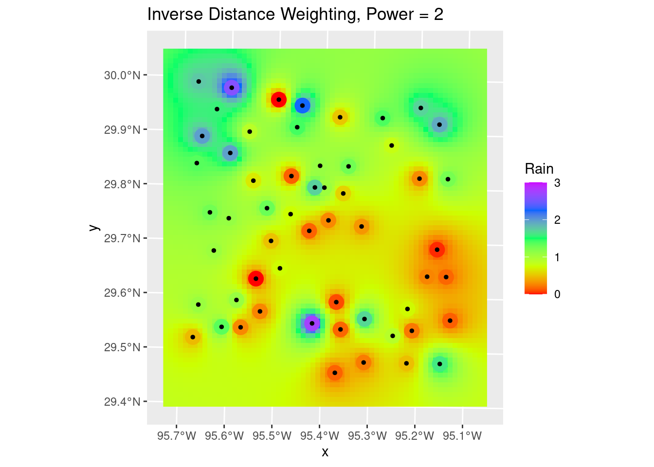
How do we decide to use any particular power for the weighting? Let’s try a number of values and see what changes in a “leave-one-out” analysis. This section was particularly inspired by Dorman (2022) and Gimond (2022).
As the final map shows, there are areas where adjacent points have wide variation, and the algorithm struggles to fit those data. This is a rough surface with a great deal of variability, and for the degree of variability, is terribly under-sampled. I would expect all algorithms to be challenged.
Another aspect of the under sampling and roughness is estimating the error. A weighting power of 1.5 is very gentle, and will tend to allow points at some distance to have an undue influence on the result. With a rough surface, as we will see more explicitly later on from the variogram, the correlation distance should be small, and a larger weighting power will accomplish that. Partly because of that intuition, I have calculated the optimum weighting power based on both the Root Mean Square error (RMS), and the Mean Absolute Error (MAE). I prefer the latter.
#   debug and verbose set to turn off chatter
Validate <- sf::st_as_sf(gstat::gstat.cv(fit_IDW, debug.level=0, verbose=FALSE))

Validate %>%
  rename(Observed=observed, Predicted=var1.pred ) %>%
  ggplot(aes(x=Observed, y=Predicted)) +
    geom_point() +
    geom_smooth(method='lm') +
    geom_abline(intercept=0, slope=1, color="red", linetype="dashed") +
    labs(title="Leave-one-out Validation",
         x="Observed (inches)",
         y="Predicted (inches)")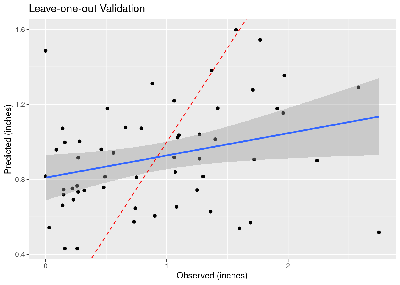
#   Do a leave-one-out analysis for a variety of weighting powers
Validate <- NULL
for (power in (1:6)*0.5) {
  my_fit <- gstat::gstat(formula = Rain ~ 1, data = df_xy,  set = list(idp = power))
  foo <- sf::st_as_sf(gstat::gstat.cv(my_fit, debug.level=0, verbose=FALSE)) %>%
    rename(Observed=observed, Predicted=var1.pred ) %>%
    mutate(power=power)

  Validate <- bind_rows(Validate, foo)
}

Validate %>%
  ggplot(aes(x=Observed, y=Predicted)) +
    geom_point() +
    geom_smooth(method='lm') +
    geom_abline(intercept=0, slope=1, color="red", linetype="dashed") +
    facet_wrap(vars(power)) +
    labs(title="Leave-one-out Validation",
         x="Observed (inches)",
         y="Predicted (inches)")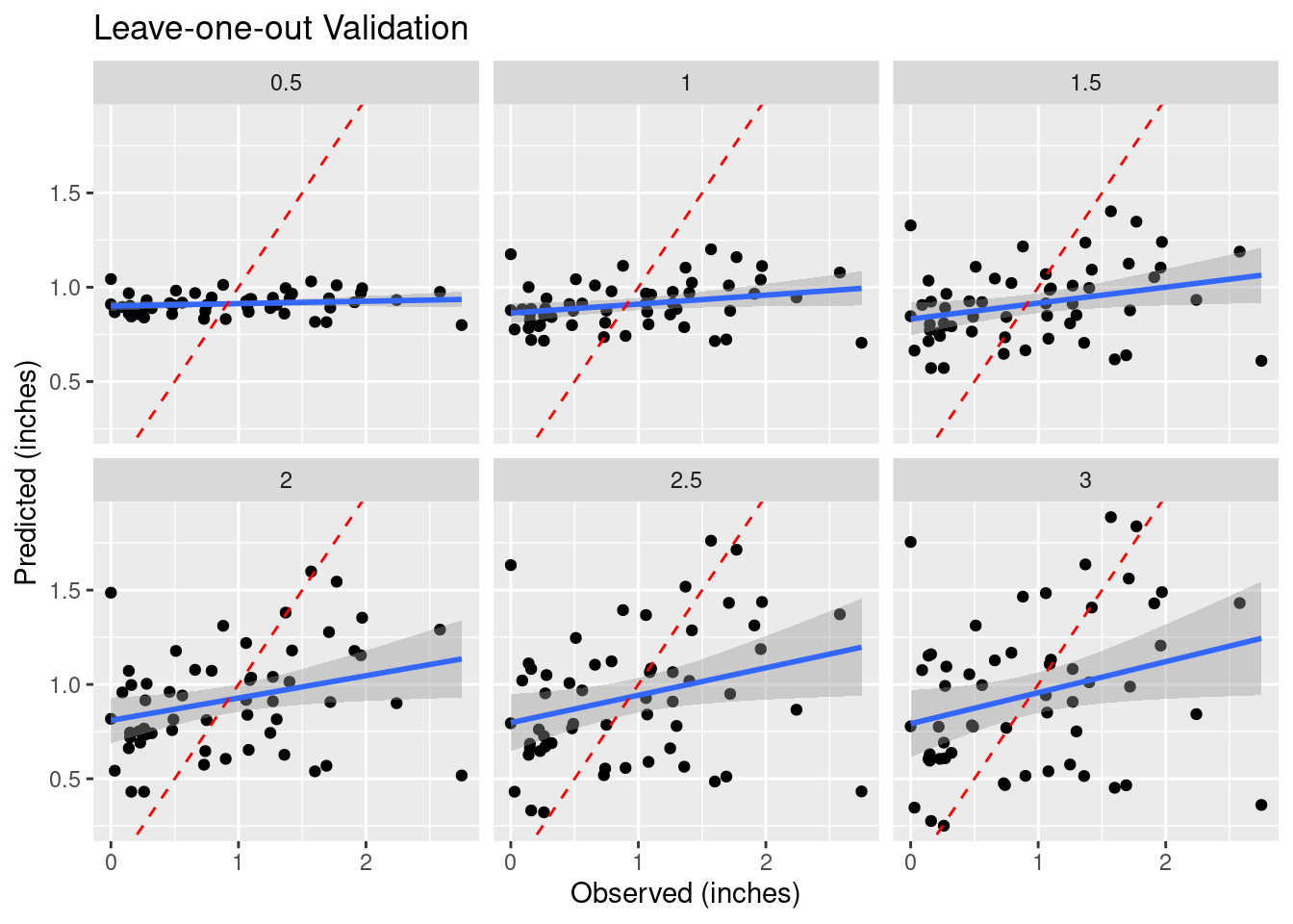
#     Root mean square error

RMS <- Validate %>%
  group_by(power) %>%
  summarise(RMS=sqrt(sum((Predicted-Observed)^2) / n()))

RMS %>%
  ggplot(aes(x=power, y=RMS)) +
    geom_point() +
    geom_smooth() +
    labs(title="RMS Error vs. Inverse Distance Weighting Power")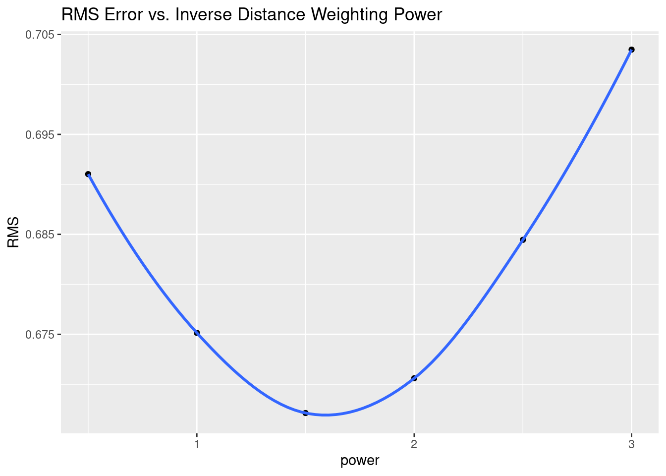
#     However, RMS error is dominated by outliers, and gives a model that feels
#     wrong. Let's try Mean Absolute Error instead

MAE <- Validate %>%
  group_by(power) %>%
  summarise(MAE=(sum(abs(Predicted-Observed)) / n()))

MAE %>%
  ggplot(aes(x=power, y=MAE)) +
    geom_point() +
    geom_smooth() +
    labs(title="MAE Error vs. Inverse Distance Weighting Power")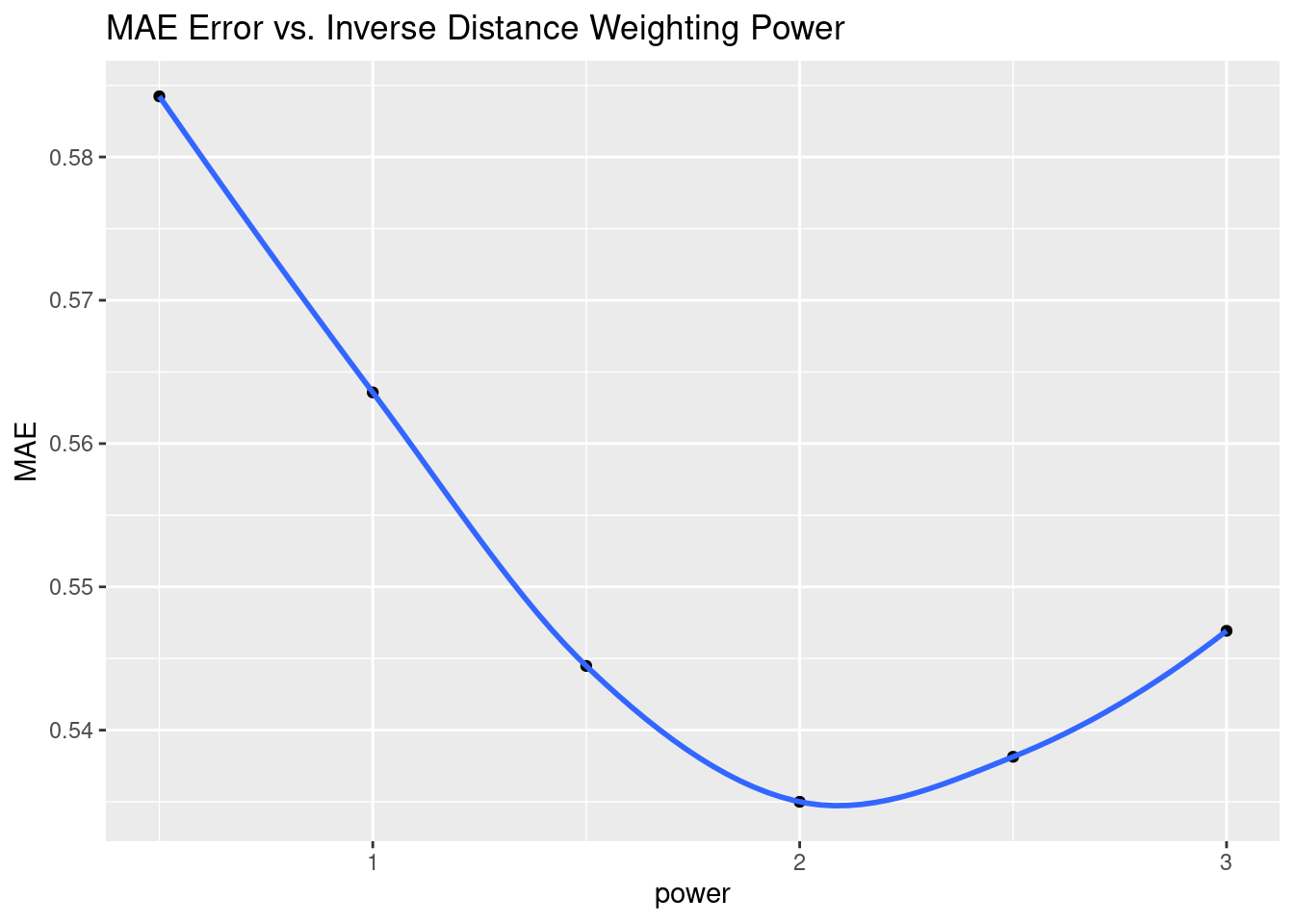
#     Let's look at the optimal RMS on a map
Validate %>%
  filter(power==1.5) %>%
    mutate(Difference=Predicted-Observed) %>%
  ggplot() +
    geom_sf(aes(size=abs(Difference), color=Difference)) +
    scale_size_continuous(range=c(1,12)) +
    geom_sf(aes(size=0.0001), color="black") +
    colorspace::scale_color_continuous_diverging(palette = "Blue-Red 3")+
    labs(title="Power of 1.5, MAE optimum")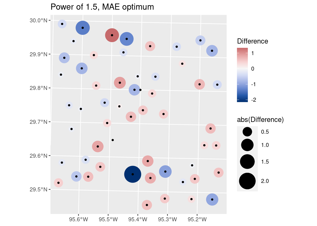
#     Let's look at the optimal MAE on a map
#bind_cols(sf::st_drop_geometry(Validate), as_tibble(sf::st_coordinates(Validate)))
Validate %>%
  filter(power==2.0) %>%
    mutate(Difference=Predicted-Observed) %>%
  ggplot() +
    geom_sf(aes(size=abs(Difference), color=Difference)) +
    scale_size_continuous(range=c(1,12)) +
    geom_sf(aes(size=0.0001), color="black") +
    colorspace::scale_color_continuous_diverging(palette = "Blue-Red 3") +
    labs(title="Power of 2, MAE optimum")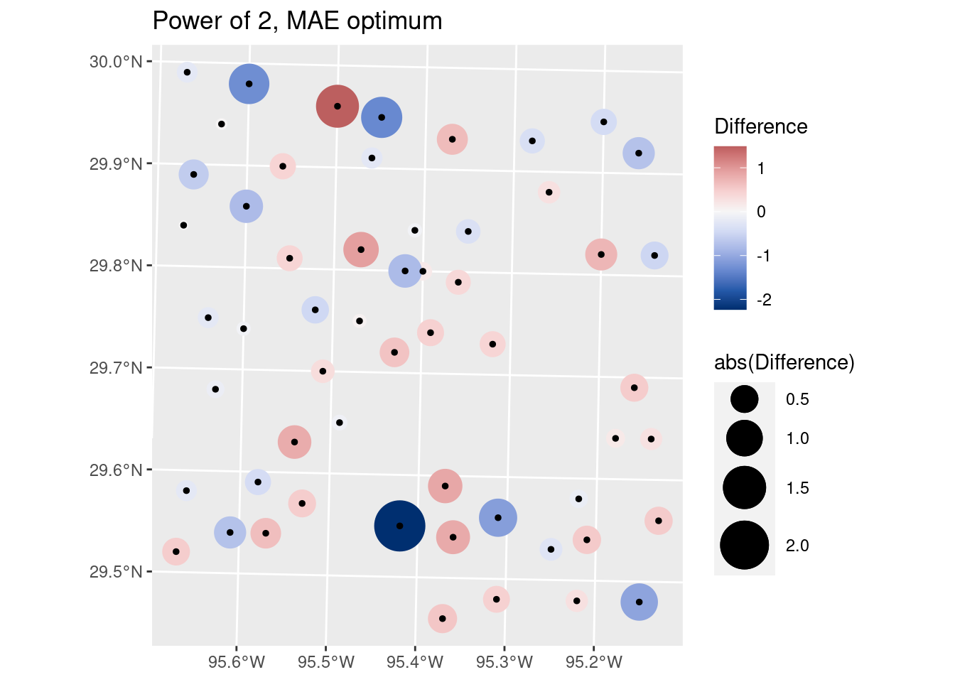
Contours
Now let’s make some contours. I am avoiding using some contouring commands, because I want to be able to treat the contours as lines, and convert them from X-Y coordinates back into Lat-Long coordinates to place on top of the basemap.
The first method for defining breaks is pretty nice for quickly making good-looking breaks, but has the disadvantages that you don’t know what number the contours represent, and also if you need to compare several plots, the contour breaks may change between plots.
# Make some pretty breaks for contour intervals based on the data
# brks <- classInt::classIntervals(pretty(n=10,
# x=as.vector(interp_IDW_stars[[1]])), n=8)

#     Or define the breaks - we'll use these to have consistent contours between
#     plots
brks <- seq(from = 0, to = 3, by = 0.5)
#   Create contour lines
Contours_IDW <- stars::st_contour(interp_IDW_stars, contour_lines=TRUE, breaks=brks)
#   Plot to see what it all looks like
ggplot() +
  stars::geom_stars(data=interp_IDW_stars) +
  geom_sf(data=df_xy, aes(color=Rain), size=5) +
  geom_sf(data=df_xy, color="Black", size=1) +
  scale_fill_gradientn(colors=rainbow(5), limits=c(0,3)) +
  scale_color_gradientn(colors=rainbow(5), limits=c(0,3)) +
geom_sf(data=Contours_IDW, color="black") 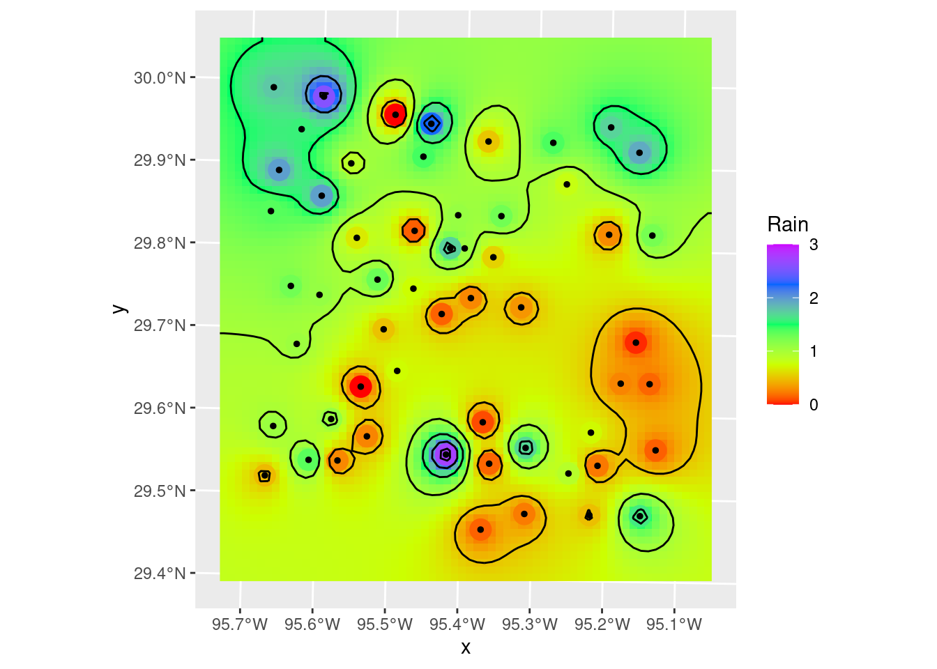
Let’s divert briefly to look at another way to plot filled contours. There is a package, metR from Campitelli (2021) which consists of ggplot extensions. The contour and filled contour functions are particularly nice, although I think I prefer putting the stars grid behind the contours to show the changes between contour lines. But the nicest bit is that metR::geom_contour2 will label contours - which is frankly pretty awesome.
Of course there are always competing desires. I like to stay as mainstream as I can, so that old code doesn’t break when a specialty package loses support and gets bit-rot. On the other hand, some added functionality is so nice that it is hard to resist.
metR will also do contour fill, but it will fill with a constant color between contours, which is not what I want. I want to see the continuous color variation.
ggplot() +
  #   geom_stars will display the full grid variation, geom_contour_fill will
  #   fill between the contours with a constant hue.
  stars::geom_stars(data=interp_IDW_stars) +
  #  This is left in just as an example - if you want that sort of contour fill
  # metR::geom_contour_fill(data=as_tibble(interp_IDW_stars),
  #                         aes(x=x, y=y, z=Rain),
  #                         breaks=brks,
  #                         show.legend = FALSE) +
  geom_sf(data=df_xy, aes(color=Rain), size=5) +
  #     data expected to be a tibble-like object
  metR::geom_contour2(data=as_tibble(interp_IDW_stars),
                      aes(x=x, y=y, z=Rain, label=stat(level)),
                      breaks=brks, color="black")+
  geom_sf(data=df_xy, color="Black", size=1) +
  scale_fill_gradientn(colors=rainbow(5), limits=c(0,3)) +
scale_color_gradientn(colors=rainbow(5), limits=c(0,3)) 
Smoothing grids and contours
Note that the smoothing step I show below is actually inappropriate for this data - I assume that the rainfall measurements are basically error-free. However, if you had a dataset where you knew that there was substantial error in some of the measurements, then smoothing the fit might make a lot of sense. Especially if you are trying to see overall trends and not too interested in high resolution details that might be bogus anyway. Note that when smoothing, we lose the data on the edges due to the half-width of the smoothing filter. Fortunately we built our grid with extra space around the edges.
In geology, we consider two main sorts of surfaces - folded topographies and erosional topographies. Folded systems we expect to be smoothly varying (ignoring faults!) with no “bulls-eyes”. But erosional surfaces might easily have abrupt changes, and in that case “bulls-eyes” are perfectly reasonable. In truth, this sort of rainfall - heavy rain from scattered individual thunderheads, should look more like the erosional model.
In this case we have to jump over to terra for the smoothing functionality. I have also made use of the smoothr package, which among other things will take the contour lines themselves as input objects, and smooth them out a little, basically file down the sharp edges. It makes very tiny changes, but quite noticeable, and very pleasing.
For smoothr - the package to smooth contours, the reference is Strimas-Mackey (2021).
#   Hmmm.... could use some smoothing
#   But stars does not have focal operations, so we go to terra?

foo_terra <- terra::rast(interp_IDW_stars)

#   Let's do a 3x3 mean (could also use a median in some circumstances)
foo_sm <- terra::focal(foo_terra, w=3, fun=mean)

#   Create contours again
Contours_sm <- stars::st_contour(stars::st_as_stars(foo_sm), contour_lines=TRUE, breaks=brks)

#  One more step - let's smooth the contours themselves - really just
#  aesthetically round off the pointy bits
Contours_sm2 <- smoothr::smooth(Contours_sm, method="ksmooth", smoothness=2)

#   and our final plot in X-Y space
ggplot() +
  stars::geom_stars(data=stars::st_as_stars(foo_sm) %>%
                      rename(Rain=focal_mean)) +
  geom_sf(data=df_xy, aes(color=Rain), size=5) +
  geom_sf(data=df_xy, color="Black", size=1) +
  scale_color_gradientn(colors=rainbow(5), limits=c(0,3)) +
  scale_fill_gradientn(colors=rainbow(5), limits=c(0,3), na.value="transparent") +
  geom_sf(data=Contours_IDW, color="red") +
  geom_sf(data=Contours_sm2, color="blue") +
  annotate("text", label="C.I. = 0.5 inches of rain",
           x=bbox_xy[['xmin']]+1000,
           y=bbox_xy[['ymin']]-1000,
           hjust="inward", size = 3) +
  labs(title="Final X-Y plot of Inverse Weighted data",
       subtitle="Red contours are original, Blue are final, color fill is smoothed data.")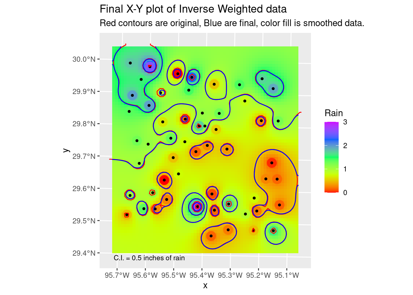
Now let’s transform our contours to lat-long and plot on a basemap. Sadly, it appears that I cannot label the contours in ggplot, geom_contour and metR both fail silently no matter what I do. I suspect (and found a stack overflow comment that seems to confirm) that these commands do not expect sf objects. Maybe if I regridded everything into a rectilinear lat-long grid it might work, but that seems like a lot of work just to get contour labels.
In the next section I’ll show an alternative from stack overflow, using tmap.
#   Now lets transform the contours & grid to lat-long space and plot on the
#   basemap

Contours_LL <- sf::st_transform(Contours_sm, crs=googlecrs)

foo_sm_star_LL <- sf::st_transform(stars::st_as_stars(foo_sm) %>%
                                     rename(Rain=focal_mean),
                                     crs=googlecrs)

ggplot() +
  #   this is the best looking basemap
  Base_basemapR +
  #   Gridded data
  stars::geom_stars(data=foo_sm_star_LL, alpha=0.4) +
  #   Add points
  geom_sf(data=df_sf) +
  #   Create filled density "contours"
  geom_sf(data=Contours_LL, color="black") +
  scale_fill_viridis_c(direction=-1, alpha=0.4) +
  #   Add a scale bar
  ggspatial::annotation_scale(data=df_sf, aes(unit_category="imperial",
                                              style="ticks"),
    location="br", width_hint=0.2, bar_cols=1) +
  #   Add CI annotation at specified window coordinates
  annotate("text", label="C.I. = 0.5 inches of rain",
           x=-Inf,
           y=-Inf,
           hjust="inward", vjust="inward", size = 3) +
  # annotation_custom(grid::textGrob(label = "C.I. = 0.5 inches of rain",
  #                                  just=c("left", "bottom"),
  #                                  gp=grid::gpar(fontsize=6),
  #                                x = unit(0.2, "npc"),
  #                                y = unit(0.02, "npc")))+
  geom_contour(data=as_tibble(foo_sm_star_LL),
               aes(x=x, y=y, z=Rain)
               )+
  coord_sf(crs=googlecrs) + # required
  #   Add title
  labs(title="Rainfall Measurements",
       subtitle="Inverse Distance Weighting interpolation",
       x="Longitude", y="Latitude")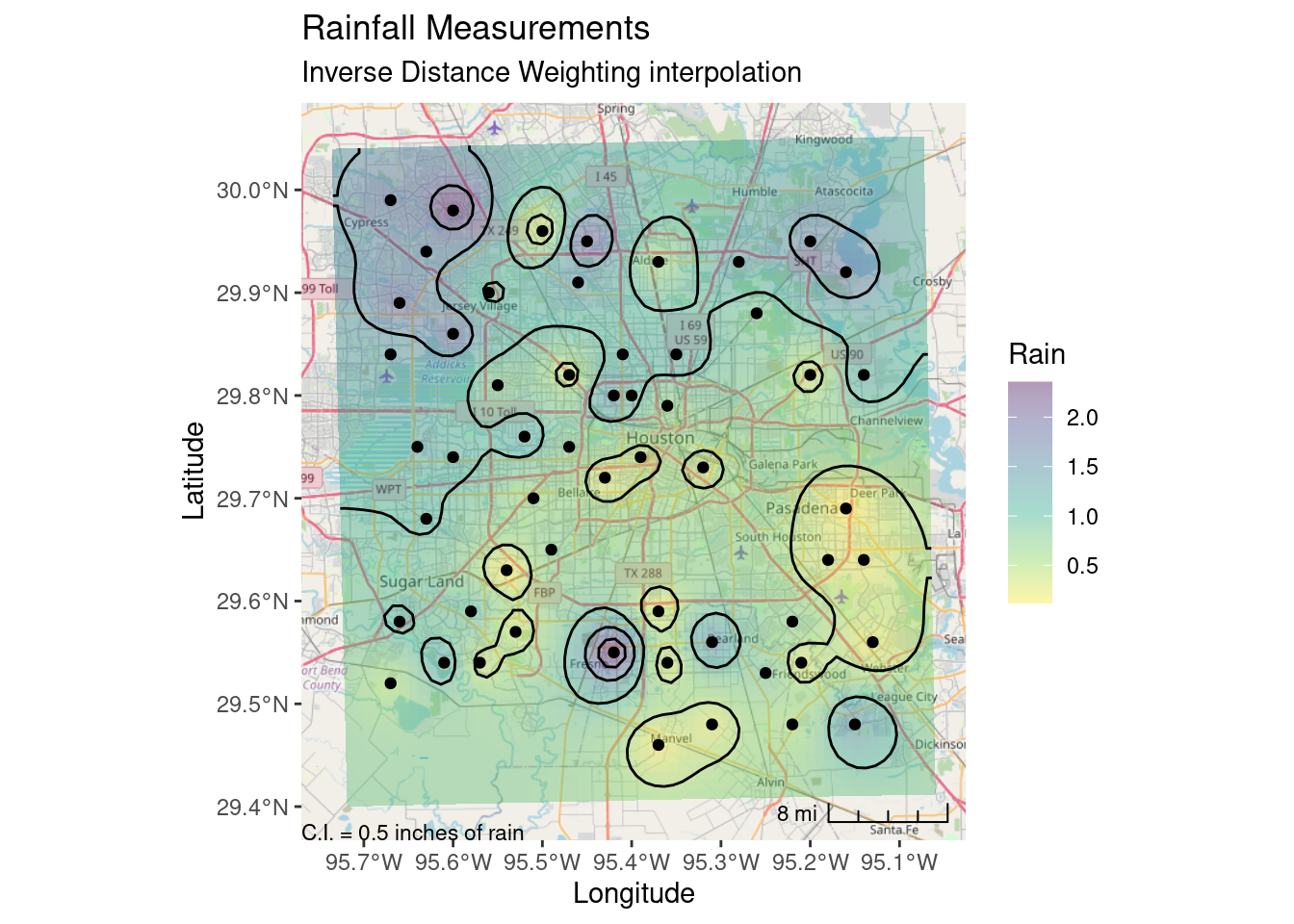
Final quality map using tmap
So here I can label the contours - however I have to label all of them. I’d prefer if I could (like metR allows) add a skip factor for the labels. The spots chosen to place the labels are also sub-optimal. metR looks for the flattest spot to label, which is rather nice. I also prefer the ggspatial scalebar, but that is just me.
Tmap is nice, but I don’t know if I am ready to learn a whole new major package just for mapping when I can get ggplot to get pretty close to what I want.
tmap::tmap_mode("plot") # set mode to static plots

#   Tweak the bounding box, it felt a little restrictive. But I would like the
#   raster coloring to stay smaller...
new_bb <- tmaptools::bb(bbox, relative=TRUE,
                        width=1.05,
                        height=1.05)

tmap::tm_shape(Base_tmap_osm, bbox=new_bb)+
  tmap::tm_rgb() +
  tmap::tm_graticules(col ="lightgray", line = TRUE) +
tmap::tm_shape(interp_IDW_stars) +
  tmap::tm_raster(palette="Blues", alpha=0.5, style="cont") +
  tmap::tm_layout(frame = TRUE, inner.margins = 0, legend.outside=TRUE) +
tmap::tm_shape(df_sf) +
  tmap::tm_sf(col="black", size=0.3) +
tmap::tm_shape(Contours_LL) +
  tmap::tm_iso(col="black", text="focal_mean") +
tmap::tm_scale_bar(breaks = c(0, 5, 10), text.size = 1,
                   position=c("right", "BOTTOM"))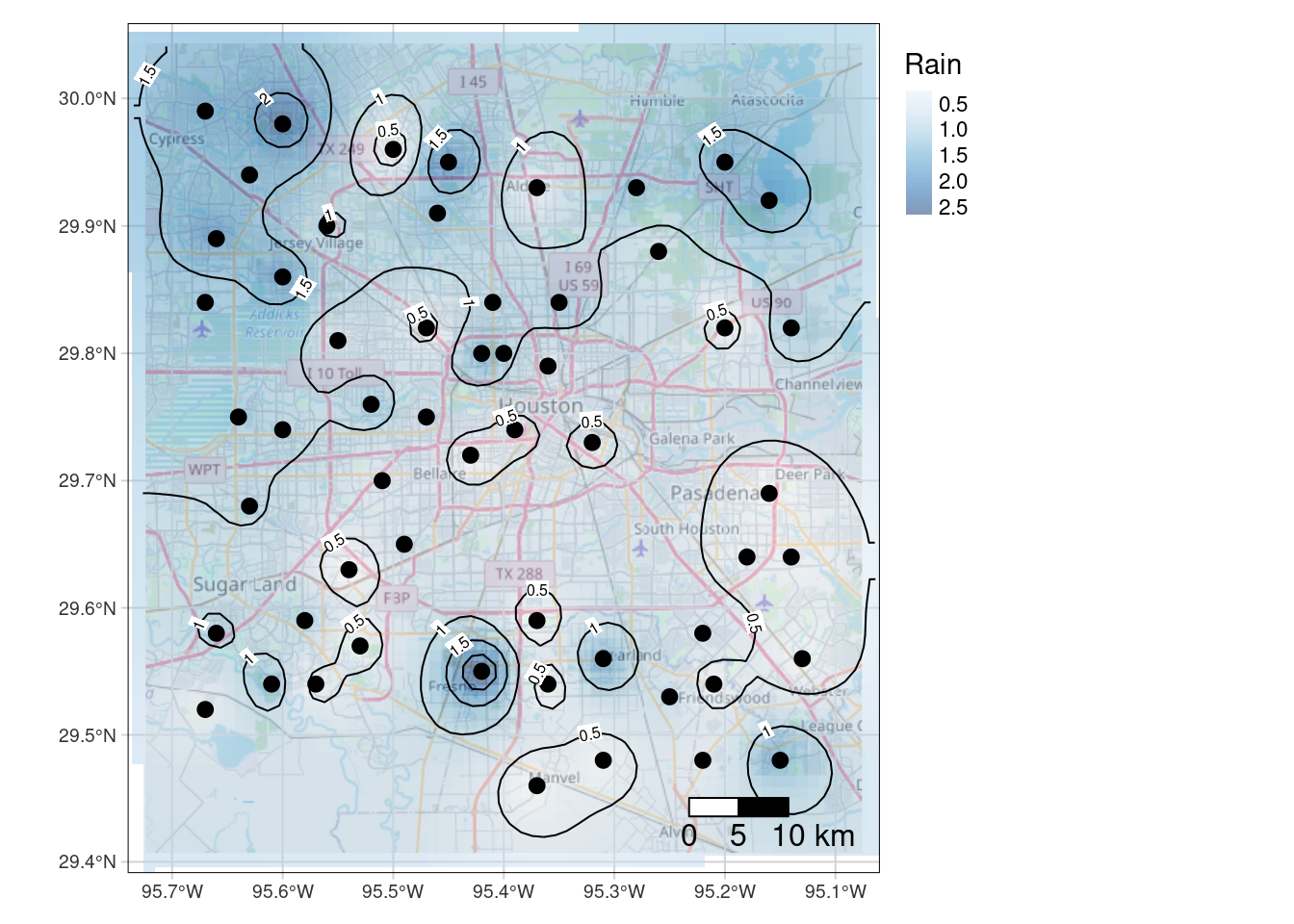
Kriging
Kriging is a big topic, so I will not explain much here. Good references to start with would be Gimond (2022), Wilke (2020), and rspatial.org (2021).
There are a few steps to doing Kriging. The algorithm assumes that the data has no regional trend - that at some distance (called the range) the data essentially become uncorrelated. To satisfy this requirement, the first step is normally to remove any trends (called the drift), usually by fitting a low-order polynomial to the data and subtracting it.
There were examples of doing this as part of the kriging process itself, but I could not get them to work. In any event, I like to look at the individual steps to make sure they make sense and that things are working properly. That and fitting a drift function is just one more way to get a feel for the data, which is often helpful.
Key to the process is fitting a variogram model. Intuitively, the range is the distance beyond which the data points do not correlate. The nugget has several interpretations - it can represent the degree of error on the input data, or it can represent an inherent non-linearity in the data - such as suddenly drilling into a gold nugget.
In our dataset, the variogram clearly shows that the range includes very little data, indicating that, as we saw with the IDW analysis, that we are very under-sampled given the short wavelength variability in this data.
One big plus of Kriging is that it automatically provides an error estimate at each point, which is always useful to consider.
So briefly, the process is as follows:
- Fit a low-order polynomial to the input data
- Subtract the chosen polynomial
- Fit the variogram with different functions to choose the best
- Krige the data to the desired output grid
- Add the polynomial back to the data
- Plot the map
- Plot the residual map to get a feel for the error bars
Get the Drift
It is pretty clear that the 2nd order fit has a serious overshoot problem in the NW corner, so choosing the linear fit is pretty easy. Which is almost always the case. It occurs to me that it might be even better to fit a polynomial using absolute error rather than a least-squares, to add some outlier protection.
#   Struggled a lot to get examples to work, so I went my own way It is
#   important in Kriging to remove any low frequency trend. This is typically
#   done by fitting a low-order polynomial surface to the data and subtracting
#   that off before proceeding. Then at the end, you add it back.

#   Let's look at 1st and 2nd order fits

df_xy_df <- bind_cols(sf::st_drop_geometry(df_xy),
                      sf::st_coordinates(df_xy)) # make a tibble

# Define the 1st order polynomial equation
f.1 <- as.formula(Rain ~ X + Y)

# Run the regression model
lm.1 <- lm( f.1, data=df_xy_df)

#   Use predict to apply the model fit to the grid This re-attaches X-Y
#   coordinates to the predicted values so they can be made into a grid

Poly_fit.1 <- sf::st_as_sf(bind_cols(grd_df,
                                     data.frame(var1.pred=predict(lm.1, grd_df))),
                           crs=localcrs,
                           coords=c("X", "Y"))

#   Convert to a stars object
Poly_fit_star.1 <- stars::st_rasterize(Poly_fit.1 %>%
                                         dplyr::select(Rain=var1.pred, geometry))

ggplot() +
  stars::geom_stars(data=Poly_fit_star.1) +
  scale_fill_gradientn(colors=rainbow(5)) +
  geom_sf(data=df_xy, aes(color=Rain), size=5) +
  scale_color_gradientn(colors=rainbow(5), limits=c(0,3)) +
  scale_fill_gradientn(colors=rainbow(5), limits=c(0,3)) +
  geom_sf(data=df_xy, color="Black", size=1)+
  labs(title="Linear trend from rainfall data")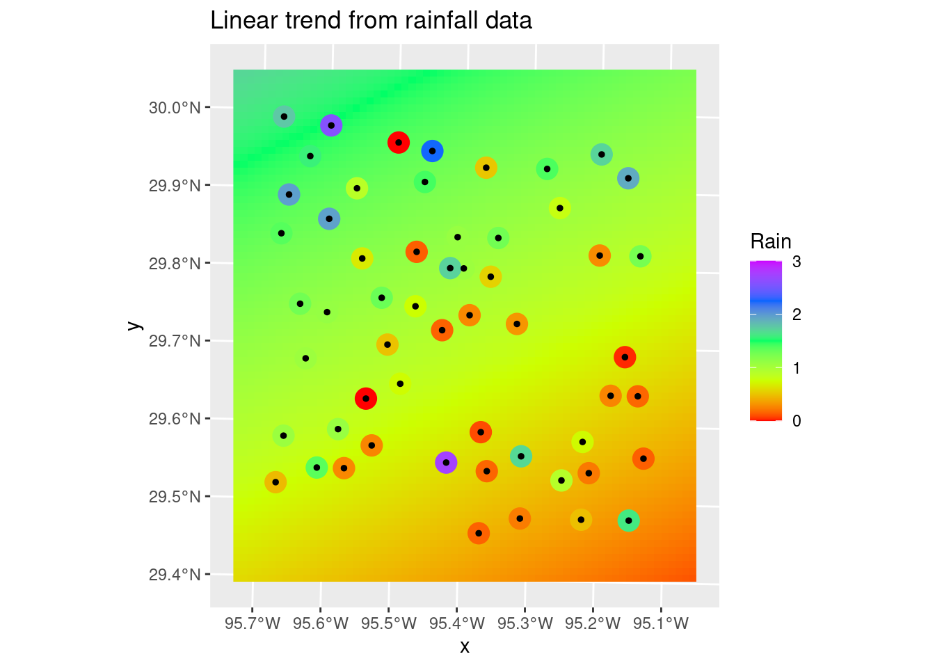
# Now let's do a 2nd order polynomial

f.2 <- as.formula(Rain ~ X + Y + I(X*X)+I(Y*Y) + I(X*Y))
# Run the regression model
lm.2 <- lm( f.2, data=df_xy_df)

#   Use predict to apply the model fit to the grid This re-attaches X-Y
#   coordinates to the predicted values so they can be made into a grid

Poly_fit.2 <- sf::st_as_sf(bind_cols(grd_df,
                                     data.frame(var1.pred=predict(lm.2, grd_df))),
                           crs=localcrs,
                           coords=c("X", "Y"))

#   Convert to a stars object
Poly_fit_star.2 <- stars::st_rasterize(Poly_fit.2 %>%
                                         dplyr::select(Rain=var1.pred, geometry))

ggplot() +
  stars::geom_stars(data=Poly_fit_star.2) +
  scale_fill_gradientn(colors=rainbow(5)) +
  geom_sf(data=df_xy, aes(color=Rain), size=5) +
  scale_color_gradientn(colors=rainbow(5), limits=c(0,3)) +
  scale_fill_gradientn(colors=rainbow(5), limits=c(0,3)) +
  geom_sf(data=df_xy, color="Black", size=1)+
  labs(title="Second order polynomial trend from rainfall data")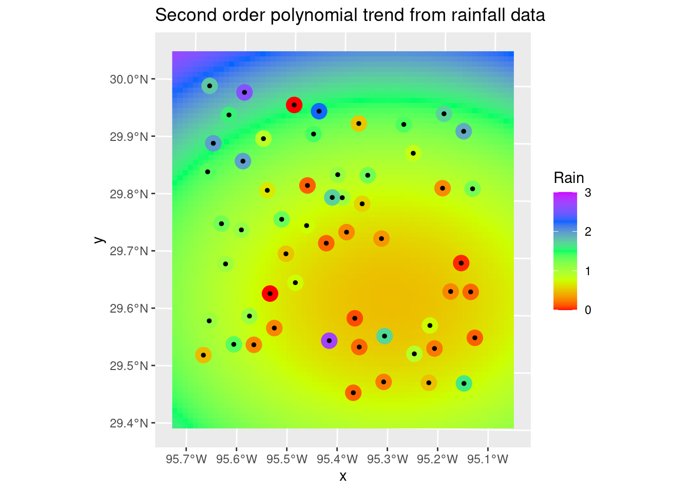
#   A matter of judgement, but I think I like the first order fit better, so
#   we'll go with it. That is usually the case.

#   Calculate residuals

df_xy_res <- bind_cols(predict(lm.1, as_tibble(sf::st_coordinates(df_xy))),
                sf::st_coordinates(df_xy)) %>%
  rename(Trend=1) %>%
  mutate(Trend=as.numeric(Trend)) %>%
  bind_cols(df_xy) %>%
  mutate(Detrended=Rain-Trend) %>%
  sf::st_as_sf()
Variogram
The variogram plots gamma - the distance between point values, against the differences in distance between those points. There are a number of standard models that are usually used:
- Spherical
- Exponential
- Gaussian
- Matern
There is a large literature and a number of functions available in R for choosing a variogram. I will do it by eye. I will set the nugget to zero, since for this data I have no expectation that there should be a nugget effect. Although, given the sudden variation apparent over short distances, I will go ahead and run a test with the nugget as a fitting parameter.
If you look into the variable var.smpl, you can see that the lowest gamma point, which has an undue influence on the fit, is a binned value of a single point, while the rest of the data points are from distance bins containing many points. This should cause pause. In any event, I will choose the Matern function fit just because I want to extend the range a little more, and that seems as good a reason as any.
Interestingly, not specifying a zero nugget did not affect most of the fits.
#   Let's look at the variogram

var.smpl <- gstat::variogram(Detrended ~ 1,
                             data=df_xy_res)
# Compute the variogram model by passing the nugget, sill and range values
# to fit.variogram() via the vgm() function.
#                models are "Sph", "Exp", "Mat", and "Gau"

Plot_data <- NULL
for (model in c("Sph", "Exp", "Mat", "Gau")) {
  foo  <- gstat::fit.variogram(var.smpl, fit.ranges = TRUE, fit.sills = TRUE,
                                   debug.level = 0,
                            gstat::vgm(psill=NA, model=model, range=NA, nugget=0))
  Plot_data <- bind_rows(Plot_data, gstat::variogramLine(foo, maxdist = max(var.smpl$dist)) %>%
                           mutate(Model=model))
}

ggplot(var.smpl, aes(x = dist, y = gamma)) +
     geom_point() +
     geom_text(aes(hjust="left", label=np), nudge_x=200) +
     geom_line(data=Plot_data, aes(x=dist, y=gamma, color=Model)) +
     labs(title="Variogram for detrended data",
          subtitle="Numbers represent number of points in the distance bin")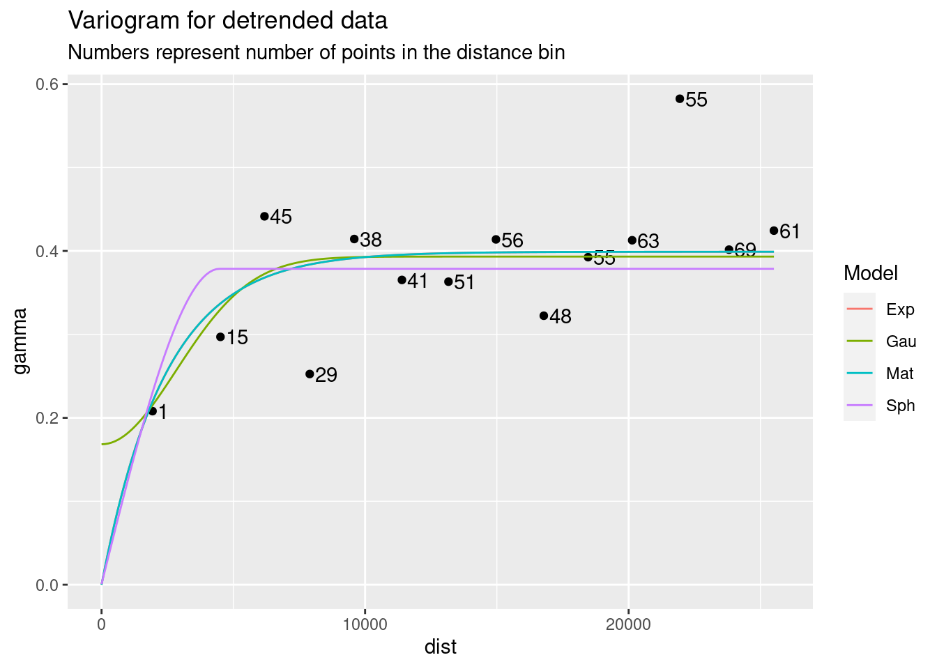
#      Allow nugget to float

Plot_data <- NULL
for (model in c("Sph", "Exp", "Mat", "Gau")) {
  foo  <- gstat::fit.variogram(var.smpl, fit.ranges = TRUE, fit.sills = TRUE,
                                   debug.level = 0,
                            gstat::vgm(psill=NA, model=model, range=NA, nugget=NA))
  Plot_data <- bind_rows(Plot_data, gstat::variogramLine(foo, maxdist = max(var.smpl$dist)) %>%
                           mutate(Model=model))
}

ggplot(var.smpl, aes(x = dist, y = gamma)) +
     geom_point() +
     geom_text(aes(hjust="left", label=np), nudge_x=200) +
     geom_line(data=Plot_data, aes(x=dist, y=gamma, color=Model)) +
     labs(title="Variogram for detrended data, nugget not set to zero",
          subtitle="Numbers represent number of points in the distance bin")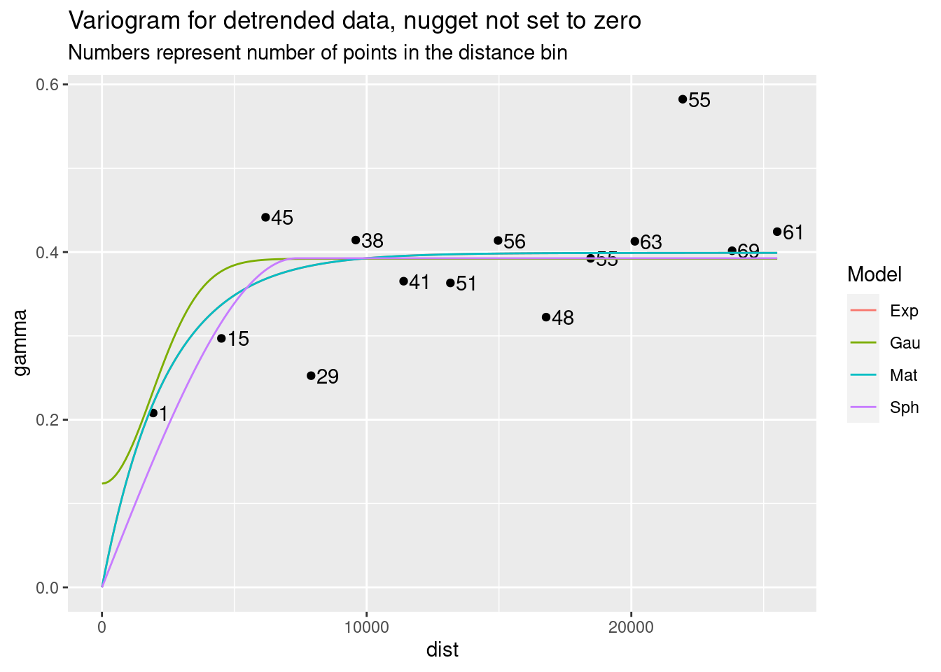
Kriging
The variance map shows the same story - the correlation length is short, so the influence any data point has is limited, so as you move away from data the map quickly reaches some average regional value with a fairly high error bar.
#   We have our model, so now let's use it
dat.fit <- gstat::fit.variogram(var.smpl, fit.ranges = TRUE, fit.sills = TRUE,
                                   debug.level = 0,
                            gstat::vgm(psill=NA, model="Mat", range=NA, nugget=0))

Krigged_grid <- gstat::krige(Detrended ~ 1,
                             df_xy_res,
                             grd_sf,
                             debug.level=0,
                             dat.fit)
Krigged_star <- stars::st_rasterize(Krigged_grid %>% dplyr::select(Rain=var1.pred, geometry))

#     Residuals
ggplot() +
  stars::geom_stars(data=Krigged_star) +
  scale_fill_gradientn(colors=rainbow(5)) +
  geom_sf(data=df_xy, color="Black", size=1) +
  labs(title="Residuals from Kriging without drift")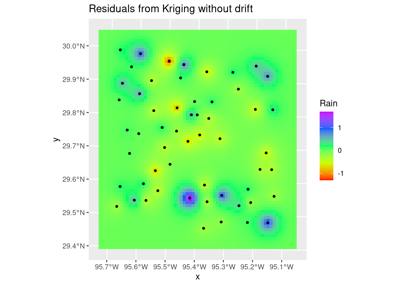
#   Variance
Krigged_starvar <- stars::st_rasterize(Krigged_grid %>% dplyr::select(Rain_var=var1.var, geometry))

#     Variance
ggplot() +
  stars::geom_stars(data=Krigged_starvar) +
  scale_fill_gradientn(colors=rainbow(5)) +
  #     This is here to get the scaling consistent with other plots
  geom_sf(data=df_xy, color="Black", size=1, alpha=0) +
  labs(title="Variance from Kriging")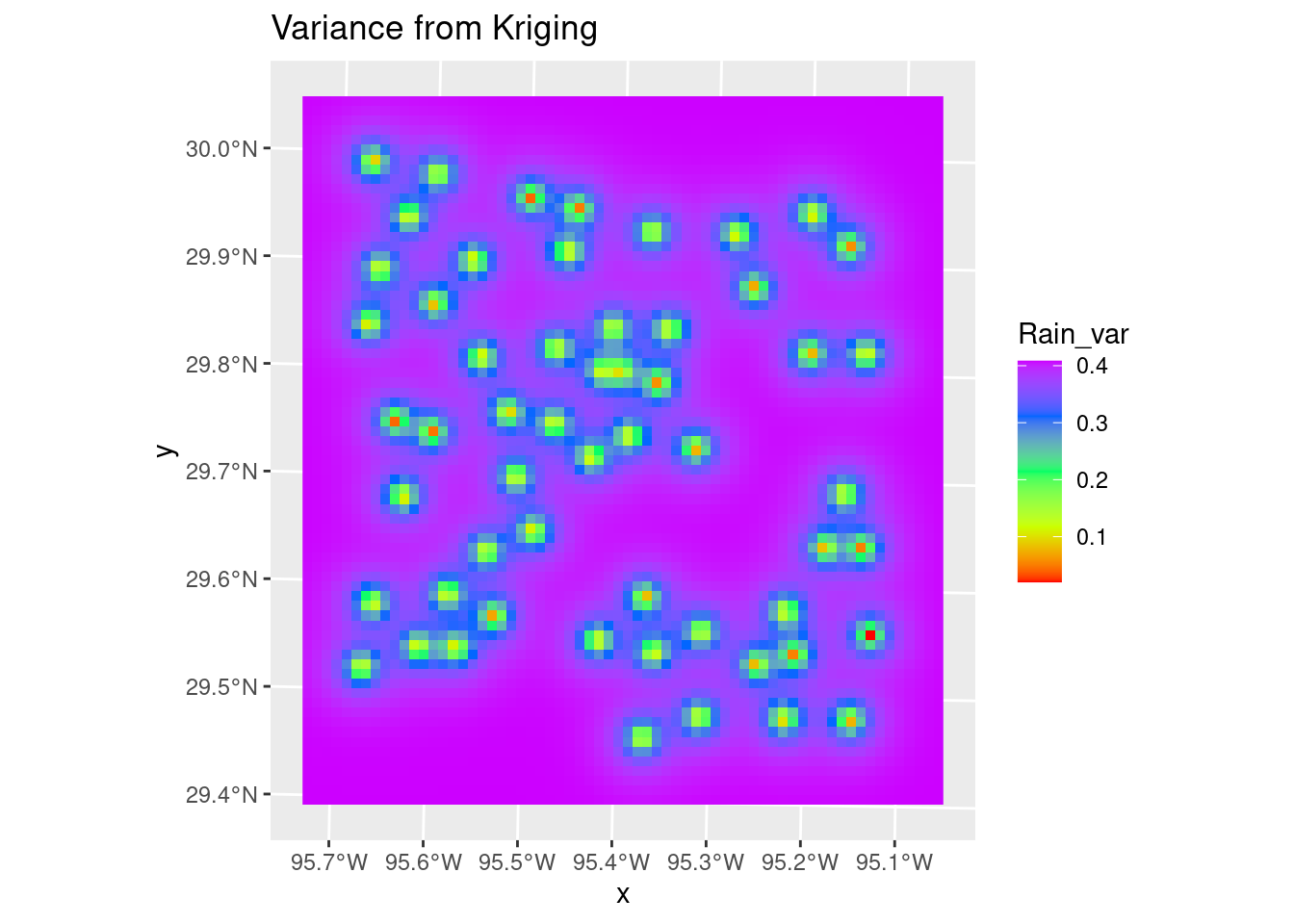
#     Final grid - residuals plus drift
Final_krige_star <- Krigged_star + Poly_fit_star.1

#   and a nice plot, after some work

ggplot() +
  stars::geom_stars(data=Final_krige_star) +
  geom_sf(data=df_xy, aes(color=Rain), size=5) +
  scale_color_gradientn(colors=rainbow(5), limits=c(0,3)) +
  scale_fill_gradientn(colors=rainbow(5), limits=c(0,3)) +
  geom_sf(data=df_xy, color="Black", size=1) +
  labs(title="Final Kriging result")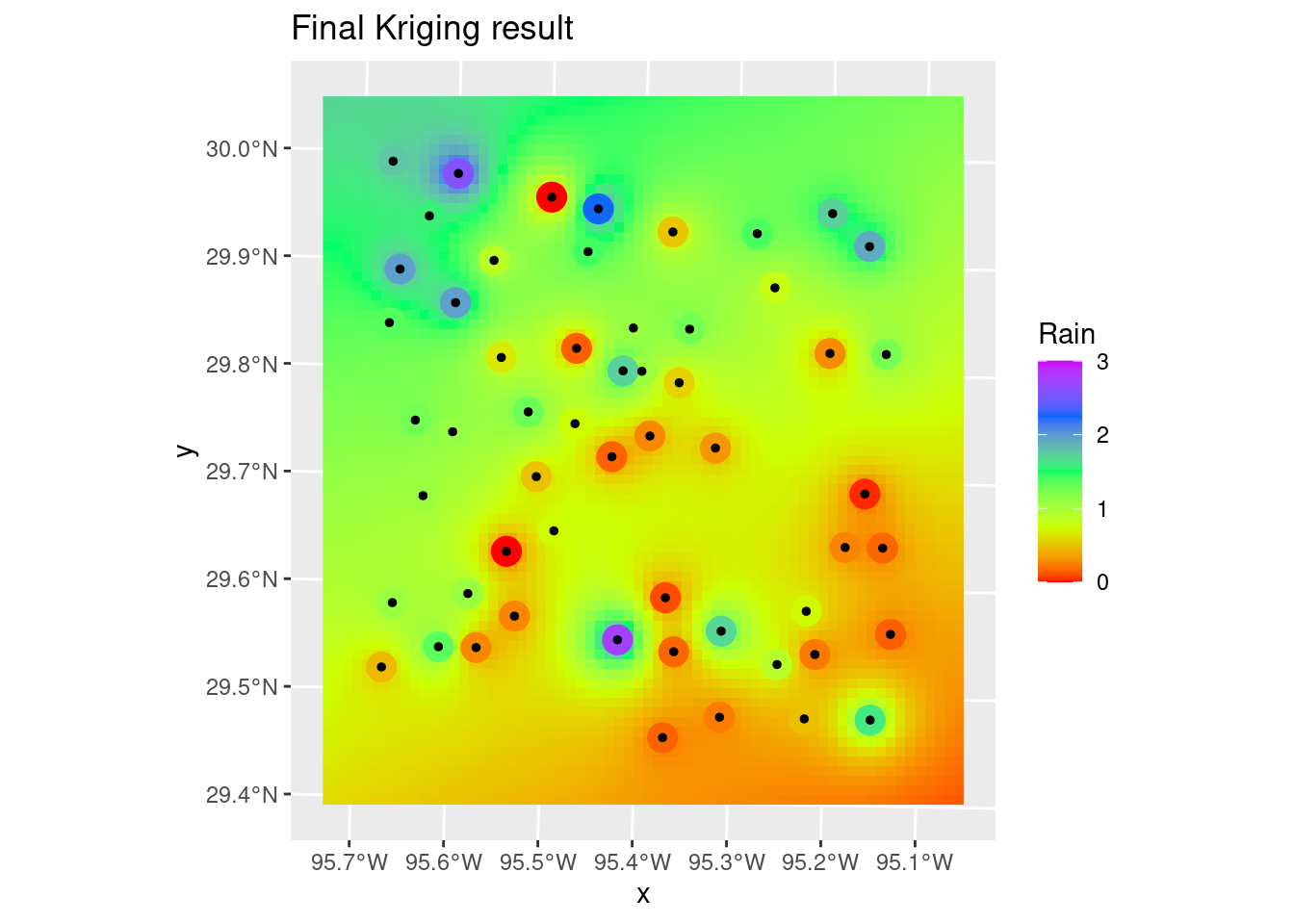
Now let’s make a nice final plot from Kriging.
#   Let's make some contours

#   Make some pretty breaks for contour intervals based on the data
#brks <- classInt::classIntervals(pretty(n=10, x=as.vector(Final_krige_star[[1]])), n=8)
#   Create contour lines
Contours_Krig <- stars::st_contour(Final_krige_star, contour_lines=TRUE, breaks=brks)
#   Plot to see what it all looks like
ggplot() +
  stars::geom_stars(data=Final_krige_star) +
  scale_fill_gradientn(colors=rainbow(5), limits=c(0,3)) +
  geom_sf(data=df_xy, aes(color=Rain), size=5) +
  scale_color_gradientn(colors=rainbow(5), limits=c(0,3)) +
  geom_sf(data=df_xy, color="Black", size=1) +
geom_sf(data=Contours_Krig, color="black") 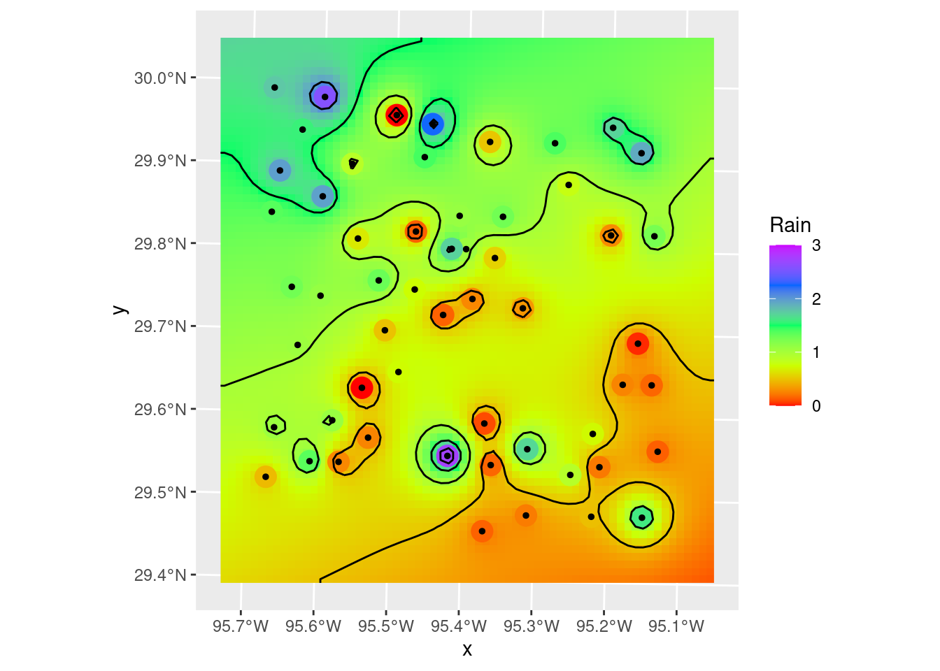
#   Hmmm.... could use some smoothing, but just to remove points and kinks.

Contours_sm <- smoothr::smooth(Contours_Krig, method="ksmooth", smoothness=2)

#   and our final plot in X-Y space
ggplot() +
  stars::geom_stars(data=Final_krige_star) +
  geom_sf(data=df_xy, aes(color=Rain), size=5) +
  scale_color_gradientn(colors=rainbow(5), limits=c(0,3)) +
  scale_fill_gradientn(colors=rainbow(5), limits=c(0,3), na.value="transparent") +
  geom_sf(data=df_xy, color="Black", size=1) +
  geom_sf(data=Contours_Krig, color="red") +
  geom_sf(data=Contours_sm, color="blue") +
  annotate("text", label="C.I. = 0.5 inches of rain",
           x=bbox_xy[['xmin']]+5000,
           y=bbox_xy[['ymin']]-1000,
           hjust="inward", vjust="inward", size = 3) +
  labs(title="Final X-Y plot of Krigged data",
       subtitle="Red contours are original, Blue are final, color fill is smoothed data.")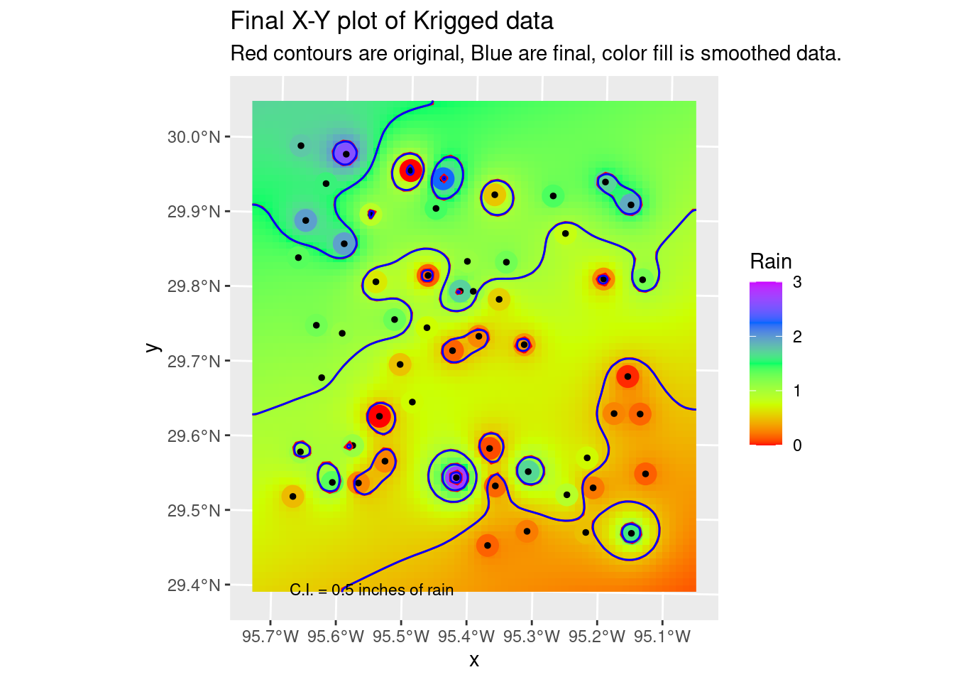
#   Now lets transform the contours to lat-long space and plot on the basemap

Contours_LL <- sf::st_transform(Contours_sm, crs=googlecrs)
Krig_star_LL <- sf::st_transform(Final_krige_star, crs=googlecrs)

ggplot() +
  #   this is the best looking basemap
  Base_basemapR +
  #   Gridded data
  stars::geom_stars(data=Krig_star_LL, alpha=0.4) +
  #   Add points
  geom_sf(data=df_sf) +
  #   Create filled density "contours"
  geom_sf(data=Contours_LL, color="black") +
  scale_fill_viridis_c(direction=-1, alpha=0.4) +
  #   Add a scale bar
  ggspatial::annotation_scale(data=df_sf, aes(unit_category="imperial", style="ticks"),
    location="br", width_hint=0.2, bar_cols=1) +
  #   Add CI annotation at specified window coordinates
  annotate("text", label="C.I. = 0.5 inches of rain",
           x=-Inf,
           y=-Inf,
           hjust="inward", vjust="inward", size = 3) +
  # annotation_custom(grid::textGrob(label = "C.I. = 0.5 inches of rain",
  #                                x = unit(0.2, "npc"),
  #                                y = unit(0.02, "npc"))) +
  coord_sf(crs=googlecrs) + # required
  #   Add title
  labs(title="Rainfall Measurements",
       subtitle="Kriging interpolation",
       x="Longitude", y="Latitude")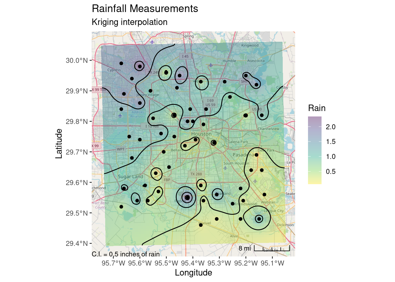
Bicubic Splines
Sometimes splines work really well, but the roughness of this dataset is so large that they overshoot and fail rather miserably. But still worth trying out. If the input data were much smoother, they would do a dandy job. It is sad though that interp still requires sp objects, and doesn’t (yet?) support sf.
The Akima performs rather poorly with bad overshoot at the edges and in the interior of the map. I don’t know enough about it to even guess at how one might tweak the many parameters to improve the interpolation.
The Linear method, or barycentric, is quite a bit better, except at the edges. The contours could use some serious smoothing as well.
minRain <- min(df_xy$Rain)
maxRain <- max(df_xy$Rain)*1.1 # allow a 10% overshoot from the actual data

#   Sadly doesn't support sf, so we have to convert to a Spatial object
Spline_grid <- interp::interp(x=sf::as_Spatial(df_xy),
                              z="Rain",
                              xo= grd_df$X,
                              yo= grd_df$Y,
                              method="akima",
                              degree = 2,
                              extrap=FALSE)

Spline_grid_delauny <- interp::interp(x=sf::as_Spatial(df_xy),
                              z="Rain",
                              xo= grd_df$X,
                              yo= grd_df$Y,
                              method="linear",
                              extrap=FALSE)


#   Convert back to sf and set any results outside original data range to NA
Spline_grid <- sf::st_as_sf(Spline_grid) %>%
  mutate(Rain = if_else(between(Rain, minRain, maxRain), Rain, NULL))

#   Convert to a stars object so we can use the contouring in stars
Spline_stars <- stars::st_rasterize(Spline_grid %>% dplyr::select(Rain, geometry))
#   Create contour lines
Contours_Spline <- stars::st_contour(Spline_stars, contour_lines=TRUE, breaks=brks)
#   and our final plot in X-Y space
ggplot() +
  stars::geom_stars(data=Spline_stars) +
  scale_fill_gradientn(colors=rainbow(5), limits=c(0,3), na.value="transparent") +
  geom_sf(data=df_xy, aes(color=Rain), size=5) +
  geom_sf(data=df_xy, color="Black", size=1) +
  scale_color_gradientn(colors=rainbow(5), limits=c(0,3)) +
  geom_sf(data=Contours_Spline, color="black") +
  labs(title="Final X-Y plot of Akima Spline Interpolation")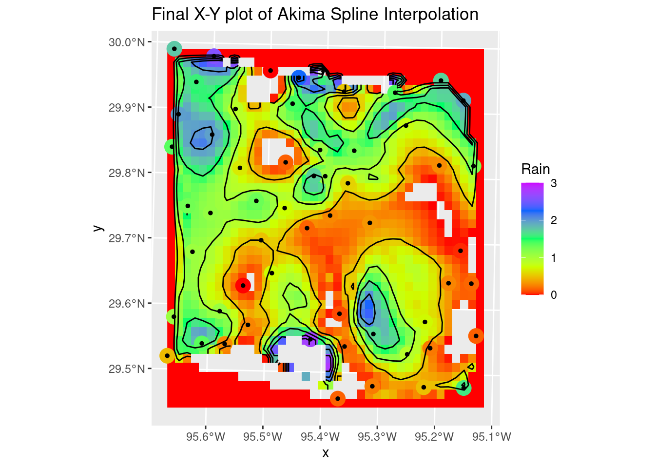
#     Convert and plot up the Delauny linear result

#   Convert back to sf and set any results outside original data range to NA
Spline_grid_delauny <- sf::st_as_sf(Spline_grid_delauny) %>%
  mutate(Rain = if_else(between(Rain, minRain, maxRain), Rain, NULL))

#   Convert to a stars object so we can use the contouring in stars
Spline_stars <- stars::st_rasterize(Spline_grid_delauny %>% dplyr::select(Rain, geometry))
#   Create contour lines
Contours_Spline <- stars::st_contour(Spline_stars, contour_lines=TRUE, breaks=brks)
#   and our final plot in X-Y space
ggplot() +
  stars::geom_stars(data=Spline_stars) +
  scale_fill_gradientn(colors=rainbow(5), limits=c(0,3), na.value="transparent") +
  geom_sf(data=df_xy, aes(color=Rain), size=5) +
  geom_sf(data=df_xy, color="Black", size=1) +
  scale_color_gradientn(colors=rainbow(5), limits=c(0,3)) +
  geom_sf(data=Contours_Spline, color="black") +
  labs(title="Final X-Y plot of Barycentric Interpolation")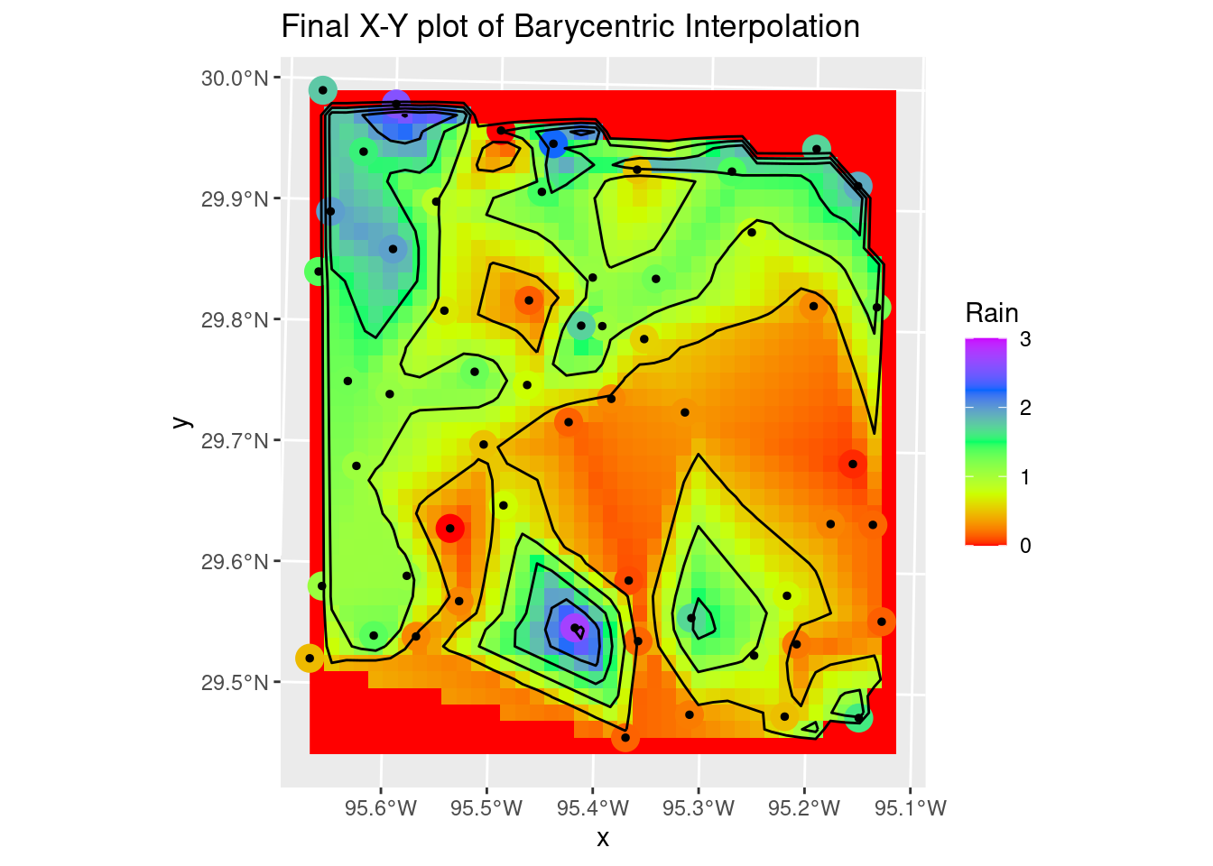
Thin Plate
The thin plate model is rather painful, requiring a sojourn into the raster package and the fields packages - so it is perhaps not well supported? In any event it yields a very smooth rendition of the surface with the default parameters. It might be useful for trend removal prior to kriging - less restrictive than a polynomial.
The lambda parameter - basically the roughness penalty - seems to be the key parameter affecting how closely the solution matches the input data. Smaller values = greater roughness allowed. Of course, greater roughness also leads to overshoot. But with some tweaking, not a bad result. I rather like this one.
 # -------- Thin Plate Spline Regression
 fit_TPS <- fields::Tps( # using {fields}
   x = as.matrix(as_tibble(sf::st_coordinates(df_xy))), # accepts points but expects them as matrix
   Y = df_xy$Rain,  # the dependent variable
   lambda = 0.0001,
   miles = FALSE # EPSG 26915 is based in meters
 )

interp_TPS <- raster::interpolate(grd_raster, fit_TPS)

#   Convert to a stars object so we can use the contouring in stars
TPS_stars <- stars::st_as_stars(interp_TPS)
#   Create contour lines
Contours_TPS <- stars::st_contour(TPS_stars, contour_lines=TRUE, breaks=brks)
#   Plot to see what it all looks like
#   and our final plot in X-Y space
ggplot() +
  stars::geom_stars(data=rename(TPS_stars, Rain=layer)) +
  geom_sf(data=df_xy, aes(color=Rain), size=5) +
  geom_sf(data=df_xy, color="Black", size=1) +
  scale_fill_gradientn(colors=rainbow(5), limits=c(0,3)) +
  scale_color_gradientn(colors=rainbow(5), limits=c(0,3)) +
  geom_sf(data=Contours_TPS, color="black") +
  labs(title="Final X-Y plot of Thin-plate Interpolation")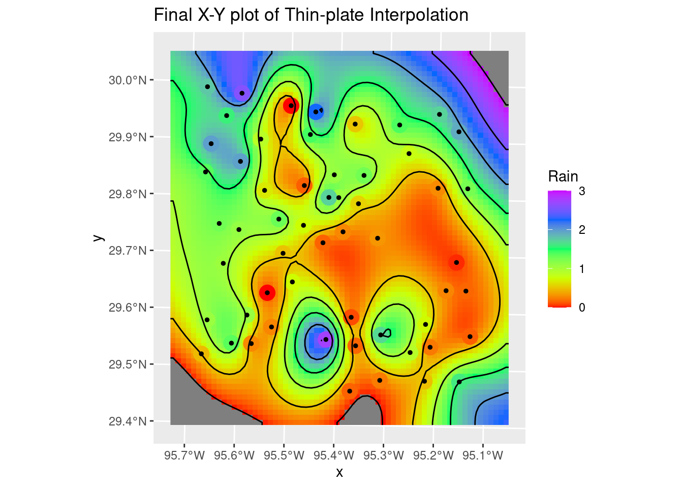
Summary
As I noted in the beginning, the whole area of mapping and geostatistics in R has been undergoing a significant revolution over the past few years, which is both good and bad. It means that many of the old examples one might find on the web are largely out of date, and so figuring out what the best modern path might be can be a challenge. There are some very helpful new reference works appearing, like Lovelace (2022), that can help greatly in sorting through the mess.
There are still some of the more niche functions that have yet to be ported to the more modern infrastructure - I have high hopes that that will occur in the not too distant future.
One general critique I have is that it is often not clear (especially with the basemaps) what the coordinate system for the object actually is. This should be more obvious - and well-documented. In general I would say that in the documentation, with some exceptions, there is too little discussion of how coordinate systems are handled, what the restrictions and assumptions are. For a topic so fundamental, it seems to be ignored. In part I think that there is a bit too much implicit and not enough explicit.
On the maps themselves, a standard label explicitly noting the geodetics for the map as plotted would be really helpful. As a professional map-maker, that was something that our software did automatically - in fact, you had no choice.
It would be really sweet if we had a mapping package (tmap or ggplot) that also combined the nice contour labeling capabilities of metR, the contour smoothing capabilities of smoothr, and worked in both X-Y and Lat-Long space.
Finally, some years ago when I made my first maps in R with ggmap, tools were quite limited and it was a challenge to move beyond the basics. Thanks to the efforts of many people, we now have almost an embarrassment of riches, and a very capable system at hand. Many thanks to all who have contributed to the development of the current mapping environment in R.